Figures & data
Figure 1. Real estate investment as percent of US GDP from 1947 to 2013. The second highest point of residential investment is in 2005, while the lowest is in 2010 (US Department of Commerce Citation2014).
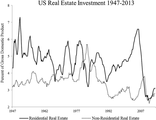
Figure 2. Authorized new housing units in Massachusetts from 1995 to 2013 (US Census Bureau Citation2014).
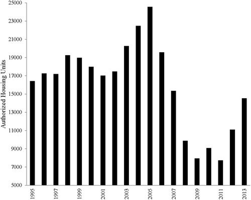
Figure 3. Study area of central Massachusetts, USA, with major cities, highways (including Interstate-495 and 90), Wachusett Mountain, and water bodies.
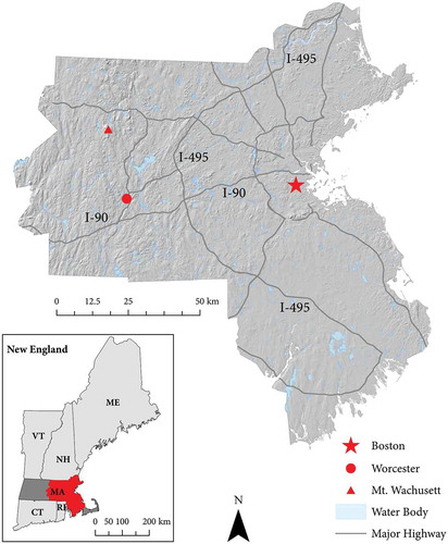
Table 1. Data used in this study.
Figure 4. Five endmember sets evaluated for use in spectral mixture analysis. The X-axis is the spectral range of Landsat-5 TM bands 1–5 and 7 (gray bars), and the Y-axis is mean proportional reflectance for each endmember in the set. Reflectance values were extracted from the 20 September 2006 Landsat-5 TM image. This figure was adapted from figure 3 in Small (Citation2001).
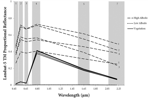
Figure 5. Empirically derived hierarchical change thresholds developed to determine biophysically significant loss on undeveloped land cover for the bust period (2006–2013). Change detection was stratified per three aggregated undeveloped land-cover types (forest, urban forest, low vegetation) using a preexisting 2009 land cover map (MaFoMP Citation2011). The thresholds displayed are for the bust period; however, the same thresholds were applied to bubble period (2000–2006) using a 2000 land-cover map for stratification (MaFoMP Citation2011).
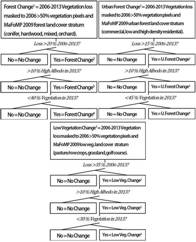
Figure 6. Example of change from to undeveloped to developed land cover isolated through change detection (a). Polygons of new developed land cover (b) are used to extract biophysical and socioeconomic variables specific to the time and place of that patch, e.g. town, area, mean vegetation fraction loss, mean slope, and residential tax rate. The polygon data is also utilized for validation of change detection in Google EarthTM (bubble outlined in red, 2003: c and e to 2006: d and f; bust outlined in violet, 2006: g and i to 2013: h and j). For full color versions of the figures in this paper, please see the online version.
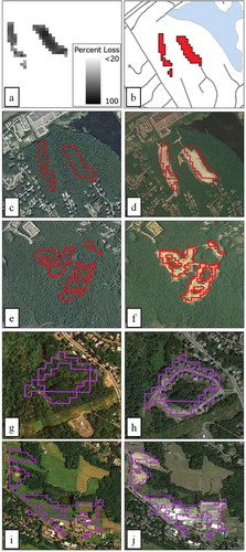
Table 2. Level I error matrix of bust and bubble period land-use change maps using Google EarthTM data and 600 samples.
Table 3. Level II area weighted error matrix of land-use change maps using Google EarthTM data and 600 samples per land-use stratum: forest (orchard, hardwood, conifer, and mixed forest classes), urban forest (low- and high-density residential and commercial classes), and low vegetation (pasture/row crop, golf course, and grassland classes).
Table 4. Attributes and descriptive statistics of distribution of bubble and bust change maps at town and loss patch levels.
Figure 7. Map of towns with major loss of undeveloped land cover as percentage of town area (>0.85% of town area) during the bubble (a and b) and after the bubble burst (c and d). Major loss per town during the bubble was primarily attributed to large developments, while major loss per town in the bust period was primarily attributed to relatively smaller and more numerous developments.
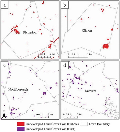
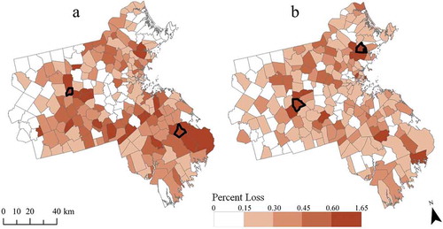
Figure 8. Map displaying loss of undeveloped land cover per town as a percentage of the town’s total area during the bubble (a) and after the bubble burst (b). Plympton, Clinton, Northborough, and Danvers (displayed in ) are outlined in black.