Figures & data
Figure 1. Map of the study area in central highlands of Kenya. The 33 subwatersheds highlighted into five main watersheds and overlaid with the mean annual mean rainfall (mm/year). Inset (lower right) shows the population density trends in selected subwatershed for 1989, 1999, and 2009 census alongside the number of large-scale horticulture greenhouses – shown as red dots on the map. For full color versions of the figures in this paper, please see the online version.
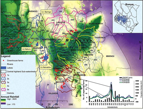
Figure 2. Spatial variation in interannual average NDVI within subwatersheds (a–e left panel) and the integrated mean annual NDVI (A–E right panel top to bottom) between 1982 and 2006. Subwatersheds are categorized into five groups (5s, 4s, 3s, 2s, and 1s), representing the five main watersheds in Kenya.
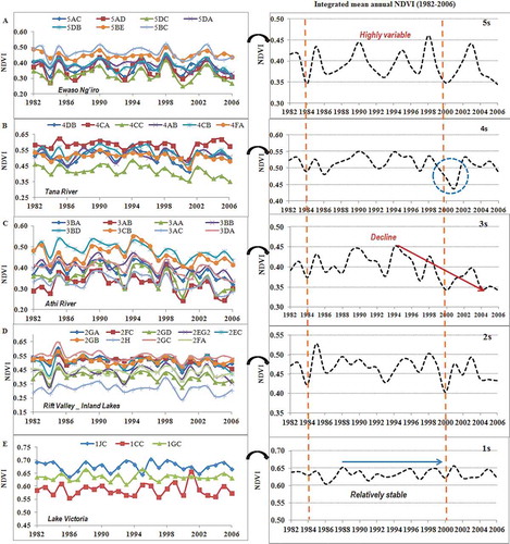
Figure 3. Spatiotemporal maps of average NDVI for 1982, 1992, and 2006 within the study regions. The green color represents clusters of subwatersheds with high average NDVI, while the brown color represent clusters of low average NDVI.
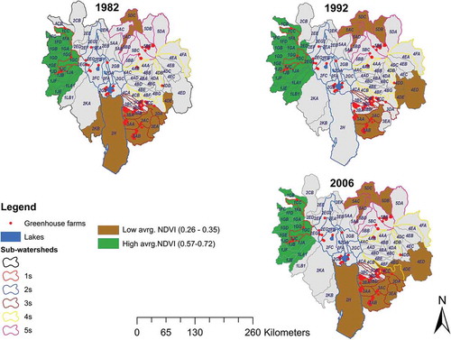
Table 1. Relationship between number of large-scale farms per subwatersheds with average NDVI 2000–2006.
Figure 4. Affected and nonaffected (control) pixels.
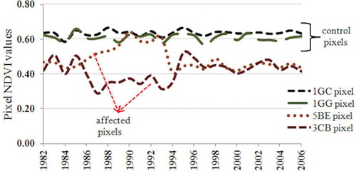
Figure 5. (a) Changes in slope of regression lines (−/+ sign) and (b) coefficient of determination (r2) of averaged annual NDVI for subwatersheds. Green bars indicate trends between 1982 and 1989, and black bars represent trends between 1990 and 2006. Only selected r2 values are labeled.
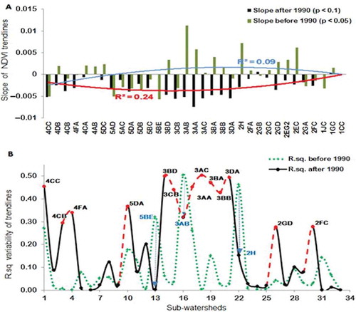
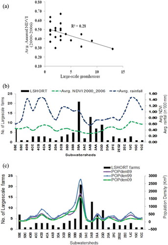
Figure 6. Relationship of intensive farming, NDVI, rainfall, and population density. (a) Averaged interannual NDVI (2000–2006) for subwatershed; (b) number of large-scale commercial greenhouse farms per subwatershed, general mean annual rainfall, and NDVI; (c) population density in the subwatersheds. *LSHORT indicates large-scale commercial horticulture.