Figures & data
Figure 1. Location of the study area (black rectangle) and distribution of buildings along the subway. For full color versions of the figures in this paper, please see the online version.
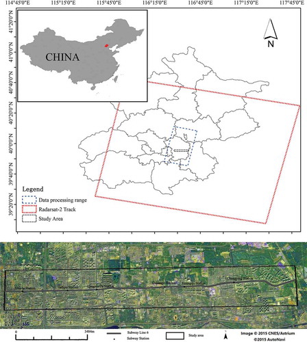
Table 1. The specific information about the Radarsat-2 data we used in this research.
Figure 2. Temporal–spatial baselines of Radarsat-2 data investigated in this research. Each circle is an SAR image and each edge is an SAR interferogram. Interferograms are all connected with a single master scene19.
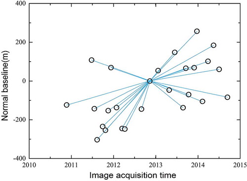
Figure 3. Kriging interpolation results and distribution map of subsidence rate. This map shows parts of Beijing Subway lines and the level points’ location. In the south and north of our research area, there are two main land subsidence bowls with a trend of merger.
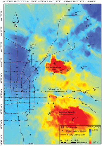
Figure 4. (a) Comparison between level monitoring data and mean PS velocities; black square represents the level value; red circle represents the mean value of PS points around the level point. (b) Deformation profile along the metro line, the red point denotes the subway station.
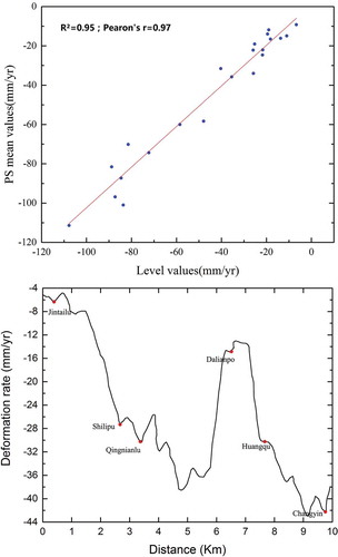
Figure 5. PS points’ distribution in the study area. PS points; density is totally enough to revel the land settlement situation. Two settlement zones are marked with red rectangle, which corresponds to b. And the land subsidence occurs as continuous strip distribution around the subway line.
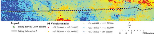
Figure 6. Ex values (a) and En values (b) in each buffer during construction (black) and operation (red). 0 m in the X axis represents the area which the subway passes through. The Ex value of land subsidence rate is higher during operation than that during construction. However, the En value differs so that the degree of spatial nonuniformity differs.
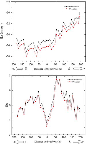
Figure 7. Time series of Ex values (a) and En values (b) in the affected zones during subway construction and operation.
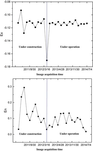
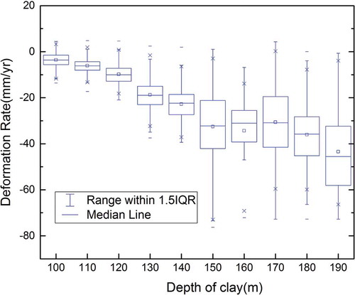
Figure 8. The overlay analysis of PS points and the compressible clay deposits. The distribution of PS points has a relation with the depth of clay.
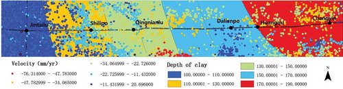
Figure 9. The distribution of deformation rate in different clay layers. The red line is a linear fit of deformation rate and depth of clay layers. Usually, the bigger the depth of clay layer is, the bigger the deformation rate is.