Figures & data
Figure 1. Study site. Map of the California’s Central Valley. California’s agricultural lands (c) are concentrated in the topographic depression formed between the coastal ranges to the west and the high Sierra Nevada mountains to the east (a). The extensive irrigated croplands are easily visible from space (b). Panel (a) is a standard USGS topographic map accessed through ESRI basemaps in ArcMap, panel (b) is an natural color satellite image accessed through ESRI basemaps in ArcMap, panel (c) is a map of cultivated lands developed for this project derived from USDA-CDL maps (see Section 3.2), and panel (d) shows the climate divisions in California from NOAA. A total of seven climate divisions occur in California (https://www.ncdc.noaa.gov/monitoring-references/maps/us-climate-divisions.php). For full colour versions of the figures in this paper, please see the online version.
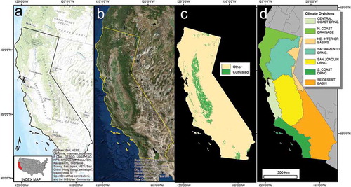
Figure 2. Example of Moderate Resolution Imaging Spectroradiometer (MODIS) monthly maximum-value composite normalized difference vegetation index (NDVI) values for 4 months in 2014.
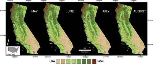
Figure 3. Creating cultivated mask: re-coding of USDA-CDL classification (132 classes) to 11 land-cover classes. The right panel shows the three cultivated cover classes.
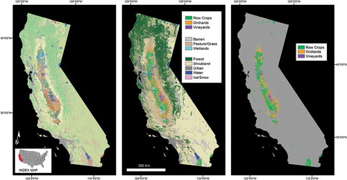
Figure 4. Examples of field sites visited in 2014. Top row (left to right): (a) abandoned walnut, (b) abandoned pomegranate, (c) irrigated corn. Bottom row (left to right): (d) newly planted almond, (e) fallowed field with weeds, (f) fallowed field barren. Photo Credit: Brett Goble.
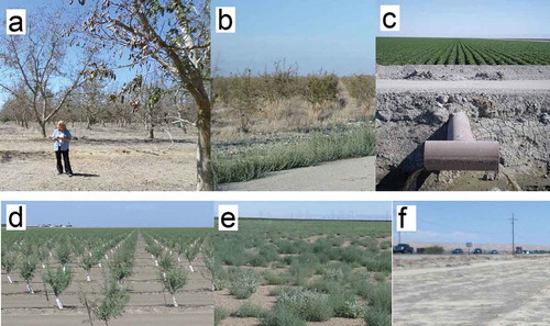
Figure 5. Flowchart of FANTA methods.
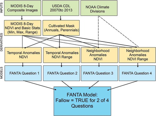
Figure 6. California greenness anomalies. Areas that are “average” (within one standard deviation of the mean) are displayed as gray, with areas greener than average (“green”) in shades of green and less green (“brown”) in shades of brown.
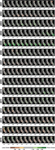
Figure 7. Temporal greenness anomalies for all cultivated lands in California, shown by month for 2013, 2014, and 2015. The green colors show the percent of cultivated land that is at least 1 standard deviation (1σ) above the average greenness value observed historically (between 2001 and 2013). The brown colors show the percent of cultivated land that is at least 1 standard deviation (1σ) below the average historical greenness value.
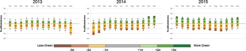
Figure 8. Temporal greenness anomalies for all cultivated lands in California, shown by month for 2013, 2014, and 2015. The green colors show the percent of cultivated land that is at least 1 standard deviation (1σ) above the average greenness value observed historically (between 2001 and 2013). The brown colors show the percent of cultivated land that is at least 1 standard deviation (1σ) below the average historical greenness value.
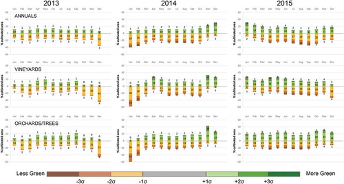
Figure 9. The FANTA model for 2014 is shown in the left panel. The zoomed insets show details of applying Equations (3) and (4) to the MODIS images of 2014, thereby calculating temporal anomalies for NDVI and NDVI range. These temporal greenness anomalies reveal areas that do not look like crops based on their history (Q1) and do not “act” like crops based on their history (Q2).
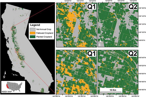
Figure 10. Illustration of calculating neighborhood anomalies. (a) NOAA climate divisions. (b) Cultivated mask derived from USDA-CDL for 2007–2013. (c) The median NDVI range value for all pixels classified as row crops calculated within each climate division, June 2014. (d) The median row crop NDVI range value extrapolated throughout the entire climate division. Global statistics were used to calculate the median NDVI and range values within each climate division, or neighborhood.
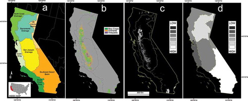
Figure 11. The FANTA model for 2014 is shown in the left panel. The zoomed insets show details of applying Equations (5) and (6) to the MODIS images of 2014, thereby calculating neighborhood anomalies for NDVI and NDVI range. These neighborhood greenness anomalies reveal areas that do not look like crops compared to their neighbors (Q3) and do not “act” like crops compared to their neighbors (Q4).
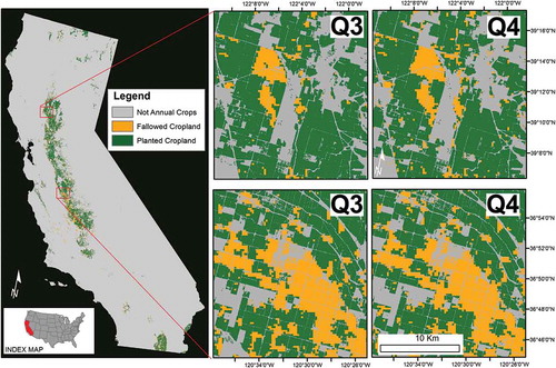
Figure 12. FANTA Model for 2014. The FANTA model for 2014 is shown in the left panel. The zoomed insets (a–d) show details of the FANTA model (a and c) with the 2014 natural color NAIP imagery on the right (b and d).
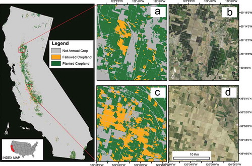
Table 1. Accuracy of FANTA Fallowed-land mapping compared to 2014 field data.
Table 2. Accuracy of USDA Fallowed-land mapping compared to 2014 field data.
Figure 13. Annual model for 2014 (far left). insets compare the model (L) to 2014 NAIP true color imagery (C) and the 2014 USDA fallow-land mapping (R). USDA model uses Farm Service Agency data coupled with Deimos and Landsat 8 satellite data from 2013 and 2014.
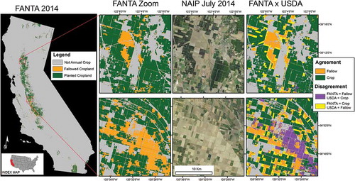
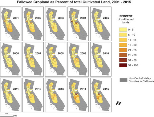
Figure 14. summarizes fallowed croplands in California on a yearly basis. Year 2014 is seen to be a worse year than 2015, with over 10% of the annual row crop fields fallowed, 1.5% more than the following year. Comparing the percent row crops fallowed from 2001 reveals that 5–8% has been more typical for 15 years analyzed. Each of the last 3 years analyzed (2013, 2014, and 2015) has more fallowed-land than any of the prior years. Note that these results are only for row crops within the cultivated mask created in Section 3.2.
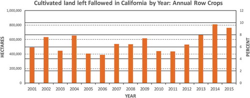
Figure 15. FANTA model results by county: acres of fallowed crop land for row crops, 2001–2015.
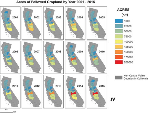
Figure 16. FANTA model results by county: percent of fallowed crop land for row crops, 2001–2015.