Figures & data
Figure 1. The Alaskan North Slope study area, outlined in gray in panel (a) and displayed in panel (b). The study area is composed of two ecoregions: Brooks Foothills and Beaufort Coastal Plain (labeled and delineated with brown dotted lines). Fourteen meteorological stations in the Permafrost and Climate Monitoring Network (PCMN) were used for ancillary data (red labeled points). The basemap is a digital surface model (DSM) overlaid by lake polygons and coastline (Jones and Grosse Citation2012). Four PCMN stations are used as examples in subsequent figures. They are labeled with letters that correspond to lower four panels and ordered by distance from the coast: c) Drew Point, d) South Meade, e) Koluktak, and f) Awuna 2. Dashed gray squares approximate the 4.45 x 4.45 km pixel footprints in the SIR grid system. Basemap imagery from DigitalGlobe was provided by Esri. All images were acquired in June.
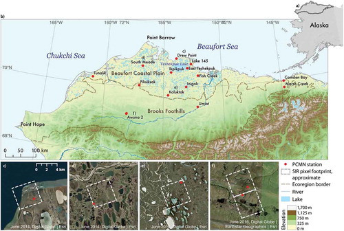
Figure 2. Example time series of scatterometer backscatter and in situ air temperature (Tmet) at Koluktak, 2000–2014 (shown in ). Daily vertically-polarized (V-pol) time series of QuikSCAT (blue) and ASCAT (orange) backscatter are plotted with in situ air temperature (light gray). The horizontal gray line marks −0.5°C, the threshold used in the melt proxy.
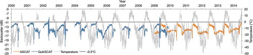
Figure 3. Time series of scatterometer and in situ data at meteorological station sites during the 2009 melt season (1 April – 20 June). Sites are ordered by distance from coast (refer to ): a) Drew Point, b) South Meade, c) Koluktak, and d) Awuna 2. Daily time series of vertically polarized sent and received (V-pol) QuikSCAT (blue line) and ASCAT (orange line) are plotted above in situ snow depth (solid gray) and air temperature (Tmet) (dashed black line). Vertical lines indicate melt onset dates detected by QuikSCAT (blue), ASCAT (orange), and Tmet (dashed).
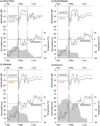
Figure 4. Sensitivity of backscatter melt onset algorithms to melt onset detected by a) in situ temperatures (Tmet) at the 14 meteorological stations and b) NCEP NARR reanalysis 2-m air temperature (T2m). Algorithms were applied to QuikSCAT backscatter 2000–2009 (blue) and ASCAT backscatter 2009–2014 (orange) with thresholds ranging from 0 to 5 dB in intervals of 0.1 dB. Daily mean temperatures greater than −0.5°C were considered a proxy for melt. Solid lines show goodness of fit (R2) of detected onset dates and shaded areas show percentage of scatterometer pixels where the algorithm failed to detect melt onset. Goodness of fit was calculated from ordinary least squares linear regression between scatterometer-detected onset dates and temperature-detected dates. Vertical lines mark 1.3 dB, the threshold value that optimized the melt-detection algorithm (see Section 4.2).
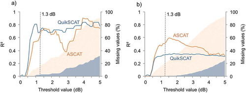
Figure 5. Plots of melt onset timing detected by the backscatter algorithm versus detected from air temperature for all available point-to-point comparisons 2000–2014. Point density is represented using point transparency (alpha = 0.15) and contour lines. Density contour lines used a Gaussian kernel density estimator with bandwidth based on a normal reference distribution. The dashed line is the 1:1 line. Orange points indicate dates from 2009, the QuikSCAT and ASCAT overlap period. Top plots compare QuikSCAT with a) in situ temperatures (Tmet) and b) modelled 2-m air temperature (T2m) and bottom plots compare ASCAT with c) Tmet and d) T2m. To compare scatterometer data to T2m, the 4.45-km SIR grids were resampled to the 32-km NARR grids using the median value of all pixels within the NARR gridcell. Summary values of the ordinary least squares (OLS) linear regression, Root Mean Squared Error (RMSE), Mean Deviation (MD), and Mean Absolute Deviation (MAD) are presented in the associated table.
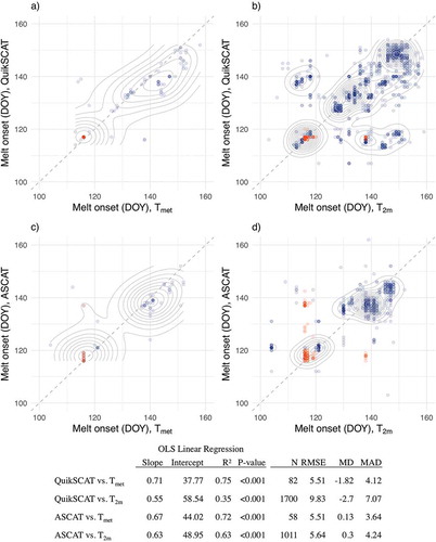
Figure 6. Day of year (DOY) of melt onset detected from QuikSCAT V-pol daily backscatter: the 2000–2009 mean (a) and the melt maps from 2000 (b), 2001 (c), 2002 (d), 2003 (e), 2004 (f), 2005 (g), 2006 (h), 2007 (i), 2008 (j), and 2009 (k). The white line outlines the area with consistent results (< 4 days of difference) between the two datasets. The gray line represents the boundary between the ecoregions (Brooks Foothills and Beaufort Coastal Plain). Example PCMN stations are indicated for references (black points, see ).
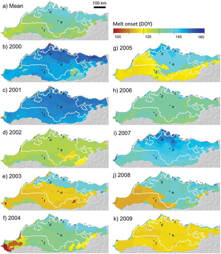
Figure 7. Day of year (DOY) of melt onset detected from ASCAT V-pol daily backscatter: the 2009–2014 mean (a) and melt maps for 2009 (b), 2010 (c), 2011 (d), 2012 (e), 2013 (f), and 2014 (g). The white line outlines the area with consistent results between the two datasets. The gray line represents the boundary between the ecoregions (Brooks Foothills and Beaufort Coastal Plain). Example PCMN stations are indicated for references (black points, see ).
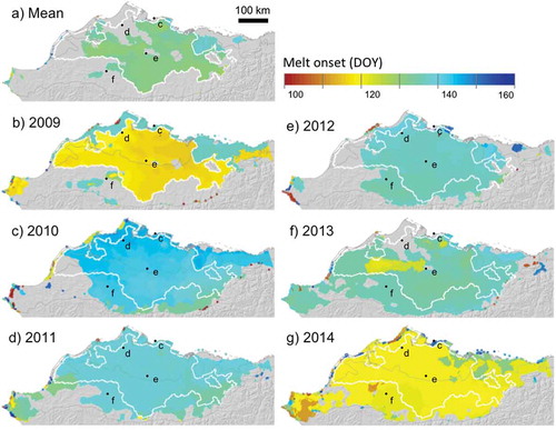
Figure 8. Day of year (DOY) of melt onset in 2009 derived from a) QuikSCAT (Q; QSCAT) V-pol daily backscatter, b) ASCAT (A) V-pol daily backscatter, and c) reanalysis 2-m air temperatures. d) Difference between QuikSCAT and ASCAT detected melt onset. Blue areas are where ASCAT detected melt later than QuikSCAT and red are the inverse. The white line outlines the area with consistent results between the two datasets. The gray line represents the boundary between the ecoregions (Brooks Foothills and Beaufort Coastal Plain). Example PCMN stations are indicated for references (black points, see ).
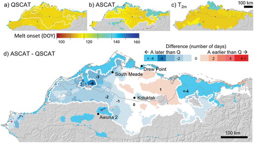
Figure 9. a) Scatterplot of melt onset in 2009 at each pixel detected by QuikSCAT (x-axis) and ASCAT (y-axis); and b) the distribution of 2009 melt onset values detected by QuikSCAT and ASCAT only from the area of agreement, where there were fewer than 4 days of difference in onset detected by each dataset (orange, n = 4,105) and in the entire study area (gray, n = 5,798).
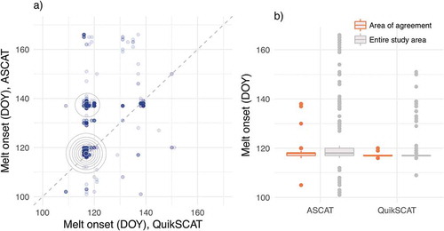
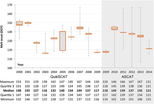
Figure 10. Annual distributions of melt onset timing in the area of agreement from QuikSCAT and ASCAT (n = 4,105). Results are only presented for the area of agreement between sensors in 2009 (see Sections 4.4 and 5.4). In 2005, the median DOY and the 75th percentile are equal so the median line is not visible. The box plot of 2009 in QuikSCAT is a single line indicating minimal variation from the median of DOY 117.