
Figures & data
Figure 1. Location and elevation of NWC.
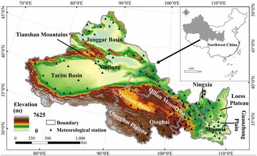
Table 1. Data sources of this study.
Table 2. Drought classification scheme.
Figure 2. Interannual trend of vegetation NEP in NWC during 2000–2019. Whiskers = ±1 standard deviation (SD).
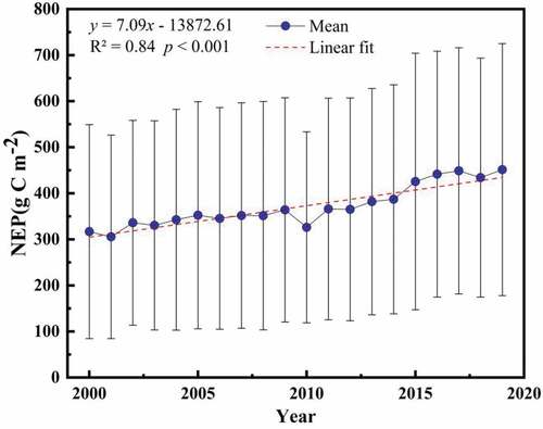
Figure 3. Spatial distribution (a) and spatial trend (b) of NEP in NWC during 2000–2019. The insets represent areas that passed the significance test (p < 0.05).
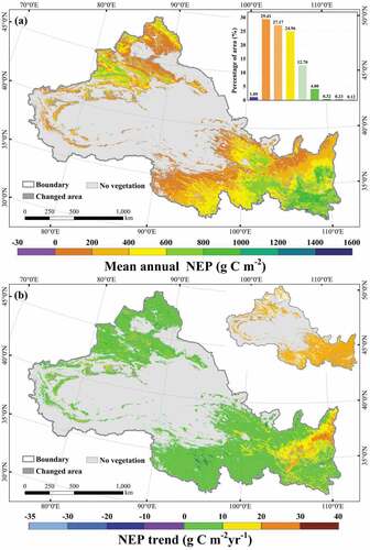
Figure 4. Map of different climatic zones (a) and land cover types (b) in NWC.
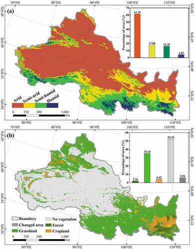
Figure 5. Interannual trends of NEP under different climatic zones (a) and land cover types (b) in NWC during 2000–2019.
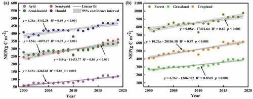
Figure 6. Spatial difference of vegetation NEP along the drought gradient (a) and the characteristics of forest (b), grassland (c), and cropland (d) NEP along the drought gradient in NWC.
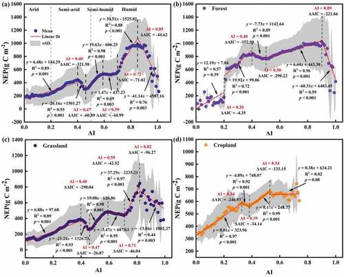
Figure 7. Interannual trends of DFMI (a) and VCI (b) in NWC during 2000–2019. DFMI (c) and VCI (d) trends under different climatic zones. Area changes of DFMI (e) and VCI (f) on different drought classes.
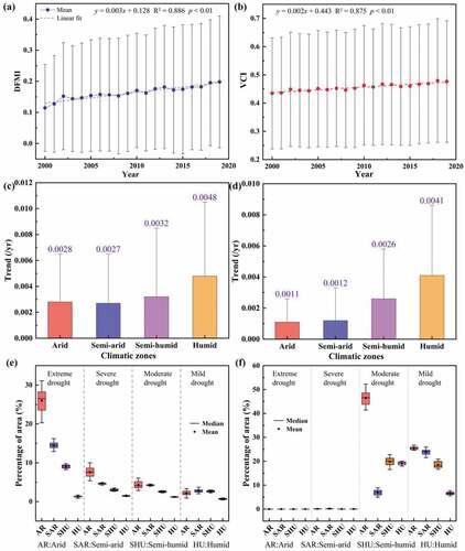
Figure 8. Spatial trends of DFMI (a) and VCI (b) in NWC during 2000–2019. The inset represents the area that passed the significance test (p < 0.05).
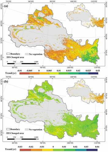
Figure 9. The variation of NEP (a) and DFMI (b) in each month. (Boxplot elements: Box = Values of 25th and 75th percentiles; Dot = Mean; Horizontal line = Median; Whiskers = ±1 SD). Wavelet power spectrums of monthly NEP and DFMI during 2000–2019 (c). XWT between monthly NEP and DFMI during 2000–2019 (d). WTC between monthly NEP and DFMI during 2000–2019 (e). The color bars show the energy density, with the 95% confidence level for red noise shown as a coarse outline. The phase relationship is indicated by the direction of the arrows (opposite phases point to the left, same phases point to the right). An upward-pointing arrow denotes a 90° delay of the first factor, while a downward-pointing arrow denotes a 90° overrun of the first factor. The thin black line is the cone boundary of the wavelet influence. Wavelet coherence ranges from 0 to 1 (0 denotes a completely uncorrelated sequence, while 1 denotes a perfectly correlated sequence).
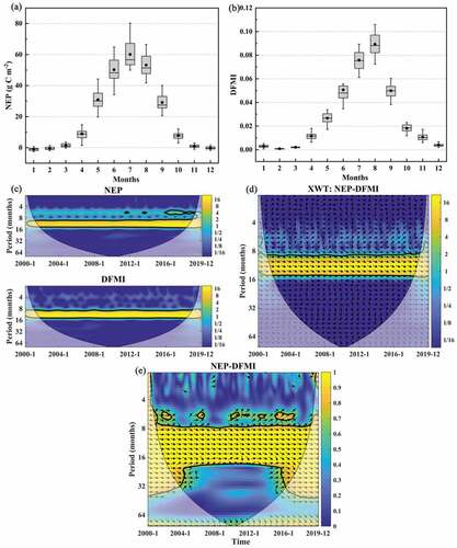
Figure 10. Spatial autocorrelation and response relationship of vegetation NEP (a, b) and DFMI (c, d) in NWC (e, f).
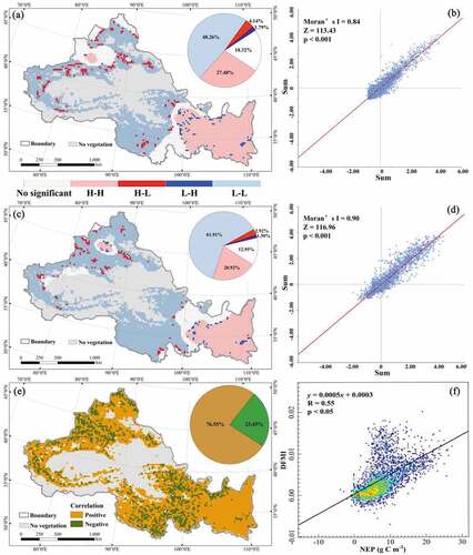
Figure 11. Comparison of NPP simulation value and product value.
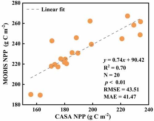
Figure 12. Spatial pixel results in validation of CASA NPP and MODIS NPP.
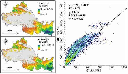
Table 3. Comparison of simulated NPP values of different land cover types with other simulated results (g C m−2).
Data availability statement
The data supporting this study’s findings are available on the USGS Land Processes Distributed Active Archive Center (LPDAAC) for MODIS data at http://lpdaac.usgs.gov/. The DEM is freely from NASA’s SRTM data at http://srtm.csi.cgiar.org/, the Landsat images are freely downloaded in the Resource and Environment Science Data Center of the Chinese Academy of Sciences at http://www.resdc.cn/, and the GOSIF data are derived from the NASA Orbiting Carbon Observatory 2 (OCO-2) at https://globalecology.unh.edu/. The meteorological data come from the National Climate Centre of China Meteorological Administration at http://data.cma.cn/.