
Figures & data
Figure 1. Map of the seismic Hazard of Italy (panel A), showing peak ground accelerations (g) that have a 10% chance of being exceeded in 50 yr (Stucchi et al. Citation2011). The study area is located in central Italy, in a high seismic risk zone. In the panel B, a satellite image of the center of L’Aquila, enclosed within the medieval walls (in red), is shown. In panel C the position of the city surrounded by significant mountain ranges is depicted.
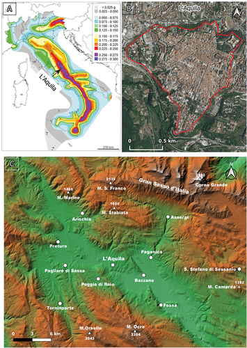
Figure 2. The map on the left displays the vulnerability classification of buildings, while the one on the right illustrates the damage grade resulting from the 2009 earthquake in the historic center of L’Aquila. These maps are the outcome of a detailed building survey carried out by (Tertulliani et al. Citation2011) following the criteria of the EMS98 (Tallini et al. Citation2019). For a detailed explanation of the vulnerability classes and damage grades, please refer to , respectively.
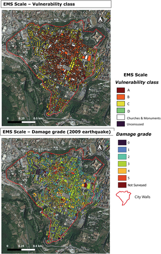
Table 1. Description of the vulnerability classes related to building type identified in L’Aquila downtown, from (Tertulliani et al. Citation2011). The number of buildings in each class is reported (modified from (Tertulliani et al. Citation2011)).
Table 2. Description of the damage grade related to building type identified in L’Aquila downtown from (Tertulliani et al. Citation2011). The number of buildings in each class is reported (modified from (Tertulliani et al. Citation2011)).
Figure 3. Map of the distribution of damage due to the 2 February 1703 event (modified by (Tertulliani et al. Citation2012), from (Colapietra Citation1978)). This earthquake was the third event of a long and strong seismic sequence that hit central Italy. The 2 February 1703 earthquake has been located 15km northwest of L’Aquila, with a macroseismic magnitude of Mw 6.7 (Gruppo di lavoro CPTI , Citation2004).
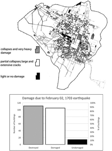
Figure 4. SAR operative acquisition modes. A) type of acquisition data modes available for Cosmo-SkyMed radar sensor. B) Stripmap mode: the right-looking satellite observes a linear area of the Earth’s surface, providing a spatial resolution of 3x3 m (modified from (ASI) Citation2021).
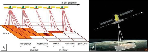
Figure 5. In blue the footprints on descending orbital geometry of the COSMO-SkyMed images and in orange the master area analyzed.
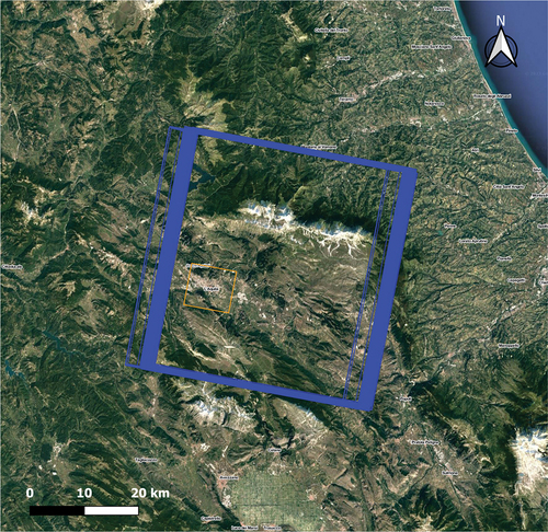
Table 3. A-DInSAR analysis charateristics are summarized.
Figure 6. Schematic representation of a typical variogram.
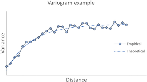
Figure 7. Example of time series at several distance (see main text for definition) from the midpoint of a cluster. Note that the curve denoted by ‘near midpoint,’ in green color, has a distance value which is near the threshold defining exclusion from cluster. The curve in red color has distance value greater than such threshold.
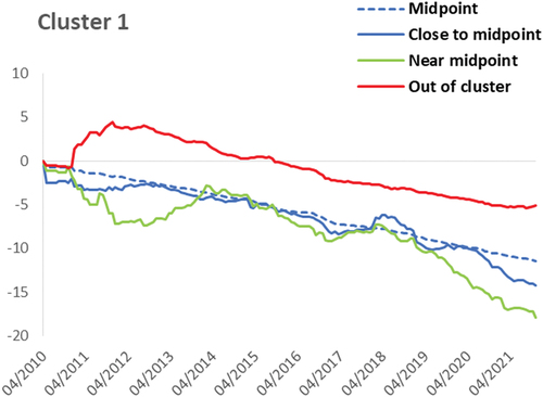
Figure 8. Flowchart illustrating data processing.
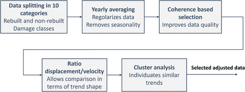
Figure 9. A-DInSAR map resulting from the processing of April 14, 2010, to November 30, 2021 descending orbit images. The study’s primary focus, as illustrated in , is the area contained within the boundaries of the city wall.
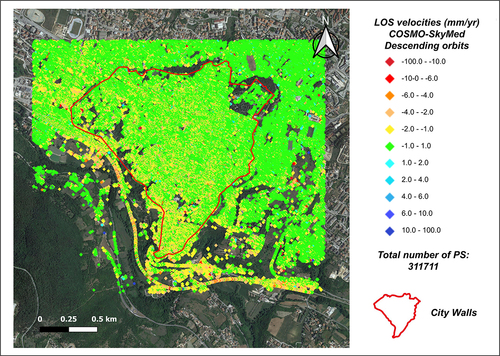
Figure 10. Two different color scales are used to represent the PS points in the study area. In the map in panel a, the range of deformations within the interval of −1.5 to 1.5 mm/year is considered as stable. In panel b, however, the instrumental error threshold is lower, and the PS points in green (stable points) are associated with a deformation of ± 0.5 mm/year.
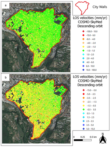
Figure 11. A-DInSAR maps, obtained using COSMO-SkyMed images acquired in descending orbit between 2010 and 2021, are clipped with buildings boundary polygons showing ground points (on the left) and building points (on the right). Green PSs are considered as stable; yellow-red PSs are moving away from the satellite; cyan-blue PSs are moving toward the satellite. The buildings in the center of L’Aquila (represented in reddish brown polygons in the ground point map and with transparent with black border polygons in the building point map) have been used as a mask to crop the interferometric dataset for a separate calculation of deformations on the buildings (BP) and ground points (GP). In the graph (left down), the x-axis represents the cumulative displacement (in mm), while the y-axis represents the number of Persistent scatterers (PSs).
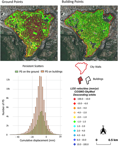
Table 4. The table presents the average velocity and mean cumulative displacement computed from the descending COSMO-SkyMed map for each damage class associated with the buildings in L’Aquila’s historic center, resulting from the 2009 earthquake.
Figure 12. Statistical distribution of cumulative displacement values for each damage grade. The distribution of damage is depicted by the placement of Persistent scatterers (PS) in this figure, which are divided into damage classes. Each category is then associated with a cumulative displacement/number of PS graph, which describes the deformations corresponding to the respective damage grade. The colour scale used in the A-DInSAR maps refers to the legend in the figure, noting that negative velocity values correspond to displacements along the satellite’s line of Sight (LOS). Conversely, positive velocities indicate points moving towards the sensor.
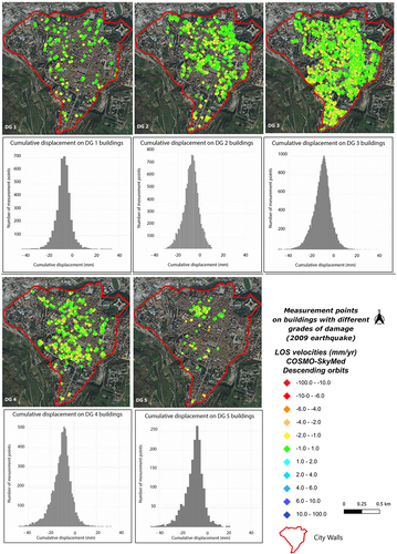
Figure 13. A) descending COSMO-SkyMed deformation map with classification of buildings based on their vulnerability. The color scale used in the map for PSs representation refers to the legend, noting that negative velocity values correspond to displacements along the satellite’s line of Sight (LOS). Conversely, positive velocities indicate points moving towards the sensor. b) average cumulative displacement data recorded by Cosmo-SkyMed for vulnerability class. A description of specifical characteristics of each vulnerability class is reported in .
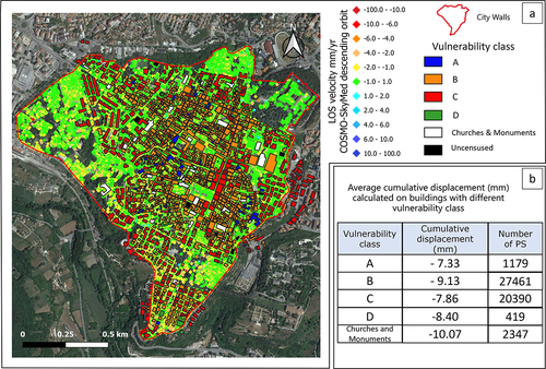
Figure 14. The variogram of the data pertaining to non-rebuilt buildings with damage category 3 is shown. The ordinate axis represents the variance of the differences in average velocity, expressed in mm/year, (zi - zj) between two points separated by a geographical distance L, on the abscissa.
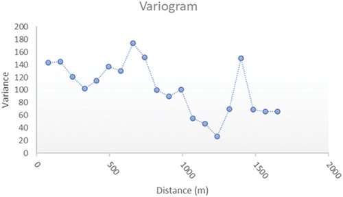
Figure 15. COSMO-SkyMed A-DInSAR deformation map is displayed with a mask that delineates the buildings in the historic center. The mask distinguishes between buildings that, following the 2009 earthquake, have undergone restoration (in blue) and those that have been reconstructed (in pink). The color scale used in the map for PSs representation refers to the legend in the figure, noting that negative velocity values correspond to displacements along the satellite’s line of Sight (LOS). Conversely, positive velocities indicate points moving towards the sensor.
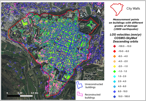
Figure 16. Coherence vs average velocity (mm/year) for non-rebuilt damage class 3 buildings. Considering consistency as a measure of data quality, it is observed that below the value of 0.6 the scattering increases significantly and two groupings of suspected outliers are detected with rates of over 15 mm/year.
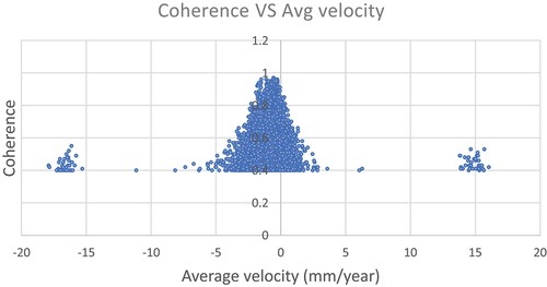
Figure 17. Midpoint of the two subsidence and uplift clusters identified according to the two approaches illustrated in Sect. 2.3. A) results following the first described variant of the k-means algorithm. B) results according to the second illustrated variant.
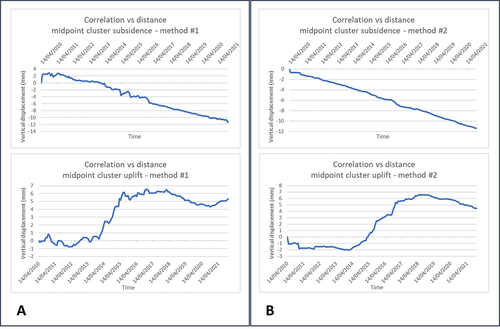
Figure 18. Correlation between displacement-time curves in the dataset related to non-reconstructed buildings with damage class D3. In the diagram, each point represents the correlation between the subsidence values recorded, on the same date, at the most representative PS within the subsidence cluster and all other PSs, including those outside the cluster. The horizontal axis denotes the reciprocal distance between these points, while the vertical axis represents the correlation value.
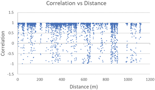
Figure 19. Diagrams showing average vertical displacement vs time, for each cluster, for all DG (damage grade) of non-rebuilt buildings. Each curve represents the midpoint of its own cluster. Red circles outline an observed anomaly in subsidence trends. The two vertical dashed lines highlight the time range August-November 2016, in which the Amatrice-Norcia seismic sequence occurred. As the uplift curves are rather irregular (being achieved from small samples), such anomaly is not well recognisable. It should be remembered that the data relating to each curve have been preliminarily normalized with respect to the average velocity. Therefore, these curves only provide information about the shape of the subsidence trend and not about the cumulative displacement.
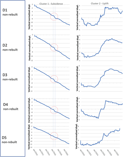
Figure 20. Diagrams showing average vertical displacement vs time, for each cluster, for all DG (damage grade) of non-rebuilt buildings. Each curve represents the midpoint of its own cluster. Red circles outline an observed anomaly in subsidence trends. The two vertical dashed lines highlight the time range August-November 2016, in which the Amatrice-Norcia seismic sequence occurred. As the uplift curves are rather irregular (being achieved from small samples), such anomaly is not well recognisable. Analogously to the case of non-rebuilt buildings, these curves only provide information about the shape of the subsidence trend and not about the cumulative displacement.
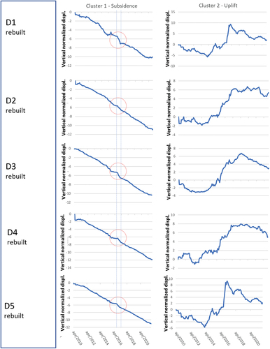
Figure 21. A) average values, with related 95% confidence intervals, of vertical subsidence velocity (mm/year) for all categories of not rebuilt buildings; B) average values, with related 95% confidence intervals, of vertical subsidence velocity (mm/year) for all categories of rebuilt buildings. C) comparison of rebuilt and not-rebuilt building data. It should be noted as the confidence intervals for non-rebuilt building are very narrow. This also outlines as opportune sampling and an effective statistical analysis considerably reduce uncertainties in subsidence A-DInSAR data.
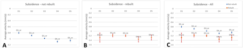
Figure 22. Descending COSMO-SkyMed deformation map, cropped using polygons representing three distinct building types: destroyed, damaged, and undamaged. The color scale used in the map for PSs representation refers to the legend, noting that negative velocity values correspond to displacements along the satellite’s line of Sight (LOS). Conversely, positive velocities indicate points moving towards the sensor.
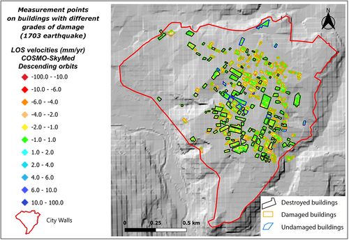
Table 5. The table shows the average velocity and related 90% confidence interval upper and lower limits, computed from the descending COSMO-SkyMed map for buildings which were destroyed, damaged and undamaged following 1703 earthquake.
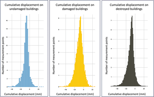
Figure 23. Statistical distribution of cumulative displacement values for each 1703 seismic damage grade. The distribution of damage is depicted by the placement of Persistent scatterers (PS) in , which are cropped by means of polygons whose colors are associated with the three damage classes. For each 1703 seismic damage category the diagram illustrating number of PS vs. Cumulative displacement, is reported.
Data availability statement
The data that support the findings of this study are available from the corresponding author, A.S.