
Figures & data
Figure 1. Schematic of the study’s workflow.
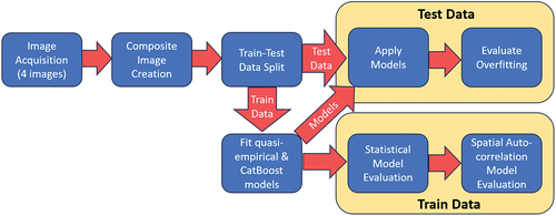
Figure 2. The study area showing the locations (red) of 500m-by-500m tile centers (Google Earth™ imagery).
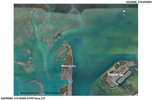
Figure 3. Contribution of individual images to the composite image.
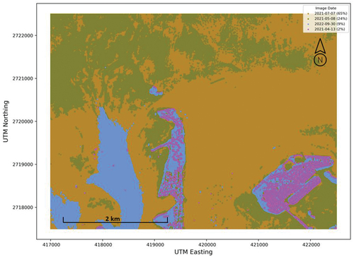
Figure 4. The images from each date and the composite image. Images are displayed as near real color (i.e. Sentinel bands 4, 3, 2 displayed in red, green, and blue, respectively). An image-specific percent clip stretch has been applied to each image.
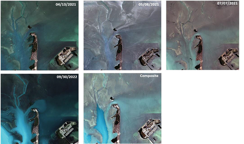
Table 1. Models explored.
Figure 5. (a) Average r-squared and (b) root mean square error (m) by model type (see ) and image date for training data.
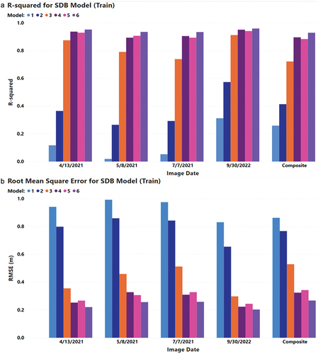
Figure 6. Relative importance of variables over all images. See for model definitions. Top row models are not geographically adaptive; bottom row is geographically adaptive equivalent of the model above it.
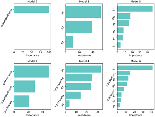
Figure 7. Evaluation of model overfitting for each image for the CatBoost model based on bands 1, 2, 3, 4, 5, and 11 and UTM northing and easting.
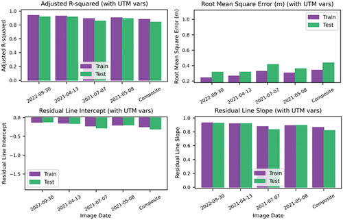
Figure 8. Example surfaces showing r-squared values (a.) and RMSE values (b.) for the CatBoost model fitted using and bands 1, 2, 3, 4, 5, and 11 and UTM northing and easting for the 2022/09/30 image. (For r-squared (a.), Moran’s I/p is 0.07/0.10, and −0.02/0.89 for RMSE (b.). Tiles with gray “haloes” comprise the test data set. Dots indicate a statistically significant (α = 0.05) cluster of values with pink indicating (a.)high r-squared)/(b.)low RMSE values (i.e. desirable model performance) and olive indicating (a.)low r-squared/(b.)high RMSE values (i.e. undesirable model performance).
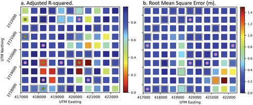
Figure 9. The number of image-model combinations on which each tile was a significant (α = 0.05) hotspot indicating desirable model performance (a. and c.) or undesirable model performance (b. And d.). Gray tiles are those that were never hotspots. Tiles with gray “haloes” comprise the test data set.
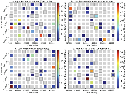
Table 2. Percentage of desirable and undesirable hotspots for the training and test data sets over all images. Green cells indicate a higher percentage than expected based on the 80/20 train/test data split; red cells indicate a lower percentage.
Data availability statement
Data supporting this study are available at https://doi.org/10.6084/m9.figshare.23631549.