
Figures & data
Figure 1. Location of the study area; (a) the DEM of Sichuan Province (NASADEM (accessed via: https://www.earthdata.nasa.gov/esds/competitive-programs/measures/nasadem)); (b) the land-cover distributions of Liangshan Yi Autonomous Prefecture and the location of two field campaigns (GLC_FCS30, from Zhang et al. (Citation2021b)); (c) geographic locations of sample plots in the first field campaign in December 2020; (d) geographic locations of sample plots in the second campaign in March 2021. The background map in subfigures (c-d) is from the Esri World Imagery (accessed via: https://www.arcgis.com/home/item.Html?id=10df2279f9684e4a9f6a7f08febac2a9).
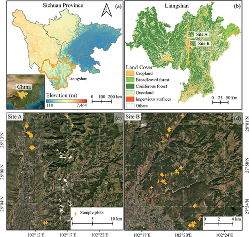
Table 1. Summary statistics of Pinus Yunnanensis in field plots in Liangshan, Sichuan.
Table 2. The satellite-based time-series data used in this study.
Figure 2. Methodology workflow for modeling forest AGC with L8 and S1 time-series data.
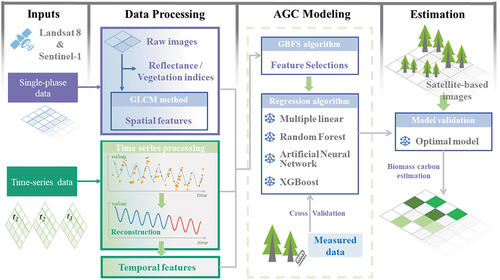
Table 3. Model/Experimental setup to investigate the impacts of spatiotemporal features on AGC estimation.
Figure 3. The process of optical time-series reconstruction for a representative in-situ plot (with AGC of 24.67 Mg C/ha measured in November 2020). Gray spots are optical observations from Landsat 8. Blue dashed lines are fitted lines of the HR model. Orange lines are reconstructed time series. Historic satellite images of this plot came from Google Earth (access via https://earth.google.com/).
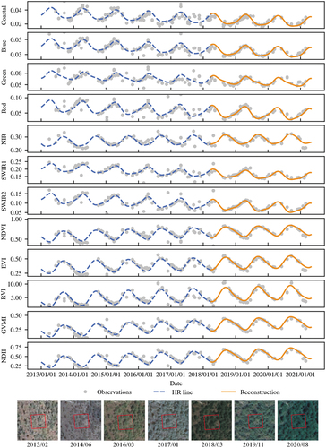
Figure 4. Scatterplots of HR model fitting. Observed values represent spectral reflections and vegetation indices, and fitted values represent predicted values from the HR model.
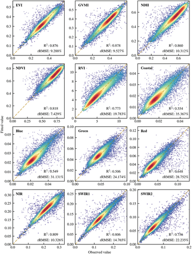
Figure 5. Taylor diagram for accuracy comparison of different regression algorithms in different experiments. REF is the reference point, and cRMSE means the centred RMSE. The distance between the shape points and the REF point serves as an indicator of the models’ performances.
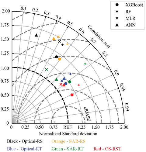
Figure 6. Scatter plots of AGC observation and prediction values from different experiments using optical time-series data. The formulas in each subplot represent the AGC model.
is the predicted AGC.
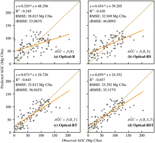
Figure 7. Scatter plots of AGC observation and prediction values from different experiments using SAR time-series data.
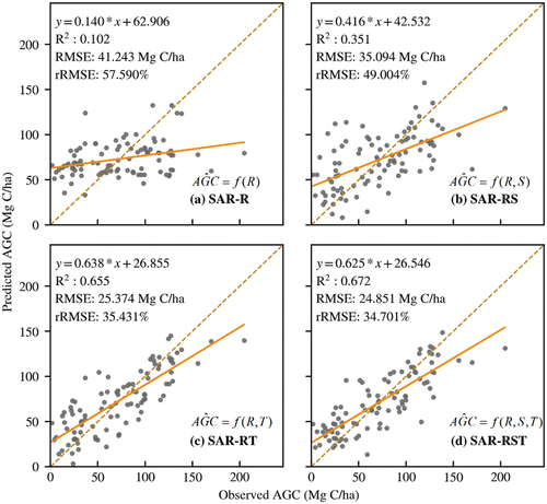
Figure 8. Feature selection process based on GBFS algorithm. Features whose absolute importance value ≥ the threshold value are selected. The number of selected features (a) and determination coefficient (R2) (b) of AGC estimation varied with the threshold value of GBFS.
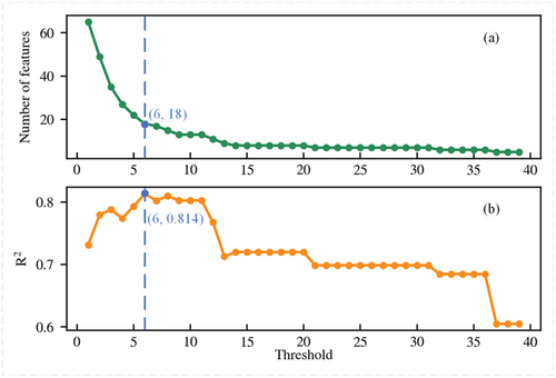
Figure 9. The importance of optical and SAR features (a), and the model performance of experiment OS-RST (b). Labels after bands or VIs represent the type of the features (temporal feature (_T)), and the phrase in parentheses were the specific calculation parameters. For instance, the feature “NDVI_T (cwt_coefficients_11)” represents the temporal feature (continuous wavelet transform (cwt), and the following number in brackets is the input parameter) of NDVI time-series data. The descriptions and calculations of selected features are shown in Table S2.
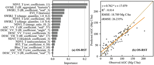
Figure 10. Spatial distribution of evergreen coniferous forest AGC (a), and kernel density estimation of predicted AGC (b).
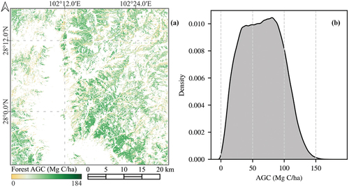
Figure 11. (a) Estimation of forest AGC annual average changes in 2016—2021 and (b) forest stand age from the Forest Resource Inventory.
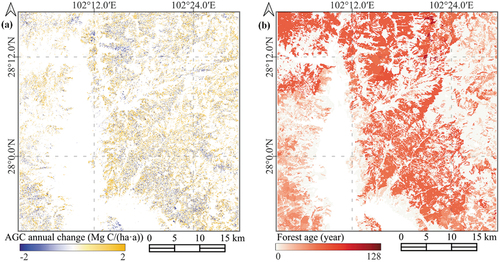
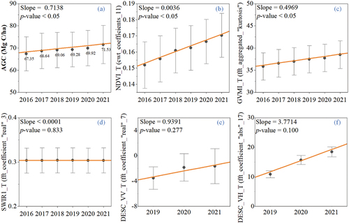
Figure 12. The changes in forest estimated AGC (a) and temporal features (b - f) during 2016 – 2021. The dark spots and gray bars represent mean values and 95% confidence intervals of AGC and feature in 96 plots, respectively. The orange lines described their temporal trends.
Supplementary_V2.docx
Download MS Word (638 KB)Data availability statement
The Landsat data that support the findings of this study are available in the USGS EROS Center at https://earthexplorer.usgs.gov/. The Sentinel data are available in the ESA Copernicus Data Space Ecosystem at https://dataspace.copernicus.eu/.