
Figures & data
Figure 1. Extent of PJ woodland piñon pine species (left) and juniper species (right). In black are areas where there is no recorded presence of PJ woodland piñon or juniper tree species (Riley et al. Citation2021).
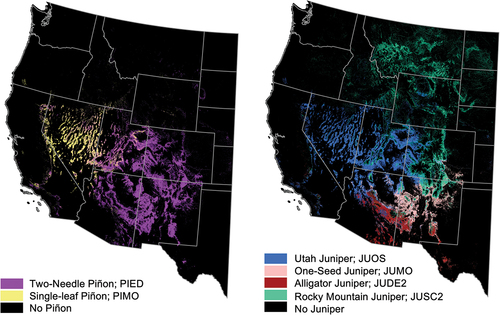
Table 1. Summary of field data sources.
Table 2. Summary of ALS projects. Shown is the project name from either USGS 3D Elevation Program or NCALM, the average pulse density in pulses/m2 of each ALS project catalog, the number of field plots acquired from each project, and the project collection start and end dates.
Table 3. Area and tree-based metrics derived from field plot coincident ALS point clouds. Adapted from (Campbell et al. Citation2021).
Figure 2. Distribution of PJ woodland AGB across 497 field plots, in Mg/ha. The median of plot AGB is 43.7 Mg/ha and is represented by the dashed line. The first quartile (Q25) is 25.1 Mg/ha, and the third quartile (Q75) is 72.9 Mg/ha. Both are represented by solid lines.
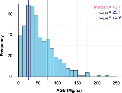
Figure 3. Increase in mean squared error in Mg2/ha2 of VSURF-chosen ALS predictor variables. Abbreviations, listed in order of variable importance, stand for canopy cover (cc), mean height aboveground (mh.Ag), canopy density (cd), mean height (mh), skewness (skew), and vertical normalized relative point density between 50cm and 100cm (vnrd.50.100). See for further metric descriptions.
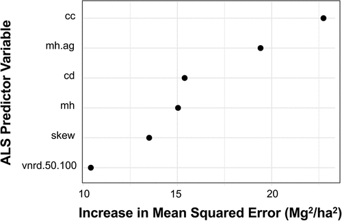
Table 4. Results of environmental category k-means clustering using different k values.
Figure 4. Environmental category clusters and the distribution of their plots across the PJ woodland range. Points represent plot locations and are underlaid by the LANDFIRE EVT defined extent of PJ woodlands (LANDFIRE Citation2020).
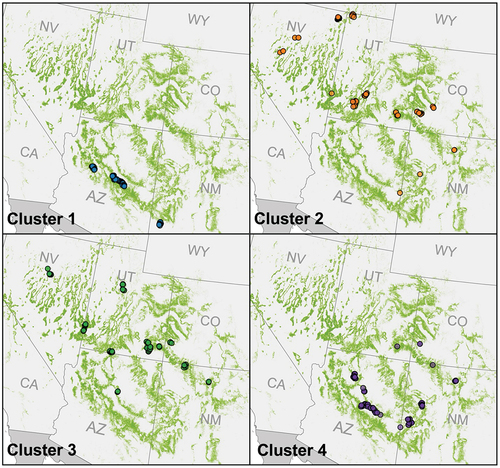
Figure 5. Density plots of the temperature, precipitation, VPD, and elevation for each environmental cluster. Values are obtained for each plot based on the geographical plot center. a) Summer minimum temperature. b) Summer maximum temperature. c) Winter minimum temperature. d) Winter maximum temperature. e) Maximum daily temperature. f) Minimum daily temperature. g) Mean annual daily temperature. h) Daily precipitation. i) Summer precipitation. j) Winter precipitation. k) Minimum VPD. l) Maximum VPD. m) Elevation.
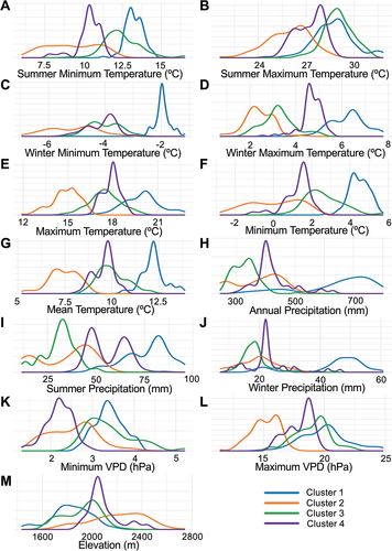
Figure 6. Species composition category clusters and the distribution of their plots across the PJ woodland range. Points represent plot locations and are underlaid by the LANDFIRE EVT defined extent of PJ woodlands (LANDFIRE Citation2020).
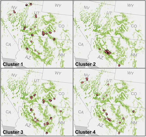
Table 5. Results of species composition category k-means clustering using different k values.
Figure 7. Proportion of PJ woodland species in each species composition cluster.
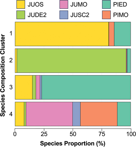
Figure 8. Transferability model performance for environmental clusters, containing three subfigures: (a) predicted (y-axis) versus observed (x-axis) AGB for models built using each training cluster (rows) applied to the prediction of each testing cluster (columns), with the solid red line representing a linear regression between predictions and observations, and the dashed black line representing the 1:1 relationship; (b) R2 values for each of the transferability models depicted in A, with cells colored according to relative performance; and (c) rRMSE values for each of the transferability models depicted in A, with cells colored according to relative performance. In B and C, the models trained and tested on the same clusters are colored gray, as they do not measure transferability, but are provided for comparison to within-cluster model performance.
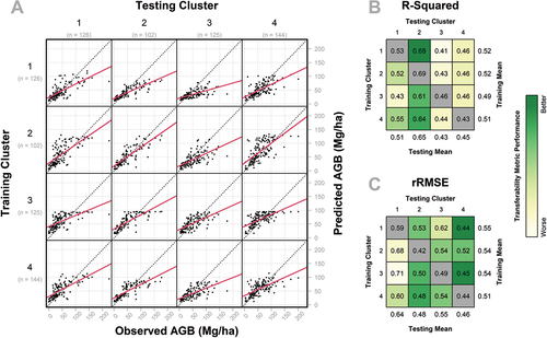
Figure 9. Transferability model performance for species composition clusters, containing three subfigures: (a) predicted (y-axis) versus observed (x-axis) AGB for models built using each training cluster (rows) applied to the prediction of each testing cluster (columns), with the solid red line representing a linear regression between predictions and observations, and the dashed black line representing the 1:1 relationship; (b) R2 values for each of the transferability models depicted in A, with cells colored according to relative performance; and (c) rRMSE values for each of the transferability models depicted in A, with cells colored according to relative performance. In B and C, the models trained and tested on the same clusters are colored gray, as they do not measure transferability, but are provided for comparison to within-cluster model performance.
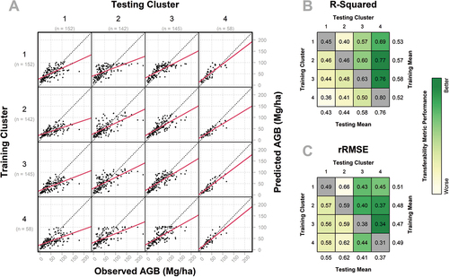
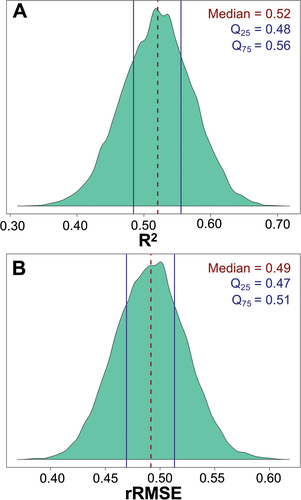
Figure 10. R2 and rRMSE distribution of 10,000 bootstrapping iterations for the range-wide model. a) R2 distribution. Dashed line represents median R2 of 0.52 and solid lines represent the 25th and 75th quartiles of 0.48 and 0.56, respectively. b) rRMSE distribution. Dashed line represents median rRMSE of 0.49 and solid lines represent the represent the 25th and 75th quartiles of 0.47 and 0.51, respectively.
Data availability statement
The field plot data that support the findings of this study are openly available in OSF at http://doi.org/10.17605/OSF.IO/8Q9Y5. All other GIS and remote sensing data were acquired from public sources.