
Figures & data
Figure 1. Experimental design.
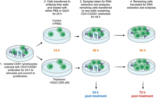
Figure 2. Unsupervised assessment of data variability.
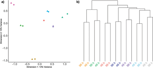
Figure 3. Global DNA methylation (β-values) for all probes.
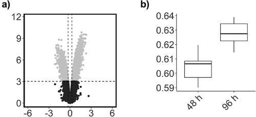
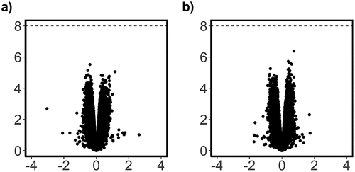
Figure 4. Scatterplot of probe significance ordered by genomic location for all probes across the array, calculated using M-Values.
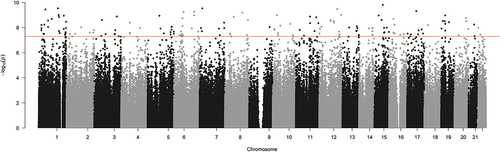
Figure 5. Box plots showing representative β-values at each time point.
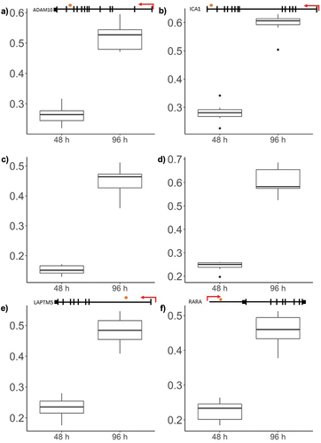
Table 1. The top 20 most significant differentially methylated positions, ordered by significance*.
Figure 6. Topmost significant genomic regions displaying differential methylation, across adjacent probe loci.
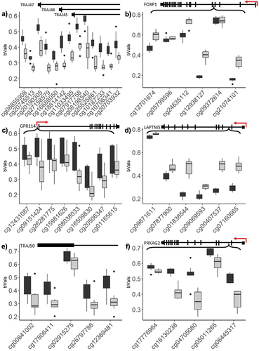
Table 2. Significant DMRs between 48 h and 96 h time points.
Table 3. GO pathway terms associated with each ontology type for the genes that demonstrated a significant DNA methylation change, and mapped to promoter regions.
Figure 7. Multidimensional scaling (MDS) plot of top 100 significant pathways.
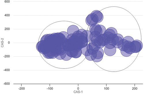
Figure 8. T cell viability and growth.
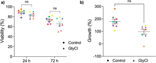
Figure 9. Analysis of overall DNA methylation change due to GlyCl treatment.
Supplementary_File1_S1.xlsx
Download MS Excel (27 KB)Supplementary_File_S2.xlsx
Download MS Excel (303.9 KB)Additional_File_2_Fig.1_qq_Activation.jpg
Download JPEG Image (823.4 KB)
Additional_file_1_Fig1_.pdf
Download PDF (419.6 KB)Data availability statement
The authors confirm that the analysed data supporting the findings of this study are available within the article [and/or] its supplementary materials. Request for raw data files can be made available from the corresponding author AJS upon reasonable request; however, these represent private data and are not available for public use.