
Figures & data
Figure 1. Drafted reference of RC specimen (dimensions in mm). The left image shows width, height, and bar positioning based on average measuraments of all specimens. The right image shows nominal dimensions from original drawings of the bridge. Bars are labelled as follows: TO = top-outer, TI = top-inner, BO = bottom-outer, and BI = bottom-inner. The remaining part of cut-off bridge slab is clearly visible on the left.
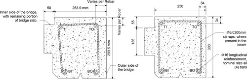
Figure 2. Original position of the segments extracted from Gullspång bridge. A number was assigned to each segment of the edge beams as received after the demolition of the bridge. Letters were used to denote later cuttings, carried out in the laboratory. The cutting was carried out with all the segment oriented in the same direction: this implies that the specimens from the west edge beams were named in alphabetical order from north to south, while the specimens from the east edge beam followed the alphabetical order from south to north (see above). Please note that the drawing is not in scale.
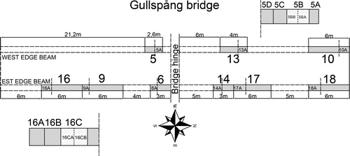
Figure 3. Examples of test specimens with varying deterioration states.
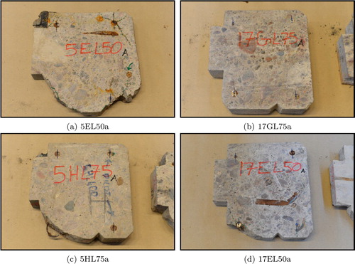
Figure 4. Inventory of tested samples, divided by category (Reference, Cracks, and Spalling).
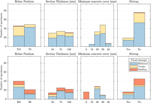
Figure 5. Photographs of pull-out rig assembly and slip measurements during testing of a specimen.
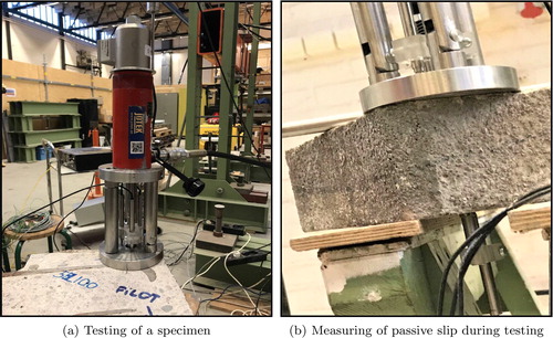
Figure 6. Pullout rig (dimensions in mm), designed by Laboratory Engineer Sebastian Almfeldt.
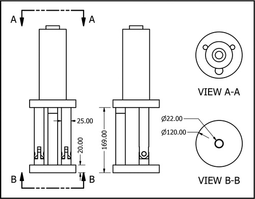
Figure 7. Photographs of pull-out rig and slip measurement devices. Note that specimen (b) is tilted with respect to normal testing position to better show the measurement device.
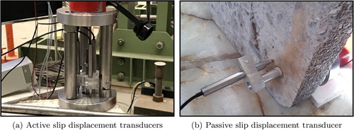
Figure 8. Example of cross-sectional circularity evaluation.
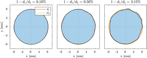
Figure 9. Calculated nominal bar area assigned to bars without any circular cross section. The grey shaded region denotes the range over which bar areas were averaged in assigning
for ‘noncircular’ bars, and the yellow shaded region indicates associated standard deviation in area assignment.
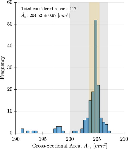
Figure 10. Average bond stress vs. passive slip for entire dataset. Bars from the same sample with different cross-section locations are highlighted as an example.
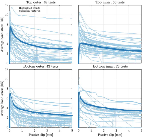
Figure 11. Peak bond stress vs. average corrosion across entire dataset, divided by casting position. Deterioration classification is designated by colour. Dashed black lines mark average value of peak bond stress, and grey colour patches indicate plus/minus one standard deviation. Specimens which exceeded rig capacity are marked with diamond markers.
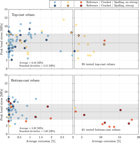
Figure 12. Average corrosion level of specimens with cracks in the surrounding concrete, sorted by crack width. Note that the y-axis is in logarithmic scale.
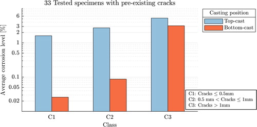
Table 1. Peak bond stress values across dataset.
Figure 13. Peak bond stress vs. average corrosion for cracked specimens. In the upper figure, the number of cracks surrounding the bar is designated by colour. In the lower figure, colour indicates different maximum crack width openings. Dashed black lines mark the average value of peak bond stress, and grey colour patches indicate plus/minus one standard deviation.
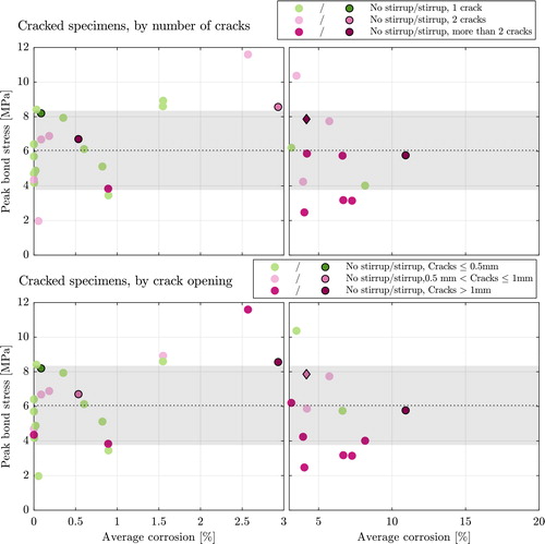
Figure 14. Residual bond stress vs. peak bond stress. Specimens are divided by casting position. Two different linear fits are presented per graph: in blue, specimens with a stirrup, in red, specimens without a stirrup.
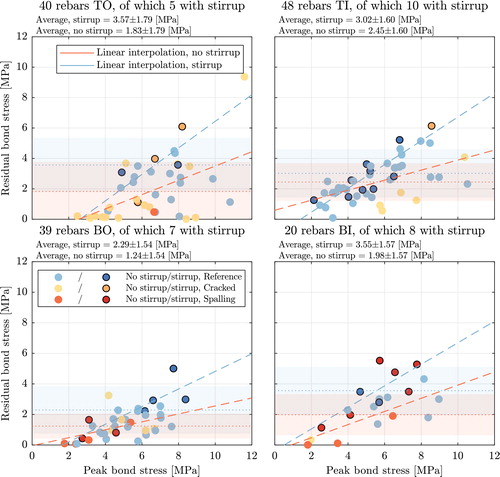
Figure 15. Peak bond stress and corresponding passive slip across entire dataset. Deterioration classification is designated by colour. Dashed lines mark the average value of slip at peak bond stress with and without stirrups, and patches of same colour indicate plus/minus one standard deviation.
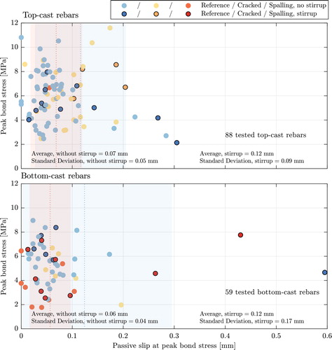
Table 2. Slip at peak bond stress values across data set.