
Figures & data
Figure 1. Multivariate analysis of expression profiles. (A) The graph shows the principal components analysis (PCA) of freshly isolated HSC (black dots), EPC (red dots), and MPC (blue dots) populations before being cultured. Each dot on the graph represents one biological replicate. (B) Heatmap shows the unsupervised cluster of samples using euclidean correlation distances of differentially expressed genes, considering a fold change >2 or <−2 and an FDR <0.05. The color scale from red to blue represents a gradient from high to low expression, respectively. Columns represent the indicated population, and rows represent individual transcripts. The hierarchical clustering of samples is shown. C. Cluster analysis dendrogram showing the relationship between HSCs, MPCs, and EPCs. The “y” axis shows the euclidean distance and the “x” axis shows each of the analyzed samples.
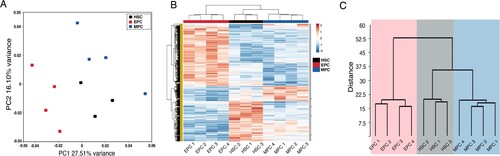
Figure 2. Comparative transcriptome analysis of freshly isolated MPCs and HSCs. (A) Volcano plot showing differential expression of genes between MPCs and HSCs. Each dot represents a transcript. The “x” axis represents the log fold-change, and the “y” axis indicates the -log (FDR). Blue (downregulation) and red (upregulation) dots represent DEGs with fold change >2 or <−2, and FDR <0.05. Some of the most significant transcripts were labeled. (B) Key pathways with prediction of activity in myeloid progenitor cells are depicted. The “x” axis represents the -log p-value of genes enriched for each pathway, the bars in red color refer to activation and the gray bars indicate that the prediction of activity is not available of the signaling pathway. (C, D) Gene Set Enrichment Analysis of MPCs vs HSCs. Gene sets were obtained from MSigDB database (Broad Institute) and then compared against the MPC and HSC signatures. Plots depict negatively enriched gene sets in HSCs. Black lines indicate the position of each gene across the ranked dataset. The normalized enrichment score (NES) is indicated in each plot. The representative expressed genes in myeloid cell differentiation signature are GATA1, FOXO3, NFKBIA, CSF1, HIF1A, among others. The representative genes in hematopoietic stem cell differentiation signature are GATA2, GATA1, NFATC2, FOSB, KCNH2, among others.
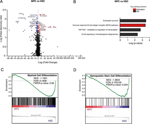
Table 1. Representative genes that were differentially expressed between hematopoietic stem and progenitor cells.
Figure 3. Comparative transcriptome analysis of freshly isolated EPCs and HSCs. (A) Volcano plot showing differential expression of genes between EPCs and HSCs. Each dot represents a transcript. The “x” axis represents the log fold-change, and the “y” axis indicates the -log (FDR). Blue (downregulation) and red (upregulation) dots represent DEGs with fold change >2 or <−2, and FDR <0.05. Some of the most significant transcripts were labeled. (B) Key pathways with prediction of activity in erythroid progenitor cells are depicted. The “x” axis represents the -log p-value of genes enriched for each pathway. Blue bars indicate inhibition and red bars indicate activation of the signaling pathway. (C) The process networks with changes in the erythroid population are shown. (D, E) Gene Set Enrichment Analysis of EPCs vs HSCs. Gene sets were obtained from MSigDB database (Broad Institute) and then compared against the EPC and HSC signatures. Plots depict enriched gene sets in EPC. Black lines indicate the position of each gene across the ranked dataset. The normalized enrichment score (NES) is indicated in each plot. The representative expressed genes in the hematopoietic progenitor cells signature are RYR3, PCLAF, CDK6, PLK4 among others. The representative genes in the definitive hemopoiesis signature are GATA1, GATA2, CBFB, AFPM1, among others.
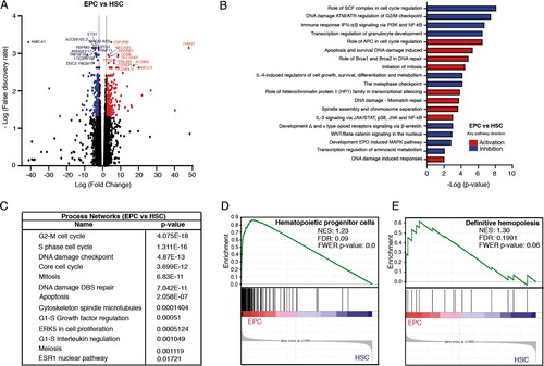
Figure 4. Comparative transcriptome analysis of freshly isolated MPCs and EPCs. (A) Volcano plot showing differential expression of genes between MPCs and EPCs. Each dot represents a transcript. The “x” axis represents the log fold-change, and the “y” axis indicates the -log (FDR). Blue (downregulation) and red (upregulation) dots represent DEGs with fold change >2 or <−2, and FDR <0.05. Some of the most significant transcripts were labeled. (B) Key pathways with prediction of activity in MPCs are depicted. The “x” axis represents the -log p-value of genes enriched for each pathway. Blue bars indicate inhibition and red bars indicate activation of the signaling pathway. (C) The process networks with changes in the myeloid population are shown. (D, E) Gene Set Enrichment Analysis of MPCs vs EPCs. Gene sets were obtained from MSigDB database (Broad Institute) and then compared against the MPC and EPC signatures. Plots depict negatively enriched gene sets in EPCs. Black lines indicate the position of each gene across the ranked dataset. The normalized enrichment score (NES) is indicated in each plot. The representative expressed genes in EPO pathway signature are SHC1, SOS1, ELK1, STAT5B, PTPN6, STAT5A and EPOR. The representative genes in granulocyte differentiation signature are TAL1, FASN, ZFPM1, LEF1, GATA2, GATA1 and TESC.
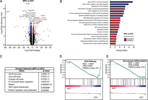
Figure 5. Proliferation and expansion kinetics of HSCs, MPCs, and EPCs. Proliferation kinetics of the three cell populations throughout liquid culture in the presence of the M cytokine mix (A) and the E cytokine mix (B). Values (mean ± S.D.; n = 7) represent the increments in total nucleated cell number, as compared to day 0. Expansion kinetics of the three cell populations throughout liquid culture in the presence of the M cytokine mix (C) and the E cytokine mix (D). Values (mean ± S.D.; n = 7) represent the increments in CFC number, as compared to day 0. Cultures were not assessed on day 25 of culture. Based on data shown in A – D, we calculated the cumulative number of total nucleated cells (proliferation) and CFCs (expansion) generated in culture during days 0–20 (E), and on day 30 (F). Cumulative cell numbers for MPCs correspond to those observed in cultures supplemented with M cytokine mix. Cumulative cell numbers for EPCs correspond to those observed in cultures supplemented with E cytokine mix.
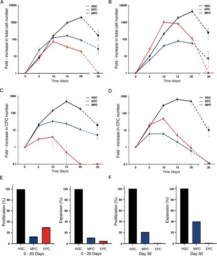
Table 2. Types of hematopoietic colonies generated in cultures from hematopoietic stem and progenitor cells.