
Figures & data
Table 1. Datasets used in analysis.
Table 2. Summary of community state types for data with species-level taxonomic assignments.
Figure 1. Community state types. Stacked bar plot of bacteria present in microbiome samples grouped by community state type (CST) for the (a) ravel,[Citation10] (b) gajer,[Citation3] (c) chaban,[Citation20] (d) hmp,[Citation21] and (e) vahmp [Citation22] datasets. Each sample is represented by a bar along the x-axis and the proportion of reads assigned to each taxon is indicated by the colors in the bar. Key for major taxa: L. crispatus (yellow), L. iners (light blue), G. vaginalis (red), A. vaginae (brown), Lachnospiraciae BVAB1 (orange), Bifidobacterium (light green). Samples are ordered by CST, and the assigned CST number is given on the x-axis of each plot. contains a summary of the CSTs.
![Figure 1. Community state types. Stacked bar plot of bacteria present in microbiome samples grouped by community state type (CST) for the (a) ravel,[Citation10] (b) gajer,[Citation3] (c) chaban,[Citation20] (d) hmp,[Citation21] and (e) vahmp [Citation22] datasets. Each sample is represented by a bar along the x-axis and the proportion of reads assigned to each taxon is indicated by the colors in the bar. Key for major taxa: L. crispatus (yellow), L. iners (light blue), G. vaginalis (red), A. vaginae (brown), Lachnospiraciae BVAB1 (orange), Bifidobacterium (light green). Samples are ordered by CST, and the assigned CST number is given on the x-axis of each plot. Table 2 contains a summary of the CSTs.](/cms/asset/5192a381-1d2e-4aaa-ac29-e0a10bfa1701/zmeh_a_1303265_f0001_oc.jpg)
Table 3. Agreement of CST transitions for different CST assignment methods.
Figure 2. Persistence of CST states. (a) Plot of mean and standard deviation of five-day bins of z-scores of distances of microbiome profiles from profiles at the next CST change for the gajer [Citation3] data, as a function of the days until the next CST change. (b) Markov chain diagram indicating the probability of transitioning between states in one week for the gajer dataset.
![Figure 2. Persistence of CST states. (a) Plot of mean and standard deviation of five-day bins of z-scores of distances of microbiome profiles from profiles at the next CST change for the gajer [Citation3] data, as a function of the days until the next CST change. (b) Markov chain diagram indicating the probability of transitioning between states in one week for the gajer dataset.](/cms/asset/4b3fc4f9-650a-4fe6-b532-9845ca31c1a1/zmeh_a_1303265_f0002_oc.jpg)
Figure 3. Dynamic modeling of the vaginal microbiome. Dynamic models are constructed using the (a) ravel and (b) gajer data. Each model consisted of static features age and race/ethnicity. For the ravel data, dynamic features BV medication and menses were included. (a) For the ravel data two sets of two outcomes were modeled, CST and O2, where O2 denotes Nugent score or pH. (b) For the gajer data, CST and Nugent score were the outcomes. (c) Unlike the other models, which assume bidirectional influence between the outcome variables, models 2–4 (right) consider unidirectional or no direct influence between the outcomes (model 4). These models were fit for each combination of static, dynamic, and outcome variables.
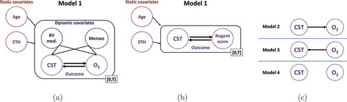
Figure 4. Inferred dynamic effect. Shown are, for each model, the effects that the features and outcome have on the rate of change of the other outcome’s state (e.g. a negative H- L-risk effect decreases the rate of change from high- to low-risk CST) as well as the associated difference in effects between each pair of outcome states (e.g. a positive L-
H-risk indicates an overall effect preferring H- over L-risk CST). Darker (lighter) colors indicate effects greater (less) than 0; 95% confidence intervals are given in parentheses; and * denotes effect or effect difference significantly different than 0 at a 5% significance level. L, M, H stand for low, medium and high.
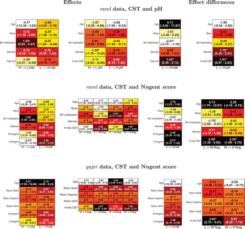
Figure 5. Comparison of dynamic models to evaluate outcome relationship. For each dynamic model, the per subject out of sample log likelihoods obtained by the outcome bidirectional dependency model 1 plotted against the corresponding values computed by models incorporating unidirectional (model 2, blue, and 3, brown) or no relationship (model 4, yellow) between outcomes (see for definition of models). * denotes cases where the sum of model 1’s log likelihoods is significantly greater than that of the corresponding model.
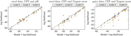
Figure 6. Outcome trajectories from dynamic model 1. The CST risk (top panel) and pH level (middle) trajectories are shown for ravel’s subjects 35 (left) and 52 (right). Blue are the model predicted trajectories, red are the actual outcome values, and the dotted lines reflects equal probability of being in either outcome state. The bottom panel shows the assigned BV medication (black) and menses (cyan) values, respectively.
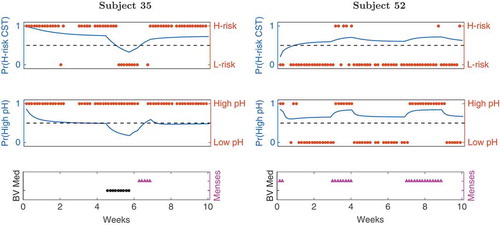
Figure 7. Predicting CST changes for daily and twice-weekly sampled data. (a) Receiver operating characteristic (ROC) curves showing the accuracy of random forest models on the ravel [Citation2] data at one- and seven-day horizons (blue and red, respectively) and gajer [Citation3] samples at 3/4- and seven-day horizons (green and cyan, respectively). The dotted black line represents the performance of a random predictor. Each curve depicts the true positive rate (or sensitivity, y-axis) versus the false positive rate (or 1 – specificity, x-axis) along the entire predictive score range; for example, the dashed vertical line and the right value in the parentheses indicate the sensitivity at 80% specificity. The area under the ROC curve (AUC, left value in parentheses) reflects the overall prediction accuracy, with higher values corresponding to better accuracy. The heatmaps show the average test AUC values for predicting (b) CST change or (c) risk level when testing on specific samples or entire subject’s trajectory and using features extracted from the microbial community data. Darker shades indicate higher AUC values; 1 d, 3/4 d, 7 d: prediction horizon of one, three/four and seven days, respectively.
![Figure 7. Predicting CST changes for daily and twice-weekly sampled data. (a) Receiver operating characteristic (ROC) curves showing the accuracy of random forest models on the ravel [Citation2] data at one- and seven-day horizons (blue and red, respectively) and gajer [Citation3] samples at 3/4- and seven-day horizons (green and cyan, respectively). The dotted black line represents the performance of a random predictor. Each curve depicts the true positive rate (or sensitivity, y-axis) versus the false positive rate (or 1 – specificity, x-axis) along the entire predictive score range; for example, the dashed vertical line and the right value in the parentheses indicate the sensitivity at 80% specificity. The area under the ROC curve (AUC, left value in parentheses) reflects the overall prediction accuracy, with higher values corresponding to better accuracy. The heatmaps show the average test AUC values for predicting (b) CST change or (c) risk level when testing on specific samples or entire subject’s trajectory and using features extracted from the microbial community data. Darker shades indicate higher AUC values; 1 d, 3/4 d, 7 d: prediction horizon of one, three/four and seven days, respectively.](/cms/asset/0a9e3f93-3d2f-4bc0-97c2-2842f0b27478/zmeh_a_1303265_f0007_oc.jpg)
Table 4. Area under the ROC curve (AUC) and sensitivity at 80% specificity for predicting CST changes.
Figure 8. Bar plot of effect sizes for bacteria with significant differences between subjects with a CST change in the next sample (TRUE) versus those that will remain in the current CST (FALSE) for the ravel [Citation10] dataset.
![Figure 8. Bar plot of effect sizes for bacteria with significant differences between subjects with a CST change in the next sample (TRUE) versus those that will remain in the current CST (FALSE) for the ravel [Citation10] dataset.](/cms/asset/c5441b6f-a5ce-46a9-93fb-3877b49a22a5/zmeh_a_1303265_f0008_oc.jpg)