
Figures & data
Figure 1. Principal component analysis (PCA) score plot. The first principal component (PC1) accounted for 44.3% and 37.7% of all variation in positive ion mode (A) and negative ion mode (B), respectively. CK: control group, EG: experimental group. Red and blue represent CK and EG, respectively.
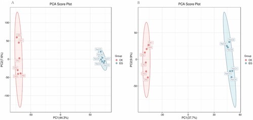
Figure 2. OPLS-DA score plot of S. polyrhiza under salt stress. The first principal component (PC1) accounted for 44.2% and 37.7% of all variation in the positive ion mode (A) and negative ion mode (B), respectively. CK: control group, EG: experimental group. Red and blue represent CK and EG, respectively.
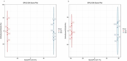
Figure 3. Volcano plot of differential metabolites. Red dots indicate metabolites that are upregulated, blue dots indicate metabolites that are downregulated, and gray dots indicate metabolites that did not pass the filter’s screening requirements.
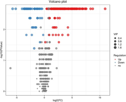
Figure 4. Hierarchical clustering heatmap of differential metabolites. The relative content of metabolites from low to high is graphically depicted by the change in blue and red hues. Each sample variety is visualized in a single column, and each metabolite is represented by a single row. CK and NaCl represent samples from the control and salt treatments with six replicates, respectively.
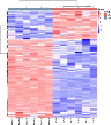
Figure 5. A bubble plot of metabolic pathway impact factors showed significantly altered metabolic pathways in S. polyrhiza under salt stress. A metabolic pathway is represented by each point; the abscissa is the impact value in the different metabolic pathways; the ordinate is the enriched pathway. The number of metabolites in the pathway is shown by the appropriate number of dots. The correlation between color and P value indicates that bluer colors have larger P values and redder colors have smaller P values.
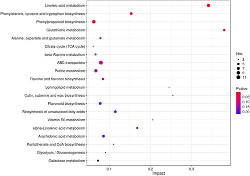
Figure 6. Expression levels of genes involved in phenolic biosynthesis (SpPAL(A), SpC4H(B), Sp4CL(C), SpHCT(D), SpCHS(E), SpCHI(F), SpF3H(G), SpF3’H(H), and SpFLS(I)) from control and salt-treated S. polyrhiza at 0,24,48 and 96 h. Data are the mean ± SE of 3 replicates. At each time piont, p < 0.05 indicated a significant difference between groups. The S. polyrhiza ACTIN gene was used as a reference gene. Red and blue represent CK and EG, respectively.
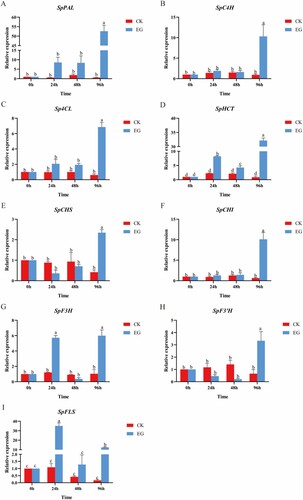
Figure 7. Schematic diagram showing how phenolic biosynthesis is affected by salt. The red boxes represents the metabolites with increased relative content, the green boxes represents the metabolites with decreased relative content, and the gray boxes represents the metabolites with unchanged relative content. Boxes without a colored background indicate compounds that were not detected. Red font indicates the genes with increased relative expression.
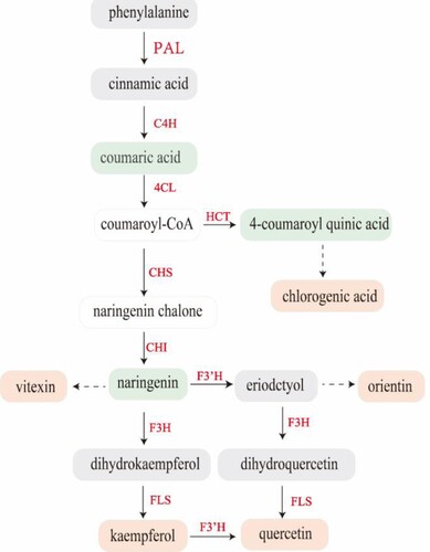
Table 1. List of the phenolic compounds in salt-treated S. polyrhiza, chosen by combining fold-change analyses.