Figures & data
Figure 1.1. Overview of major outcomes at global scale for the 6th issue of the Copernicus Ocean State Report.
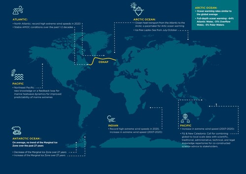
Figure 1.2. Same as , but for the European regional seas.
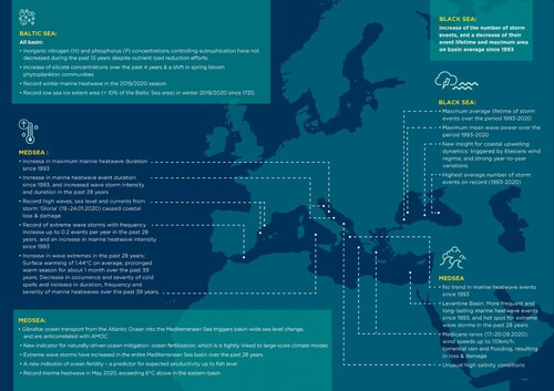
Figure 2.1.1. Latitudinal and interannual variation of extreme wind speeds (99th percentile of 1 degree zonal bands) for the three major ocean basins. ASCAT-A (a) climatology (2007–2014) and (b) median annual number of observations per grid cell. The numbered coloured bands in (a) represent the Beaufort scale classification. Difference between climatologies for (c) ASCAT-A and collocated ERA5 and (d) original and collocated ERA5. Annual extreme wind speed anomaly for 2020 with respect to the climatology for (e) the Atlantic, (f) the Pacific and (g) the Indian Ocean. The spread in wind speed anomalies for the period 2007–2019 is provided for comparison.
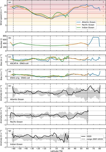
Table 2.1.1. Beaufort scale for wind speed classification, other commonly used wind speed units and associated probable wave height.
Figure 2.1.2. ASCAT-A 99th wind speed percentile (a) climatology (2007–2014), (b) annual anomaly for 2020 and (c) annual trend (2007–2020). Areas with trends significant above the 90% confidence level are outlined in black. Regions examined in more detail are indicated with numbered boxes.
Figure 2.1.3. Time series (2007–2020) and linear trends of annual 99th percentile extreme wind speeds over selected regions with large trends (see Figure 2.1.2(c)), for ASCAT-A, collocated and original ERA5. Trends not significant at the 90% confidence level are shown with dotted instead of dashed lines.
Table 2.1.2. Linear trends for ASCAT-A, collocated and original ERA5 [m s−1 yr−1] in the annual 99th percentiles over the period 2007–2020 for selected ocean regions.
Figure 2.2.1. Vertical profile of the overturning transport in potential density space, averaged over the 47-month period of OSNAP observations, from August 2014 to June 2018, across (a) the full OSNAP section, (b) OSNAP East, and (c) OSNAP West. The reanalyses ensemble-mean (red, product ref 2.2.1) and spread (green shading) is plotted, along with each ensemble member, and the OSNAP observations (black, product ref. 2.2.2). The ensemble spread is calculated as two times the standard deviation across the ensemble members (excluding ORAS5). ORAS5 is excluded from the ensemble-mean and spread across all sections (see text). The map on the right shows the location of OSNAP East and OSNAP West (red lines).
Table 2.2.1. Time-mean and uncertainty, and monthly-mean variability of the maximum MOC, and the meridional heat and freshwater transports (MHT and MFT) across the three OSNAP sections, for the ensemble-mean (product ref 2.2.1) and the OSNAP observations (product ref 2.2.2).
Figure 2.2.2. (a) Timeseries of the monthly-mean overturning transport, from August 2014 to June 2018 across (top) the full OSNAP section, (middle) OSNAP East, and (bottom) OSNAP West in the four reanalyses, the ensemble-mean (red, product ref. 2.2.1) and the OSNAP observations (black, product ref. 2.2.2). Labels and shading as in Figure 2.2.1. The horizontal grey dashed line in the lower plot divides the y-axis into two linear scales, with the y-axis compressed above the line. (b) Box plot of the monthly-mean MOC variability in the observations (green) and in the ensemble-mean (red) across each OSNAP section, over the same time period as in (a). The boxes represent the interquartile range (IQR) with the median line shown. The whiskers cover a range of values up to 1.5 times the IQR and the diamonds are outlying values beyond this range.
Figure 2.2.3. Timeseries of (a) the monthly-mean and (b) the 12-month running mean, of the overturning transport from January 1993 to December 2020 across (top) the full OSNAP section, (middle) OSNAP East, and (bottom) OSNAP West. Labels, shading and product information are as in and . The horizontal grey dashed lines divide the y-axis into two linear scales, with the y-axis compressed above the line.
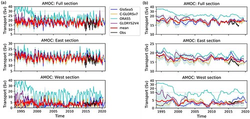
Figure 2.3.1. Climatologies of lower boundaries of (a) PW and (b) AW layers as well as (c) layer thickness of the AW layer. Light blue line in (a) indicates the boundaries of the Arctic Mediterranean. GREP (product ref 2.3.4) ensemble mean climatological (d) temperature along with water masses and their vertical (σ-based) and horizontal (temperature-based) boundaries (see section 2.3.2 for definitions) and (e) current cross sections across the Greenland-Scotland-Ridge.
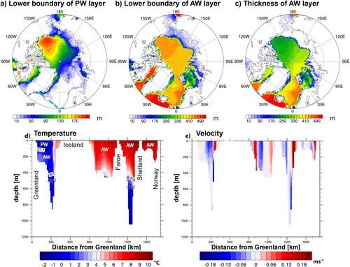
Figure 2.3.2. (a) Heat accumulation of the Arctic Mediterranean, represented as full-depth ocean heat content (OHC) (along with PW and AW contributions) and heat used for sea ice melt (ME); (b) time derivative (indicated by appended ‘T’) of quantities shown in (a); (c) anomalous ocean heat transport into Arctic Mediterranean from the GREP (product ref 2.3.4; shading represents ensemble spread) ensemble mean and observations (product ref 2.3.5; shading represents uncertainty based on 26 TW provided by Tsubouchi et al. (Citation2021), reduced by the factor as discussed in the text); (d) inferred net surface energy flux (FS), combining CERES-EBAF (product ref 2.3.1) net TOA fluxes and atmospheric budgets from ERA5 (product ref 2.3.2) and JRA55 (product ref 2.3.3), respectively, averaged over the Arctic Mediterranean. All quantities are presented with the annual cycle removed, and a 12-point running mean was applied to time series in (b) to (d).
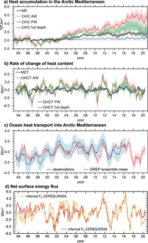
Figure 2.3.3. Contemporaneous correlation (shading) and regression (contours) of Sea Level Anomaly from AVISO (product ref 2.3.6) with (a) OHT from GREP (product ref 2.3.4), (b) OHT from observations (product ref. 2.3.5), and (c) the Arctic Oscillation (AO) Index (product ref 2.3.7); Stippling indicates significant correlations at the 95% confidence level; (d) standardised anomaly time series of OHT from GREP and observations, AO Index, and the SLA-based proxy of OHT (see Equation (2)).
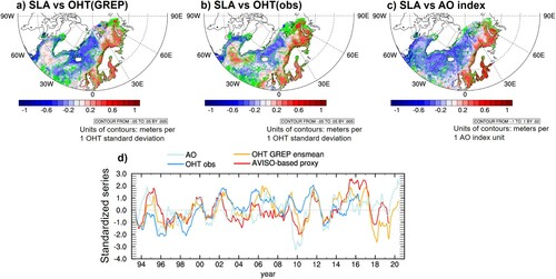
Figure 2.4.1. GREP SIC root mean square error for September (left), and February (right) averaged over 1993–2020 as derived from NOAA/NSIDC CDR (product ref. 2.4.2).
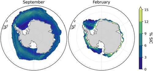
Figure 2.4.2. Mean seasonal cycle of total SIE (solid) and MIZ extent (dashed), from GREP (red, product ref. 2.4.1) and satellite estimates (black, product ref. 2.4.2), with individual ORA products (thin lines), for the 1993–2020 period. The seasonal cycles of pack ice (dash-dotted lines) and sparse ice (dotted lines) are also presented.
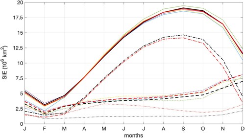
Figure 2.4.3. Time-series of Antarctic SIE (solid) and MIZ extent (dashed) from GREP (red, product ref 2.4.1) and CDR (black, product ref. 2.4.2) for February, May, September, and December. Thin lines represent the single ORAs. An error bar of 10% has been applied to the observational output (product ref. 2.4.2).
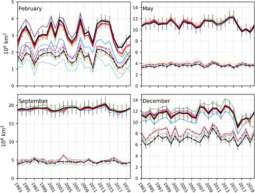
Table 2.4.1. Slopes of trend lines (computed as linear least-squares regression) for the extent of marginal ice, consolidated pack ice and total ice for February–December (1993–2020) for both GREP (product ref 2.4.1) and CDR (product ref. 2.4.2).
Figure 2.4.4. Time series of monthly-averaged latitudes of MIZ for GREP (red, product ref. 2.4.1) and CDR (black, product ref. 2.4.2) in February, May, September, and December.
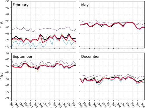
Figure 2.4.5. Map of seasonal trend in sea ice concentration (% yr−1) from CDR (product ref. 2.4.2) and GREP (product ref. 2.4.1) in (a) winter (JJA), (b) spring (SON), (c) summer (DJF), and (d) autumn (MAM), for the 1993–2020 period. Contours indicate the SIC at 0.15 (green) and 0.8 (magenta). Dots show 95% significance. JJA: June-July-August; SON: September-October-November, DJF: December-January-February; MAM: March-April-May.
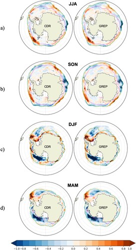
Figure 2.5.1. (a) The TAMOC (black line), MSSHMS (annual and semi-annual harmonics removed) (green line) and the Gibraltar inflow transport (red line) over the period 1993–2019. Note that the y axis for the TAMOC transport is reversed. (b) The 12 month running mean (also detrended) of total TAMOC (black line), the MSSHMS averaged in the Mediterranean basin (green line), TUMO (blue line), TEK (yellow line) and the Gibraltar inflow transport Finflow (red line) over the period 1993–2019 (mean and linear trend also removed). Note that the y axis for the AMOC transport is reversed. (c) Lagged correlations between the different components of the TAMOC, MSSHMS and the Gibraltar Finflow over the period 1993–2019. (d) Same as in (c) but for the period used in Volkov et al. (Citation2019): April 2004, Feb 2017. The 95% significance level for correlation is indicated by the dashed grey line (0.37 and 0.51 at zero lag for the longer and shorter period, respectively). Significance level over a 12-month running mean is calculated by assuming one independent degree of freedom per year. Product ref. 2.5.1 is used for the Gibraltar inflow transport, and product ref. 2.5.2 for all the other variables.
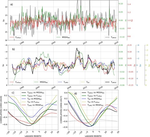
Figure 2.5.2. (Left panel) Correlation coefficients between MSSHMS, (with annual and semi-annual harmonics removed), the components of the meridional transport at 26.5°N (TAMOC, TFC, TEK, TUMO) and the Gibraltar inflow transport (Finflow). (Right panel) Same as in the left panel but between the time series from which annual and semi-annual harmonics have been removed also in the transports. The 95% significance level for the correlation is 0.11 and 0.16 for the longer and shorter period, respectively. Grey solid line (significance) corresponds to the 1993–2019 period, grey dotted line (significance) corresponds to April 2004 – February 2017 period. Product ref. 2.5.1 is used for the Gibraltar inflow transport, and product ref. 2.5.2 for all the other variables.
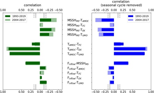
Figure 2.5.3. Composite currents (amplitude in m/sec in colour) at 75 m depth for the years when the MSSHMS is >4 cm (panel a) and <−4 cm (panel b). Product ref. 2.5.2 is used.
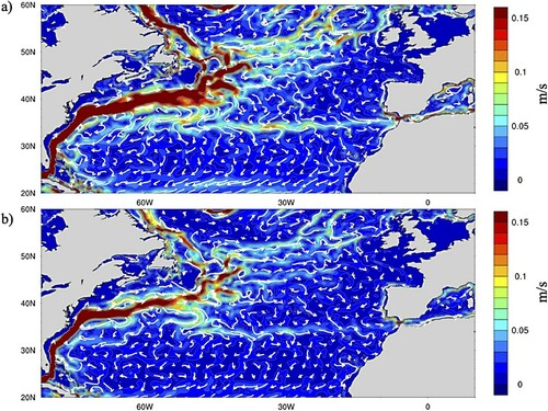
Figure 2.5.4. (Left panel) Lagged correlation coefficients between MSSHMS (annual and semi-annual harmonics removed), the components of the meridional transport at 26.5°N (TAMOC, TFC, TEK, TUMO) and the Gibraltar inflow transport (Finflow). Grey solid line (significance) corresponds to the 1993–2019 period, grey dotted line (significance) corresponds to April 2004 – February 2017 period. The 95% significance level for correlation is 0.37 and 0.51 at zero lag for the longer and shorter period, respectively. Significance level over a 12-month running mean is calculated by assuming one independent degree of freedom per year. (Right panel) Time lags (in month) for which the correlations in the left panel are maxima. Product ref. 2.5.1 is used for the Gibraltar inflow transport, and product ref. 2.5.2 for all the other variables.
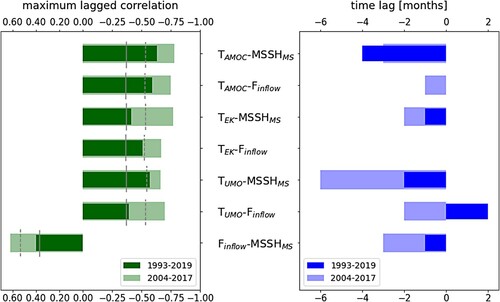
Figure 2.6.1. Spatial distribution of 90thPO4 (a) and 90thNO3 (b) percentile in the Mediterranean Sea in DJF (period 1999–2019). Values in both panels are in mmol/m3 and have been computed using the CMEMS biogeochemical reanalysis (product reference 2.6.2)
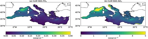
Figure 2.6.2. Spatial distribution of the correlation between the monthly DJF winter time series of the mixed layer depth and FEPO4 (a) and FENO3 (b) respectively in the period 1999–2019. Only correlation values statistically significant at 95% are shown. Mixed layer depth data are based on the CMEMS physical reanalysis (product reference 2.6.1). FEPO4 and FENO3 have been calculated using the CMEMS biogeochemical reanalysis (product reference 2.6.2).
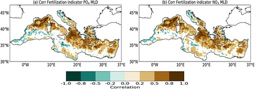
Figure 2.6.3. Spatial distribution of the highest value of SP+-SPclim for PO4 (a) and NO3 (b) in the Mediterranean Sea in the period 1999–2019. The size of each dot is equal to the absolute value of SP+-SPclim. The large-scale circulation patterns considered are NAO (black), EA (red), EAWR (blue) and SCAN (green). The resolution of the gridded data has been downgraded from 1/24° to 0.5° for sake of clarity. Values have been computed using the time series of the monthly values of the indexes for large-scale circulation patterns (product reference 2.6.3). Only differences statistically significant with p < 0.05 according to a Mann-Withney test are shown.
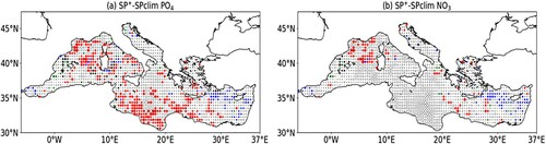
Figure 2.6.4. Spatial distribution of the slope of the linear regression between monthly December-January-February time series of PO4 (a) and NO3 (b) and monthly December-January-February EA index time series in the period 1999–2019. Only values statistically significant at 95% are shown. Slopes have been calculated using the CMEMS biogeochemical reanalysis (product reference 2.6.2) and the time series of the monthly values of the indexes for large-scale circulation patterns (product reference 2.6.3)
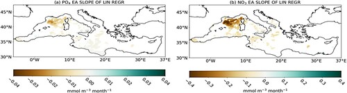
Figure 2.6.5. Spatial distribution (in number of days) of the maximum monthly value of FEPO4 (a) and FENO3 (b) in the Mediterranean Sea during DJF 2020. Contour lines (with colour legend in the figure) shows the mixed layer depth (in m). Mixed layer depth data are based on the CMEMS physical reanalysis (product reference 2.6.1) FEPO4 and FENO3 have been calculated using the CMEMS biogeochemical reanalysis (product reference 2.6.2).
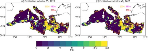
Figure 2.7.1. Maps of the 1998–2020 chlorophyll concentration climatology (top) and trend (bottom), provided at 1 km spatial resolution (product ref. 2.7.4). The white lines highlight the borders between the four sub-regions investigated in this study: West (the western Mediterranean Sea); East (the eastern Mediterranean Sea); Adriatic (the Adriatic Sea); Aegean (the Aegean Sea). The trend values are displayed as percentages of the initial value (1998 annual mean) only when significant at the 95% confidence level.
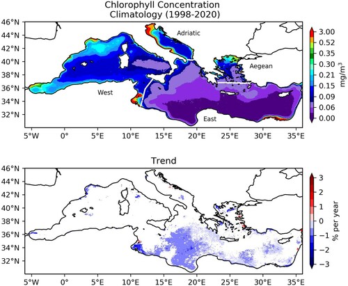
Figure 2.7.2. Spatial distribution of the marine heatwave (MHW) metrics from satellite-derived SST record (product ref. 2.7.1) over the period 1993–2019. a, c, e, mean (per year) and b, d, f, trend (per decade) of annual MHW number, MHW duration and MHW maximum intensity. The trend values are displayed only when significant at the 95% confidence level.
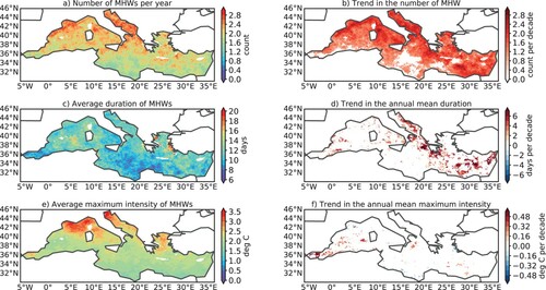
Figure 2.7.3. Annual changes (full lines) and linear trends (dashed lines) of MHW metrics averaged over the whole Mediterranean Sea comparing satellite-derived SST record (product ref. 2.7.1) and reanalyses (product 2.7.2 and 2.7.3). a MHW count, b MHW duration and c MHW maximum intensity. Trend values are given with a 95% confidence interval. d, e, f, trend of the MHWs metrics (d frequency per decade, e duration per decade and f maximum intensity per decade) over 1993–2019 for each product and each selected (sub)-region. Purple lines indicate the 95% confidence interval.
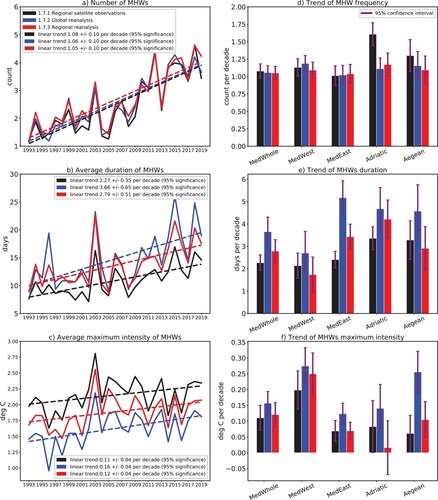
Figure 2.7.4. Annual variability (full lines) and trend (dashed lines; trend values are given with a 95% confidence interval) in the duration of MHW in the whole Mediterranean Sea, and e, f, g, h, trend in the duration of MHW for each selected (sub)-region (referred in ), for different degrees of severity (as defined in section 2.7.2). Values compare satellite-derived SST record (product ref. 2.7.1) and reanalyses (product 2.7.2 and 2.7.3). Purple lines indicate the 95% confidence interval.

Figure 2.8.1. Long-term wave statistics of the Black Sea. Significant wave height (a) 1979–2019 99th percentile, (b) 2020 99th percentile anomaly, and (c) 1979–2020 linear trend of 99th percentile. (d), (g), and (j) yearly average number of storm events, (e), (h), and (k) lifetime of storm events, and (f), (i), and (l) intensity of storm events for the same periods as in (a)-(c). The analyses are based on yearly averages obtained from product ref. 2.8.1.
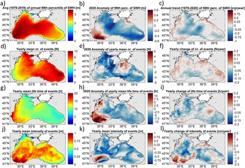
Figure 2.8.2. Long-term wind statistics of the Black Sea obtained from the METOP-A satellite (upper row; product ref. 2.8.3) as well as ERA5 (lower row; product ref. 2.8.2). The considered periods start in 2007 and 1979, respectively. (a) and (d) 99th percentile until 2019, (b) and (e) 2020 99th percentile anomaly, and (c) and (f) linear trend of 99th percentile until 2020. The analyses are based on yearly averages.
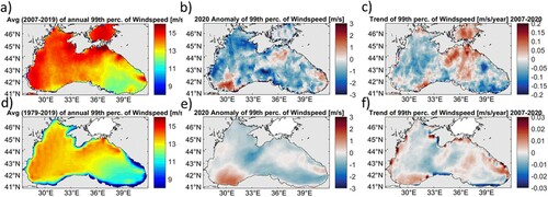
Figure 2.8.3. Yearly (a) number, (b) lifetime, (d) intensity, and (f) maximum event area. The dashed lines denote the linear regression (c), (e), and (g) are the respective histograms. The histograms have the following bin sizes: 5 h, 0.1 m, 0.05 km², respectively. The analyses take into account the whole model domain and are based on product ref. 2.8.1. Long-term spatial mean storm analyses of the Black Sea based on 42-year CMEMS wave reanalyses show almost no trend in event numbers (0.029 ± 0.275 events/year), a slight increase of their intensity (0.774 ± 2.938 cm/year) but decreasing trends in the event lifetime (−0.021 ± 0.061 h/year) and event area of extremes (−5.903 ± 169.676 km2/year).
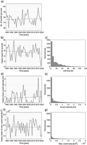
Figure 2.8.4. Long-term wave power statistics of the Black Sea. (a) 1979–2019 99th percentile, (b) 2020 99th percentile anomaly, and (c) 1979–2020 linear trend of 99th percentile. (d) Standard deviation, (e) maximum, and (f) coefficient of variation of the period 1979–2020. The analyses are based on yearly averages derived from product ref. 2.8.1.
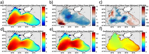
Figure 2.9.1. Time-mean Eulerian meridional overturning maximum of the absolute value of the stream function (isopycnal layers 22.45, 23.85, 25.7 kg m−3 as dashed lines) on the top; yearly maximum overturning stream function for the whole basin (blue line) and down to 250 m (red line) on the bottom with standard deviations as the bar plots.
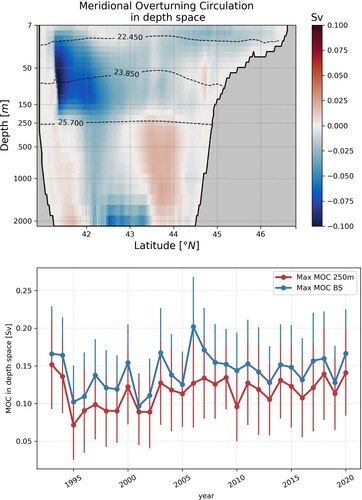
Figure 2.9.2. Time-mean overturning transport in density space on the top; Time evolution of the maximum BS-MOC in density space between 22.45 and 23.85 kg m−3 (red line), volume of temperature below 8.35°C in the deep basin (blue line) and CIL cold content obtained using ship data and Argo floats (orange line, from Capet et al. Citation2020, product ref 2.9.3) on the bottom.
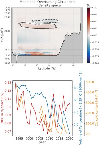
Figure 2.9.3. T–S diagrams from BS-REA for a 4-year period starting from 1993. Grey crosses show T–S climatological (1995–2020) data from SeaDataCloud (Myroshnychenko Citation2020, product ref. 2.9.2). Dashed line represents 8.35°C isothermal. The number of grid points below the 8.35 isothermal are shown in the bottom left corner of each figure.
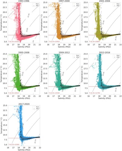
Figure 3.1.1. Summary of SDG 14.1.1a sub-indicators (reproduced with small modifications from UNEP Citation2021).
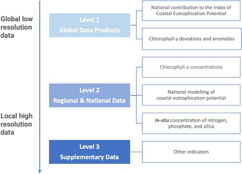
Figure 3.1.2. Schematics of the derivation of the SDG14.1.1a sub-indicator on the state of coastal eutrophication. (A) Schematic of the Level 2 approach for the derivation of the annual PE and PO maps and of the chlorophyll-a concentration sub-indicator per Exclusive Economic Zone. (B) UNEP Level 1 approach reproduced with small modification from UNEP (Citation2021).
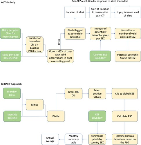
Figure 3.1.3. 2020 annual PE (red) and PO (blue) European method indicator map calculated using the CMEMS Ocean Colour regional products (product references 3.1.1–3.1.5). Active PE flags indicate pixels where more than 25% of the valid observations were above the 1998–2017 P90 climatological reference. Active PO flags indicate locations where more than 25% of the valid observations were below the 1998–2017 P10 climatological reference.
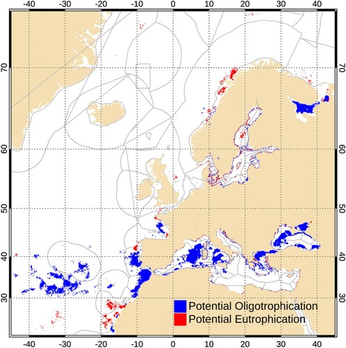
Figure 3.1.4. Time series (1998–2020) of the PE for European waters based on CMEMS Ocean Colour regional products (product ref. 3.1.1–3.1.5), extending the time series 1998–2019 published in Eurostat (Citation2021). Annual EEZ mean values for each European country were calculated by performing for each year a spatial average (weighted by pixel area) of the annual PE map. AL: Albania, BE: Belgium, BG: Bulgaria, CY: Cyprus, DE: Germany, DK: Denmark, EE: Estonia, EL: Greece, ES: Spain, FI: Finland, FO: Faroe Islands, FR: France, GE: Georgia, GL: Greenland, HR: Croatia, IE: Ireland, IS: Iceland, IT: Italy, LT: Lithuania, LV: Latvia, MC: Monaco, ME: Montenegro, MT: Malta, NL: Netherlands, NO: Norway, PL: Poland, PT: Portugal, RO: Romania, SE: Sweden, SI: Slovenia, UK: United Kingdom.
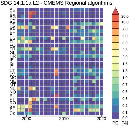
Figure 3.1.5. Time series (2000–2019) of the UNEP (Citation2021) SDG 14.1.1a Level 1 chlorophyll-a deviation sub-indicator based on OC-CCI global chlorophyll-a data (product ref. 3.1.6). Grey boxes identify missing data: reporting was not computed for 1998, 1999 and 2020 (list of countries as for ).
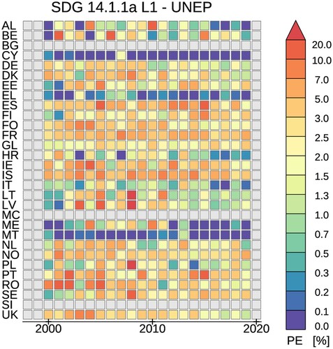
Figure 3.2.1. Map of the Baltic Sea (excluding northern sea areas) and the shipping route of Finnmaid used for the transect (product ref. 3.2.1). Red points mark the centres of the zones into which sampling locations were pooled. Numbers refer to sub-basins of the Baltic Sea, which are separated by blue lines. 1: Kattegat, 2: Great Belt, 3: The Sound, 4: Kiel Bay, 5: Bay of Mecklenburg, 6: Arkona Basin, 7: Bornholm Basin, 8: Gdansk Basin, 9: Eastern Gotland Basin, 10: Western Gotland Basin, 11: Gulf of Riga, 12: Northern Baltic Proper, 13: Gulf of Finland, 14: Åland Sea.
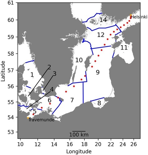
Figure 3.2.2. Monthly means of temperature (a), salinity (b) and concentrations of total N (c), total P (d), NO3 (e), PO4 (f), DSi (g) and Chl a (h) during the entire measurement period (2007–2020) calculated using in situ data collected by Finnmaid FerryBox (product ref. 3.2.1). Observations were grouped into 24 zones (see methods and ) which are presented using the latitude of the centre of the zones.
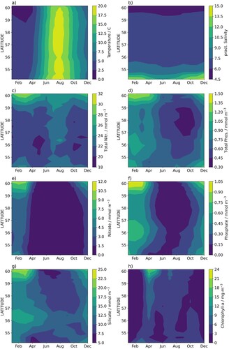
Figure 3.2.3. Deviation of temperature (a), salinity (b) and concentrations of Total N (c), Total P (d), NO3 (e), PO4 (f), DSi (g) and Chl a (h) from the monthly means () of the total measurement period (2007–2020) calculated using in situ data collected by Finnmaid FerryBox (product ref. 3.2.1). Observations were grouped into 24 zones (see methods and ) which are presented using the latitude of the centre of the zones.
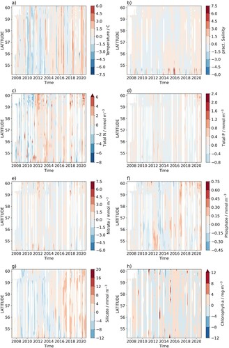
Figure 3.2.4. The upper sub-panel in each panel shows the average annual change from the monthly mean of total N (a), total P (b), NO3 (c), PO4 (d), DSi (e) and Chl a (f) during the total measurement period (2007–2020) as a function of the latitude, calculated using in situ data collected by the Finnmaid FerryBox (product ref. 3.2.1). Error bars show the standard error of the fitted long term trend (linear model). The lower sub-panel shows the adjusted R2 for the linear fit used to derive the annual change.
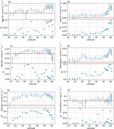
Figure 3.3.1. SST & Chl-a: Trend of Sea Surface Temperature (average yearly anomalies) as derived from product ref. 3.3.5 over the period (a) 2013–2019 and (b) 1997–2019 (units: °C per year). The two periods have been chosen to overlap with the availability of in-situ records. Coloured circles indicate corresponding trend estimates as derived from in-situ observations (product ref. 3.3.6, see ). Note the difference in colour scales in the two plots (c) Chl-a trend (units: % per year) over the period 1997–2019 from product ref. 3.3.3. White pixels are not statistically significant.
Table 3.3.1. In situ temperature meta data and correlation coefficients for the comparison with SSTSAT. Station positions on regional scales, and overlapping time series lengths are provided in and , respectively. The significance level at 95% would be 0.55 if we had only 10 independent samples and 0.38 for 20 samples. Maps are based on Etopo5 in Fiji, and a high resolution SHOM DEM in New Caledonia.
Table 3.3.2. Trend calculations during overlapping periods for SST time series from in situ reef loggers (ref 3.3.6) and the remote sensing product (ref 3.3.2).
Figure 3.3.2. Time series of daily in-situ SST anomalies at some measurement platforms (coloured lines) in Fiji and New Caledonia of the ReefTEMPS observing network (product ref. 3.3.6). Station locations (a) Suva Reef, Viti Levu, Fiji; (b) Uitoe01, New Caledonia; (c) Poindimié, New Caledonia; (d) Anse Vata, New Caledonia; (e) Prony, New Caledonia] are indicated in the maps of . Satellite derived daily SSTSAT (product ref. 3.3.5) anomalies closest to each measurement platform have been added, respectively (grey line). Anomalies were calculated with respect to the annual climatology over the overlap periods.
![Figure 3.3.2. Time series of daily in-situ SST anomalies at some measurement platforms (coloured lines) in Fiji and New Caledonia of the ReefTEMPS observing network (product ref. 3.3.6). Station locations (a) Suva Reef, Viti Levu, Fiji; (b) Uitoe01, New Caledonia; (c) Poindimié, New Caledonia; (d) Anse Vata, New Caledonia; (e) Prony, New Caledonia] are indicated in the maps of Figure 3.3.1. Satellite derived daily SSTSAT (product ref. 3.3.5) anomalies closest to each measurement platform have been added, respectively (grey line). Anomalies were calculated with respect to the annual climatology over the overlap periods.](/cms/asset/c92550b6-5e81-41db-b64b-4c7a3cf52ae5/tjoo_a_2095169_f0048_oc.jpg)
Figure 3.3.3. Chl-a observations: (A) Study area (black outlined box) in proximity to the wider Fiji zone, with Chl-a change (from product ref 3.3.1) (B) Chl-a in the proximity of Fiji in April and September 2003 for the day of the Bula cruise (product ref 3.3.2). In situ data are represented by the coloured circles, on the same colour scale (product ref 3.3.3) (C) Same as (A) based on the monthly Chl-a product (product ref 3.3.1), for April 2003 and September 2003. The two off-shore stations discussed are station 29 and station 48. Station 54 was discarded because of the Rewa river influence. The black dot to the south (178.79°E, 18.48°S) in ‘bluest water’ corresponds to a station sampled on October 2009 (product 3.3.7).
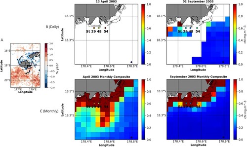
Figure 3.3.4. (a) Chl-a time series of monthly satellite-derived CMEMS Chl-a (product ref. 3.3.1) south of the position of the Bula stations 29 and 48 (grey bullets ‘Southern Pixels’), and in situ Chl-a (product ref. 3.3.3) measured by fluorimetry (open squares) for the 5 Bula cruises (Bula 1: 6–11 Nov 2001, Bula 2: 12–19 March 2002, Bula 3: 12–22 May 2003 Bula 4: August 30–September 9, 2003; Bula 5: 5–15 June 2004) and for the S288 Seamans October 2019 cruise (b) Linear regression graph for Bula + Seamans data.
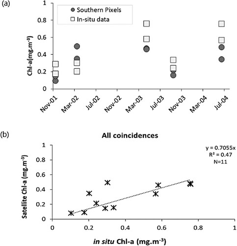
Figure 3.3.5. Satellite-derived monthly Chl-a (ref. 3.3.1) at a pixel just south of the in-situ stations st 29, st 48, st 54 and our reference point to the south (see (B)). St 54 is heavily impacted by the Rewa river and therefore not included in the correlation analysis. Variability is much lower at the reference point to the south. The red and blue dots indicate in the Bula situ data (ref. 3.3.3).
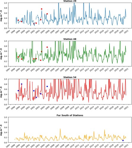
Figure 3.4.1. Tide gauge locations in the Baltic Sea. The names of the tide gauges used for validation (blue circles) are given in the ‘Auxiliary Data’ section. The list of abbreviations and names of the tide gauges used for reconstruction TGD-P28, (pink diamonds) we show also here. Aa, Aarhus; De, Degerby; Fo, Forsmark; Fu, Furuogrund; Ham, Hamina; Han, Hanko; Hei, Heiligenhafen; Hel, Helsinki; Hes, Hesnaes; Kal, KalixStoron; Kas, Kaskinen; Kem, Kemi; Kol, Kolka; Kro, Kronstadt; Ku, Kungsholmsfort; La, LandsortNorra; Raa, Raahe; Rat, Ratan; Rau, Rauma; Ri, Ringhals; Sa, Sassnitz; Sim, Simrishamn; Skag, Skagen; Skan, Skanor; Sli, Slipshavn; So, Sonderborg; Ud, Udbyhoej; Vi, Visby. Products used: ref. 3.4.3 (TGD-P28, TGD-P46).
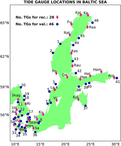
Figure 3.4.2. The performance of the reconstruction method expressed as the RMSE difference between the global state and its reconstruction during the training period. Product used: ref. 3.4.1 (ANL).
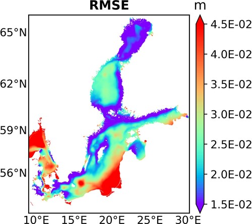
Figure 3.4.3. Comparison between tide gauge observations (top) and numerical simulations (bottom) in the locations used for training (28 tide-gauge locations, compare ), but for the longer than training period. Products used: ref. 3.4.1 (ANL), ref. 3.4.2 (REA) and ref. 3.4.3 (TGD-P28).
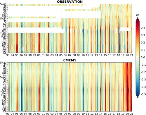
Table 3.4.1. Covered period and purpose for all data sets used during the training and application of the reconstruction algorithm. The abbreviation ‘ANL’ and ‘REA’ refer to the ‘Baltic Sea Physics Analysis and Forecast’ and ‘Baltic Sea Physics Reanalysis’ CMEMS products, respectively (product ref. 3.4.1 and ref. 3.4.2). ‘TGD-P28’ and ‘TGD-P46’ indicate the tide-gauge data sets including the 28 stations used for reconstruction and the 46 stations used for independent validation. Both data sets are derived from the ‘Baltic Sea – In Situ Near Real Time Observations’ CMEMS product (product ref. 3.4.3). ‘ERA5’ refers to the atmospheric data from the Fifth generation of ECMWF atmospheric reanalyses of the global climate product (product ref. 3.4.4) from the Copernicus Climate Change Service Climate Data Store (CDS). ‘REC’ stands for the SSH reconstruction based on Equation 3.4.5 (product ref. 3.4.5).
Figure 3.4.4. Correlation against observations (left-hand side) and Skill against SMHI data (right-hand side) of the reconstructions for the periods 1993–2019 (top) and 2020 (bottom) at the 46 independent (circles) and 28 dependent (diamonds) tide gauge locations. Products used: ref. 3.4.1 (ANL), ref. 3.4.2 (REA), ref. 3.4.3 (TGD-P28, TGD-P46) and ref. 3.4.5 (REC).
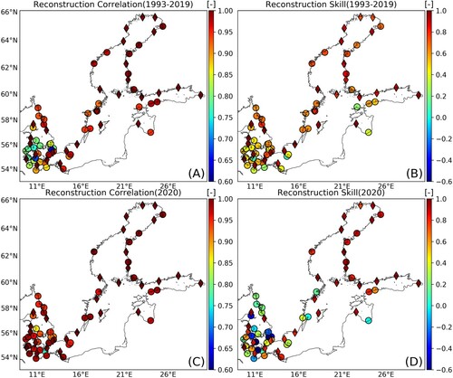
Figure 3.4.5. Mean yearly 99% percentile of SSH for the period 1993–2019 (A), the year 2020 (B) and the anomalies of the values in 2020 from the values of the rest of the period (C). The coloured maps and dots show the values derived from the reconstructions (REC) and independent tide gauges (TGD-P46), respectively. Tide gauge locations with insufficient observations are not shown in the panels. Products used: ref. 3.4.3 (TGD-P46) and ref. 3.4.5 (REC).
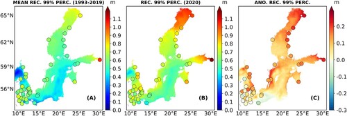
Figure 3.4.6. Correlation coefficient of the reconstructed sea level anomaly (map) and tide gauge observation (coloured circles) with the North Atlantic Oscillation (NAO) index during winter season (DJF, December–January–February) for the period 1993–2020 (A). Time series of the normalised DJF NAO index and normalised mean SSH differences between the Bothnia Bay and Arkona Basin (B) from REC (red solid line) and from TGD-P46 observations (black dashed line). Observations in the northern box (‘Botnian Bay’) are represent by the measurements derived from the stations: Kemi, KalixStoron, Furuogrund, Ratan, Skagsudde, Vaasa, Pietarsaari, Raahe and Oulu; Observations in the southern box (‘Arkona Basin’) are represented by the measurements derived from the stations: Simrishamn, Skanor, Rodvig, Hesnaes, Sassnitz, Koserow and Tejn. Products used: ref. 3.4.3 (TGD-P46), ref. 3.4.4 (ERA5) and ref. 3.4.5 (REC).
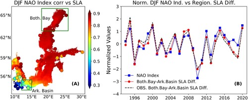
Figure 3.5.1. Yearly values of collocated reanalysis (product 3.5.1) and observed 99th percentile of SWH computed by merging wave buoy (left panel; products 3.5.2, 3.5.3) and satellite (right panel; products 3.5.4, 3.5.5) observations respectively in the Mediterranean Sea.
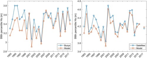
Figure 3.5.2. (a) POT threshold: 1993–2020 long-term 99th percentile of SWH (m) and 1993–2020 average of (b) annual number of events exceeding the 99th percentile, (c) their average intensity (m) and (d) their average duration (hours); (e) 1993–2020 trends of the annual 99th percentile SWH, (f) the annual number of events exceeding the long-term 1993–2020 99th percentile, (g) their average intensity and (h) their average duration. Areas of statistically significant trends at the 5% significance level are within grey contours. The numbers shown in plot (a) denote regions and are used in .
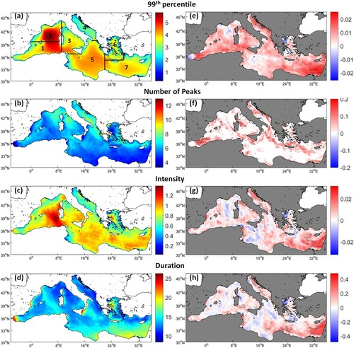
Figure 3.5.3. 1993–2020 inter-annual variability of the annual number of events exceeding the long-term 1993–2020 99th percentile SWH, their average intensity and duration, computed for the sub-regions of the Mediterranean Sea defined in (a) (relevant numbers in (a) are shown in front of the name of the sub-region on the right side of the panels in ).
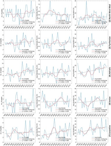
Figure 3.6.1. (a) Spatial distribution of the SST warming during the periods: 1982–1993, 1994–2005, 2006–2017 and 2017–2020. The uneven length of the periods was chosen so as to highlight the different phases in the change. Note the temporal difference in the colourbar. (b) Yearly values of the spatially averaged SST anomaly with trends (at 95% confidence level) per individual period (coloured lines) and for the whole-time span (black dotted line). (c) Boxplot representing the SST anomaly variation for each year: on each box, the central mark indicates the median, and the bottom and top edges of the box indicate the 25th and 75th percentiles, respectively. The whiskers extend to the most extreme data points not considered outliers, and the outliers are plotted individually using the ‘+’ symbol. All graphical representations are based on the satellite-derived SST CMEMS products (Ref. No. 3.6.1 and 3.6.2).
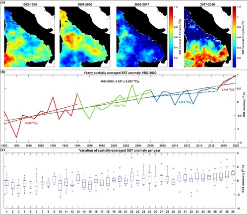
Figure 3.6.2. (a) Hovmöller diagram (left) and intra-annual variations (right) of the spatially averaged SST per year, indicating significant changes in the seasonal cycle during 1982–2020. The monthly SST variations of the coldest year (1984), the three warmest years (2018, 2019, 2020) and the year of the European heatwave (2003) are highlighted for comparison with blue, shades of red and yellow, respectively. (b) SST phenology changes over the study area for the 39-year study period, showing the trend (at 95% confidence level) of the summer days (top), the summer onset (middle) and the trend of the summer end (bottom) based on the satellite-derived SST CMEMS product (Ref. No. 3.6.1 and 3.6.2).
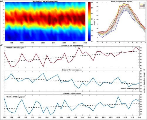
Figure 3.6.3. Time series of the annual basin-wide-averaged MHW (red) and MCS (blue) metrics together with their linear trends for the whole-time span (dotted line). These metrics were calculated following Hobday et al. (Citation2016) and Schlegel et al. (Citation2017) based on the daily satellite-derived SST CMEMS products (Ref. No. 3.6.1 and 3.6.2). Mean values are in units of annual event count (frequency), days (duration and total number of days with anomalous temperatures) and °C days for the integrated temperature anomaly during the event, equivalent to the sum of all daily intensity values (cumulative intensity). Trends (at 95% confidence level) are in the same units as the mean, per year.
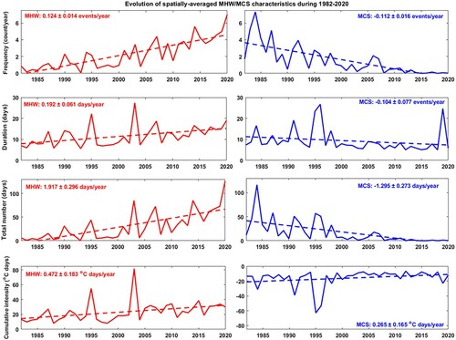
Figure 3.6.4. (a) Reported occurrences of extreme weather events (ESWD Ref. No. 3.6.4) in the coastal area (up to 0.5 degrees from the coastline) of the Tyrrhenian Sea. (b) Yearly values of the spatially averaged SST anomaly (CMEMS Ref. No. 3.6.1 and 3.6.2) indicating negative and positive anomalies with blue and red colours, respectively. (c) Yearly values of the spatially averaged convective available potential energy (CAPE) indicating the evolution of the mean atmospheric instability that can be used to assess the potential for the development of convection leading to severe weather events (ERA 5 Ref. No. 3.6.3). (d) Spatial distribution of the ESWD severe weather events associated with fatalities during the last 4 decades. Each circle represents the geographic location of an extreme event that caused fatalities, while the size indicates the severity (number of fatalities) and the colour the specific type of the event (ESWD Ref. No. 3.6.4). (e) Percentage of each extreme weather type that caused fatalities across the selected area during 1982–2020 based on reports from the European Severe Weather Database (ESWD Ref. No. 3.6.4).
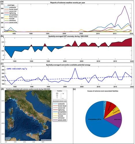
Figure 3.7.1. Correlation plot for the biogeochemical dynamics in the Ionian Sea. ‘Summ’ is computed as the sum of June, July and August concentrations, while ‘Wint’ is the sum of January, February and March values. Chl is for chlorophyll (mg/m3), phy is for phytoplankton carbon biomasses (mgC/m3), PO4 is for phosphate (mgP/m3), NOx is for nitrate and nitrite (mgN/m3), TRIX is a trophic index calculated as (Vollenweider et al. Citation1988), Temp is water temperature and Sal is salinity. Significance levels: ‘***’ = 0, ‘**’< 0.001, ‘*’< 0.01, ‘▪’< 0.05, ‘·’ n.s.
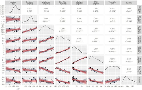
Table 3.7.1. Synthesis of the correlation coefficients between winter nutrient concentrations and summer phytoplankton biomasses and chlorophyll concentrations, and fish landings for Mediterranean Sea sub-basins. Grey numbers indicate non-significant correlations.
Table 3.7.2. Significant regressions for Mediterranean Sea sub-basins from the multiple regression analysis carried out with Chlorophyll, Phytoplankton biomass, landings data and CMEMS biogeochemical variables.
Figure 3.7.2. Annual variability of winter surface contents in the different Mediterranean sub-basins, relative to each sub-basin climatological value.
Figure 4.1.1. Portus in-situ station in the Gloria’s impact region. M stands for sea level gauge, B for Buoy and R for HF-radar. Codes stand for M1-Gandía, M2-Valencia, M3-Sagunto, M4-Tarragona, M5-Barcelona, M6-Formentera, M7-Ibiza, M8-Palma de Mallorca, M9-Alcudia, R1-Vinaroz, R2-Alfacada, R3-Salou, B1-Valencia, B2-Tarragona (coastal), B3- Tarragona (deep water), B4-Begur, B5-Dragonera, and B6-Mahón. SOCIB’s HF radars are marked as R4 and R5. CMEMS data product ref-4.1.5.
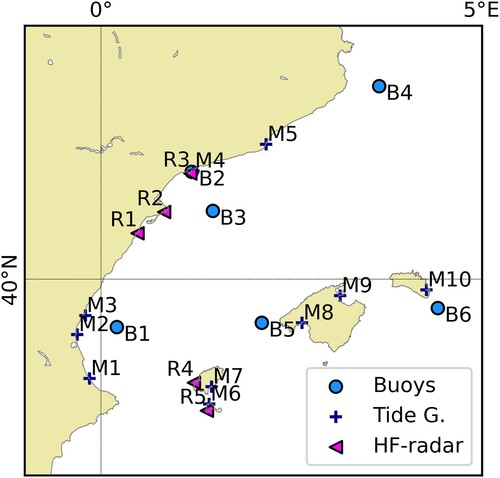
Figure 4.1.2. Maximum values recorded during the Gloria event for the different ocean variables. Upper left panel shows significant wave data, upper centre Mean wave period, upper right current speed, lower left sea level residual and lower right high frequency sea level oscillations amplitude. CMEMS data product ref-4.1.5.
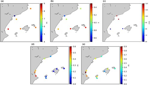
Figure 4.1.3. Map of the significant wave height field provided by the forecast wave system during Gloria at: 2020-01-20 02 UTC (a), 2020-01-20 06 UTC (b), 2020-01-20 13 UTC (c) and 2020-01-21 00 UTC (d). They coincide with the storm peak measured at Dragonera, Valencia, Tarragona and Begur respectively. Product ref-4.1.7.
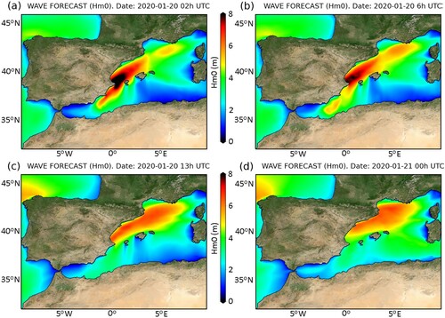
Figure 4.1.4. Infragravity band energy (30 s – 5 min band) at the tide gauge vs Tm02 at the closest buoy for the historical tide gauges record. The historical maximum energy in this band was recorded in Valencia, Sagunto and Ibiza during Gloria (circles). Colour code represents the significant wave height. All data from product ref-4.1.5., except 2 Hz data from ref-4.1.7.
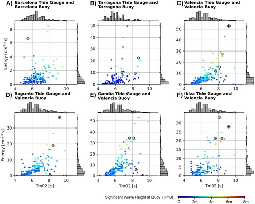
Figure 4.1.5. Daily average WMOP surface currents (cm/s) for the pre-storm (18 January 2020), storm (20 January 2020) and post-storm (23 January 2020) conditions. The arrows and the colour indicate the direction and the magnitude of the currents, respectively. Data product 4.1.6.
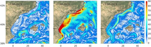
Figure 4.1.6. Upper panel shows the observations of the HF radar during Gloria event (daily means). Lower panels the comparison of hourly surface current speed (A) and direction (B) provided by B3 buoy (red) and HF radar (blue) at the closest grid point, for January 2020. CMEMS data product ref-4.1.5.
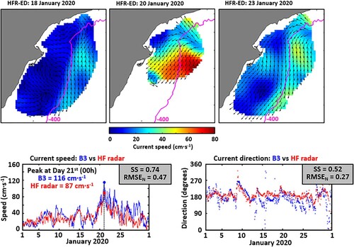
Figure 4.2.1. Arctic Ocean sea-ice conditions (concentration, thickness, and drift) in selected months during 2020. In the left column is shown the monthly averaged sea-ice values and in the right column is shown the monthly anomalies of each of the sea-ice properties with respect to the reference period 2010–2019. In the left column, the SST anomaly (red-blue scale, product 4.2.4) is included over the ice-free regions. (A, B) Sea-ice concentration (greyscale, product 4.2.1) with sea-ice drift (arrows, product 4.2.2) superimposed, July 2020. (C, D) Same as (A, B), but for September 2020. (E, F) Sea-ice drift (product 4.2.2) on top of the sea-ice thickness (blue scale, product 4.2.3), October 2020. (G, H) Same as (E, F), but for December 2020. The grey box indicates the Laptev Sea region for computation of the sea-ice extent index in . The grey line indicates the position of the Laptev transect for .
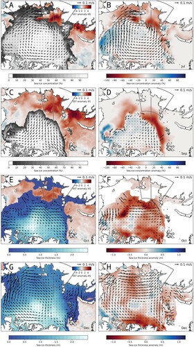
Figure 4.2.2. (A) Modelled sea-ice thickness anomalies in June 2020 (in standard deviations from the reference period 2010–2019), based on product 4.2.5 (2010–2019) and 4.2.6 (2020). (B) 10 m wind divergence (colour) and wind speed and direction (arrows) in July 2020, from ERA5. (C) Net downward shortwave radiation anomaly in July 2020 relative to the reference period 2010–2019 (in standard deviations), from ERA5. (D) Modelled surface layer salinity anomaly in August 2020 relative to the reference period 2010–2019, based on product 4.2.5 (2010–2019) and product 4.2.6 (2020). Grey box shows the area used to calculate the sea-ice extent index in (). Grey line shows the Laptev transect.
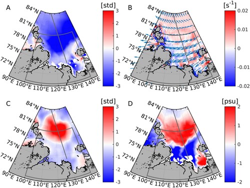
Figure 4.2.3. Monthly density anomalies (kg/m3, product 4.2.6 for 2020 values and product 4.2.5 for the reference period) in the Laptev transect, for September (A) and December (B). See transect location outlined in . Thin black and red lines show the monthly MLD (Equation 2) for the reference period (2010–2019) and in 2020, respectively. The thick, broken line at the surface represents the sea-ice extent (in the model defined as sea-ice concentration > 30%); black when ice occurred both in 2020 and in the reference period, and red when ice occurred in the reference period but not in 2020.
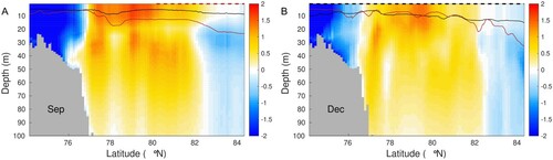
Figure 4.2.4. Top: Modelled monthly Brunt-Väisälä frequency (N2, Equation 3), potential temperature Θ and salinity S using the surface layer and the 100 m depth averaged over the region of 78°N–81°N in the Laptev transect (see outline in ). Blue line shows the reference average (2010–2019; product 4.2.5). Red line shows the values in 2020 (product 4.2.6). Insets: Average Θ-S properties in the surface layer (stars) and at 100 m depth (triangles) during the reference period (blue) and in 2020 (red). Bottom: Observed daily sea-ice extent in the Laptev Sea as a fraction of the total Laptev area; red represents the sea ice in 2020 and blue represents the averaged sea-ice extent in the reference period 2010–2019 (blue). Based on data from OSI SAF climate data record (product 4.2.1). Note, that the ticks on the x-axis represent the midpoint of the month.
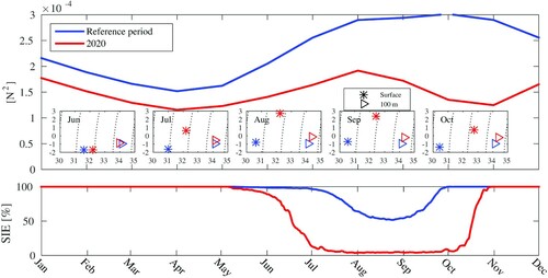
Figure 4.2.5. Northern Hemisphere primary production during 2020, with monthly estimates (in mgC.m-2.d-1, left column) and monthly anomalies with respect to reference period 2010–2019 (in %, right column). Observations are given for (a, d) July, (b, e) September, and (c, f) October. White region represents the polar data gap due to glint or sun zenith angle.
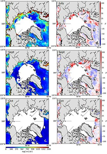
Figure 4.3.1. (a) ORAS5 SST mean anomalies (in degree C) for April–November 2020. Contours of number of days of MHW in 2020 are superimposed (50-day contour interval). The black box delimits the NEP area: 140-160W/35-50N; (b): Timeseries of both ORAS5 (solid lines) and OSTIA (dashed lines) daily SST in 2020 in the NEP area (black), the daily mean (blue) and 90th percentile (red) over the 1993–2016 reference period, respectively. MHW events in ORAS5 are shaded in red; (c) anomalies of inferred net surface heat flux combining CERES-EBAF (shades in W/m2), ERA5 mean sea level pressure (contours in hPa, 2hPa contour interval), 10-m wind (arrows in m/s) averaged over January–March 2020; (d) ORAS5 mixed-layer depth mean anomalies for April 2020. All anomalies are computed with respect to 1993–2016 reference period.
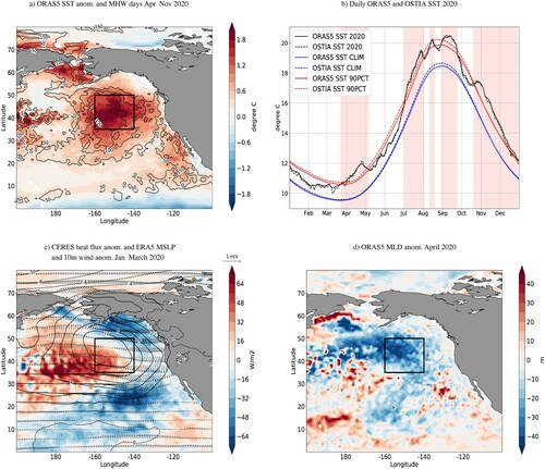
Figure 4.3.2. (a) Average in NEP of the number of days of both moderate and strong 2020 MHW events during the MAM, JJA and SON seasons in both ORAS5 reanalysis (bars) and SEAS5 forecast ensemble mean (diamonds) and spread (error bars); (b) Same as (a) for the maximum amplitude (in degree C) of the 2020 MHW; (c) MHW seasonal forecast probabilities for MAM, JJA and SON 2020; (d,e) 2011–2020 timeseries of the total number of MHW days and the maximum amplitude (in degree C), respectively, of MHW events during the MAM, JJA and SON seasons for both ORAS5 and SEAS5 ensemble mean and spread. Both the spatial averaging over the NEP grid points and the computation of the ensemble mean can lead to numbers of MHW days below 1 day as grid points and/or ensembles that do not show any MHW are taken into account. In some cases, the ensemble spread can be larger than the ensemble mean (for example in 2018, where the distribution is skewed toward large values) and thus include negative values of number of MHW days.
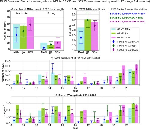
Figure 4.3.3. (a) Depth-time plot of the ORAS5 (product ref 1.3.1) monthly potential temperature anomalies in NEP (colour-shaded) for the period 2011–2020. The solid grey line is the timeseries of ORAS5 monthly mixed-layer depth (MLD, in m); (b) monthly anomalies of potential temperature averaged in the layer 0–200 m (in degree C) for both ORAS5 (black) and the JMA dataset (red); (c) monthly anomalies of ORAS5 MLD (in m, blue) and Brunt-Vaisala frequency at 120 m (in s-1, green); (d) monthly anomalies of ERA5 10-m wind speed (in m/s, black) and mean sea level pressure (in hPa, blue) and of the net flux (in W/m2) from CERES-EBAF. The periods shaded in light red and blue correspond with the triggering and the end, respectively, of the MHW events discussed in the main text. All anomalies are computed with respect to 1993–2016 reference period.
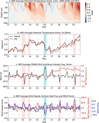
Figure 4.4.1. (a) The Baltic Sea and its division into the different regions used in this study. The black dashed lines show the boundaries between the regions. The spatial distribution of the share of error points of the sum of data points belonging to the clusters k = 2 and k = 4 relative to the number of all data points at each grid cell (i,j) on the ferry routes along which the measurements were made. The colourbar shows the share of the sum of data points belonging to the clusters k = 2 and k = 4 to the sum of the all data points in the respective grid cell (i,j). The stars mark the start and end of the ferry routes (product ref. 4.4.2, 4.4.4). (b) The distribution of the error clusters for K = 4. The colourmap shows the logarithmic distribution of the number of salinity and temperature error pairs (model minus observation) in the 2-dimensional error space. Error bins have a resolution of 0.5°C for temperature and 0.5 g kg−1 for salinity.
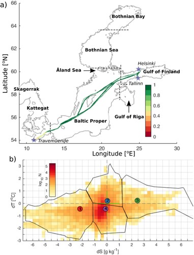
Table 4.4.1. The bias, root-mean-square error (RMSE), standard deviation (STD) and correlation coefficient (Corr) for each of four clusters (product ref. 4.4.2, 4.4.4).
Figure 4.4.2. Time series of upper layer (0–50 m) ocean heat content (red), maximum ice extent (black) and maximum ice volume (blue) anomalies in the Baltic Sea in winter (December–February) (product ref. 4.4.1, 4.4.3, 4.4.6). The dashed line shows the trendline of upper layer ocean heat content anomaly over the period of 1993–2014 and the shaded area shows its 95% confidence level. The anomalies are calculated relative to the climatological winter (December–February) mean values. The climatological period is 1993–2014.
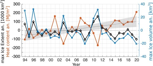
Figure 4.4.3. (a) Spatial distribution of upper layer (0–50 m) ocean heat content anomaly in the Baltic Sea in winter 2019/20 (December–February) (product ref. 4.4.2). The anomalies are calculated relative to the climatological (1993–2014) winter (December–February) mean spatial distribution (product ref. 4.4.1). The black contour corresponds to 211 MJ/m2 ocean heat anomaly isoline. (b) The upper 50 m layer average temperature in the Baltic Sea in winter 2019/20 (December–February) (product ref. 4.4.2). (c) The number of ice days (sea ice concentration >0.15) anomaly in winter 2019/20 (December–February) (product ref. 4.4.3) compared to the climatological number of days during the ice season October–May. Black contours correspond to the climatological number of sea ice days.
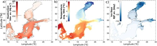
Figure 4.4.4. Spatial distribution of winter (DJF) climatological mean (1993–2014) total surface energy budget (a), total surface energy anomaly in winter 2019/20 (b), shortwave radiation anomaly in winter 2019/20 (c), longwave radiation anomaly in winter 2019/20 (d), latent heat anomaly in winter 2019/20 (e) and sensible heat anomaly in winter 2019/20 (f) in the Baltic sea region. The heat fluxes are positive downward.
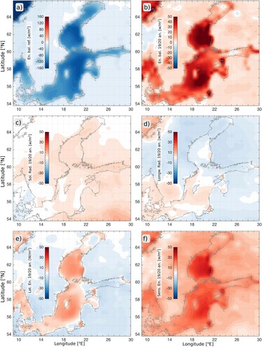
Table 4.4.2. Horizontal mean heat content anomaly (HC), surface energy balance anomaly (En) and corresponding heat (EnH) left in the sea over the three month period for the Baltic Sea subbasins in winter (DJF) 2019/20 (see ) (product ref. 4.4.1, 4.4.2).
Figure 4.4.5. (a) Time series of winter (December–February) mean NAO index. (b) Time series of winter mean (December–February) AO index. (c) Combined proxy-in-situ-airborne-satellite derived time series of the maximum annual ice extent of the Baltic Sea (left panel) and its distribution during 1991–2020 and the second mildest 30-year period in 1909–1938 (right panels).
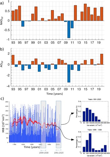
Figure 4.5.1. Maps of surface fields from 16th to 18th of September (every 12 h): left panels: sea level (m); central panels: sea surface current (m/s) and direction; right panels: significant wave height (m) and direction. The path of the low pressure centres is also provided (black line), from 16th September at 12.00 (n. 1) to 18th September at 00.00 (n. 9) every 6 h. Products ref.: 4.5.1, 4.5.2 and 4.5.8.
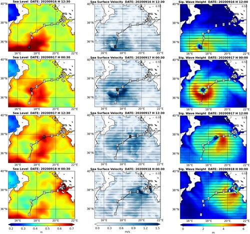
Figure 4.5.2. Top-left panels: time series of sea level measured at Katakolon Tide Gauge (black line, Prod. Ref. 4.5.5), evaluated from the MedFS model (blue lines: solid line is the total SSH and the dashed line represents the surge contribution, Prod. Ref. 4.5.1), and from a High-Resolution unstructured model (red line, Prod. Ref. 4.5.4). Top-right panel: model topography, Katakolon Tide Gauge position (red circle), HR-model domain (black rectangle) and offshore (green) and coastal (yellow) areas impacted by Ianos Medicane. Central panels: SST (°C) anomaly between 19th September (after Ianos) and 14th (before Ianos) from model data (left, Prod. Ref. 4.5.1) and satellite (right, Prod. Ref. 4.5.6) including the Medicane Ianos path (black line). Bottom panels: comparison between modelled significant wave height (SWH, coloured area, Prod. Ref. 4.5.2) and satellite measurements (inset circles, Prod. Ref. 4.5.7) on 17th September, the inner figures depict the corresponding time series of measured (black) and modelled (blue) wave height along the satellite track.
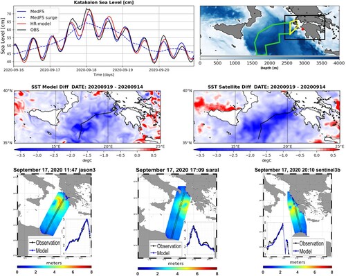
Table 4.5.1. Significant wave height model skill on 17 September 2020 compared to Jason3, Saral and Sentinel 3B satellite tracks.
Figure 4.5.3. September–mid-October 2020 daily evolution of: vertical eddy diffusivity (a), vertical velocity (b), mean temperature in the layer 1–140 m (c), nitracline depth (d), mean nitrate in the layer 0–140 m (e), vertical integrated primary production (f), depth of the deep chlorophyll maximum (DCM; g), surface chlorophyll (h), mean chlorophyll in the layer 0–140 m. Each variable is evaluated in three different areas: off-shore impacted areas (green), in-shore impacted areas (yellow) and off-shore Ionian Sea not impacted by Ianos (blue). Lines and shadow areas are the median and the interquartile range; the vertical dashed red lines correspond to the initial and final dates of the event. Prod. ref. 4.5.1 and 4.5.3.
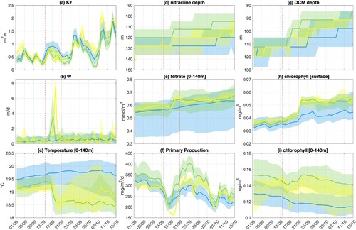
Figure 4.6.1. (a) Temperature measurements from buoy (product 4.6.1) and satellite (product 4.6.3) data at the fixed 61277 platform location (35.73°N–25.13°E) during May 2020. Blue marks stand for daily mean buoy SSTs at 1 m and the associated bars define the corresponding diurnal range. Orange marks represent mean daily water temperature at 20 m from the same buoy. Green dots represent the satellite nighttime SST. Dashed purple line shows the mean daily wind speed evolution throughout the event. (b) Application of the Hobday et al. (Citation2016) methodology for the May 2020 MHW detection at the same location as in (a), using historical and NRT SST data from products 4.6.2 and 4.6.3, respectively (c) Temperature profiles from Argo float 6902847. Different colours (blue, red, purple) represent different time periods relative to the MHW evolution (before, during and after, respectively). The path followed by the float within the days considered in this graph extends from 34.83°N–22.71°E (May 6) to 34.43°N–22.95°E (May 26).
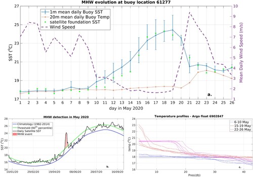
Figure 4.6.2. (a) Maximum MHW intensity (maximum SST anomaly with respect to local climatology for each calendar day) during May 2020; (b) Day in May 2020 when maximum MHW intensity occurred (c) Categorisation of MHW conditions at 18 May in the eastern Med using the continuous Severity Index (SI) following Gupta et al., 2020. SI ranges (1–2], (2,3], (3,4] and higher than 4 correspond to Moderate, Strong, Severe and Extreme MHW categories, respectively. Triangles mark the 61277 and HERAKLION buoys locations (offshore and coastal, respectively). In all panels, non-coloured sea grid points of the domain stand for no MHW conditions.
![Figure 4.6.2. (a) Maximum MHW intensity (maximum SST anomaly with respect to local climatology for each calendar day) during May 2020; (b) Day in May 2020 when maximum MHW intensity occurred (c) Categorisation of MHW conditions at 18 May in the eastern Med using the continuous Severity Index (SI) following Gupta et al., 2020. SI ranges (1–2], (2,3], (3,4] and higher than 4 correspond to Moderate, Strong, Severe and Extreme MHW categories, respectively. Triangles mark the 61277 and HERAKLION buoys locations (offshore and coastal, respectively). In all panels, non-coloured sea grid points of the domain stand for no MHW conditions.](/cms/asset/e570346b-91fc-4030-b16c-62250d5907d3/tjoo_a_2095169_f0090_oc.jpg)
Figure 4.6.3. Hovmöller diagram for CMEMS SST (a), ERA5 air temperature at 3 m (b), CMEMS wind speed (c) and ERA5 latent heat flux (d). For all parameters, diagrams depict daily mean values for the period 1–31 May 2020, averaged for the latitudinal zone 33.5°N–37°N.
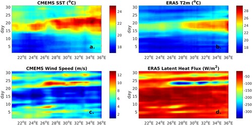
Figure 4.7.1. Schematic representation of the surface currents and water mass flux (orange and light blue shaded arrows) during the NIG (a) anticyclonic (b) cyclonic modes, superimposed on the geographical location of salinity profiles in the SAP colour-coded by time derived from (a) the historical dataset (Ref. No. 4.7.6) and (b) Argo floats (CMEMS product Ref. No. 4.7.5). (c) Salinity time series in the sub-surface (100–200 m; blue symbols) and intermediate (200–800 m; red symbols) layers; grey and yellow shaded areas highlight the anticyclonic and cyclonic NIG circulation modes, respectively; red continuous lines are the salinity trends for each mode in the intermediate layer. (D) Time series of the spatially averaged current vorticity (black line) and low-pass filtered (13 months) current vorticity (red line) computed in the Northern Ionian Sea (37–39°N; 17–19.5°E; black dashed rectangle in (a)). The temporal phases of the NIG are defined as anticyclonic when the vorticity field is negative and cyclonic when the vorticity field is positive. (E) Time series of the meridional components of the volume transport across the South Greek Transect (SGT) and the North Greek Transect (NGT) shown in panel (a). Acronyms: OC – Otranto Channel; SAP – South Adriatic Pit; NIG – Northern Ionian Gyre; WAC – Western Adriatic Current; EAC – Eastern Adriatic Current; MIJ – Mid-Ionian Jet; PG – Pelops Gyre; IG – Ierapetra Gyre; AW – Atlantic Water; LDW – Levantine Surface Water; LIW – Levantine Intermediate Water.
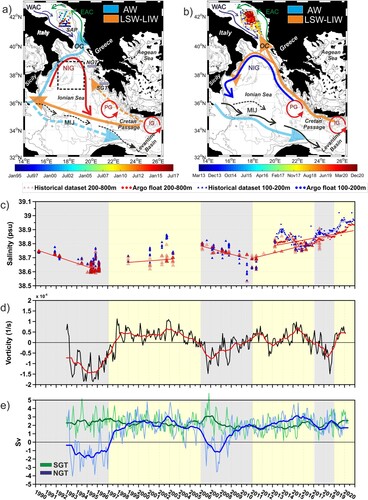
Figure 4.7.2. Mean velocities associated with the horizontal volume transport in bins of 0.25°×0.25° derived from satellite altimetry (CMEMS products Ref. No. 4.7.1 and 4.7.2; the product Ref. No. 4.7.1 is an improvement of the product Ref. No. 4.7.2, based on a more accurate Mean Dynamic Topography, currently available from April 2019; for more details see Taburet et al. Citation2019), integrated from the surface to 100 m depth, superimposed on mean salinity patterns (153 m depth; CMEMS products Ref. No. 4.7.3 and 4.7.4) for the years (a) 2017, (b) 2018, (c) 2019, (d) 2020.
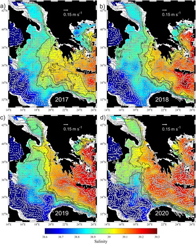
Figure 4.7.3. Trajectories of (a) drifter IMEI 300234065616590 and of (b) Argo float WMO 6902848 colour-coded by time. (c) Contour diagram of salinity collected by the float WMO 6902848. (d) T/S diagram of the float profiles collected in the SAP coloured by time. CMEMS product Ref. No. 4.7.5.
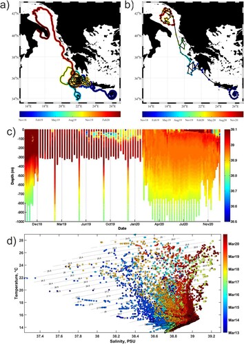
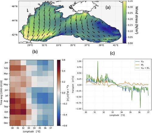
Figure 4.8.1. Top panel: Locations of the available meteorological stations (product ref 4.8.3) and the orange dot is the location of the sample time series. Middle panel: Time series of SST from sample observation (black stars, product ref 4.8.2) and reanalysis ocean model (red lines, product ref 4.8.1) for the all-available period 2013–2020. Bottom panel: Time series of SST from observation (black stars, product ref. 4.8.2) and reanalysis ocean model (red lines, product ref 4.8.1) for only 2018. Right column: Model SST bias for the all stations from west to east shown in the top panel.
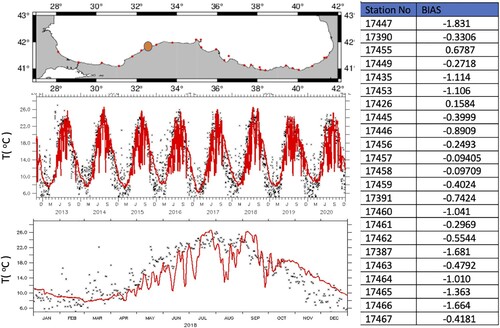
Figure 4.8.2. Top: Locations of the six stations around the upwelling region. Time series of June to September averaged mean surface temperature (black line) and cross-shore Ekman Transport (blue line) for the above six stations from left to right. The correlation coefficient between SST and Ekman transport is given by p. The trends are shown with the dashed lines.
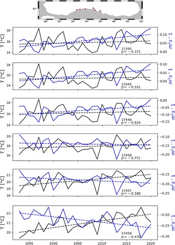
Figure 4.8.3. (a) Averaged wind stress. (b) Hovmöller plot of mean total Ekman transport per bin of longitude per month. (c) zonal Ekman transport component (Vek), Ekman pumping (We), coastal upwelling + Ekman pumping (tot Ek) along the Turkish coast (longitude).