
Figures & data
Figure 1. Image of US-INg’s location relative to the highway to the east and the Forest and suburban neighborhood to the west. The image also includes an approximation of the tower’s footprint during daylight and nighttime hours, made using Kljun et al. footprint model [Citation43].
![Figure 1. Image of US-INg’s location relative to the highway to the east and the Forest and suburban neighborhood to the west. The image also includes an approximation of the tower’s footprint during daylight and nighttime hours, made using Kljun et al. footprint model [Citation43].](/cms/asset/ad9f5cb8-02f9-4d44-9e84-aaf173fc022e/tcmt_a_2365900_f0001_c.jpg)
Table 1. Characteristics Of US-INg. The domain covers 2 square kilometers centered around US-INg, divided into Eastern and Western halves.
(Cont.).
Figure 2. Average percent reductions in google mobility data relative to baseline levels in Marion County, Indiana, separated into categories based on the type of destination of the user [Citation1]. Blue circles represent reduction in trips to places of work, red vertical lines represent mobility reduction to users’ homes, pink crosses represent mobility reduction to public transit stations like bus stops and metro platforms, the black stars represent mobility reduction to restaurants, shops, theaters, etc., and the green diamonds represent mobility reduction to grocery stores, pharmacies, specialty food stores, etc [Citation1]. The baseline level is the median value from the period between January 3 and February 6 for each day of the week [Citation1]. The tick marks on the x-axis show the end of the pre-lockdown period (March 3), the beginning of the lockdown period (March 25), and the ending of the lockdown period (May 5).
![Figure 2. Average percent reductions in google mobility data relative to baseline levels in Marion County, Indiana, separated into categories based on the type of destination of the user [Citation1]. Blue circles represent reduction in trips to places of work, red vertical lines represent mobility reduction to users’ homes, pink crosses represent mobility reduction to public transit stations like bus stops and metro platforms, the black stars represent mobility reduction to restaurants, shops, theaters, etc., and the green diamonds represent mobility reduction to grocery stores, pharmacies, specialty food stores, etc [Citation1]. The baseline level is the median value from the period between January 3 and February 6 for each day of the week [Citation1]. The tick marks on the x-axis show the end of the pre-lockdown period (March 3), the beginning of the lockdown period (March 25), and the ending of the lockdown period (May 5).](/cms/asset/1b4b1daf-4494-4cb4-9252-b038d2b80023/tcmt_a_2365900_f0002_c.jpg)
Figure 3. Average hourly weekday emissions observed when winds coming from the west sector (a–d) and the east sector (e–h). The pre-lockdown fluxes are in red and lockdown period fluxes are in blue. The RCO used to extrapolate from CO to CO2ff for the data in these graphs is the value from Turnbull et al. [Citation21]. Error bars represent standard error.
![Figure 3. Average hourly weekday emissions observed when winds coming from the west sector (a–d) and the east sector (e–h). The pre-lockdown fluxes are in red and lockdown period fluxes are in blue. The RCO used to extrapolate from CO to CO2ff for the data in these graphs is the value from Turnbull et al. [Citation21]. Error bars represent standard error.](/cms/asset/82f0e743-fcd7-4f7b-ba9a-81c9e6f96dec/tcmt_a_2365900_f0003_c.jpg)
Table 2. Reductions in average fluxes from pre-lockdown to lockdown (Δ µmol m−2 s−1) and percent reductions shown in parentheses (Δ%). Percent reduction is defined here as 100*|(pre-lockdown average – lockdown average)/pre-lockdown average|. Average fluxes are computed by averaging the average hourly fluxes of each period. An RCO value of 8 ppb ppm−1 was used for flux disaggregation [Citation21]. Uncertainties are standard errors of the mean values.
Figure 4. Bar graph representing the number of datapoints used to calculate the average emissions for each hour of the weekday in each period (pre-lockdown and lockdown) and sector (east and west).
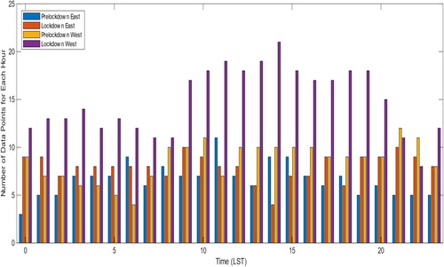
Figure 5. Daily cycles of total CO2 emissions estimated by Hestia from (a) west sector and (b) east sector. Error bars represent standard error.
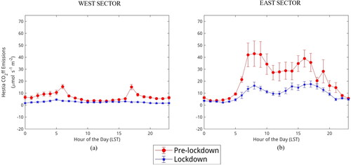
Table 3. Reductions for the major individual sources that contribute to the Hestia emissions estimate. Absolute reductions in µmol m−2 s−1, percent reduction shown in parentheses. Uncertainties represent standard error.
Table 4. Correlations between average daily cycles from US-INg results and Hestia results. Correlation is significant if p < 0.05.
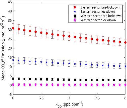
Figure 6. Mean CO2ff emissions (excluding weekends) for each period in each sector vs. RCO. Error bars represent standard error.
Data availability statement
The eddy-covariance data used for this research are available at https://doi.org/10.26208/2YQZ-5S85. The CO and CO2 mole fraction measurements are available at https://doi.org/10.18113/D37G6P. The Hestia model data are available at https://doi.org/10.26208/H62J-4004.