Figures & data
Figure 1. Map of the selected study locations in Mosul (Station I) and Baghdad (Station II).
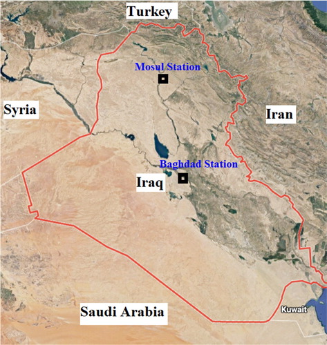
Figure 2. Model structures for: (a) CART; (b) CCNN; (c) SVM.
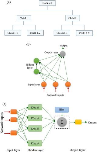
Table 1. The statistical performance metrics of the applied CART model over the training and testing phases at Station I in Mosul.
Table 2. The statistical performance metrics of the applied CCNN model over the training and testing phases at Station I in Mosul.
Table 3. The statistical performance metrics of the applied GEP model over the training and testing phases at Station I in Mosul.
Table 4. The statistical performance metrics of the applied SVM model over the training and testing phases at Station I in Mosul.
Table 5. The statistical performance metrics of the applied CART model over the training and testing phases at Station II in Baghdad.
Table 6. The statistical performance metrics of the applied CCNN model over the training and testing phases at Station II in Baghdad.
Table 7. The statistical performance metrics of the applied GEP model over the training and testing phases at Station II in Baghdad.
Table 8. The statistical performance metrics of the applied SVM model over the training and testing phases at Station II in Baghdad.
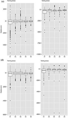
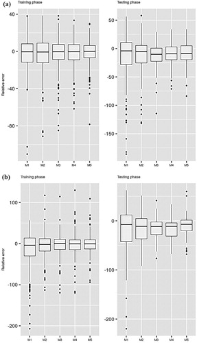
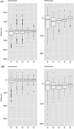
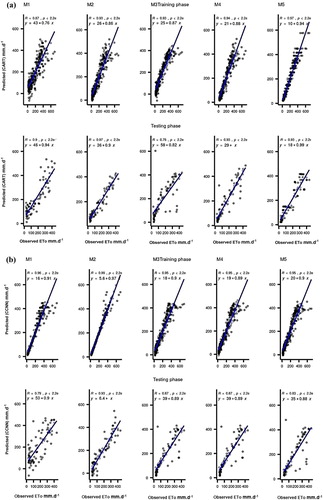
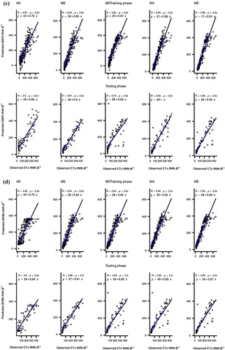
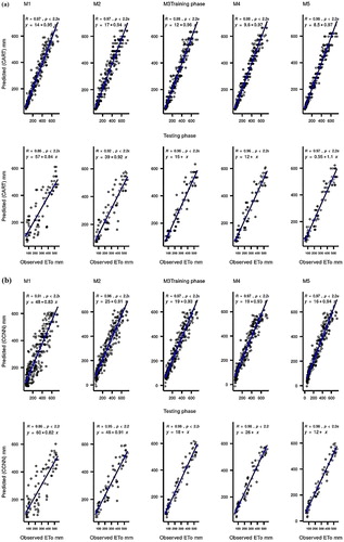
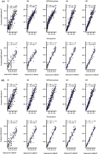
Figure 7. Taylor diagram visualizations for the performance of the applied predictive models at Station I: (a) CART; (b) CCNN; (c) GEP; (d) SVM.
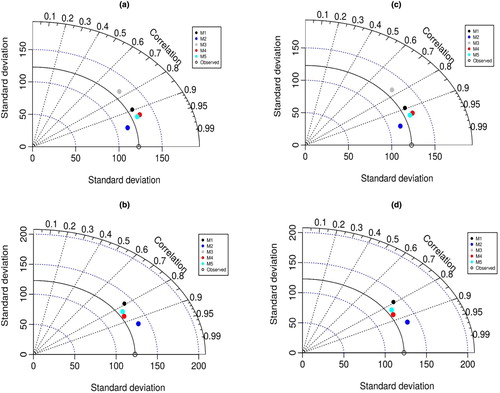
Figure 8. Taylor diagram visualizations for the performance of the applied predictive models at Station II: (a) CART; (b) CCNN; (c) GEP; (d) SVM.
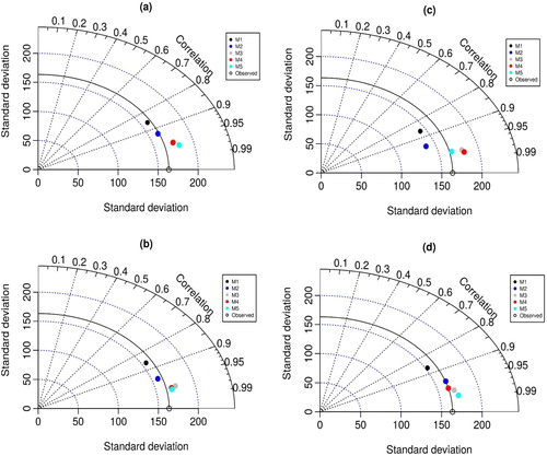
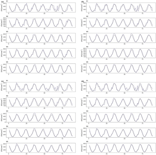
Figure 9. Time series data visualization between the performance of the applied predictive models (dark blue lines) and the observed evaporation process (black lines) at Station I: (a) CART; (b) CCNN; (c) GEP; (d) SVM.
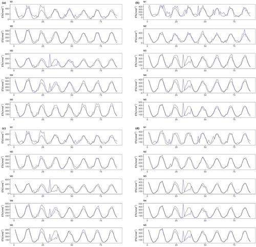
Figure 10. Time series data visualization between the performance of the applied predictive models (dark blue lines) and the observed evaporation process (black lines) at Station II: (a) CART; (b) CCNN; (c) GEP; (d) SVM.