
Figures & data
Figure 1. Within several serial intervals, simulated epidemics transition from exponential to sub-exponential growth in cases. (A) Cumulative Ebola cases, (B) log-normal plot of cumulative Ebola cases and (C) number of infectious individuals versus simulation day for different community sizes (C = {25, 51, 101, 201}). Each curve shows the average and standard error of the results of 100 simulations seeded with one infectious individuals on the 1st day.
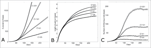
Figure 2. The transition from exponential to linear growth in a population with household-community structure is due to local saturation of communities. (A) Average saturation of the communities of infected individuals and (B) 14-day running effective reproductive number Re14 vs. simulation day for different community sizes (C={25, 51, 101, 201}). Each curve shows the average and standard error of the results of 100 simulations seeded with one infectious individuals on the 1st day.
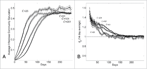
Figure 3. The endemic state of an epidemic moving through a network with household-community structure can be understood as a wave progressing at a fixed rate through the network. (A) The network location of all infected individuals versus simulation day in a single simulation (C = 101). The network location of an infectious individual is indicated as a darkened pixel at height (
the network distance of an infectious individual at node
from the initial infected individual at node
). (B) The number of infectious cases in the jth community vs. simulation day (j = 100, C = 101). The curve shows the average and standard error of the results of 100 simulations seeded with one infectious individuals on the 1st day.
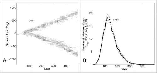
Figure 4. Country variation in the 5 month time period (March22nd-August 22nd) of the epidemic is consistent with either different community structures or different levels of background control. (A) Cumulative number of Ebola cases (gray curves) for the community size C and temporal shift for the first day of the outbreak that provides the best fit of the reported WHO data (filled black circles) from March 22, 2014 to August 22, 2014 while all other parameters were held constant. For Guinea, Sierra Leone and Liberia, optimal fits were found for community sizes C = {27,131,251}, respectively while the temporal shift predicted that the epidemic in each country began (i.e., simulation “Day 1”) on Dec 29th, 2013 for Guinea; April 15th, 2014 for Sierra Leone and March 5th, 2014 for Liberia. The (B) Cumulative number of Ebola cases (gray curves) for the level of epidemic control and temporal shift for the first day of the outbreak that provides the best fit of the reported WHO data (filled black circles) from March 22, 2014 to August 22, 2014 while all other parameters were held constant (C = 251). For Guinea, Sierra Leone and Liberia, optimal fits within the nearest 5% reduction were found for epidemic control levels , respectively while the temporal shift predicted that the epidemic in each country began (i.e., simulation “Day 1”) on Dec 30th, 2013 for Guinea; April 11th, 2014 for Sierra Leone and March 5th, 2014 for Liberia. Simulation results of cumulative Ebola cases results are shown as mean ± standard error of 100 simulations seeded with one infectious individual on the 1st day.
Figure 5. Comparing simulation output parameters for epidemics with varying community size or levels of epidemic control. (A) Epidemics with different community sizes cannot be well distinguished by the equilibrium community saturation. The equilibrium community saturation of infectious individuals versus simulation day for different community sizes (C = {27,131,251}). (B) Community saturation decreases with increasing levels of epidemic control. The equilibrium community saturation of infectious individuals vs. simulation day for different levels of epidemic control () for community size C = 251. (C) Epidemics with waves of comparable magnitude with lower levels of commuity saturation travel faster. The average distance of infectious individuals from the origin (location of the first infectious individual) verses simulation day for simulation parameters fitting Guinean case data with either large commuity size and high control (C = 251, β0 = 0.3) or lower community size and lower control (C = 27, β0 = 0.0). Curves shows the average and standard error of the results of 100 simulations seeded with one infectious individual on the 1st day.
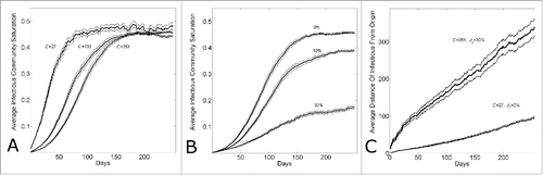
Figure 6. The effect of epidemic control during an epidemic with household-community structure on the wave dynamics. The dotted vertical line indicates the simulation day (k=280) when epidemic control is applied. (A) The number of infectious individuals, (B) the average infectious community saturation and (C) the running 2-week reproductive number Re14, per simulation day as the level of epidemic control on the kth day is varied ( for community size C=251. Curves shows the average and standard error of the results of 100 simulations seeded with one infectious individuals on the 1st day.
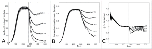
Figure 7. The effect of epidemic control to reduce the size of an epidemic wave. (A) The equilibrium number of infectious cases per day (measured on day k=480) versus the level of epidemic control . (B) The number of infectious cases per day vs. the simulation day as the community size is varied (C = {27,131,251}) for a fixed level of epidemic control
. For both panels, in all simulations, epidemic control is applied on the the kth day (k=280). Connected points in (A) and curves in (B) show the average and standard error of the results of 100 simulations seeded with one infectious individual on the 1st day.
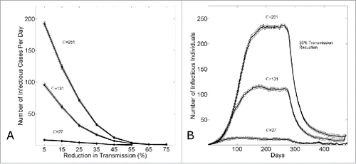
Figure 8. Two overlapping interaction neighborhoods for an arbitrary node (i,j) when the household size is H = 5 and the community radius Rc = 6. The depicted lattice corresponds to an
population of 130 individuals distributed among 26 households (5 individuals per household). An arbitrary node is indicated with a ‘∗’. The household interaction neighborhood for this node is the jth column of the lattice indicated in dark gray. The community interaction neighborhood for this node is the
sub-array of the lattice indicated with 2 shades of gray.
Table 1. Parameter values used in simulations. This table provides a description of each parameter used in simulations, the value or range that is used, and the reference source for the value that is used if applicable