Figures & data
Figure 1. Metabolomic profiling of D. rerio humoral fluid. A, Percent survival of D. rerio infected with PBS (control 1, PBS), boiled V. alginolyticus (8 × 10⁵ CFU/fish) (control 2, boiled), and sublethal dose of V. alginolyticus (8 × 10⁵ CFU/fish) (live). B, Bacterial number of survival and dying fish after bacterial challenge. C, Reproducibility of metabolomic profiling platform. Metabolite abundances quantified in cell samples over two technical replicates are shown. Correlation coefficient between technical replicates varies between 0.990 and 0.999. This plot shows the two replicates with the weakest correlation of 0.990. D, Representative total ion current chromatogram from control (saline), dying and survival samples. E, Category of the identified metabolites.
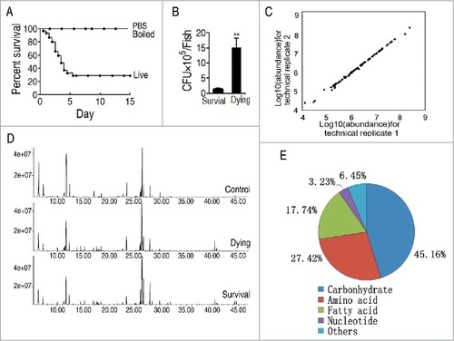
Figure 2. Differential metabolomic profiling between dying and survival groups in response to V. alginolyticus infection compared with control. A, Heat map showing differential metabolites. Green color and red color indicate increase and decrease of metabolites relative to the median metabolite level, respectively (see color scale). B, Z-score plot of differential metabolites based on control. The data of dying (left) and survival (right) groups were separately scaled to the mean and standard deviation of control. Each point represents one metabolite in one technical repeat and colored by sample types. C, Category of identified metabolites of differential abundance. D, Number of differential abundance of metabolites. E, Venn diagram for comparison of differential metabolites between the dying and survival groups.
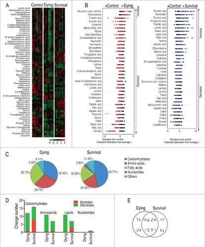
Figure 3. Identification of crucial metabolites. A, The PCA analysis of the control group, the dying group and the survival group. Each dot represents the technique replicates in the plot. t[1] and t[2] explain 98.7% of the total variance which allows confident interpretation of the variation. B and C, S-plot generated from OPLS-DA. Predictive component p[1] and correlation p(corr)[1] differentiate the survival from the control and the dying. Predictive component p[2] and correlation p(corr)[2] separate the control group from the dying group. Triangle represents individual metabolite, where potential biomarkers are highlighted with red, which is greater or equal to 0.05 and 0.5 for absolute value of covariance p and correlation p(corr), respectively. D, Comparison of the crucial biomarker malic acid among the control, the survival and the dying groups.
![Figure 3. Identification of crucial metabolites. A, The PCA analysis of the control group, the dying group and the survival group. Each dot represents the technique replicates in the plot. t[1] and t[2] explain 98.7% of the total variance which allows confident interpretation of the variation. B and C, S-plot generated from OPLS-DA. Predictive component p[1] and correlation p(corr)[1] differentiate the survival from the control and the dying. Predictive component p[2] and correlation p(corr)[2] separate the control group from the dying group. Triangle represents individual metabolite, where potential biomarkers are highlighted with red, which is greater or equal to 0.05 and 0.5 for absolute value of covariance p and correlation p(corr), respectively. D, Comparison of the crucial biomarker malic acid among the control, the survival and the dying groups.](/cms/asset/f07957fd-84fa-4595-8ed2-da86e66b89b9/kvir_a_1423188_f0003_oc.jpg)
Figure 4. Pathway enrichment. A and B, Pathway enrichment of varied metabolites in the dying group (A) and in the survival group (B). Significant enriched pathways are selected to plot. C, Integrative analysis of metabolites in significantly enriched pathways. Red color and green color indicate increased and decreased metabolites, respectively.
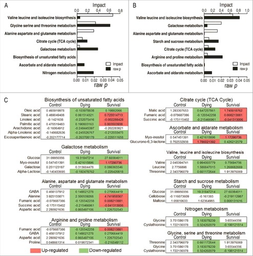
Figure 5. Comparative metabolic pathway analysis and enzyme activity measurement between the dying group and survival group. A, Analysis of the metabolic profiles resulting from D. rerio challenged with V. alginolyticus provides a better insight into the effects of 46 significant metabolites (p<0.05). Based on the KEGG compound (http://www.kegg.jp/kegg/compound/), metabolic network pathways in D. rerio are further analyzed with iPath2.0 (http://pathways.embl.de/iPath2.cgi). Red line represents increase in the survival group but decrease in the dying group; blue line represents increase in the dying group but decrease in the survival group; yellow line represents increase in both of the dying group and survival group; green line represents decrease in both dying group and survival group. B, Activity of PDH, KGDH and SDH in the control group, the dying group and the survival group.
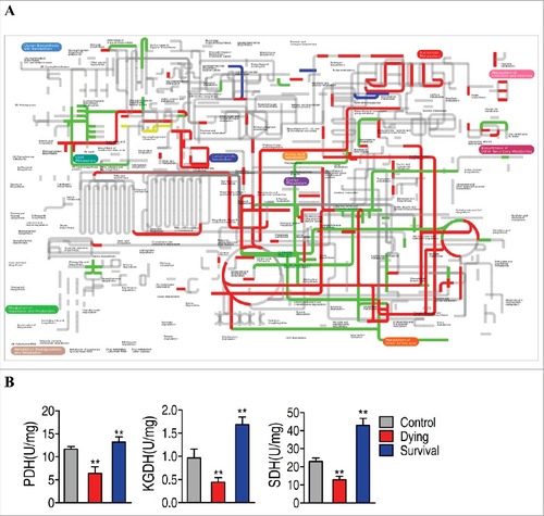
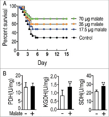
Figure 6. Percent survival of D. rerio challenged with V. alginolyticus in the presence or absence of the indicated dose of malate (A). Activity of PDH, KGDH and SDH in the presence or absence of exogenous malate (B).