Figures & data
Figure 1. Phylogenetic trees of 53 complete genomes of APPV. (a) Bayesian Inference tree of the APPV genomes reconstructed by MrBayes. Posterior probability values are shown at each node. (b) Maximum likelihood tree of the APPV genomes reconstructed by RAxML. Bootstrap support values are indicated on the tree as a percentage of 1000 replicates. The colored circular sectors indicate the three phylogroups among APPV strains. Phylogroups I, II, and III are represented in orange, green, and blue, respectively.
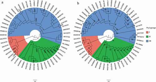
Figure 2. Principal component analysis (PCA) biplot diagram showing similarity and variation in codon usage pattern of APPV genomes. A PCA biplot is used for simultaneously displaying the genome CDSs of APPV and vectors of variables’ (lines) projection to the first two principal components. Biplot conducts on ten among most representative variables (codons) from all APPV strains. The direction and length of the arrows indicate how each codon contributes to the first two components in the biplot. Principal component 1 (Dimension 1) represents 27.8% of variation and principal component 2 (Dimension 2) represents 18.9% variation. Phylogroup I, II, and III are depicted using orange, green, and blue, respectively.
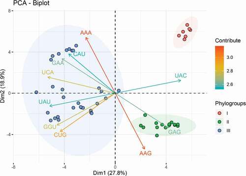
Table 1. Nucleotide composition of APPV complete genomes.
Figure 3. Dinucleotide abundance of the complete CDS of APPV. The different colors represent the different dinucleotides. Dinucleotides are regarded as underrepresented or overrepresented if the relative abundance values are below 0.78 or over 1.23 (dashed lines), respectively.
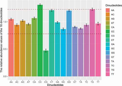
Figure 4. PR2 plot analysis of the APPV complete coding genomes. Phylogroups I, II, and III are represented in orange, green, and blue, respectively.
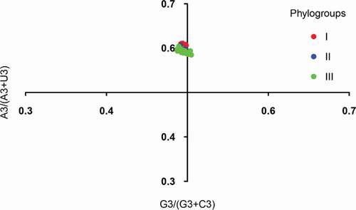
Figure 5. ENC plot analysis of the complete coding genomes of APPV. The ENC diagram shows relationship between ENC value and GC content at the third position (GC3s). The curve in the plot represents the expected ENC value for all GC3 compositions. Phylogroups I, II, and III are represented in orange, green, and blue, respectively.
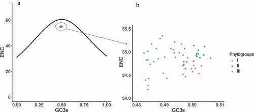
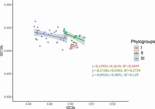
Figure 6. Neutrality analysis of the APPV complete coding genomes. The neutrality plot shows the correlation between GC content in synonymous positions (GC12s) and GC content in non-synonymous positions (GC3s). Phylogroups I, II, and III are represented in orange, green, and blue, respectively.