
Figures & data
Figure 1a. (A) the boxplot of SARS-COV-2 genome length distribution at different time points. The median is represented by the horizontal bar inside rectangles. The interquartile range box represents the middle 50% of the data. The whiskers extend from either side of the box. The whiskers represent the ranges for the bottom 25% and the top 25% of the data values, excluding outliers. (B) the average and the standard deviation of SARS-COV-2 genome length at different time points. The average value is marked as the red circles. Standard deviation of its genome length at different months is represented as the ranges marked in red. The emergence timeline of Delta and Omicron is also marked.
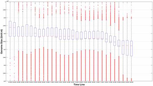
Figure 1b. (Continued).
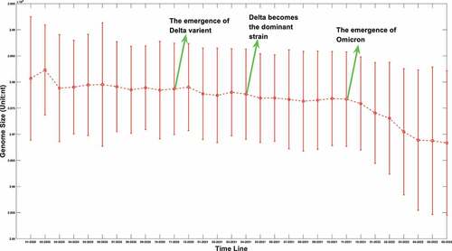
Table 1. Statistical characteristics of mutation score of two different length groups.
Figure 2. SARS-COV-2 mortality calculated using two different approaches. The red line stands for the mortality using death data explicitly. The blue stripe stands for the mortality calculated after transformation.
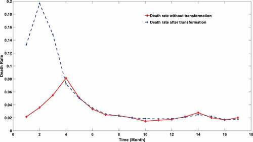
Table 2. Pearson correlation between genome length and death rate at different threshold sets.
Figure 3. The genome length distribution of SARS-COV-2 in three different types of patients. The red box stands for symptomatic patients; the blue one stands for hospitalized patients; the green one stands for asymptomatic patients.
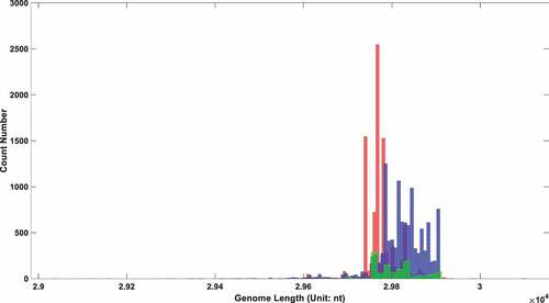
Table 3. Heterogeneity test of SARS-COV-2 genome length among different symptom patients.
Figure 4a. (A). Conservation frequency of each locus. The position of specific locus is marked as (the number in y coordinate-1) * 1000 + (the number in x coordinate). UTR is marked in red rectangles. (B). the Pearson correlation between the frequency of mutations in genetic variation and mortality. The position of specific loci is marked as (the number in y coordinate −1) * 1000 + (the number in x coordinate). UTR is marked in red rectangles. (C). Significance of the P-value of the ratio between deceased patients and asymptomatic patients calculated by chi-square test. The position of specific loci is marked as (the number in y coordinate −1) * 1000 + (the number in x coordinate). UTR is marked in red rectangles.
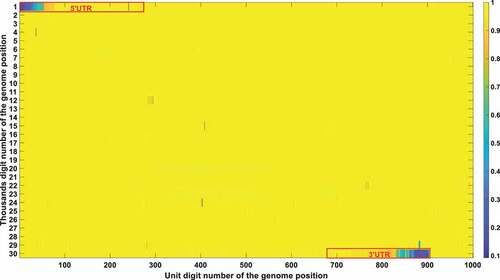
Figure 4b. (Continued).
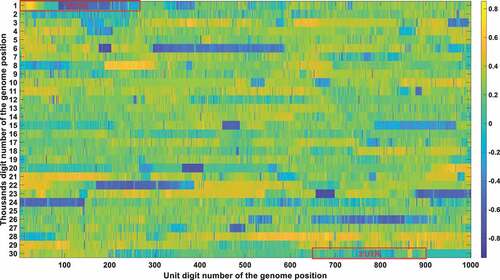
Figure 4c. (Continued).
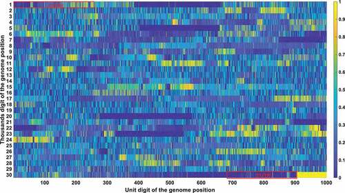
Table 4. Locus that meet all of the three thresholds. Specifically, the mutation frequency threshold is set to be 0.2; the Pearson correlation threshold is 0.2; the chi-square significance threshold is 0.01.
Figure 5. Three destinies of genome RNA in our mathematical model. The first fate is that it might be decomposed and eliminated in the host cell if it doesn’t pass the surviving threshold. The second possibility is deleting into a shorter UTR genome under the pressure of the human RNA degradation system. The shorter genome is depicted as a short solid green line. The third possibility is that it might replicate into two offspring with the template marked as a solid blue line and the new strand marked as a solid red line. The replication can be triggered if the time interval passes the replication cycle.
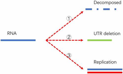
Figure 6a. (A). UTR deletion size distribution at different generations based on undifferentiated attenuation model. 50th, 100th, 200th, 300th and 500th generations were selected to further analyse their UTR region deletion degree. 50th, 100th, 200th, 300th and 500th generations were marked in the red line, green line, blue line, black line, and cyan line, respectively. (B). UTR deletion size distribution at different generations considering reduced deletion probability at certain bottleneck points. 50th, 100th, 200th, 300th and 500th generations were selected to further analyse their UTR region deletion situation. 50th, 100th, 200th, 300th and 500th generations were marked in the red line, green line, blue line, black line, and cyan line, respectively.
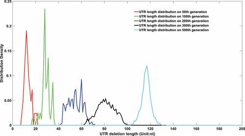
Figure 6b. (Continued).
Data availability statement
The data presented in this study are available in the supplementary materials.