
Figures & data
Figure 1. Flow chart of data processing and analysis
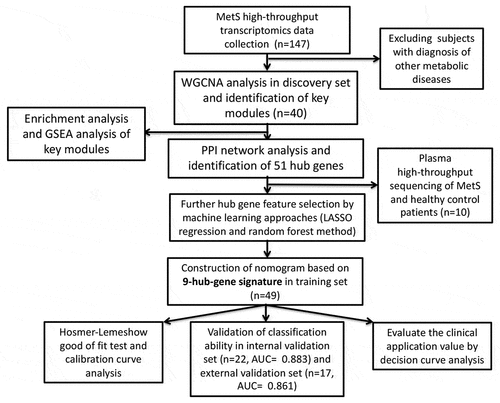
Figure 2. Weight gene correlation network analysis (WGCNA). (a) Sample clustering dendrogram and outliers detection. (b) Selection of the soft threshold. Scale-free topology fitting index R2 analysis (left) and mean connectivity for various soft threshold powers (right). The red line in the left panel means R2 = 0.9. (c) Clustering diagram of gene modules represented by different colors. (d) Clustering tree of gene modules and the correlation heatmap of the module eigengenes. (e) Heatmap of the relationship between modules and MetS: red for positive correlation and blue for negative correlation. (f,g) Scatter diagrams of genes in red module and black module. X-axis represents gene significance and y-axis represents module membership
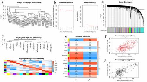
Figure 3. (a) Enrichment analysis of Gene Ontology (GO) function. (b) Enrichment analysis of Kyoto Encyclopedia of Genes and Genomes (KEGG) signaling pathway. The color represents the P value and X-axis represents gene number. (c) Gene Set Enrichment Analysis (GSEA) of KEGG signaling pathway. (d) Gene set enrichment analysis of biology process (BP). (e) Gene set enrichment analysis of molecular function (MF). (f) Gene set enrichment analysis of cellular component (CC)
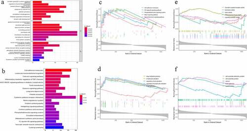
Figure 4. Protein-protein interaction (PPI) network. The gradual color and spot size represents the connectivity degree
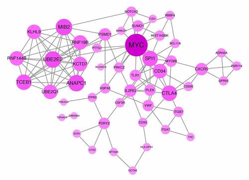
Figure 5. (a) The mean-squared error of LASSO regression. Y-axis represents mean-squared error. X-axis represents the ideal gene feature amount on various of lambda value. Left dotted line means the minimum of mean-squared error and the right dotted line means one standard deviation above minimum of mean-squared error. (b) Coefficients distribution trend of LASSO regression. (c) The importance of hub gene features based on random forest algorithm and the ideal gene feature amount
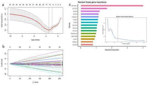
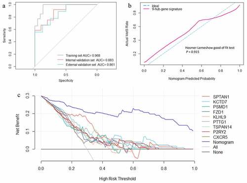
Figure 6. (a) Receiver operating characteristic curves of the web nomogram calculator based on the 9-hub-gene signature. (b) Calibration curve analysis and Hosmer-Lemeshow good of fit test of the web nomogram calculator based on the 9-hub-gene signature. (c) Decision curve analysis of every single gene feature and the web nomogram calculator based on the 9-hub-gene signature
Supplemental Material
Download ()Data availability statement
The data that support the findings of the this study are available from the corresponding author on reasonable request. The datasets for this study can be found in the Gene Expression Omnibus (GEO) database [https://www.ncbi.nlm.nih.gov/geo/].