Figures & data
Table 1. The primer sequences used for qRT-PCR
Figure 1. WGCNA of GSE110226. (a) Sample clustering tree. Two outlier samples were removed with a cut height of 70. (b) Sample dendrogram and trait heatmap. (c) The relationship between scale-free topology model fit or mean connectivity and soft-threshold power. The soft-threshold power was 9
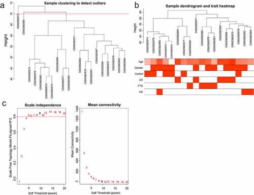
Figure 2. Module analysis. (a) Cluster dendrogram of gene. There were 15 modules, and different colors represented different modules. (b) Module–trait relationships. Red represented positive correlation and green represented negative correlation, and P-values were indicated in parentheses. (c) GS and MM in the magenta module. (d) GS and MM in the blue module
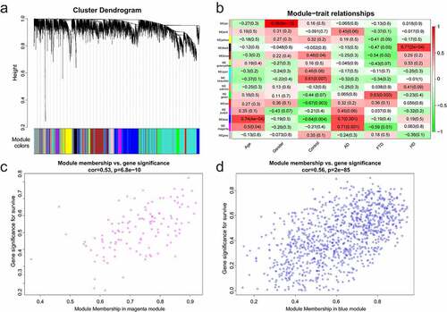
Figure 3. DEGs of GSE110226. (a) The volcanic map of DEGs. Red represented up-regulated genes and blue represented down-regulated genes. (b) The heat-map image of DEGs. Red represented up-regulation and green represented down-regulation
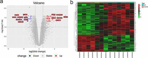
Figure 4. The immune infiltration analysis of AD. (a) The landscape of immune infiltration in AD and controls. Different colors represented different immune cells, and there were 22 immune cells. (b) The histogram of immune cells. There were four immune cells with significant difference (CD8 + T cells, M2 macrophages, activated dendritic cells, and resting NK cells). (c) The correlations analysis between immune cells. Orange represented positive correlation and blue represented negative correlation, and the digits represented Pearson correlation coefficient
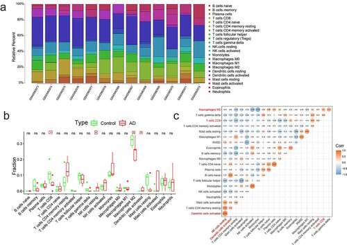
Figure 5. Functional enrichment analysis of immune-key genes. (a) The venn diagram of immune-related genes, key modules genes and DEGs. (b) GO-BP. (c) GO-CC. (d) GO-MF. (e) Biological pathway. Different colors represented different signaling pathways
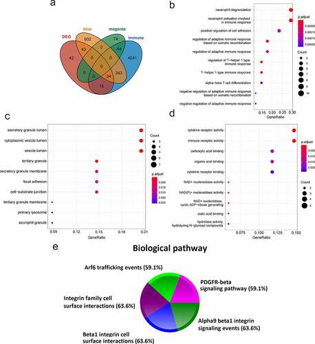
Figure 6. PPI network analysis. (a) PPI network. There were 34 genes. (b) PPI network visualization. Red represented up-regulated genes and green represented down-regulated genes. (c) Hub genes. According to the MCC algorithm, the top 10 genes were selected as hub genes. The redder the color, the higher the score of the hub genes
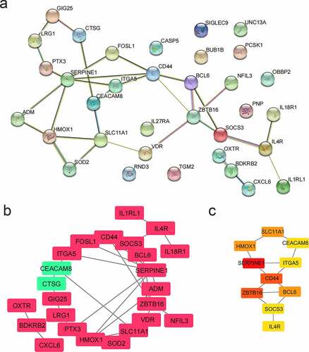
Figure 7. The relationship between hub genes and immune cells. Orange represented positive correlation and blue represented negative correlation, and the digits represented Pearson correlation coefficient
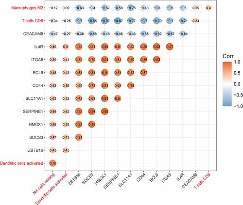
Figure 8. The ROC curve of hub genes and immune cells. (a) The ROC curve of four differential immune cells. (b) The ROC curve of 10 hub genes
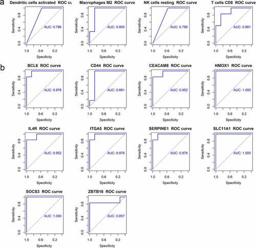
Figure 9. The expression of hub genes in GSE122063
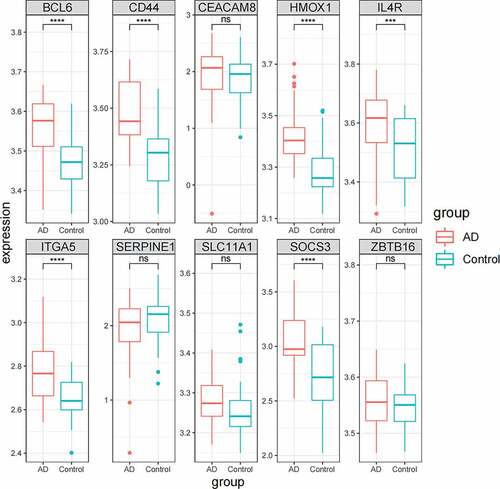
Table 2. Comparison of average incubation period and quadrant percentage of rats in location and navigation test (±s)
Table 3. Comparison of frequency of crossing the original platform and quadrant percentage of rats in space exploration test (±s)
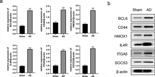
Figure 10. The expression of hub genes in AD rats. (a) The relative expression levels of hub genes/β-actin were detected by qRT-PCR. (b) The protein expression of hub genes was detected by western blot. ***P < 0.001