Figures & data
Figure 1. Flow chart showing the initial data set and exclusions from it.
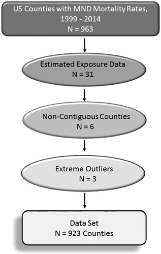
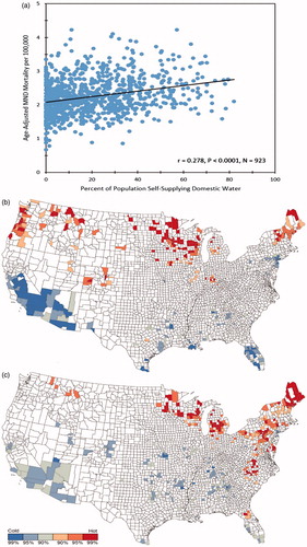
Figure 2. Panel 2a. Scatterplot of MND mortality rates vs. well water prevalence for 923 U.S. counties. Panel 2b. “Hot” and “cold” spots for MND mortality rates. Counties at the 90th, 95th, and 99th percentile of the distribution of low and high MND mortality rates are shown in shades of blue and red, respectively. Panel 2c. “Hot” and “cold” spots for well water use. Counties at the 90th, 95th, and 99th percentile of the distribution of low and high well water use are shown in shades of blue and red, respectively.