Figures & data
Figure 1. Screening, Eligibility, and Enrolment of Adult Patients with Severe Community-Acquired Pneumonia. SCAP stands for severe community-acquired pneumonia. ER stands for emergency room. HAP stands for hospital acquired pneumonia. AIDS stands for acquired immune deficiency syndrome.
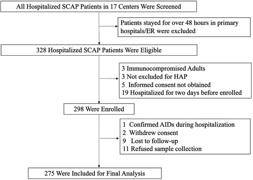
Table 1. Baseline Characteristics, Clinical Manifestation and Radiographic Findings of Adult Patients with Severe Community-Acquired Pneumonia in the Study on Admission.
Figure 2. Responsible Pathogen identified in Adult Patients with Severe Community-Acquired Pneumonia. shows the numbers (above the bars) and percentages (y-axis) of specific pathogens detected. A total of 222 pathogens were detected in 275 patients, of which 198 patients got positive aetiology results. The big pie chart in the middle shows the proportions of bacterial only, viral only, other pathogens only (including fungi, mycoplasma, Chlamydia Psittaci and Leptospira), not detected and co-infection. The small pie chart on the left shows the detailed proportions of co-infection.
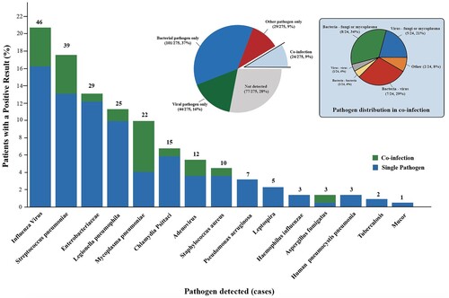
Figure 3. Comparison of Pathogen Detected in Different Regions and Seasons. Panel A shows the proportions of a specific pathogen in southern (177 patients) and northern China (98 patients), which are geographically divided from the Qinling-Huaihe Line. Panel B shows the number of patients in whom influenza virus, S. pneumoniae, Enterobacteriaceae, Chlamydia Psittaci and Leptospira were detected according to month and year. Panel C shows the number of patients in whom influenza virus was detected according to month and geography. SCAP denotes severe community-acquired pneumonia.
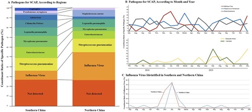
Figure 4. Performance of Different Diagnostic Tools. Panel A shows the presume positive rate with different detection methods combination. Only used traditional culture detected 14.4% (43 of 299) pathogens. Culture, antigen test and PCR detected 40.8% (122 of 299). Culture, antigen test, PCR and NGS detected 74.2% (222 of 299). Note all 278 patients enrolled were used combined methods and 24 were detected for two pathogens responsible. PCR stands for a polymerase chain reaction. NGS stands for next-generation sequencing. Panel B shows in-hospital mortality of patients with or without positive aetiology results. Venn diagrams in Panel C show specific pathogens detected according to different detected methods. Green for molecular detection methods, including PCR and mNGS. Red for traditional culture. Blue for antigen tests. The numbers in the circles stand for cases.
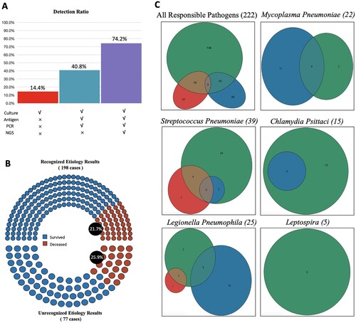
Table 2. Laboratory Findings on Admission.
Table 3. Clinical Outcomes and Medical Cost.
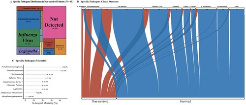
Figure 5. Pathogen-Specific Outcome in Adult Patients with Severe Community-Acquired Pneumonia.The tree map in Panel A shows the proportions of specific pathogen in non-survived patients. The area stands for the quantity of hospital death patients the specific pathogen caused. The Sankey diagram in Panel B shows the different outcomes of specific pathogens. The width of the arrows is proportional to the flow rate (survived in blue or non-survived in red). The numbers above are cases. Panel C shows the in-hospital mortality (%) of pathogens.