Figures & data
Table 1. Characteristics, general, and specific assets [+] of remotely sensed data and EO technology for humanitarian aid (after Lang et al. (Citation2015), modified and extended). Characteristics are generic definition elements of the term “remote sensing” as found in textbooks, e.g. Campbell (Citation2002). Open challenges are indicated by an [°]. Note that for the sake of readability, this overview table has no intention to refer to specific work and consequently provides no references (cf. the following sections).
Figure 1. Abstract view of information product portfolio in a humanitarian assistance.
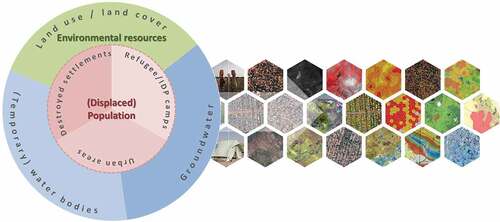
Figure 2. (1) Population monitoring (change between 2013 and 2015) in a refugee camp in Kenya. The figure shows the northern section of the camp and indicates increase (yellow to red tones), as well as decrease (blue tones) of dwelling density reported on a regular hexagon grid. White dashed polygons and dark spots indicate clouds and respective shadows. Data source: Worldview-2, 50 cm GSD, Analysis: Z_GIS. (2) Hydrogeological reconnaissance map for surface water abstraction in the vicinity of a camp site in Ethiopia, reflecting the situation in 2015. Data source: Landsat-8 and (hydro)geological data, Analysis: Z_GIS. (3) Vegetation change as an indication for land use conversion. Dark green – vegetation no change, bright green – vegetation increase, turquoise – veg. decrease, brown colour – no vegetation in both years. Data source: Sentinel-2, 10 m resolution 2016/2017. Analysis: Z_GIS.
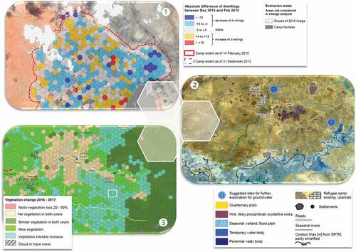
Figure 3. Procedure of dwelling detection in an OBIA environment. (1) Subset of a camp structure map based on extracted dwelling types (product); (2) High contrast image for dwelling detection; (3) Automated delineation using segmentation; (4) Categorization into dwelling types by rules; Data sources for (1) to (4): WorldView-2, 50 cm, Analysis: Z_GIS.
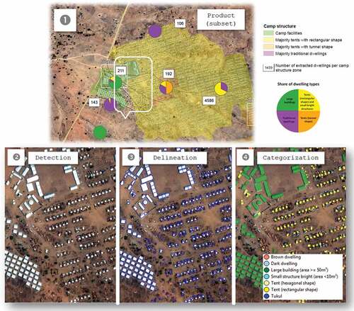
Figure 4. Ready-to-print map (top) vs. web services/applications (bottom), Source: WorldView-3, 50 cm, Analysis: Z_GIS The printed map has all relevant elements of a conventional cartographic product. For the interactive web map (e.g. ArcGIS Online), users can edit the data if needed, add their own data or perform basic spatial analysis functions. Using a set of configurable apps the map can be displayed in a well-designed, intuitive and user-friendly way.
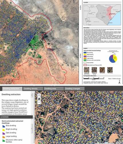
Table 2. Topics addressed in demonstrator products within the EO4HumEn+ project and scenarios to extend the current portfolio of the humanitarian information service (POP = population monitoring, ENV = environmental resources).
Figure 5. Map showing scenario locations on global scale and types of products (colour code).
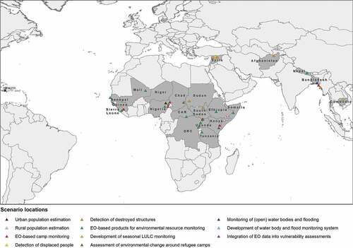
Figure 6. Estimation of dwelling density from ALOS-2 data in Maiduguri, Nigeria. The plot (left) shows observed vs. predicted building density based on ALOS-2 single polarization (SM1, red) and full polarization (SM2, blue) data (Braun, Citation2019).
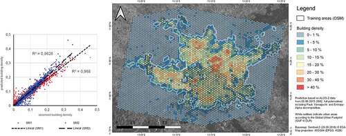
Figure 7. Mapping of destroyed structures; (A) visual detection of destroyed village in Jebel Mara region of Darfur, Sudan; (B) experimental damage assessment by difference of DSMs from optical VHR images for the city of Mosul, Iraq (Braun, Citation2019).
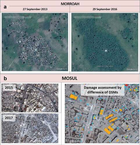
Figure 8. Detection of damages by time-series of Sentinel-1 in Raqqa, Syria. The graph shows the overall changes detected in the Sentinel-1 time-series analysis compared to the findings by UNOSAT in the given time-periods. While moderate damages (light blue) are highly underestimated, there is a good correlation with the amount of severe damages (dark blue) (Braun, Citation2019).
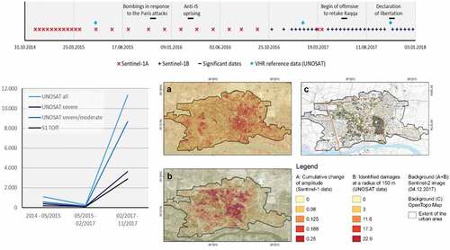
Figure 9. Sea-surface dynamics on the extent of Thengar Char since 2014. The mean extent was derived based on visual interpretation of the temporal average backscatter intensity image for the investigated period (left). The mean images of 2015, 2016 and 2017 displayed in red, green and blue emphasizes the overall movement of the island’s surface towards the north (Braun, Citation2019).
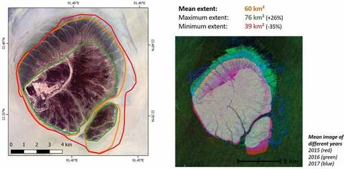
Figure 10. Selected map products to support water infrastructure refurbishment in Lapilang, Nepal. (A) dwelling extraction from VHR images; (B) suggested locations for communal water taps based on acceptable horizontal and vertical distance to households; (C) longitudinal profile along water pipeline from SPOT DEM, to support construction; (D) landcover of catchment areas of water sources to assess risk of contamination (Riedler et al., Citation2017).
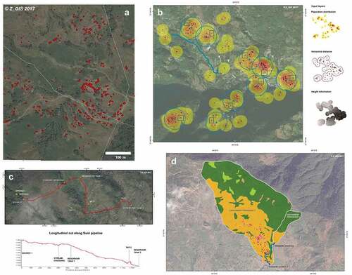
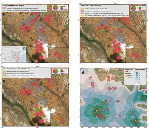
Figure 11. Selected map products for vulnerability to diarrhoea in Tana River, Kenya; (A) access of households to safe water; (B) access of households to water treatment; (C) access of households to refuse disposal; (D) walking distance to nearest health facility, Analysis: Z_GIS.