Figures & data
Table 1. Recommendations from delegates: priority actions to support adaptive pathways for DRI.
Figure 1. Hierarchical processes that describe infrastructure resilience.
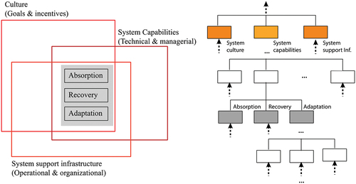
Figure 2. Description of the main processes related to resilience.
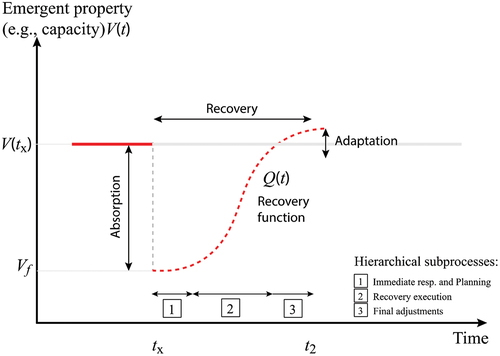
Figure 3. Relevance of processes in the response to an extreme event.
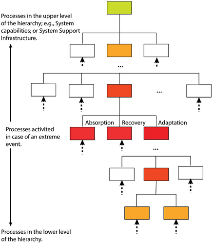
Figure 4. (a) Realization of the system response; (b) comparison of expected NPV between traditional and adaptation pathway simulation designs.
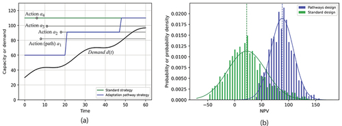
Figure 5. (a) Realizations of the system response to an extreme event; (b) comparison of expected system recovery time.
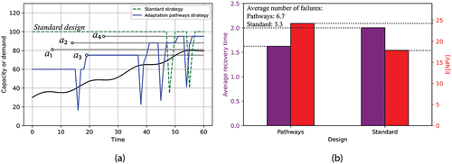
Table 1. Summary of relevant data sources and details. More information is provided in Hickford et al. (Citation2023).
Table 2. Description of adaptation options considered with costs, relevant asset types and impacts on damage curves and return period cut-offs.
Figure 1. Graphical representation of transport system-of-systems risk and adaptation assessment framework.
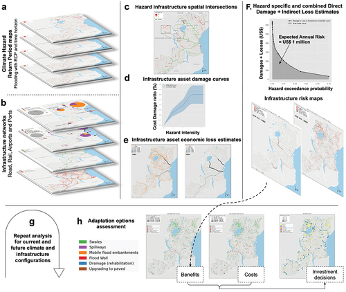
Figure 2. Results of maximum (a) PV of benefits PVs; (b) PV of adaptation investments; and (c) BCR for adaptation options for roads at risk due to river and coastal flooding under climate change.
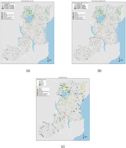
Figure 3. Results of maximum (a) PV of benefits; (b) PV of adaptation investments; and (c) BCR for adaptation options for railways.
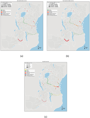
Figure 1. IPCC Sixth Assessment Report: Climate risk to climate resilient development transition.
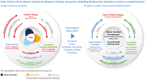
Figure 1. Methodological approach of RPA.
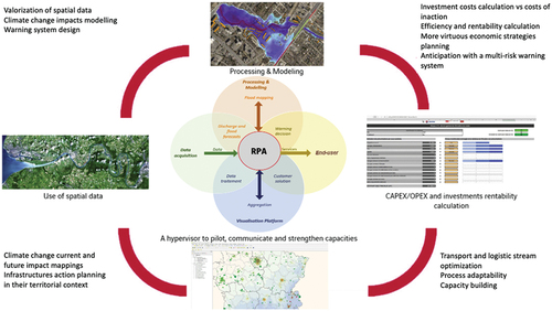
Figure 2. Downscaling principle to adapt climatic models’ outputs to the land-use (Adapted from Willems [2011] in Siwila et al. (Citation2013).
![Figure 2. Downscaling principle to adapt climatic models’ outputs to the land-use (Adapted from Willems [2011] in Siwila et al. (Citation2013).](/cms/asset/605ae8de-64ba-438f-a33e-c220fc801904/tsri_a_2181552_f0011_oc.jpg)
Figure 3. Conceptual mapping of vulnerability (Sharma & Ravindranath, Citation2019).
Figure 4. A multi-hazard approach to spatialize complex risks, such as tropical cyclones.
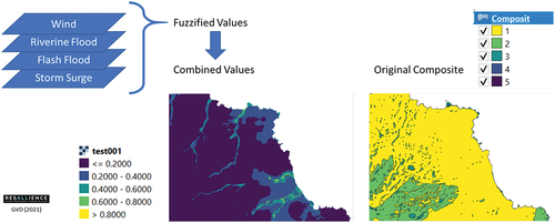
Figure 5. The resilience performance assessment analytical table allowing the evaluation of climate change impacts.
Figure 6. Exposure mapping of multiple hazards to identify most exposed parts of the island to complex risks such as hurricanes.
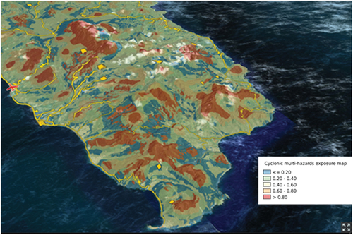
Figure 7. Mapping of vulnerability from multiple hazards to identify the most vulnerable sectors of the island.
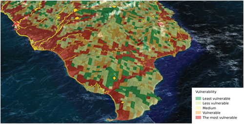
Figure 8. Localization of current and future investment projects facing island territorial vulnerability.
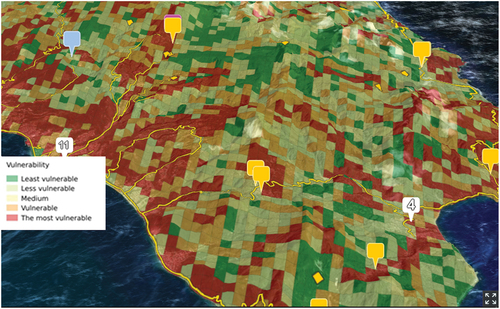
Figure 1. Illustration of climate risk classification (for revenues).
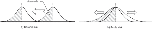
Table 1. Valuation example comparing NPV and DNPV estimations (US$).
Figure 1. Hourly storm hyetograph from 26 July 2005 at 2.30pm to 27 July 2005 at 2.30am with a period of high intensity between 2.30pm and 9.30pm (IST).
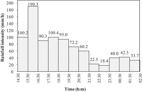
Figure 2. Mithi River catchment and Mumbai International Airport.
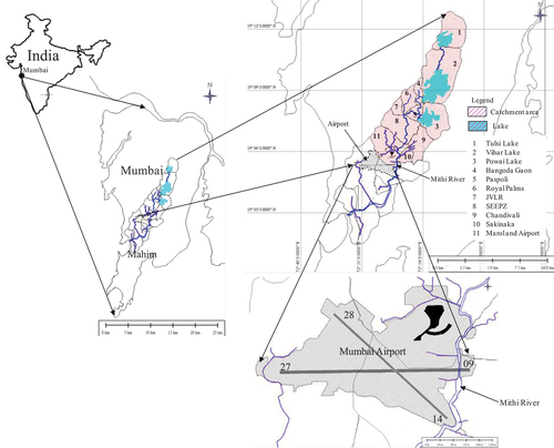
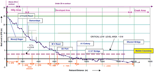
Figure 4. Overall methodology.
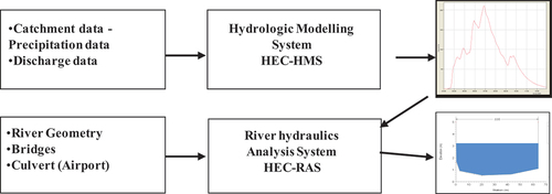
Figure 5. Proposed widening of the existing culvert.
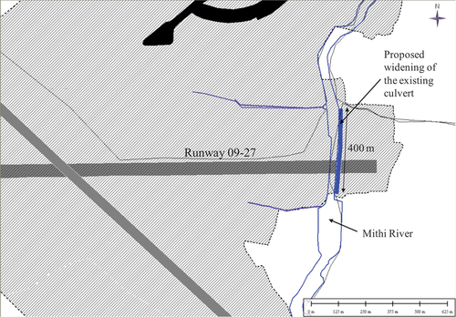
Figure 6. Final curved box culverts provided.
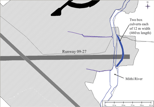
Figure 7. Water levels for widening two culverts and an additional culvert.
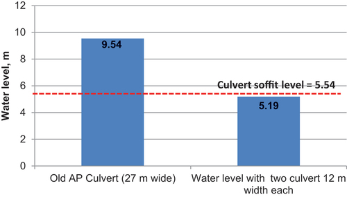
Figure 8. Proposed holding ponds in the Kurla-LTT area, Mumbai, India.
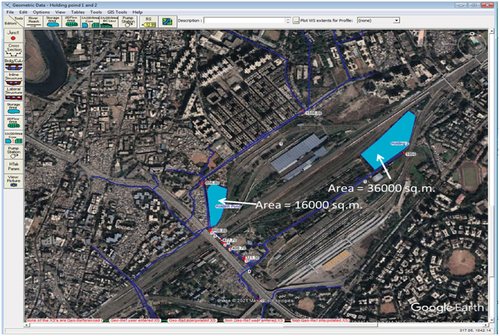
Figure 9. Reduction in water levels due to the proposed mitigation measures.
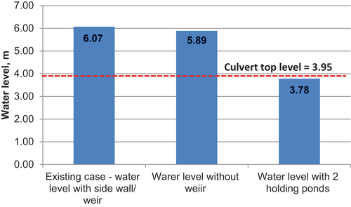
Figure 1. Conceptualization of the research methodology, including the data sources (Landsat and Sentinel imagery), processing steps within GEE and the outputs to be used by stakeholders.
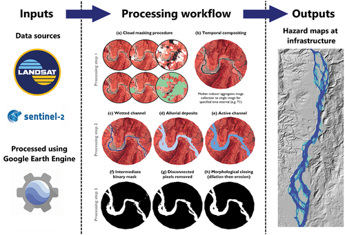
Table 1. Characteristics of the satellite imagery data used in InfraRivChange.
Figure 2. Landing page of the InfraRivChange web application.
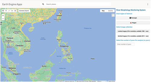
Figure 3. Landsat example from the Gamu Bridge; Cagayan River.
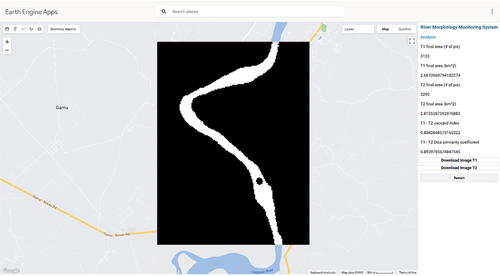
Figure 4. Landsat example from the Itawes Bridge; Chico River.
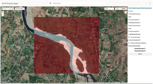
Figure 5. Sentinel example from the Don Mariano Marcos Bridge; Lagben River.
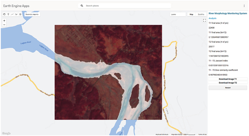
Figure 6. InfraRivChange web application applied outside of the Philippines, to the Chahlari Ghat Bridge (India).
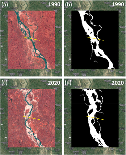
Table 1. Terrain derivatives and definitions used in this study. Modified after (Safanelli et al., Citation2020).
Table 2. Rainfall derivatives and definitions used in this study (Talchabhadel et al., Citation2022).
Figure 1. Overall methodology to map LISI, CISI and the web application.
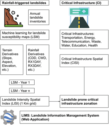
Figure 2. Annual landslide susceptibility map for years 2016 to 2020 produced using a random forest model in Google Earth Engine.
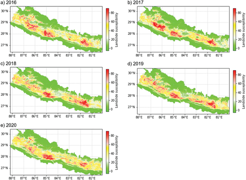
Table 3. Validation score of landslide susceptibility maps: (i) area under the curve value (higher is better); and (ii) out of bag error in random forest model training (lower is better).
Figure 3. (a) LISI map classes; (b) CISI map classes; and (c) LISI overlaid on CISI classes (LISI > 5 and CISI > 5).
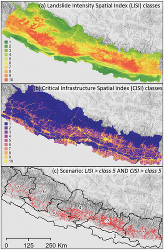
Figure 4. Snapshot of a web application for dissemination of LISI, CISI and other relevant datasets. The snapshot shows LISI of Nepal.
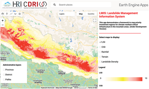
Figure 1. Methodology of the study.

Table 1. Result of Delphi survey phase II: consensus indicators.
Table 2. Result of Delphi survey phase II: non-consensus indicators.
Table 3. Result of Delphi survey phase III.
Table 1. Result of Delphi survey phase II: consensus indicators.
Table 2. Result of Delphi survey phase II: non-consensus indicators.
Table 3. Result of Delphi survey phase III.
Figure 1. Montreal and the Place Bonaventure case study area LST maps.
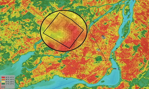
Figure 2. Hourly direct beam radiation of Montreal for two half-cycles of 2020.
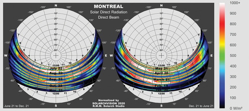
Figure 3. Hourly air temperature from sunrise to sunset in Montreal in 2020.
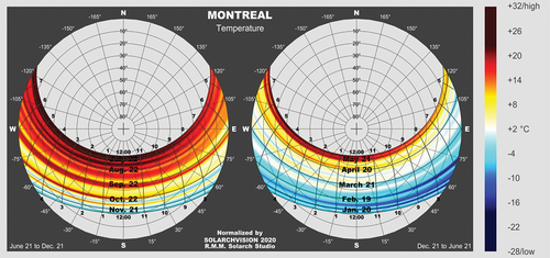
Figure 4. Hourly positive/negative effects of direct solar radiation in Montreal in 2020.
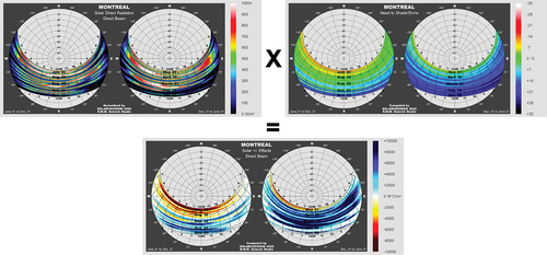
Figure 5. Extreme negative solar impacts in relation to high air temperature scenarios in Montreal across different months based on 1953–2005 data.
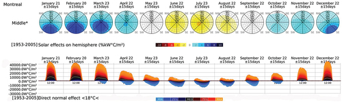
Figure 6. Distribution, probabilities and passive solar impacts in Montreal across different months using 1953–2005 data.
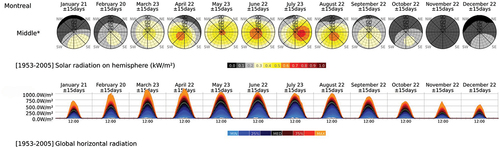
Figure 7. Distributions, probabilities and active solar potentials in Montreal across different months using 1953–2005 data.
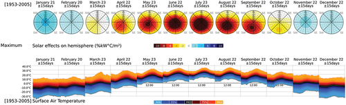
Figure 8. The positive and negative effects in urban context Montreal, June–September 2020
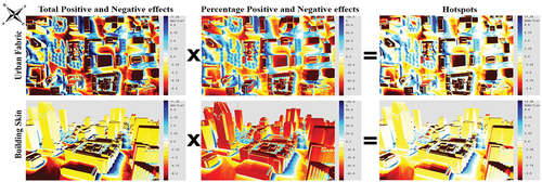
Figure 9. The hotspots in Place Bonaventure’s urban fabric.
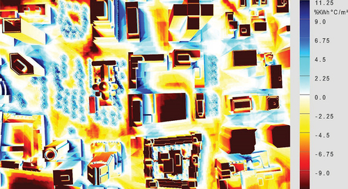
Figure 10. The hotspots in Place Bonaventure’s building skins.
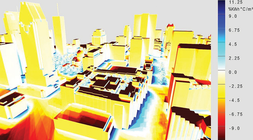
Figure 11. Scenario simulation with and without trees.
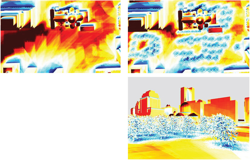
Figure 1. Space weather disturbances from the Sun (adopted from Eastwood et al., Citation2017).
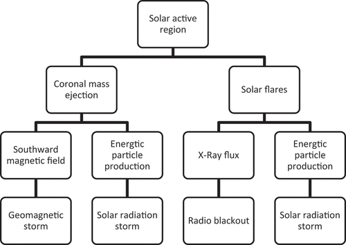
Table 1. Classifications of sunspots or active regions.
Table 2. Potential influence of solar flares.
Figure 2. Dilution of precision.
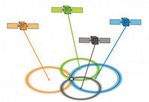
Figure 3. Image of an X2.7 solar flare (visible on left side of sun) on 5 May 2015.
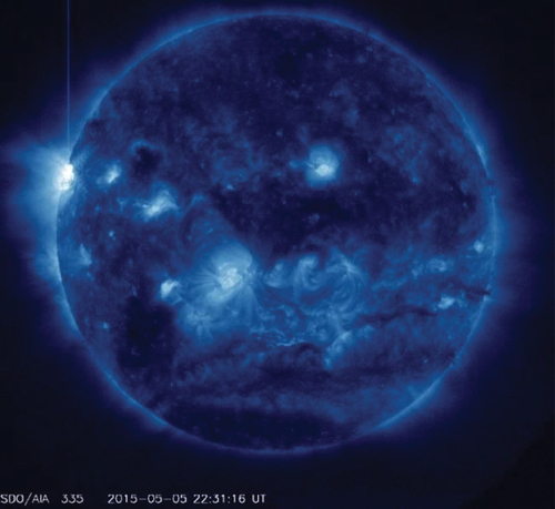
Figure 4. Variation in TEC values registered on 12 May 2015 (X axis = Hour of the day; Y axis = TEC value).
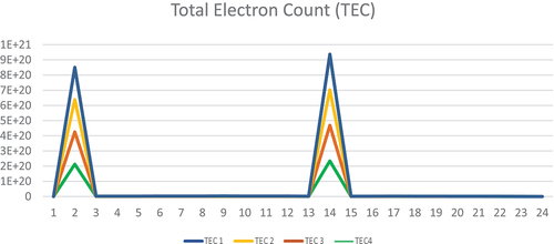
Figure 5. Values recorded by IRNSS satellites on 12 May 2015.
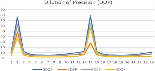
Figure 1. Details of specimens considered in the present study.
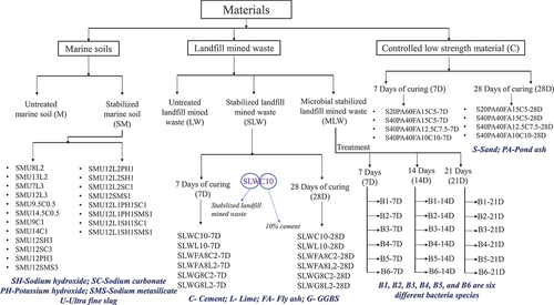
Figure 2. Details of crumb tests utilized for water stability assessment.
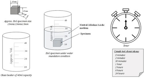
Figure 3. Water stability responses of various specimens of unstabilized and stabilized soil/alternate soils.
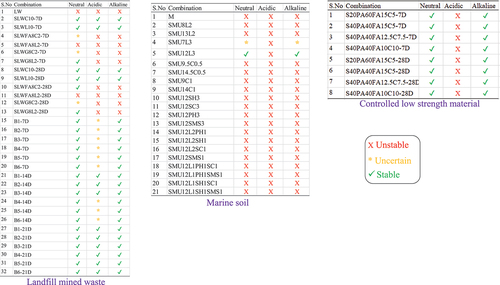
Figure 4. Typical crumb test images for marine soil, landfill mined waste and controlled low strength material specimens.
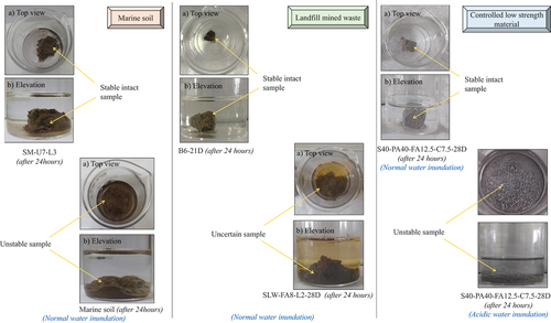
Figure 5. Crumb test results and microscopic images of biostabilized landfill mined waste.
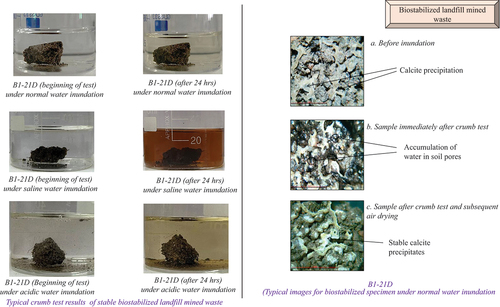
Figure 6. Correlation between unconfined compression strength and crumb test results.
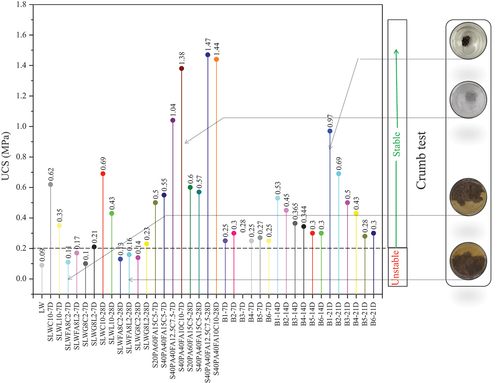
Figure 1. Typical floor plan and structural details of the hospital building in Dwarka, New Delhi.
Figure 2. THM for representing the force-deformation behaviour of UFREIs (Banerjee & Matsagar, Citationn.d.).
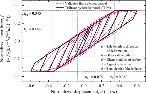
Figure 3. Properties of a single UFREI utilized for base isolation of the hospital building.
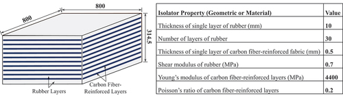
Figure 4. Plan layout and details of the UFREI-based isolation system.
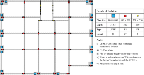
Table 1. Details of site-specific earthquake excitations considered in this study.
Figure 5. Time history of top-floor absolute acceleration responses (truncated) of hospital building with and without base isolation.
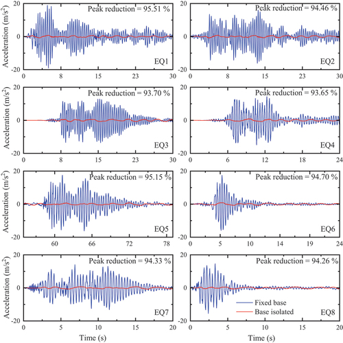
Figure 6. Peak inter-story drift ratio of the hospital building with and without base isolation.
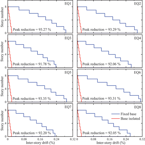
Figure 7. Force-deformation behaviour of the UFREI-based isolation system using the THM.
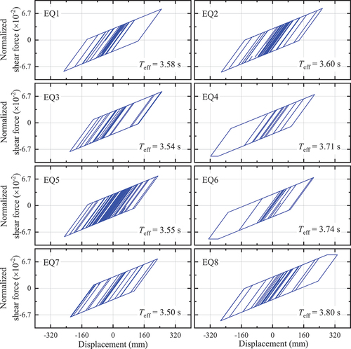
Table 1. Scenario losses, repair time and recovery time assessment results.
Figure 1. Probability of (a) occupancy loss and (b) functionality loss at DBE and MCE over time for various pathways.
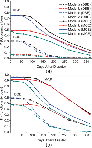
Figure 1. Overview of the methodology.
Figure 1. Study area: Sagar Island.
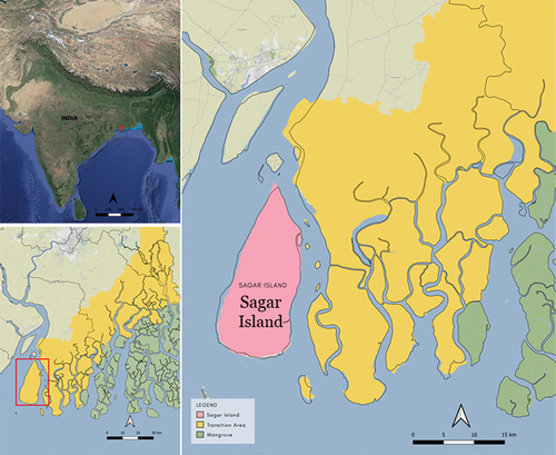
Table 1. Datasets and their description.
Table 2. Description of parameters used for built-up area prediction.
Table 1. Datasets and their description.
Figure 2. Damage matrix based on experiment for Sagar Island.
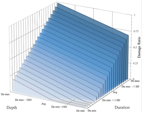
Table 2. Description of parameters used for built-up area prediction.
Figure 3. Damage stage analysis of predicted built-up area (2050) in 100-yr flood: return period for (a) 24 hrs and (b) 48 hrs.
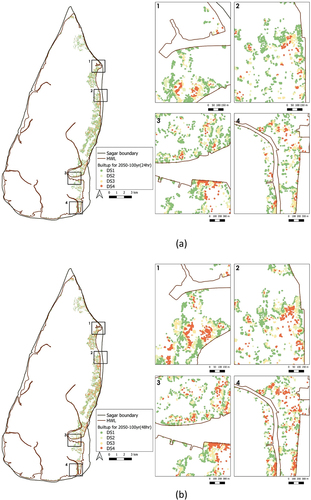
Figure 4. Building damage stage analysis against 100-year flood-return period (a) pre-mitigation, (b) post-mitigation using NBS.
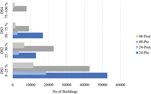
Table 3. Description of parameters used for estimating cost-benefit of NBS.
Figure 1. Study area map.
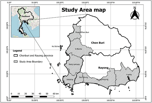
Figure 2. Methodological framework of the study.
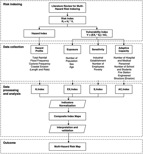
Table 1. Risk assessment indicators and variables.
Figure 3. Multi-hazard map of Chonburi and Rayong province.
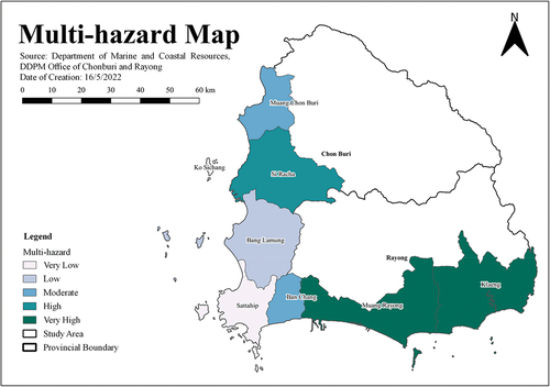
Table 2. Multi-hazard index.
Table 3. Risk index of case study districts.
Figure 4. Multi-hazard risk map.
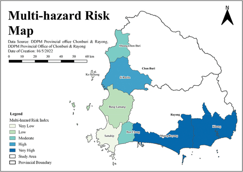
Figure 5. Multi-hazard risk and critical coastal infrastructure map.
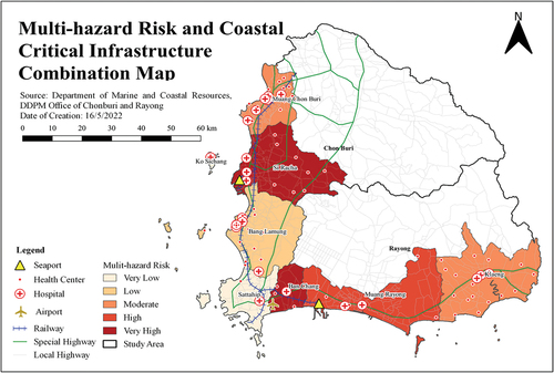
Figure 1. Water Square/Plaza in Benthemplein.
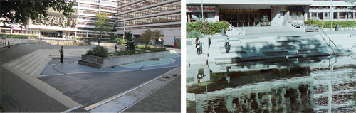
Figure 2. Sønder Boulevard.
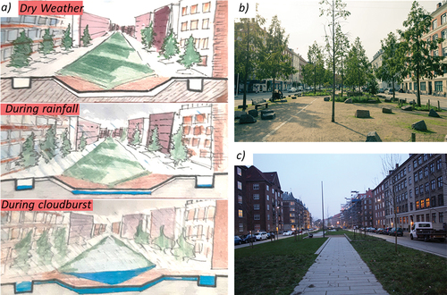
Figure 3. Grand Mall Park.
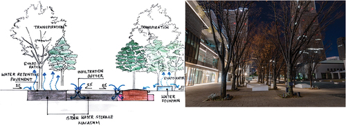
Figure 4. SuDS management train.
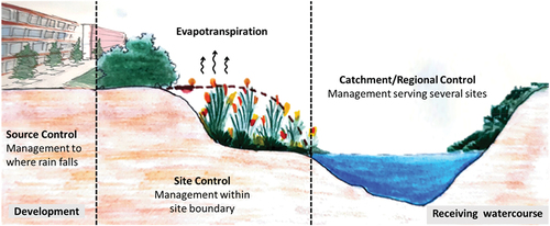
Figure 1. Location and elevation maps of the transboundary Himalayan mountain region in Asia includes the world’s 10 highest peaks.
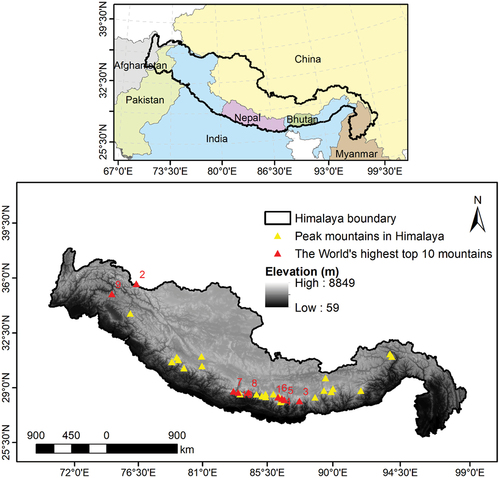
Table 1. List of data and their source websites.
Figure 2. Spatial maps generated using open-source datasets for the modelling.
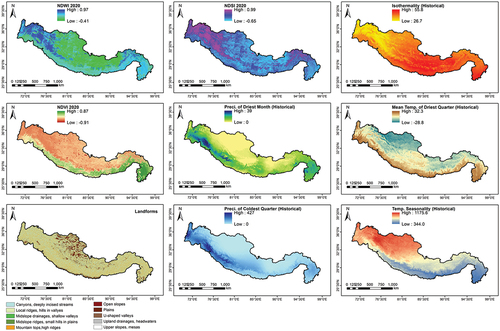
Figure 3. Wetland location sampling used for training and testing of the model.
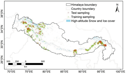
Figure 4. Performance evaluation of the model.
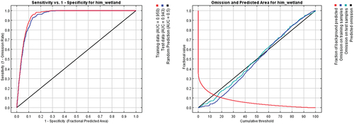
Figure 5. Himalayan wetland inventory using historical climate data.
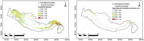
Figure 6. Himalayan wetland inventory based on different future climate scenarios.
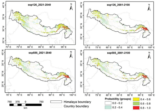
Figure 1. Illustrates the methodology of the study.
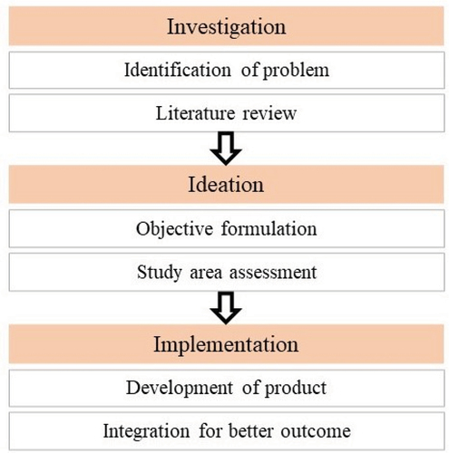
Figure 2. Distribution of structural losses corresponding to a 100-year return period for a cyclonic wind hazard.
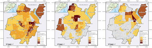
Figure 3. Snippets of the mobile application to be used in the post-disaster scenario for rescue, relief and recovery.
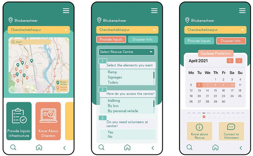
Figure 4. Snippets of the mobile application to be used in the post-disaster scenario for rescue, relief and recovery.
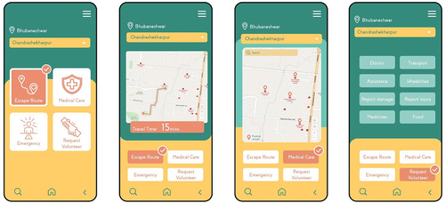
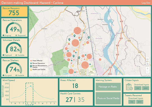
Figure 5. Snippet of the data visualization dashboard for informed decision-making.