Figures & data
Fig. 1 Plot shared by Rachel Maddow on Twitter and live on The Rachel Maddow Show on August 6th, 2020.
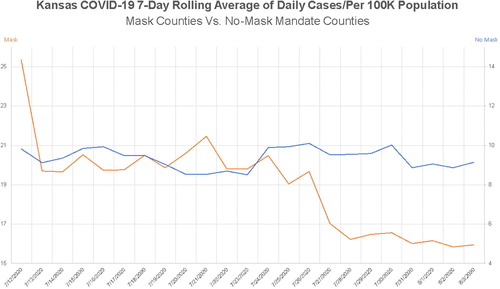
Fig. 2 Steven Strogatz’s Twitter comment to show a recreation of a plot showing the number of daily cases of COVID-19 per 100,000 in the population of Kansas.
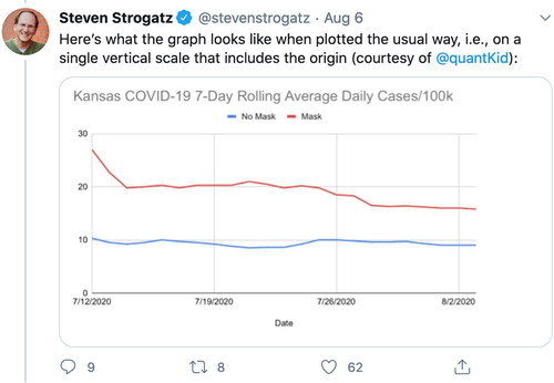
Fig. 3 Tweet on May 16 by Calling Bullshit showing a misleading plot produced by the Georgia Department of Public Health.
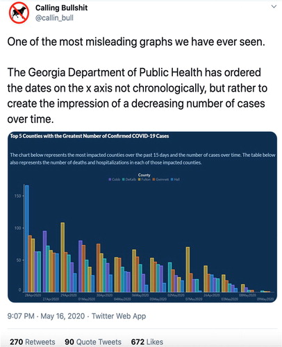
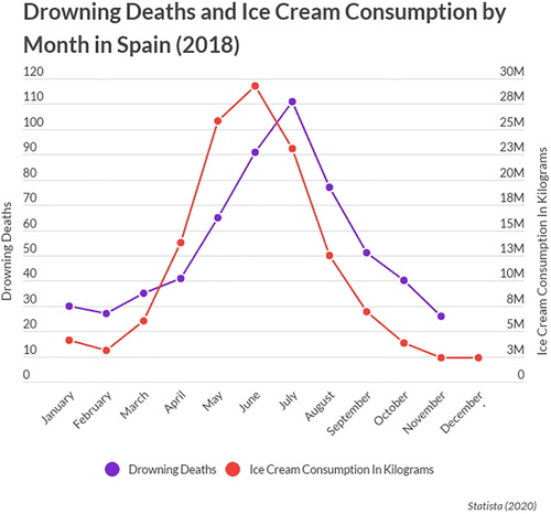
Fig. 4 Plot published in Acquah (Citation2020, May) utilizing two vertical axes to compare ice cream consumption and drowning deaths across time to represent association.