Figures & data
Fig. 1 Documented steps taken to select variables of interest and download the raw data.
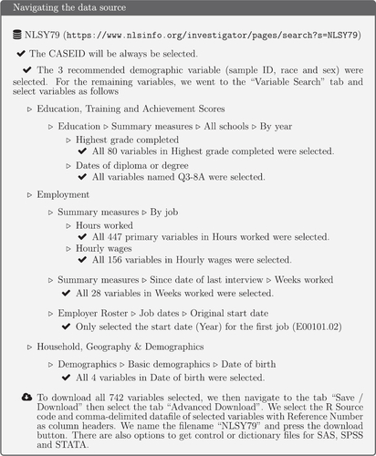
Table 1 Frequency table of the age at the start of the survey in NSLY79 cohort in the extracted data.
Table 2 Contingency table for sex and race for the extracted NLSY79 demographic data.
Fig. 2 Longitudinal profiles of wages for a random sample of 36 individuals in the pre-cleaned data. There is considerable variation in wages. Some individuals (2799, 11,041, 11,146) are only measured for a short period. Some individuals (8296, 9962) possibly have errors in wages in some years, because of the extreme fluctuation.
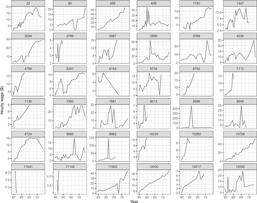
Fig. 3 Summary plots to check the data after the tidying stage: (A) longitudinal profiles of wages for all individuals 1979–2018, (B) boxplots of minimum, median, and maximum wages of each individual, (C) and one individual (id = 39) with an unusual wage relative to their years of data. It reveals that some values of hourly wages are unbelievable, and some individuals have extremely unusual wages in some years. Accordingly, more cleaning is necessary to treat these extreme values.
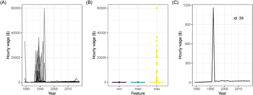
Fig. 4 Comparison between the original (black dots) and the corrected (solid gray) mean hourly wage for same sample of individuals as shown in . A robust linear model prediction was used to identify and correct mean hourly wages value. The extreme spikes, corresponding to implausible wages, have been replaced with values more similar to wages in neighboring years for individuals 8296 and 9962, but otherwise the profiles have not changed.
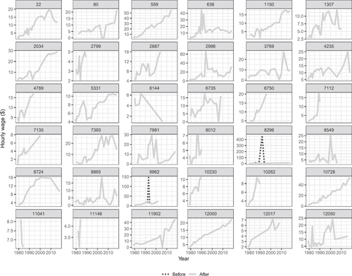
Fig. 5 Remake of the summary plots of the fully processed data suggest it is now in a reasonable state: (A) longitudinal profiles of wages for all individuals 1979–2018, (B) boxplots of minimum, median, (C) and maximum wages of each individual, and one individual with an unusual wage relative to their years of data.
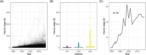
Fig. 6 The stages of data cleaning from the raw data to get three datasets contained in yowie. “# of individuals” means the number of respondents included in each stage, while “# of observations” means the number of rows in the data. The color represents the stage of data cleaning in the statistical value chain (M. P. J. van der Loo and de Jonge Citation2021). Pink, blue, and green represent the raw, input, and valid data, respectively.
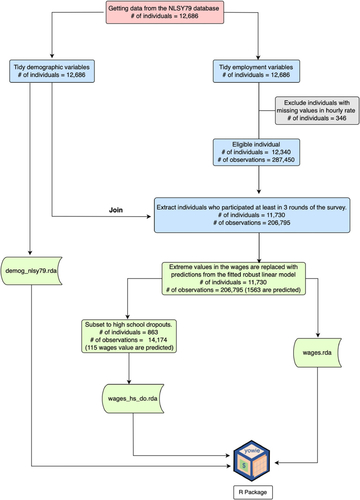
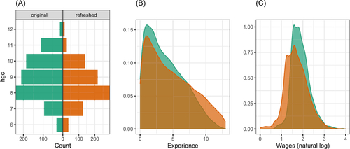
Fig. 7 Comparison of original and refreshed data: (A) highest grade completed, (B) experience, and (C) log wages. Some difference in wages would be expected because the refreshed data is not inflation-adjusted, but the two sets are reasonably similar.
supplementary_materials.zip
Download Zip (4.3 MB)Data Availability Statement
The authors confirm that the data supporting the findings of this study are available within the supplementary materials.