Figures & data
Table 1. Analog series.
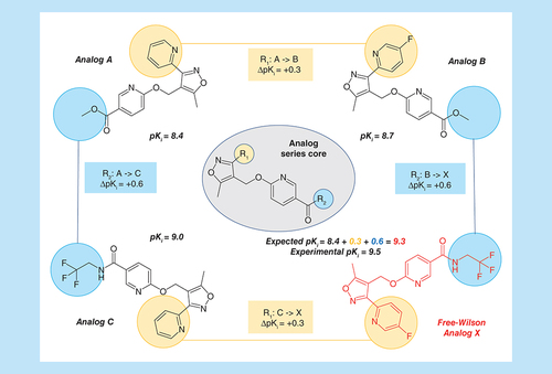
Shown are four analogs from the same AS that are active against GABA receptor alpha-5 subunit (AS 5; ChEMBL target ID 5112). For each compound, its logarithmic experimental potency (pKi) value is reported. In addition, the core structure of the AS is depicted in the center and the two substitution sites R1 and R2 are highlighted in yellow and blue, respectively. Corresponding substituents in analogs are colored accordingly. Individual potency contributions of directed substitutions are reported as ΔpKi values. The figure illustrates the principles of Free-Wilson predictions of compound potency.
AS: Analog series.
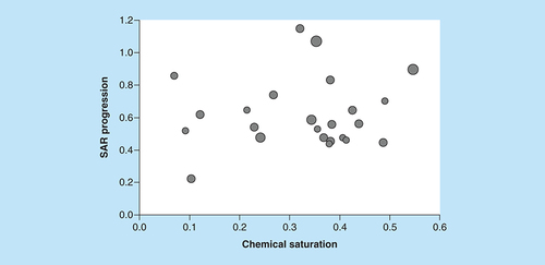
The scatter plot compares COMO chemical saturation (S) and SAR progression (P) scores for ASs from ChEMBL (version 25). Each dot represents a series and is scaled in size according to the number of analogs. Different combinations of S and P scores distinguish ASs at different LO stages.
AS: Analog series; COMO: Compound optimization monitor; LO: Lead optimization; SAR: Structure–activity relationship.
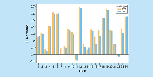
On the vertical axis, mean coefficients of determination (R2) for regression models are reported. The horizontal axis lists ASs using their IDs according to . For each AS, two R2 values are given for RR (blue) and SVR (orange) models.
AS: Analog series; ID: Identification; RR: Ridge regression; SVR: Support vector regression.
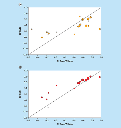
Scatter plots compare R2 values of FW and SVR predictions for individual ASs. Each dot represents an AS that is scaled in size according to the number of FW EAs. The diagonal corresponds to perfect correlation between calculated coefficients. (A) FW versus global SVR predictions (according to ). (B) FW versus SVR predictions on FW EA subsets.
AS: Analog series; EA: Existing analog; FW: Free-Wilson; SVR: Support vector regression.
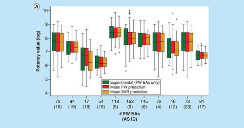
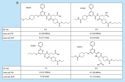
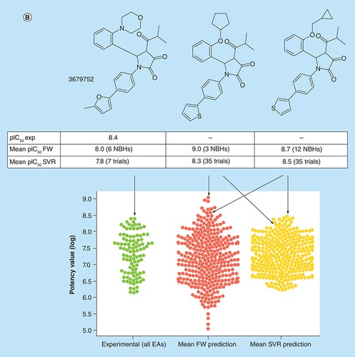
(A) Box plots compare experimental and predicted potency value distributions. Each triplet represents one of 11 ASs yielding predictive FW and SVR models. The y-axis reports log. potency values and the x-axis the number of FW EAs. Numbers in parentheses are AS IDs. Distributions of experimental potency values (green), mean FW predictions (red) and mean SVR predictions (orange) are reported for FW EAs. (B) Individual predictions are shown for four exemplary FW EAs (with ChEMBL IDs) from the same AS with activity against purinergic receptor P2Y12 (AS 6; ChEMBL target ID 2001). In the table inserts, the first row contains the experimental potency values of each analog and the second row the mean FW-predicted potency values (with the corresponding number of FW NBHs in parentheses). The third row contains the mean SVR-predicted potency values (with the corresponding number of individual prediction trials in parentheses).
AS: Analog series; EA: Existing analog; FW: Free-Wilson; ID: Identification; NBH: Neighborhood; SVR: Support vector regression.
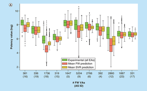
(A) Box plots compare experimental potency value distributions of 11 ASs according to A with potency predictions of corresponding FW VA populations. The y-axis reports logarithmic potency values and the x-axis the number of FW VAs per series. Numbers in parentheses are AS IDs. The experimental potency distribution of all EAs per series is displayed in light green, the FW-predicted VA potency distribution in red and the corresponding SVR-predicted distribution in orange. (B) Exemplary VAs (middle and right) are shown that were predicted to have higher potency than the most potent EA (left) of an AS active against the P2X purinoceptor 3 (AS 19; ChEMBL target ID 2998). In beeswarm plots below (color-coded according to the box plots), the exemplary compounds are indicated using arrows.
AS: Analog series; EA: Existing analog; FW: Free-Wilson; ID: Identification; NBH: Neighborhood; SVR: Support vector regression; VA: Virtual analog.
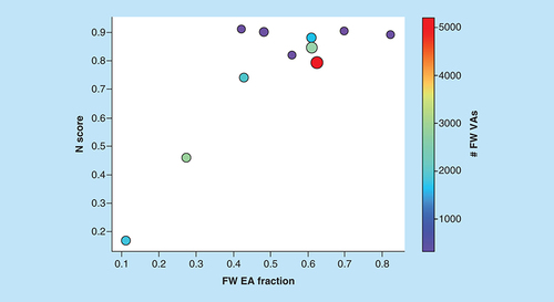
N scores are shown for ASs yielding predictive models as a function of increasing FW EA fraction, defined as the proportion of FW EAs among all EAs. Dots represent ASs that are scaled in size by the number of analogs per series and color-coded according to the number of algorithmically generated FW VAs per series.
AS: Analog series; EA: Existing analog; FW: Free-Wilson; VA: Virtual analog.