
Figures & data
Figure 1 Scatterplot depicting residents’ average annual teaching hours versus mean overall RISE percentile.
Abbreviation: RISE, Resident In-Service Examination.
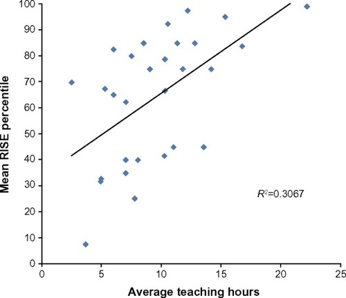
Figure 2 Residents’ average overall RISE percentile compared to admission USMLE step I scores.
Abbreviations: RISE, Resident In-Service Examination; USMLE, United States Medical Licensing Examination.
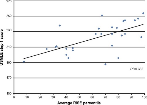
Figure 3 Average annual teaching hours as a function of admission USMLE step I score.
Abbreviation: USMLE, United States Medical Licensing Examination.
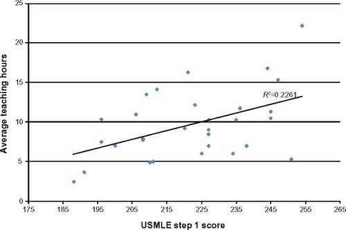
Figure 4 Linear regressions of scatterplots comparing overall RISE percentile to annual teaching hours by year of training (individual data points not shown).
Abbreviations: PGY, postgraduate year; RISE, Resident In-Service Examination.
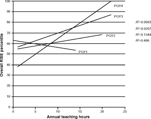
Table 1 Change in overall RISE percentile per hour of preclinical didactic teaching by year in program with and without controlling for USMLE Step I performance