Figures & data
Table 1 Baseline Patient Characteristics
Figure 1 Kaplan-Meier survival curves for different BI score groups (A), impaired ADL sub-groups of BI Score≤60 (B), normal ADL sub-groups of BI Score>60 (C).
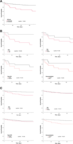
Table 2 Risk Factors from Univariate and Multivariable Cox Analysis
Figure 2 ROC curves of BI score, GRACE score, and BI score plus GRACE score for one-year survival.
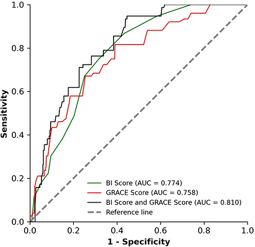
Figure 3 Calibration plots of overall survival probabilities at one year. The x-axis represents the overall survival rate predicted by the nomogram, and the y-axis represents the actual overall survival rate observed. The grey line of dashes along the diagonal passing through the origin represents a perfect calibration model, where the prediction probabilities are consistent with the observation probabilities. The red line represents the calibration curve, which connected by the red dots that indicate observed 1-year mortality rate. The blue crosses mean bias-corrected estimates and the black vertical bars indicate 95% CIs.
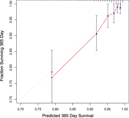
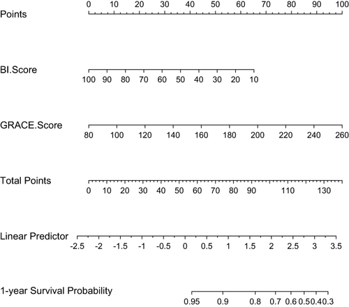
Figure 4 Nomogram of one-year survival probabilities after hospital discharge. The presence or absence of each score indicates a certain number of points. The points for each score are summed together to generate a total-points score for one-year survival probabilities.