Figures & data
Figure 1 Study cohorts.
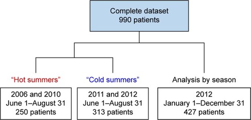
Table 1 Comparison of patient characteristics and climate variables by season in the year 2012
Figure 2 Differences in the age and BMI of patients with AECOPD in relation to the season.
Notes: Displayed are mean values at 95% confidence intervals. *P<0.05.
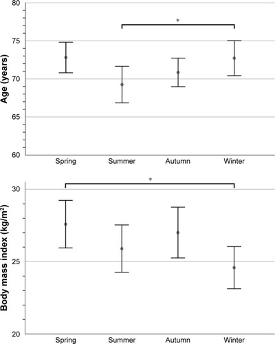
Table 2 Comparison of AECOPD patient characteristics between hot and cold summers
Table 3 Comparison of AECOPD patient comorbidities between hot and cold summers
Figure 3 Increase in hospital admissions per day in relation to the minimum outdoor temperature.
Notes: The number of hospital admissions per day due to AECOPD are displayed as diamond markings. The trajectories were calculated using a locally-weighted scatter plot smoothing method. A vertical line marks the threshold temperatures for increased hospital admissions during the summer as calculated by Poisson regression analysis.
Abbreviation: Tmin, daily minimum outdoor temperature.
Abbreviation: Tmin, daily minimum outdoor temperature.
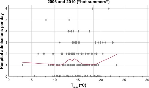
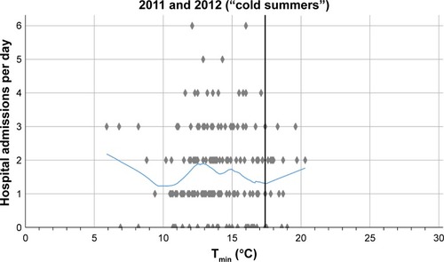
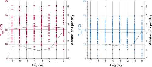
Figure 4 Temperature analysis on the days preceding an increase in hospital admissions.
Notes: The figures show the daily minimum outdoor temperatures 1 week before an increase in hospital admissions to three or more AECOPD patients per day. The left column displays the results for hot summers, the right column for cold summers. Red and blue dots represent the recorded minimum outdoor temperatures. The number of admissions per day are shown as black dots. All trajectories were calculated with a locally-weighted scatter plot smoothing method. The black trajectories illustrate the daily admissions due to AECOPD, the red and blue curves represent minimum outdoor temperatures.
Abbreviation: Tmin, daily minimum temperature.
Abbreviation: Tmin, daily minimum temperature.