Figures & data
Figure 1 Principal component analysis (PCA) score plots obtained from the quality control group (QC), the blank group (B), the model group (M), and the ZHSE group (Z) in positive and negative electrospray ionization source (ESI) mode.
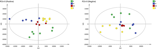
Figure 2 The results of OPLS-DA modeling using the data from the model group (M) and the ZHSE group (Z) in positive and negative electrospray ionization source (ESI) mode.
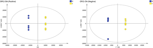
Figure 3 S-score plots constructed from the results in positive and negative modes.
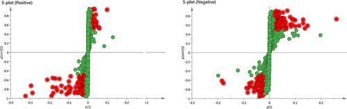
Figure 4 Up- and down-regulated ions with different degrees. The notations are as follows: (1) positive ions with a mass-to-charge ratio greater than 500; (2) positive ions with a mass-to-charge ratio less than 500; (3) negative ions with a mass-to-charge ratio greater than 500; (4) negative ions with a mass-to-charge ratio less than 500.
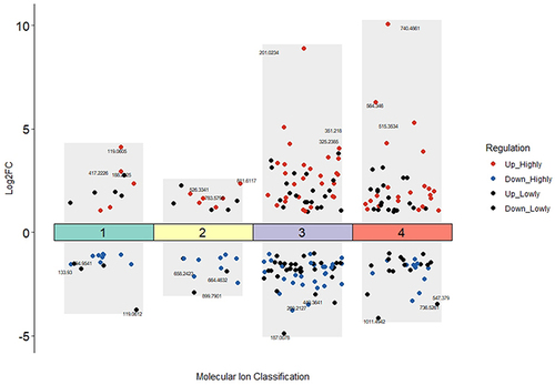
Figure 5 The bubble diagram from the enrichment analysis.
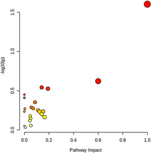
Figure 6 The clustering heatmap of the enriched key differential metabolites in different samples.
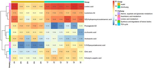
Figure 7 Schematic diagram of the metabolic pathways related to ZHSE and the trends of biomarkers enriched in these metabolic pathways. The notations are as follows: (↑) in green boxes, metabolite higher in the ZHSE group than in the model group; (↓) in red boxes, metabolite lower in the ZHSE group than in the model group. The relevant metabolic pathways are described at the bottom of the boxes.
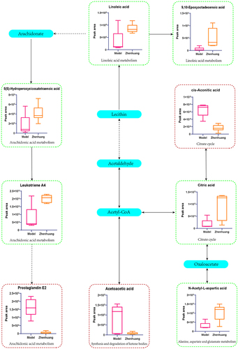
Figure 8 The “Potential Metabolite-Target-Component” interaction network with all target information for active chemical constituents and potential metabolites. The yellow nodes represent active chemical constituents of the ZHSE. The purple nodes represent potential metabolites. The green nodes represent the protein targets of active chemical constituents. The pink nodes represent the targets associated with potential metabolites. The orange nodes represent the proteins that were targets of both active chemical constituents and potential metabolites.
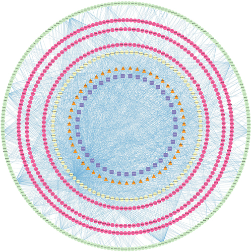
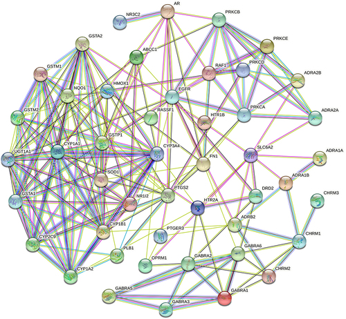
Figure 9 The “Protein-protein-interaction” network with target proteins co-targeted by compounds and metabolites. Purple edges: known Interactions (from curated databases). Pink edges: known Interactions (experimentally determined). Green, red and blue edges: Predicted Interactions.