Figures & data
Figure 1 The work-flow of this study.
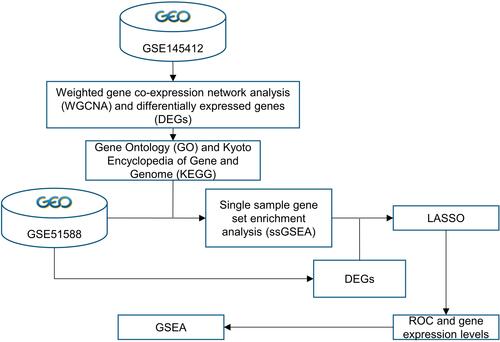
Table 1 Demography of OA Samples in GSE51588 Dataset
Figure 2 WGCNA analysis and hub candidates for MS. (A) Determination of the soft threshold power in WGCNA. The left panel shows the influence of soft threshold power on the scale-free fit index and the right panel shows the impact of soft threshold power on the mean connectivity; (B) gene clustering tree to detect 51 co-expression clusters with corresponding color assignments, each of which represents a module. The gray module indicates no co-expression among the genes; (C) the module-trait relationships. Each row represents a module, the column to the trait (MS phenotype). Each number in rows includes the corresponding correlation and P-value. The positive correlation is in red and the negative one is in green; (D) correlated heatmap of topological overlap of 400 randomly selected genes. Darker squares along the diagonal correspond to modules. The gene dendrogram and module assignment are shown along the left and top; (E) volcano plot of DEGs between control and MS groups; (F) heat map of DEGs between control and MS groups; (G) Venn diagram for selecting hub candidates in MS.
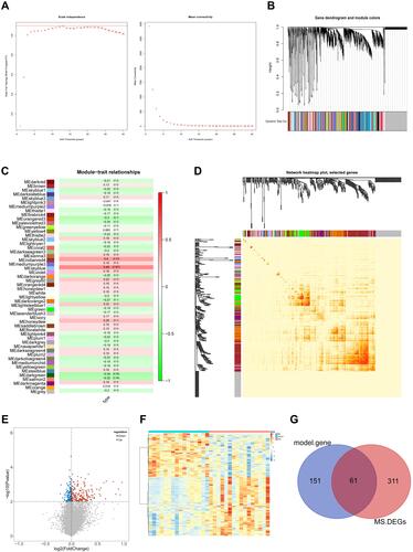
Figure 3 GO enrichment and KEGG analyses for 61 gene candidates. (A–C) The top 10 terms of GO categories of biological process (BP), molecular function (MF) and cellular component (CC), respectively; (D) top 10 terms of KEGG analysis. P-value < 0.05 was considered to be the cut-off criteria.
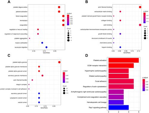
Figure 4 Identification of hub genes for OA affected by MS (MOHGs). (A) Box plot of differentially expressed KEGG pathways in the control and OA patient samples. The expression level of each KEGG pathway was calculated based on ssGSEA for each sample (ns = no significance; *p < 0.05; **p < 0.01; ***p < 0.001; ****p < 0.0001); (B and C) volcano plot and heat map of DEGs between control and OA groups, respectively (|log2FC| > 1 and P-value < 0.05 were defined as screening standard to obtain DEGs for OA.); (D) Venn diagram for selecting hub candidates for MS-affected OA.
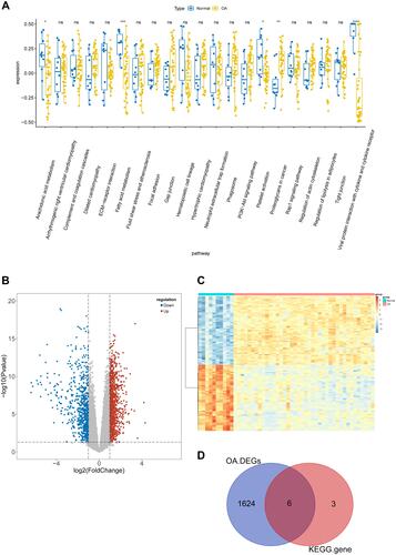
Figure 5 Identification of diagnostic gene biomarkers from MOHGs and model establishment. (A) LASSO regression model of MOHGs. The left plot shows cross-validation to select the optimal tuning parameter (λ or Lambda). The left vertical line crosses over the optimal log λ, which corresponds to the minimum value for multivariate Cox modeling. The right plot indicates coefficient profiles of MOHGs. (B) the ROC curve of constructed model with 4 identified genes (ELOVL7, F2RL3, GP9, and ITGA2B), with an AUC of 1; (C and D) the expression levels of identified 4 diagnostic genes in OA and MS dataset (significant differences were indicated by the corresponding P-values of Wilcoxon test); (E) the ROC curves of identified 4 diagnostic gene biomarkers in OA dataset, with 1-specificity and sensitivity. The AUC value of each curve shows the diagnostic ability of corresponding gene candidates; (F) the ROC curves of identified 4 diagnostic gene biomarkers in the MS dataset.
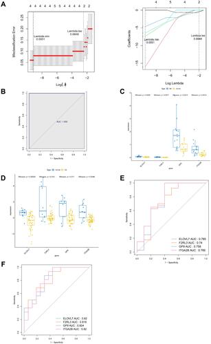
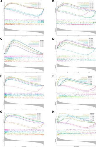
Figure 6 GSEA analysis of 4 diagnostic genes in OA dataset based on GO and KEGG enrichment analyses. Top 10 closely related KEGG pathways and GO terms were shown in each figure. (A and B) GSEA analysis of ELOVL7; (C and D) GSEA analysis of F2RL3; (E and F) GSEA analysis of GP9; (G and H) GSEA analysis of ITGA2B.