Figures & data
Table 1 Patients’ Characteristics of the Entire Collective
Table 2 Patients Characteristics of the Study Group (SG)
Figure 1 The patient allocation and inclusion process into individual analyses is visualized.
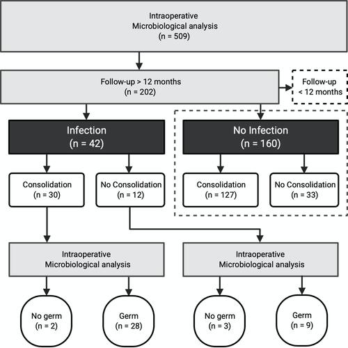
Figure 2 (A) shows the healing and outcome of patients suffering from an OI (study) and patients without OI (control). Duration is shown in years, while outcome is shown as percentages (here 1 equals 100%). (B) visualizes the predictive performance of different computational models that were compared. While 1 shows the final model included into our study, 2 and 3 depict the performance of models including merely one variable.
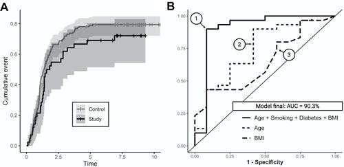
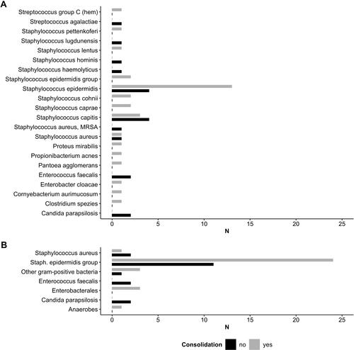
Figure 3 (A) shows the individual pathogens found during microbiological analysis of intraoperative tissue samples for responder (consolidation) and non-responder (no consolidation) of treatment. (B) Pathogens were summarized into coherent groups of bacteria by an experienced microbiologist.