Figures & data
Figure 1 Flowchart of this study. The following datasets were used for the identification of potential diagnostic genes and mechanisms associated with the development of sepsis: GSE13904 (children), GSE25504 (children), GSE9960 (adults) and GSE154918 (adults).
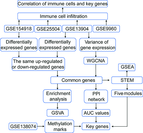
Figure 2 WGCNA of genes showing large expression variance in sepsis patients. (A) Network heatmap of unsupervised cluster analysis of module genes. Different colors in columns and rows represent different modules. (B) Correlation of modules with clinical traits. Each column represents a different module; each row, a different clinical phenotype. Red indicates positive correlation; blue, negative correlation. (C) Progressive up- or down-regulation in a module in the trend: healthy controls < sepsis < sepsis shock.
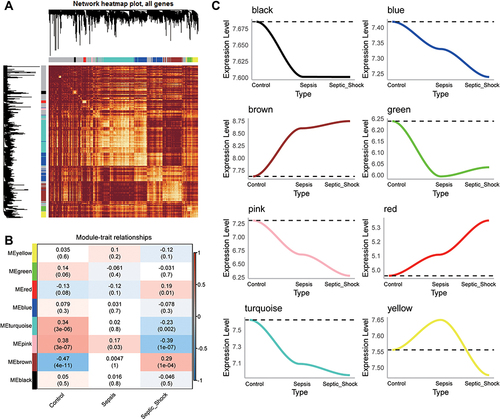
Figure 3 Identification of common genes in sepsis. (A) Petal plot of sample size for sepsis and control groups in four datasets. Red petals represent healthy controls; blue petals, sepsis patients. (B) Manhattan plot of differentially expressed genes between sepsis patients and healthy controls in GSE13904 and GSE154918. Up, up-regulation in sepsis; Down, down-regulation in sepsis; Not, no significant difference from controls. The three genes in each group showing the largest fold difference are labeled. (C) Venn diagram of differentially expressed genes in GSE13904 (children) and GSE154918 (adults). (D) Venn diagram showing DEGs in GSE13904 (children) and GSE154918 (adults) as well as module genes, that are common to adults and children or specific to each one of those groups.
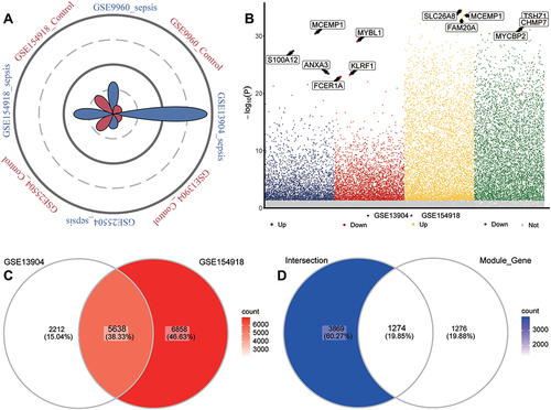
Figure 4 Biological functions and KEGG pathways enriched in common genes. (A) Common genes of sepsis patients relative to controls involved in up- or down-regulated biological processes, as quantified by gene set variation analysis (GSVA). FC, fold change. (B) Common genes of sepsis patients relative to controls involved in up- or down-regulated KEGG pathways, as quantified by single-sample GSVA. FC, fold change. (C) Common genes involved in up- or down-regulated KEGG pathways of GSEA results in sepsis patients relative to controls. P < 0.05 was considered statistically significant.
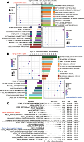
Figure 5 Immune cell suppression in sepsis patients. (A) Differences in immune cell infiltration between sepsis and controls. Each row represents a type of immune cell; each column, a different dataset. Red nodes represent significant up-regulation in sepsis; blue nodes, significant down-regulation. (B) Clustering and correlation of immune cell types based on infiltration levels. The size of each node represents the single-sample gene set enrichment analysis (ssGSEA) scores of each immune cell type, transformed by log10 (Log rank test P-value). Connections between immune cell types represent interactions between the two. The thickness of the line indicates the strength of the correlation, based on Pearson correlation analysis. Red lines represent positive correlations; blue lines, negative correlations. Immune cell cluster A is shown in yellow; cell cluster B, blue; cell cluster C, red; and cell cluster D, brown.
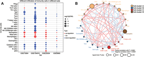
Figure 6 Identification of potential diagnostic genes for sepsis. (A) PPI network of common genes (top 100 with highest degree of connection). Darker color indicates higher degree of connectivity. (B) Heatmap of the top 100 genes based on degree of connectivity in the PPI network. Data from sepsis patients are shown in yellow; sepsis shock patients, green; and controls, brown. (C) Genes with areas under the receiver operating characteristic curve (AUCs) greater than 0.9 in GSE13904 (children) and GSE154918 (adults). Red represents genes with up-regulated expression in sepsis; blue, genes with down-regulated expression. The lengths of the bars represent the mean AUC values of the genes. (D) Differential expression of key genes between sepsis patients and controls. Red nodes represent genes with up-regulated expression in sepsis; blue nodes, genes with down-regulated expression; grey nodes, no significant difference from controls. (E) Correlation between key genes and immune infiltrating cells, based on Pearson correlation analysis. Red nodes represent positive correlations; blue nodes, negative correlations. *P < 0.05, **P < 0.01.
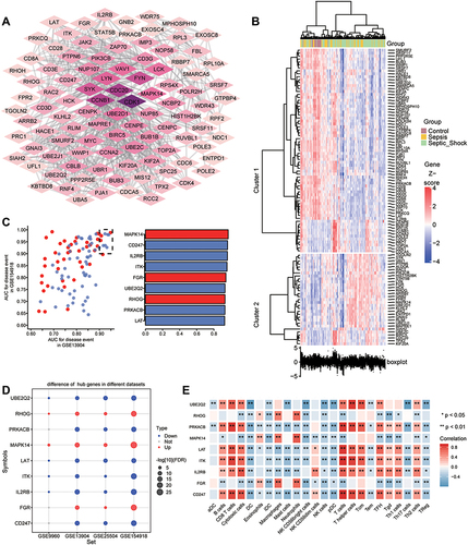
Figure 7 Identification of persistently dysregulated genes during progression from sepsis to septic shock. (A) Heatmap of persistently dysregulated genes identified by STEM in the trend: healthy controls < sepsis patients < septic shock patients. Gene sets were arranged based on cluster assignment in order to generate simplified expression profiles. We graphically depicted only five clusters with >10 genes. (B) The box plots of STEM genes in five clusters. Line plots and box plots were used to display log2 (fold change). Representative genes were highlighted using red lines. Key genes were in significant STEM clustering and located on the right side of the box map. *P < 0.05, **P < 0.01. (C) Expression of key genes were persistently elevated during sepsis development. (D) Signaling pathways persistently up- or down-regulated as sepsis develops. Red in the heatmap represents an enrichment score greater than 0; blue represents an enrichment score less than 0.
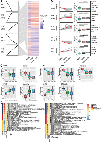
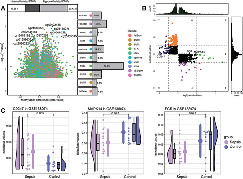
Figure 8 Screening of key methylation markers for sepsis in GSE138074. (A) Differentially methylated positions (DMPs) between sepsis and controls. Of all DMPs, 49.58% were hypermethylated and 50.42% were hypomethylated. The 10 sites with the highest methylation levels are labeled. Each feature color represents a different methylation site. (B) The methylation levels and the expression levels of methylation marks. Key genes are labeled. (C) Differences in key gene methylation levels between sepsis and controls. P for CD247 was 0.039; MAPK14, 0.047; FGR, 0.047.