Figures & data
Table 1 Clinical and Demographic Characteristics of Analyzed COVID-19 and MERS- CoV Infected Patients’ samples
Figure 1 Workflow illustration. Peripheral blood samples collected from different sample cohorts were pre-processed. The biomaterials were inactivated prior to proteomic analysis, and complex differentially expressed protein (DEP) data were subjected to multivariate computational analysis for biological interpretation of the different stages of the coronavirus disease process. The datasets were filtered, and potential COVID-19-related biomarker panels were identified. The details of the clinical and demographic characteristics of all the samples are listed in.
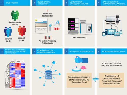
Figure 2 (A) (Left panel) Principal component analysis (PCA) using the expression dataset of 193 differentially expressed proteins between grades of COVID-19 patients. Three distinct clusters are apparent, with asymptomatic (Asymp), mild, and moderate (Mod) forming a close cluster distinct from ICU-admitted patients who recovered from severe illness (Severe-R) and ICU-admitted patients who died of severe illness (Severe-D). (Right panel) Hierarchical cluster analysis using the above dataset of the 193 differentially expressed proteins between grades of COVID-19 patients. Asymptomatic, mild, and moderate cases show remarkably similar heat map patterns, while recovered severely ill and deceased severely ill are distinctively different. The heat map shows the relative amounts of proteins by color as either upregulation with positive z-scores in red or downregulation with negative z-scores in blue. The representations of the trend in the expression changes of some of these proteins between all five grades of COVID-19 patients are illustrated in Supplementary Figure 1, and a complete list of the proteins is in Supplementary Table S1. The figure was generated using Qlucore Omics Explorer version 3.7 (Lund, Sweden). (B) Ingenuity pathway analysis of the 193 differentially expressed proteins between the five grades of COVID-19. Some of the 193 proteins that were mapped/implicated in the IPA database in the pathway analysis of two signaling networks, including Cell Death and Survival, Cardiovascular Disease, and Cell-To-Cell Signaling and Interaction. (C) Cellular Compromise, Inflammatory Response, and Hematological System Development and Function. (The figure was partly generated using a licensed Ingenuity Pathway Analysis program (www.qiagen.com)).
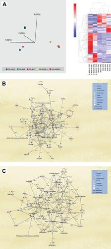
Figure 3 (A) Six steps Illustrations of the molecular mechanisms of the host immune response to SARS-CoV-2 infection showing the entry of inhaled SAR-CoV2 into the respiratory epithelium (step 1). The acute viral infection triggers responses from a large number of pro-inflammatory cytokines (step 2) and as the virus attacks the host cells (step 3) and releases more viral particles into the circulation, triggering different molecular responses and compromising the host immune system (step 4) through multiple biological pathways (step 5). These pathways might be implicated in the different clinical manifestations of the disease as well as modulating the severity of symptoms or controlling cytokine release in response to viral infection (step 6). (B) Comparison of the canonical pathways from the different pairwise analyses of COVID-19 patients. Overexpression changes are more notable between severe and asymptomatic COVID-19 pairs than in mild or moderate pairs with asymptomatic disease. Hierarchical cluster analysis using the expression dataset of differentially expressed proteins that were implicated in three of the top canonical pathways including LXR-RXR activation, acute-phase reaction and production of nitric oxide and reactive O2 respectively. Asymptomatic and moderate cases showed remarkably similar heat map patterns while recovered severely ill and deceased severely ill were distinctively different. The heat map shows the relative amounts of proteins by color as either upregulation with positive z-scores in red or downregulation with negative z-scores in blue using Qlucore Omics Explorer version 3.7 (Lund, Sweden).
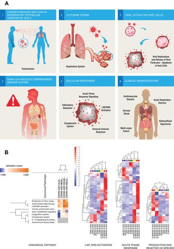
Figure 4 (A) PCA and hierarchical cluster analysis using the expression dataset of 91 differentially expressed proteins between MERS-CoV patients and control subjects. The expression changes of these proteins separate the samples into three distinct clusters, indicating the potential use of these proteins for accurate stratification and as prognostic biomarkers for MERS-CoV patients (see Supplementary Table S2). (B) The representations of the expression changes of some of these proteins between MERS-CoV patients and control subjects. The normalized quantitative values of individual proteins across all sample groups are depicted as box plots using the Qlucore Omics Explorer version 3.7 (Lund, Sweden) (https://qlucore.com).
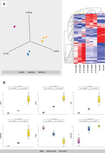
Figure 5 (A) Identification of biomarkers implicated in regulation of SARS-CoV-2 and MERS-CoV. (Top panel) The Venn diagram showing 49 proteins that overlap between the two datasets of COVID-19 and MERS-CoV, indicating some level of homogeneity in protein expression profiles of the two implicated coronaviruses. PCA plot (left lower panel) and hierarchical cluster analysis (right lower panel) using the expression dataset of the 49 proteins that overlap between the two datasets of COVID-19 and MERS-CoV. (B) Representative changes in abundance of some of the 49 proteins between the different grades of COVID-19 patients. The normalized quantitative values of individual proteins across all the sample groups are depicted as box plots, which were generated using the using the Qlucore Omics Explorer version 3.7 (Lund, Sweden) (https://qlucore.com).
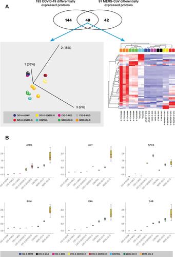
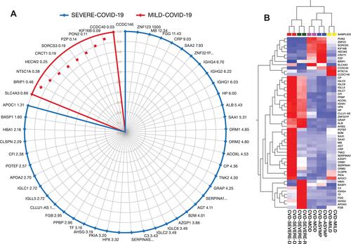
Figure 6 (A) Potential protein panel for diagnosis of asymptomatic cases, prognosis of COVID-19 disease progression from mild to severe COVID-19, and prediction of disease outcomes among severely ill patients. (B) The heat map shows the relative amounts of proteins by color as either upregulation with positive z-scores in red or downregulation with negative z-scores in blue using Qlucore Omics Explorer version 3.7 (Lund, Sweden).