Figures & data
Figure 1 The differentially expressed autophagy-related genes. (A) The heatmaps of 27 DE-ATGs, reflecting the expression levels of different genes in normal and cancer tissues. (B) The volcano plot of the DE-ATGs. (C) The boxplot of the DE-ATGs.
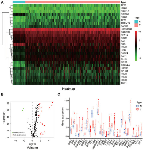
Figure 2 GO enrichment analysis of differentially expressed autophagy-related genes. (A) The GO circos plots of the DE-ATGs. The outer circle represents different genes and GO terms, the first 20 genes of 27 DE-ATGs being shown. The color depth of the outer circle of genes represents the logFC indicating gene expression level. The internal colorful ribbon represents the different GO terms the genes enriched. (B) The GO cluster of the DE-ATGs. The outer circle represents the GO terms the genes enriched, the inner circle represents the logFC of each gene, with the color depth corresponding to the gene expression level. (C) The top 10 significantly enriched GO terms were displayed in the bar plot. The length of the bar represents the number of genes enriched, and the color represents the correlation.
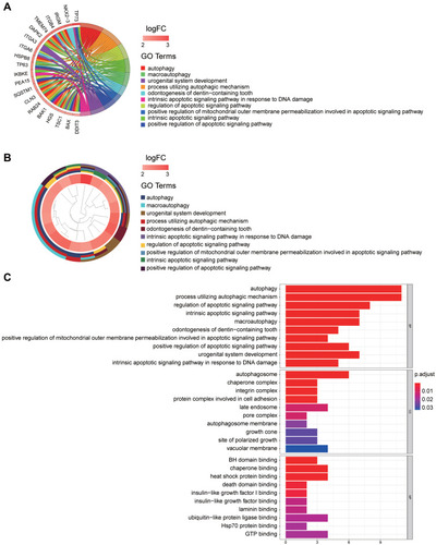
Figure 3 KEGG enrichment analysis of differentially expressed autophagy-related genes. (A) The significantly enriched KEGG were displayed in the bar plot. The length of the bar represents the number of genes enriched, and the color represents the correlation. (B) The circle of KEGG enrichment analysis. Each spot in the circle represents a gene, and the outer circle reflects the enrichment of the DE-ATGs in different signaling pathways. The red color represents the up-regulated expression of the gene in the pathways, while the blue color represents the down-regulated expression of the gene in the pathways. The inner circle represents the Z-score, the color depth corresponding to the Z-score. The right table annotates KEGG pathways.
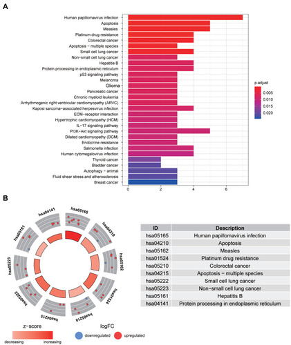
Figure 4 Identification of candidate DE-ATGs. (A) The univariate Cox regression analysis identified 12 candidate DE-ATGs (p < 0.05). (B) Colored by cluster ID, where nodes that share the same cluster ID are typically close to each other. (C) The result of multivariate Cox regression analysis.
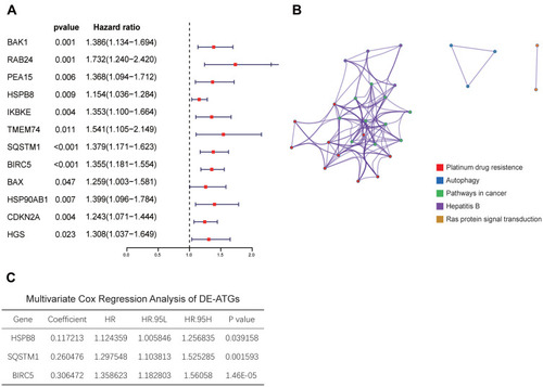
Figure 5 The three genes expression in tumor and non-tumor tissues and survival analysis. (A) The three genes expression level in tumor and normal tissues. (B) The K–M curves of the three genes.
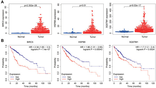
Figure 6 BIRC5 and SQSTM1 could be used as independent predictors. (A–C) The forest plot of BIRC5 and SQSTM1. (D, E) The ROC curves of BIRC5 and SQSTM1.
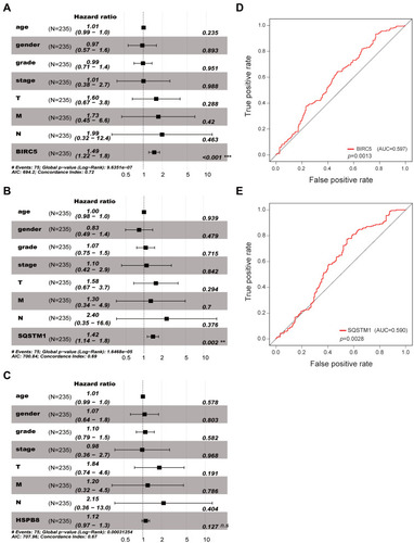
Figure 7 The relationships of the expression level of BIRC5 and SQSTM1 with different clinicopathologic features. (A–D) The relationship between the expression of BIRC5 and survival status, grade, stage and T stage. (E–G) The relationship between the expression of SQSTM1 and survival status, age, and gender.
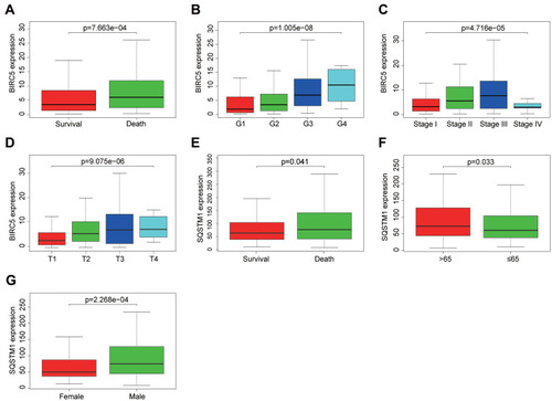
Figure 8 The autophagy-related risk signature prognostic index (PI) and prediction ability of HCC patients. (A) The K-M plot representing that the high-risk group had shorter OS than the low-risk group. (B) The heatmap showing the three signature genes expression levels of patients in the low-risk group and high-risk group. (C) The survival time of patients in the TCGA dataset. (D) The number of patients in the two groups ranked by the risk score. (E) The univariate Cox regression analysis of the three genes and clinicopathologic features. (F) The multivariate Cox regression analysis of the three genes and clinicopathologic features. (G) The ROC analysis of the autophagy-related risk signature and the clinicopathologic features.
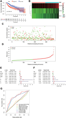
Figure 9 The association between autophagy-related risk signature and clinicopathologic features. (A) The autophagy-related risk signature associated with survival status. (B) The autophagy-related risk signature associated with OS time which be divided into two groups by OS<5 years and OS>5 years. (C) The autophagy-related risk signature associated with gender. (D) The autophagy-related risk signature associated with grade which is divided into two groups, Grade 1–2 (G1-2) and Grade 3–4 (G3-4). (E) The autophagy-related risk signature associated with T stages which is divided into two groups, T1-2 and T3-4. (F) The autophagy-related risk signature associated with M stages which is divided into two groups M0 and M1.
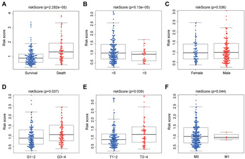
Figure 10 Validation of the autophagy-related risk signature (A) Kaplan–Meier analysis about DFS of the autophagy-related risk signature. (B, C) Kaplan–Meier analysis about OS of the autophagy-related risk signature. The data set of A and B was obtained from Hepatological Surgery Department of the Affiliated Hospital of Qingdao University and the data set of C was obtained from ICGC.
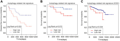
Figure 11 Nomogram to predict the 1-, 3-, and 5-year survival probability of patients with HCC. (A) The nomogram of the HCC dataset from TCGA. Querying the points corresponding to different prognostic parameters and calculating the total points could predict the survival probability of patients. (B–D) Calibration curves of the nomogram to predict the 1-, 3-, and 5-year survival probability.
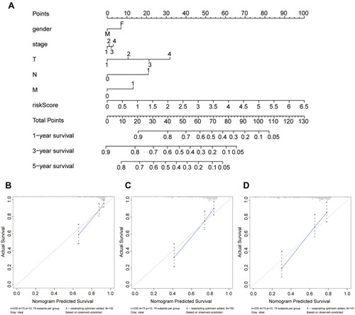
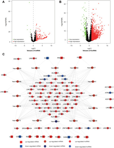
Figure 12 Differently expressed miRNAs and lncRNAs and ceRNA network. (A) The volcano plot of the differently expressed miRNAs. (B) The volcano plot of the differently expressed lncRNAs. (C) The lncRNA-miRNA-mRNA network of DE-ATGs in HCC.