Figures & data
Figure 1 Flow chart.
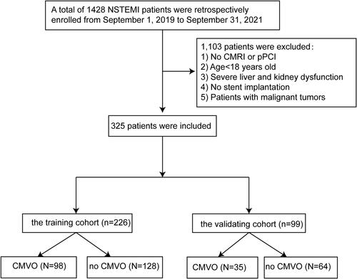
Table 1 Patient Characteristics
Table 2 Univariate Logistic Regression Analysis of the Data from the Training Cohort
Table 3 Multivariate Logistic Regression Analysis of the Data from the Training Cohort
Figure 2 Nomogram for predicting the possibility of CMVO after primary PCI in NSTEMI patients.
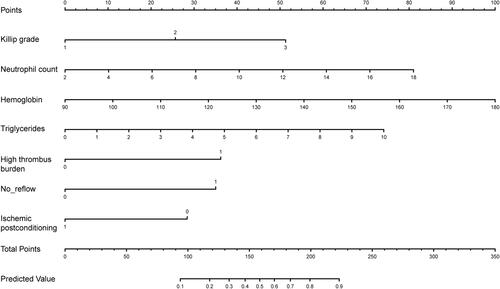
Figure 3 ROC curves for the nomogram in the training cohort (A) and the validating cohort (B).
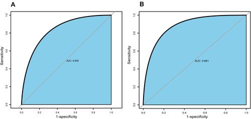
Figure 4 The calibration plot for the nomogram in the training cohort (A) and the validating cohort (B). The predicted probability of CMVO is plotted on the x-axis and the actual probability is plotted on the y-axis.
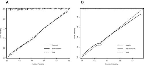
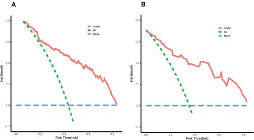
Figure 5 The decision curve analysis (DCA) for the nomogram in the training cohort (A) and the validating cohort (B). The blue dotted line represents the intervention-none and the net benefit with zero, the green dotted line shows intervention-all-patients. The upper part of the green dotted line represents positive income, meanwhile, the lower part represents negative income. The red line represents a threshold of the model.