Figures & data
Table I. Mean dose, dose limits for planning target volumes (PTV) and dose constraints for organs at risk (OAR).
Figure 1. CT slices (sagittal and axial) of the patient with the largest mismatch of 59% (A and B) and of a patient with a mismatch of 18% (D and E). The contours are: GTVPET1 (red), GTVPET2 (blue) and the volume receiving 79 Gy (yellow), converted from the dose color wash. Panels C and F illustrate the DVHs from the same two patients with mismatch of 59% and 18% mismatch, respectively. Curve colors are: GTVPET1 (red), GTVPET2 (blue), PTVPET1 (green), PTVPET2 (purple).
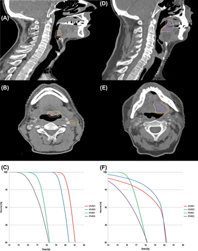
Table II. Target volumes, mean dose, dose distribution and tumor control probability.
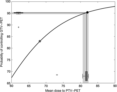
Figure 2. Variability in tumor control probability (TCP) as a result of the recorded variability in GTVPET. The gray dot is the probability of tumor control using the current mean dose (68 Gy). The black dot depicts the probability of control from the dose painted plans using the mean dose to the GTVPET from the first scan (GTVPET1). The black lines show the median dose on scan 2 (x-axis) and the resulting median TCP (y-axis). The two box-and-whiskers plots along the axis show the distribution of doses and TCP estimates, with an outlying patient marked as a black cross. The outlying patient had lymph nodes delineated on scan 2 that was not delineated on scan 1 – on review this difference was due to the interpretation of the uptake, rather than variability in uptake. The median detriment in TCP on scan 2 relative to scan 1 is 0.2%.