Figures & data
Fig. 1. Map showing the location of Weybourne Atmospheric Observatory (red star). Major centres of H2 production (four facilities and over) in the UK and the Benelux region are highlighted using semi-transparent red circles. Map Source: Google Maps.
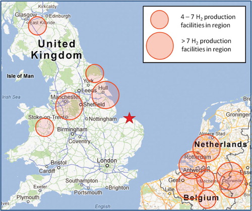
Fig. 2. Example of RGA3 non-linearity results for July 2008. ‘H2 expected’ is the mixing ratio expected from a linear relationship determined from a single point calibration and this point lies on the dashed line.
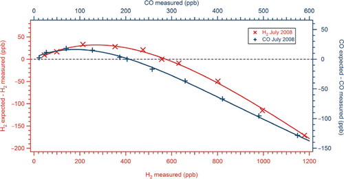
Fig. 3. Time series of H2 measured at Weybourne for period March 2008–February 2009. Note the change in axis scale above 800 ppb. The red markers represent the background H2 estimated in Section 3.1.
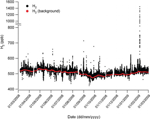
Fig. 4. Monthly means and medians of H2 and CO at Weybourne. The lines represent sine wave fits to the mean values.
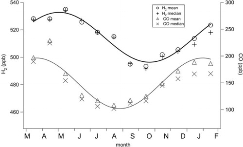
Fig. 5. Hourly means for H2 mixing ratio and hourly means for irradiance at Weybourne for MAM, JJA, SON and DJF. Error bars represent±one sigma standard deviation of the hourly mean H2 mixing ratio.
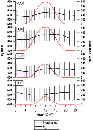
Fig. 6. Wind rose showing the distribution of ΔH2 for (a) all positive ΔH2 and (b) data above a ΔH2 of 40 ppb. Radial axis represents probability and the legends show mixing ratio ranges colour coded. A wind rose showing the wind distribution is shown on each panel in black.
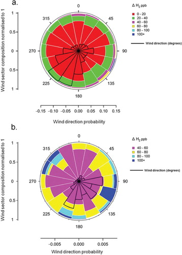
Fig. 7. ΔH2 vs. ΔCO for all data collected between March 2008 and February 2009. Dashed boxes labelled 1 and 2 correspond to event 1 and event 2 in Section 3.6, respectively. Note the change in scale on y-axis above 300 ppb H2.
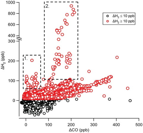
Fig. 8. ΔH2 vs. ΔCO in each of four seasons for elevated ΔH2 (≥10 ppb) and also filtered for polluted conditions (NOx>5 ppb). ΔH2 values above 150 ppb have been excluded as these belong almost exclusively to the periods of anomalously high H2 (i.e. corresponding to boxes 1 and 2 in ). Regression analysis was performed for the data where NOx was above 5 ppb NOx. The dashed lines in each panel represent ΔH2/ΔCO ratios of approximately 0.36 to 0.6, which are representative of near-source vehicle emission ratios reported in the literature (see text in Section 3.5).
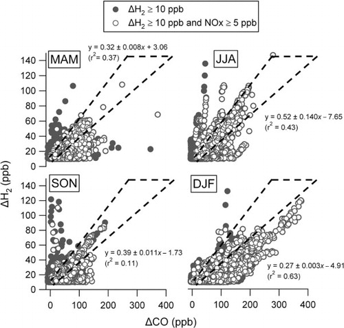
Fig. 9. NAME back-maps showing surface exposure (0–100 m) for air arriving at Weybourne between (a) 06:00 and 09:00 on the 5 July 2008 and (b) 03:00 and 06:00 on the 5 February 2009. The percentage of total air mass is the fraction of the 30 000 particles released that are detected in each 0.05°×0.05° grid box during the 2 d prior to the release.
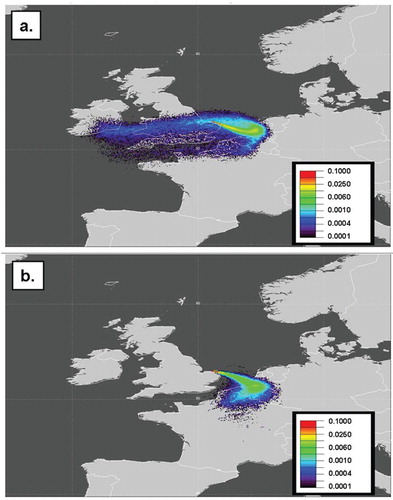
Fig. 10. H2 deposition events used to estimate H2 deposition velocity for (a) 11–17 June 2008 and (b) 25–30 July 2008. Events used are highlighted using blue transparent rectangles.
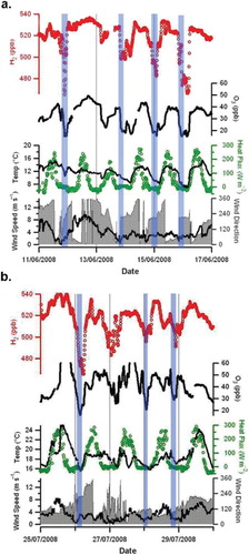
Fig. 11. RASS potential temperature for the H2 deposition events used to estimate H2 deposition velocity for (a) 11–17 June 2008 and (b) 25–30 July 2008. Black circles represent the nBL heights estimated from O3 deposition in Section 3.7 and corresponding to the blue transparent rectangles shown in .
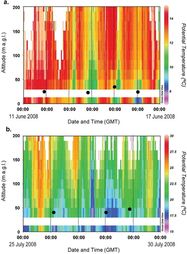
Table 1. Comparison of H2 deposition velocity estimates using a ‘top-down’ approach
Fig. 12. H2, CO, O3, NO, NO2 and wind direction for the period of strong northerly flow observed during May 2008. The dashed lines numbered 1–4 correspond to number air-mass trajectory maps numbered 1–4 shown in .
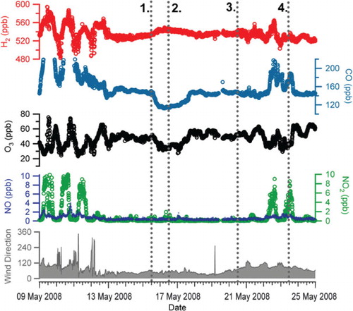
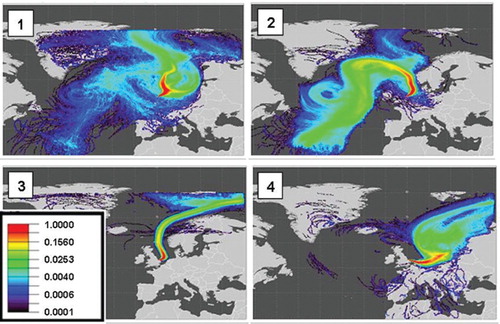
Fig. 13. Ten-day NAME back-maps showing the probability of surface influence (0–1000 m) for 12:00–14:00 h for 15 May 2008 (top left), 16 May 2008 (top right), 20 May 2008 (bottom left) and 23 May 2008 (bottom right).