
 ?Mathematical formulae have been encoded as MathML and are displayed in this HTML version using MathJax in order to improve their display. Uncheck the box to turn MathJax off. This feature requires Javascript. Click on a formula to zoom.
ABSTRACT
Both philosophically and in practice, statistics is dominated by frequentist and Bayesian thinking. Under those paradigms, our courses and textbooks talk about the accuracy with which true model parameters are estimated or the posterior probability that they lie in a given set. In nonparametric problems, they talk about convergence to the true function (density, regression, etc.) or the probability that the true function lies in a given set. But the usual paradigms' focus on learning the true model and parameters can distract the analyst from another important task: discovering whether there are many sets of models and parameters that describe the data reasonably well. When we discover many good models we can see in what ways they agree. Points of agreement give us more confidence in our inferences, but points of disagreement give us less. Further, the usual paradigms’ focus seduces us into judging and adopting procedures according to how well they learn the true values. An alternative is to judge models and parameter values, not procedures, and judge them by how well they describe data, not how close they come to the truth. The latter is especially appealing in problems without a true model.
Many statistical analyses are framed as problems of model selection or parameter estimation. Frequentists have procedures for choosing models and estimating parameters; Bayesians have procedures for calculating posterior probabilities of models and parameters. Either type of procedure might make sense when there are true models and parameters. But often there are not, and pretending otherwise can lead to inferential errors because it diverts attention from the often crucial task of finding many good models. We illustrate with examples from the literature.
Example 1 (prostate cancer).
Hastie, Tibshirani, and Friedman (Citation2009) analyzed a dataset on prostate cancer that was originally reported by Stamey et al. (Citation1989). According to Hastie, Tibshirani, and Friedman,
“[Stamey et al.] examined the correlation between the level of prostate-specific antigen and a number of clinical measures in men who were about to receive a radical prostatectomy. The variables are log cancer volume (lcavol), log prostate weight (lweight), age, log of the amount of benign prostatic hyperplasia (lbph), seminal vesicle invasion (svi), log of capsular penetration (lcp), Gleason score (gleason), and percent of Gleason scores 4 or 5 (pgg45).”
After showing a pairwise scatterplot of all the variables, a correlation matrix of the predictor variables, and a simple linear regression of the level of prostate-specific antigen (lpsa) on the eight predictors, the next analysis by Hastie, Tibshirani, and Friedman is presented in their Table 3.3, reproduced here as
Table 1. Estimated coefficients and test error results, for different subset and shrinkage methods applied to the prostate data.
“shows the coefficients from a number of different selection and shrinkage methods. They are best-subset selection using an all-subsets search, ridge regression, the lasso, principal components regression, and partial least squares. Each method has a complexity parameter, and this was chosen to minimize an estimate of prediction error based on tenfold cross-validation.”
There are 28 models M1, …, M256 (we follow Hastie, Tibshirani, and Friedman and consider only linear models with an intercept) that indicate which coefficients are set to 0, and the focus is on choosing a model and estimating its parameters. But choosing a model and estimating parameters tell only part of the story about the data. We hope to tell another part by finding models that are nearly as good as the best. For a parametric model with parameter θ and density pθ(y) the log-likelihood function is ℓ(θ) = log (pθ(y)) treated as a function of θ for the fixed, observed y. We’re interested in log-likelihood functions because we interpret them as quantifying how well the parameter value θ describes the data y. When a multidimensional θ is divided into two parts, say θ1 and θ2, the profile log-likelihood function is treated as a function of θ1 for the fixed, observed y, which we interpret as quantifying how well the parameter value θ1 describes the data y when paired with its best partner θ2.
In the prostate cancer example wecan consider the model M to be a parameter and examine the profile log-likelihood function where the notation
means that the supremum is taken over σ and those β’s in model M while the other β’s are set to 0. We try to find features of M that allow lP(M) to be large relative to its maximum over the 256 models. Our story will depend not just on the maximum of lP(M), but on the whole function. We work with the 67 cases Hastie, Tibshirani, and Friedman used for training and omit the 30 cases they used for testing.
is a density and rug plot of the 256 values lP(Mi). The maximum is lP(M) ≈ −67.5 which is for the full model and corresponds to the LS column of .
Figure 1. Density and rug plots of the profile likelihood for the 256 models of the prostate cancer data in Example 1.
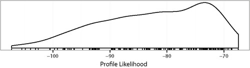
LASSO says that the model ought to include lcavol, lweight, lbph, and svi and exclude age, lcp, gleason, and pgg45. lP(M) for the LASSO model is about −71.2. shows there are many models with lP(M) as large or nearly as large as −71.2. Our view is that if any of the models with large lP(M), say larger than about −75 or so, exclude lcavol, lweight, lbph, or svi, then the inference for including those variables is weak because we can describe the data nearly as well without those variables as with them.
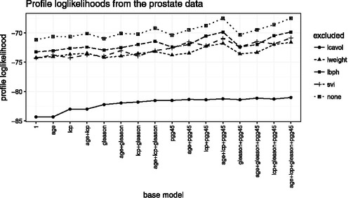
Figure 2. Profile log likelihoods of the 80 models in Example 1 that include at least three of lcavol, lweight, lbph, and svi. The base model indicates which other predictors are included. The five lines are for models that exclude either one or none of lcavol, lweight, lbph, and svi.
Though more could be done—for example, model diagnostics, removing more than one key variable, fitting nonlinear regressions—we will stop exploring the prostate data for now. Example 1 illustrates some themes of this article:
| 1. | When exploring the question of whether a variable ought to be in a model, it is useful to see how much descriptive power is gained by including that variable. Example 1 used profile log-likelihood to make the comparison, but later examples will show the dangers of relying too heavily on likelihood. | ||||
| 2. | It was useful to see how strongly the evidence for including a variable depends on which other variables were included. In Example 1 the dependence was weak, but that isn’t always the case. | ||||
| 3. | There are no true models and parameters. LPSA is not generated as an exact linear function of the predictors plus Normally distributed errors with constant variance. Just to be clear, even if we adopted a nonparametric model such as a spline, there would still be no true regression function and no true error distribution because the population to which we want to generalize is fuzzy and is changing through time and space. Because there are no true models and parameters, it is misleading to speak of estimating, finding confidence intervals for, or finding the posterior distribution of them and misleading to judge procedures according to how accurately they learn true values. But we can still judge models and parameter values according to how well they describe the data. | ||||
| 4. | Analysis of the prostate data should not be framed as optimization. The data are not a perfectly drawn random sample from a well-defined population; the population of potential prostate patients is changing over time and space, as are the relationships among the variables; and the region of spacetime over which we want to generalize is fuzzy. For all these reasons, the parametric form is only an approximation to an imprecisely defined thing we want to study. Whatever target function we adopt and whatever its optimum may be, the answer may change if we adopt a slightly different formulation of the problem or collect data at a slightly different time in a slightly different way from a slightly different population. Therefore, we should be interested not only in the precise optimum of a precisely defined target function but should look for all (model, parameter) combinations at which our target function is large because those combinations are plausible descriptions of the data. They may even be optima under slightly different formulations. | ||||
| 5. | Even though there is no true model and no true coefficients, it still makes sense to talk about how well (model, parameter) combinations describe the data. | ||||
Our point of view contrasts with that of many other statisticians. Here, for example, is how van der Laan (Citation2015) explained an alternate view.
“…it is not true that one must start with simplifying assumptions, as the field of statistics has the theoretical foundation that allows the precise formulation of the statistical estimation problem. …However, that is precisely what most statisticians blithely do, proudly referring to the quote, ‘All models are wrong, but some are useful.’ …
“The consequences of giving up on formulating the actual statistical model are dramatic for our field, making statistics an art instead of a science. …if one gives up on the scientific standard that a statistical model has to be true, then any statistician can do whatever they want. …
“It is complete nonsense to state that all models are wrong, so let’s stop using that quote. For example, a statistical model that makes no assumptions is always true. …
“…targeting the estimator toward the estimand so the resulting estimator is minimally biased and statistical inference is possible.”
We disagree. It is not that we “give up on the scientific standard that a statistical model has to be true;” it’s that in many problems, including Example 1, there is no true model, not even a nonparametric one. Because there is no true model, it is not possible to target the estimator toward the estimand so the resulting estimator is minimally biased: bias is not a relevant concept.
Instead of choosing a model, we prefer to keep many models in mind, along with the parameters of those models that provide good descriptions of the data. We agree with Lindley (Citation1993) who said,
“The ideal statistician holds all possible models in his head but the real statistician works with a subset of models, what Savage called a ‘small world’, the choice of which is governed by the data and other considerations.”
and add that we try to keep our small world as large as possible for as long as possible. We turn next to another example where again there is no true model.
Example 2 (soil respiration).
Soil respiration refers to the exchange of carbon between the soil and the atmosphere. This example draws on data analyzed by Giasson et al. (Citation2013) of over 100,000 measurements of soil respiration in the Harvard Forest, in north-central Massachusetts. To quote from Giasson et al.:
“[S]oil respiration (Rs) [is] the sum of belowground autotrophic (roots and associated mycorrhizae) and heterotrophic (mainly microbes, microfauna, and mesofauna) respiration. Estimates of global Rs range from 68 to 98 Gt C [gigatons of carbon per year] (Raich and Schlesinger Citation1992; Schlesinger and Andrews Citation2000; Bond-Lamberty and Thomson Citation2010), or about two-thirds of all of the C emitted to the atmosphere by terrestrial ecosystems. The amount of C emitted through Rs is
10 times more than that released through fossil fuel combustion and cement manufacturing (IPCC Citation2007; Peters et al. Citation2012), although, for the most part, Rs is closely coupled to a large photosynthetic uptake, leading to a much smaller net C exchange with the atmosphere (Schlesinger and Andrews Citation2000).”
Because Rs is generated by metabolic processes it is affected by soil temperature Ts, and much interest centers on the relationship between Ts and Rs.
Figure 3. in the Harvard Forest. Over 100,000 data points.
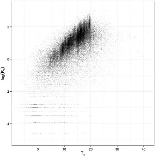
A good first description of the data is
| Model A |
| ||||
There are multiple enhancements of Model A that describe the data more accurately including the following.
| Model B | We could propose a nonlinear regression function such as, for example, a simple quadratic. doesn’t suggest much curvature except for the points with low Rs or high Ts but the t-statistic for the quadratic term is over 100 and the p-value is minuscule. A nonparametric regression function would presumably fit even better than a quadratic. | ||||
| Model C | The relationship between Rs and Ts varies slightly by the type of site, that is, by whether the site is deciduous, hemlock, coniferous, swamp, bog, mixed, and so on, so we could propose a model in which different forest types have different slopes and intercepts, either random or fixed. | ||||
| Model D | Residuals from Model A are asymmetric, non-Normal, and vary by type of site, so we could propose a more accurate model for residuals. | ||||
| Model E | Giasson et al. (Citation2013) further explain measurement of Rs: “Rs was measured in fixed locations on a given sampling day, generally where PVC or aluminum collars had been inserted and left in the soil … | ||||
There is much collar-to-collar variability in the response of Rs to Ts, and that was the main focus of Giasson et al. (Citation2013). It is not our focus here, but we could propose a model in which parameters differ from collar to collar.
If we were writing a report to ecologists on Example 2 we would want our report to emphasize two ideas: (i) the bulk of the data, with some exceptions whose cause we don’t yet understand, can be well-described by a linear relationship with a slope about 0.127 or so and a residual SD around 0.67 or so; and (ii) Models B through E describe the data modestly better than Model A. These ideas are not quantified by estimates, hypothesis tests, p-values, confidence intervals, or posterior probabilities. With over 100,000 data points, confidence and posterior intervals would presumably be small. That’s inappropriate when there’s no precise thing we’re trying to estimate. There are no true models and no true coefficients in Example 2 for reasons similar to those of Example 1: the data are not a perfectly drawn random sample from a well-defined population; the population, such as it is, is changing over time and space; and the region of spacetime over which we want to generalize is fuzzy. We should not take a position on whether the relationship between log (Rs) and Ts is linear, quadratic, or nonparametric; we should present to the investigators multiple ways of describing the data. We should not select models; we should keep in mind many models and their relative strengths.
Even effect sizes are fundamentally imprecise. That is, there is no precise meaning to the effect of a deciduous rather than a hemlock forest. Deciduous forests differ from each other, as do hemlock forests. Within the Harvard Forest, different deciduous stands differ from each other. Even so, our data tell us something about forests in general and about the comparison between deciduous and hemlock forests. But the thing our data tells us is fuzzy and should not be accorded the apparent precision that 100,000 data points convey in our usual paradigms.
van der Laan (Citation2015) said, “As a consequence [of giving up on the scientific standard that a statistical model has to be true], we will not be an intrinsic part of the scientific team, and the scientists will naturally have their doubts about the methods used, thus only accepting the answers we generate for them if it makes sense to them: ….” We disagree. Rather, scientists should have doubts about methods that rely on there being a true statistical model, even if nonparametric, for this dataset. If we insist there is a true model, and if the answers it generates do not make sense to ecologists, then those answers should not be immediately accepted. They should be checked to see whether they lead to a new ecological understanding or whether they are an artifact of our insisting that there is a true model and that our algorithms are accurately estimating it.
The nextexample is another in which there is no true model. It illustrates one danger of taking the model and likelihood function too seriously.
Example 3 (ozone).
Wang et al. (Citation2012) reported,
“Lower atmospheric ozone, a gaseous air pollutant, is toxic to many plants and threatens the health of forests across the United States. In the 1990s, the USDA Forest Service began a monitoring program to assess status and trends with respect to the presence of phytotoxic concentrations of ozone in our nation’s forests. Ozone detection is based on the foliar (leaf) injury response of ozone-sensitive bioindicator species; a response that is conditioned primarily by the levels of ozone in the air and moisture in the soil. …
“Ozone enters plants through stomata (pores) in the leaves. Once in the leaf, it damages the chloroplasts, leaving marks that are visible to the naked eye. …
“The USDA Forest Service administers a nation-wide ozone biomonitoring program to address national concerns about ozone impacts on forest health (Smith, Coulston, and O’Connell Citation2008). Information on plant response to ozone in forested landscapes is collected on a network of 1,200 field sites in 46 states. …
“There are five environmental covariates. Three — N100, W126, and SUM06 — are measures of ozone. Two — MI and PDSI — are measures of plant moisture stress. MI provides an indication of plant moisture deficit (precipitation input vs. transpiration output) while PDSI is a measure of soil moisture stress (i.e., drought severity). Both measures are important because ozone damages leaves by entering open stomata, and stomates are closed when plant moisture is limiting or the soil is too dry. …. Because W126 and SUM06 are nearly collinear, we omit W126 in what follows.
“In addition to the environmental covariates, there are four spatial covariates — state, site, climate division, and ecological section — and year. …
“To answer our questions, we fit multiple models, all of the form
Those models and two goodness of fit measures, AIC and BIC, are shown in . AIC, BIC, and their variants are information criteria of the form where k is a penalty. They are used to select the model with the smallestvalue.
Table 2. Models and measures of fit as calculated by Wang et al. (Citation2012) in Example 2.
Wang et al. (Citation2012) presented a thorough comparison of the models covering considerations such as the ecological relevance of the predictors, the a priori plausibility of the models’ fitted values, and the improvement in either AIC or BIC of one model over another. AIC and BIC are used as informal guides, not formal model selection criteria. Wang et al. summarized:
“…familiar parametric regression curves for binary data (logistic, probit, complementary log-log) are not sufficiently flexible to model the data well, at least not without high-degree polynomials of the predictors. Some sort of semiparametric models are needed. We used splines in generalized additive models, but other choices might work equally well. …
“…good models should include at least one ozone variable. Whether that variable is SUM06 or N100 makes just a small difference. …Similarly, good models should include at least one moisture variable.
…
“[Our analysis] also tells us something about our ability to predict ozone damage. Many fitted values are below 0.2 or 0.1 — and the data agree — which shows that there are some environmental conditions — for example low levels of ozone combined with low plant available moisture — under which we can be confident there will be little ozone damage. In contrast, there are no fitted values greater than about 0.7, which shows that we have not been able to identify environmental conditions under which we can reliably expect plants to be damaged.”
The story Wang et al. thought it important to tell consists of three main points: use flexible models; include both ozone and moisture as predictors; we can predict when damage won’t occur but not when it will. That may not be the whole story about this dataset, but telling this part of the story does not require selecting a model, estimating parameters, testing hypotheses, or calculating posterior probabilities. Instead, it relies on informal measures of goodness of fit to convey how well various models describe the data.
Wang et al. used AIC and BIC informally because they realized that information criteria can be sensitive to how details of model specifications interact with data. As Wang et al. note, the log-likelihood, being a sum, can be sensitive to outliers, so it pays to look at each yi’s contribution to see whether a small number of data points have large influence in model comparison. It is a familiar point that sums and averages can be sensitive to outliers but one that is often ignored in model selection and comparison, especially by people who treat statistical analysis as an optimization problem. Wang et al. explore that point in the context of their models. Rather than repeat their analysis, we present a simpler example that illustrates the same point.
Example 4 (logistic regression).
Our example will be a logistic regression. We (1) generated 1000 points with X ∈ [ − 20, 20] from a model in which , (2) added one additional point (x, y) = ( − 20, 1), and (3) compared a logistic regression in which X enters linearly to one in which it enters quadratically to see how the additional point affects the comparison.
depicts the model comparison when the data do not include the additional point. plots the 1000 original points as small dots, jittered vertically for legibility. The dashed curve is the fit when X enters linearly and the large dotted curve is the fit when X enters quadratically. plots the fitted values from the quadratic model against those from the linear model. The fits are nearly identical, as they should be because the smaller model is true.
4c plots vs.
, the individual points’ log likelihoods, and 4d is a boxplot of the points’ contribution to the log likelihood ratio. The contributions are all less than ± 0.4 and no point dominates the sum. R tells us that AIC for the linear and quadratic fits are 156.44 and 158.08, respectively; the linear fit wins by a little bit.
In contrast, compares the two models when the additional point ( − 20, 1) is included. and show that the fitted values of the two models are still nearly identical. Even so, shows that the new point’s probability is much less, on the log scale, under the linear model than under the quadratic model. The boxplot in 5d shows that the new point’s contribution to the log-likelihood is close to −15, much larger than any other point’s. The AIC values are 194.64 for the linear fit and 167.99 for the quadratic. The quadratic fit wins by a lot.
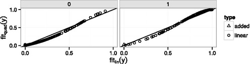
The explanation for the large influence of the added point in Example 4 can be seen in the lower left corner of but perhaps even more clearly in , which shows the fitted values from the quadratic model plotted against the fitted values from the linear model separately for yi = 0 and yi = 1. (Wang et al. Citation2012, have a similar plot.) The new point has a fitted value very close to zero under both models, but its fitted value is slightly larger under the quadratic model so its point in is slightly above the line. When both models are surprised. But though the quadratic model’s fitted value is only slightly larger, its surprise, as measured by log-likelihood, is much less. Any point near the lower left corner of the yi = 1 panel or the upper-right corner of the yi = 0 panel has potential for high influence in model comparison because it can yield a large likelihood ratio, which is an artifact of treating the model too seriously.
Figure 4. Example 4. Data generated from linear logistic model. Comparison of linear and quadratic logistic regression. (a) Jittered yi vs. xi. Small points are data. Dashed curve is the linear logistic fit. Dotted curve is the quadratic logistic fit. (b) Points are fitted values from quadratic and linear logistic regression. Line is y = x. (c) from quadratic and linear logistic regression. Line is y = x. (d) Boxplot of log-likelihood ratio
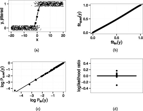
Figure 5. Example 4. Data generated from linear logistic model with one additional point ( − 20, 1). Comparison of linear and quadratic logistic regression. (a) Jittered yi vs. xi. Small points are data. Dashed curve is the linear logistic fit. Dotted curve is the quadratic logistic fit. (b) Points are fitted values from quadratic and linear logistic regression. Line is y = x. (c) from quadratic and linear logistic regression. The additional point is the one near ( − 17, −3.5). Line is y = x. (d) Boxplot of log-likelihood ratio
.
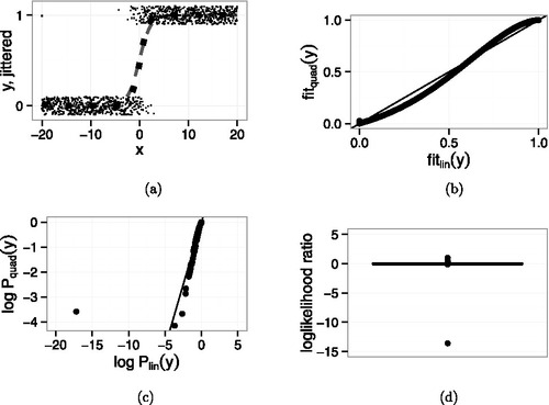
Figure 6. Fitted values from the quadratic model vs. fitted values from the linear model in Example 4. Left panel: y = 0; right panel: y = 1. Circles: points generated from the linear model. Triangle: the added point.
This article was prompted by the author’s observation that data description receives too little attention in statistical research, application, and teaching. We tried to demonstrate through examples that quality of description is a useful way to report at least some aspects of statistical analyses. If the description is explanatory, in the sense that it fits with plausible mechanisms in physics, medicine, sociology, or whatever, so much the better, but good models should describe the data well. We agree with Lindley (Citation1993), who said, “In the earlier stages … consideration of models can be done informally by inspection of the data. Only when the issues become more delicate is there a need for a formal system ….” When we explore data our usual goal is to find many models and parameters that describe the data and report those to the investigator, whose response may influence which formal system is applied.
Our primary criterion for good description is likelihood, but likelihood can sometimes mislead. One problem occurs when there are outliers, so we may make reports such as, “a linear logistic model describes most of the data well, but there is an outlying point” (Example 4) or “A linear model describes most of the data well but there are exceptions at the extremes” (Example 2). Another problem occurs because, when the sample size is large, one model or set of parameters may have a much larger likelihood than another, even though the two models are nearly identical, similarly to the idea that statistical significance does not equal practical significance.
To summarize, we think statistics education and practice should pay more attention to data description, even if that comes at the expense of formality and algorithms.
Related Research Data
References
- Bond-Lamberty, B., and Thomson, A. (2010), “Temperature-Associated Increases in the Global Soil Respiration Record,” Nature, 464, 579–582.
- Giasson, M.-A., et al. (2013), “Soil Respiration in a Northeastern US Temperate Forest: A 22-Year Synthesis,” Ecosphere, 4.11.
- Hastie, T. J., Tibshirani, R. J., and Friedman, J. H. (2009), The Elements of Statistical Learning: Data Mining, Inference, and Prediction (2nd ed.), Springer Series in Statistics, New York: Springer.
- IPCC (2007), “Changes in Atmospheric Constituents and in Radiative Forcing,” The Physical Science Basis. Contribution of Working Group I to the Fourth Assessment Report of the IPCC, eds. S. Solomon, D. Qin, M. Manning, Z. Chen, M. Marquis, K. B. Averyt, M. TIgnor, and H. K. Miller. Cambridge University Press, chap. 2, section 2.3.1.
- Lindley, D. V. (1993), “Discussion of Exchangeability and Data Analysis,” (with discussion), Journal of the Royal Statistical Society, Series A, 156, 29–30.
- Peters, G., et al. (2012), “CO2 Emissions Rebound After the Global Financial Crisis,” in Nature Climate Change, 2, 2–4.
- Raich, J. W., and Schlesinger, W. H. (1992), “The Global Carbon Dioxide Flux in Soil Respiration and Its Relationship to Vegetation and Climate,” in Tellus B, 44.2, 81–99.
- Schlesinger, W. H., and Andrews, J. A. (2000), “Soil Respiration and the Global Carbon Cycle,” English Biogeochemistry, 48, 7–20.
- Smith, G. C., Coulston, J. W., and O’Connell, B. M. (2008), “Ozone Bioindicators and Forest Health: A Guide to the Evaluation, Analysis, and Interpretation of the Ozone Injury Data in the Forest Inventory and Analysis Program,” Tech. Rep. General Technical Report NRS-34, United States Department of Agriculture.
- Stamey, T., Kabalin, J., McNeal, J., Johnstone, I., Freiha, F., Redwine, E., and Yang, N. (1989), “Prostate Specific Antigen in the Diagnosis and Treatment of Adenocarcinoma of the Prostate II Radical Prostatectomy Treated Patients,” Journal of Urology, 16, 1076–1083.
- van der Laan, M. J. (2015), “Statistics as a Science, Not an Art: The Way to Survive in Data Science,” Amstat News, 452, 29–30.
- Wang, P., Baines, A., Lavine, M., and Smith, G. (2012), “Modelling Ozone Injury to U.S. Forests,” Environmental and Ecological Statistics, 19, 461–472.