
 ?Mathematical formulae have been encoded as MathML and are displayed in this HTML version using MathJax in order to improve their display. Uncheck the box to turn MathJax off. This feature requires Javascript. Click on a formula to zoom.
ABSTRACT
Accessibility to tactile maps is limited due to their expensive and time-consuming development. Acceleration of their production requires standardized design guidelines that consider symbol design and production methods. In this paper, based on a review of research and best practice, we summarize knowledge on how to design tactile maps properly and provide a selection of highly legible, recommended symbols for the compilation of tactile maps. We also examine generalization constraints and other design parameters that are necessary for the standardization of tactile mapping. Finally, we explore differences in tactile map design depending upon the selected production method. Over the years, many useful guidelines have been developed although they remain unknown to the wider audience. There is still a long way to go in creating a global standard for the design of tactile maps.
Introduction
We are living in the information era and many people benefit from the abundance of freely available spatial data. New technologies facilitate the production of tactile maps (e.g., Götzelmann and Pavkovic, Citation2014; Barvir et al., Citation2021), but we still lack straightforward methodologies on how to compile these data into a legible form for people with visual impairments (PVI) in a controlled and repeatable manner, while keeping the processes of production relatively fast and cheap. In order to do so, as in the case of traditional maps, we should aim to use the procedures, devices and software that allow repetitiveness of the map generation process and minimize unnecessary subjectivity. Standardization is an important step in achieving these goals.
The standardization of tactile mapping requires the unification of the principles of their preparation in such a way that, regardless of the designer, the quality of the equivalent maps (covering the same topic and area), prepared by other creators, should remain at a similar level. It is thus necessary to develop standardized design rules, optimal criteria, and measurable parameters for the tactile map production scheme that would reduce the level of subjectivity of the final result. For example, knowing the minimum recommended height differences between two components on a map would help mapmakers in their design choices. Moreover, such an approach increases reproducibility of tactile maps, minimizes errors, speeds up their development, and reduces costs related with their production. This, in turn, increases the accessibility to tactile materials for PVI.
The production of tactile maps is usually less formal than their traditional counterparts. The existing standards alone (e.g., BANA and the CBA, Citation2010; ISO, Citation2016) do not provide full methodologies on how to modify spatial data to produce tactile maps. Thankfully, combining findings of the existing literature and research in this field, together with the best practices developed by the practitioners designing such maps might, at least partially if not completely, bring us closer to the full methodology of tactile map production for everyone - not just expert computer users or professional cartographers. This would be a milestone in the standardization and, consequently, the, acceleration of their development. Therefore, the main aim of this paper is to review guidelines for the design of tactile maps and extract rules and parameters that could be defined to standardize (at least partially) the process of their production.
This manuscript is structured as follows. First, we summarize the current state of the art of tactile map production and standardization. Second, we present the methodology of our research along with the scope of our analysis, and seek answers to our research questions:
What are the recommendations for tactile symbol design?
What are the recommended tactile symbols?
What generalization parameters (and their values) can be defined for tactile mapping?
Third, we describe the results of the analysis with emphasis on recommendations resulting from the literature and best practices. Finally, we discuss our findings and propose future work in the area of tactile mapping standardization.
State of the art
Tactile mapping
The main difficulty that distinguishes traditional from tactile mapping is the need to transform visual information into a form that can be perceived by other senses (mainly touch). This, in turn, requires a certain level of map content simplification and abstraction in comparison with traditional maps, because a person without visual impairments is usually able to distinguish points and lines that are 0.15 mm apart (Yanoff and Duker, Citation2009), whereas using the sense of touch, this value increases to 2.4 mm (Klatzky and Lederman, Citation2003). This implies the need for a higher level of generalization of spatial data for the preparation of a legible tactile map. Generalization itself is a complex and difficult research topic in cartography, but should attract even more attention in the field of tactile cartography due to the perceptual characteristics of touch (Touya et al., Citation2019).
The difficulty in compiling tactile maps from traditional maps is not only about simplifying their content. Even for general navigation, some features that are usually not put on traditional maps need to be added, e.g., exact locations of traffic lights at pedestrian crossings. Little attention has also been paid to thematic tactile mapping (Perkins, Citation2002; Wabiński and Mościcka, Citation2019). This results in a lack of educational materials that would allow pupils at schools for the visually impaired to fulfil curricula of subjects such as geography or history. The source of this problem is that, currently, practically every tactile map should be approached individually.
Due to the high complexity of the above problems, the process of creating tactile maps is difficult and requires the involvement of a number of specialists (Więckowska et al., Citation2012; Mukhiddinov and Kim, Citation2021). It causes the production of tactile maps (and tactile graphics in general) to be both time-consuming and expensive (Gual et al., Citation2015; Brittell et al., Citation2018; Wabiński et al., Citation2020). The cost aspect can be even considered prohibitive (Stangl et al., Citation2019). Therefore, issues associated with tactile cartography tended to be marginalized and were largely unappreciated by the broader cartographic community.
The situation has recently changed due to the development of computer techniques and increasing awareness of the needs of people with disabilities. The popularity of concepts of inclusiveness and universal design has grown significantly. This can be observed in the amount of research being published that is related to the needs of PVI. It includes research related to tactile maps, i.e., maps for PVI with convex elements dedicated to reading by touch that also contain highly contrasting visual elements. The last decade has brought a significant increase in working solutions for tactile map production that either adapt existing spatial data (e.g., Watanabe et al., Citation2014; Hänßgen, Citation2015; Červenka et al., Citation2016) or convert hand-drawn maps (e.g., Takagi and Chen, Citation2014; Pandey et al., Citation2020). Research in this area can be summarized by a number of literature reviews regarding tactile graphics from just the last three years: on touch-based accessible graphics (Butler et al., Citation2021), tactile cartography in the digital age (Cole, Citation2021), automatic creation of tactile graphics (Mukhiddinov and Kim, Citation2021), as well as automatic tactile maps generation (Wabiński and Mościcka, Citation2019). The aesthetics of tactile mapping has also been discussed (Kent, Citation2019).
Unfortunately, researchers often focus on the possibilities of modern techniques without a full understanding of all the issues related to tactile mapping. As a consequence, many emerging solutions aimed at helping PVI are designed in research laboratories and do not prove to be useful in everyday life. Incorrect approaches in evaluations of technology for PVI are raised by Brulé et al. (Citation2020). Their research concludes that it is of great importance to take a participatory and inclusive approach by inviting PVI to the research activities and get their feedback on whatever solutions are designed.
Although many of the aforementioned problems in tactile mapping are well known, methodological and technical solutions are still missing. They are particularly essential for the most subjective tasks in the development of tactile maps: cartographic editing and appropriate generalization (e.g., Červenka et al., Citation2016; Taylor et al., Citation2016) that require manual editing by experienced cartographers of tactile maps to obtain a legible product. This problem is tackled by Eriksson et al. (Citation2003: 47), who noted that ‘copying of a visual map without revision into a tactile form of the same size would result in a map that is difficult or impossible to read because of its being too cluttered’. Thus, a straightforward transcription (as mentioned by Cole, Citation2021) of a visual map is not an appropriate solution.
These difficulties cause a significant discrepancy in the level of development between traditional and tactile mapping. Traditional mapping is supported by a number of solutions that largely speed up and simplify the mapping process. This includes the standardization of mapping rules as well as dedicated software for implementing them. To the best of our knowledge, there are still no solutions capable of developing tactile maps systematically that are based on the specific demands of tactile map reading.
Standardization attempts
The first attempts to standardize tactile mapping were attempted almost 50 years ago. One of the best-known examples is The Nottingham Kit that was applied widely to the tactile mapping of urban areas (James, Citation1975), and was later enhanced to form a European-wide standard: Euro-Town-Kit (Laufenberg, Citation1988). This was, however, never meant to be an universal standard for all types of maps.
Fleming (Citation1990) anticipated that tactual mapping research will continue to focus on the development of a standard set of symbols, and the refinement of production and reproduction techniques. The author also stated that several nations follow certain design guidelines but standardization has not been achieved at the international level. Although many new production methods have appeared since 1990, we have still not come to an agreement upon a standardized set of symbols. The obstacles in the way of standardization are numerous differences of perception among individuals with visual impairments and differences between various production methods of tactile maps. Besides, the intended purpose of a map influences its design. All of the above contributes to the complexity of the standardization process.
Many countries have proposed their own guidelines, e.g., Australia (The NSW Tactual and Bold Print Mapping Committee, Citation2006), Mexico (Instituto Nacional de Estadisticas y Geografia, Citation2017), Poland (Olczyk, Citation2014), Sweden (Eriksson et al., Citation2003), and the United States and Canada (BANA and the CBA, Citation2010). International standards also exist (ISO, Citation2013, Citation2016, Citation2019), but take a very technical approach. Unfortunately, although characterized by invaluable expertise and insight, these guidelines are neither globally recognized nor universally applicable within the domain of tactile map generation. This is due to many issues, such as the dispersion of these works, the absence of officially published materials (they exist mainly in the form of working papers), their elaboration in different languages, and the lack of cooperation between researchers and institutions working on these guidelines that have been raised in other research (Wabiński and Mościcka, Citation2019; Mukhiddinov and Kim, Citation2021).
Over the years, institutions and researchers attempted to create universal solutions in the field of tactile map standardization. Cole (Citation2021: 835) concludes that even though ‘the standardization of tactile mapping practices has been on the to-do lists of many researchers for decades, […] tactile mapping standards have never quite made it past the proposal stage’. One such example is the Tactile Graphics Project launched in 2000 by the International Council on English Braille that aimed at creating international production guidelines, but now seems discontinued (ICEB, Citation2002). We were unable to find any similar projects being implemented in subsequent literature.
Methodology
Our research is based on the assumption that a comprehensive understanding of guidelines for tactile mapping requires both scientific and practical knowledge. Scientific knowledge is mainly derived from published research and often remains unimplemented in practice, but reveals new rules or dependencies. Such knowledge is usually well disseminated in the recognized international journals. Practical knowledge is acquired mainly from practitioners' best practices. This knowledge, at least in the field of tactile mapping, is usually applied only on the local level and is not published globally in English. Such knowledge is invaluable due to its practical applications. However, in our opinion, only the combination of theoretical knowledge and practical applications provides a comprehensive recognition of the topic, especially one as specialized as tactile mapping.
Scope of analysis
This study applies a critical analysis of sources and involves two main stages. First, the problem of establishing guidelines for tactile mapping was divided into issues covering all important aspects involved in the process of tactile map design: editing and reproducing. Then each of these issues was examined separately within both types of the analysed sources: research and best practice. Regarding the process of tactile map development, the following issues were analysed:
Recommendations for tactile symbol design, i.e., the requirements to be met by symbols so that they reflect reality in the best possible way and are understandable for PVI, e.g., by using the simplest shapes possible that still resemble the features mapped. These recommendations are related to the geometrical characteristics of point, line and area symbols, as well as inscriptions. Every symbol type is considered separately due to its individual characteristics. Many rules related to symbol design are described only in locally applied best practices and guidelines that are derived from the expertise of tactile map cartographers and other specialists involved in their development (Więckowska et al., Citation2012). These documents usually take the form of a set of best practices rather than concrete and explicit guidelines.
Recommended tactile symbols, which include symbols that were found to be easily distinguishable in the former studies, such as those recommended for the compilation of tactile maps, e.g., square and asterisk point symbols. This issue is strongly related to the previous one. Some of the symbols, designed according to the above recommendations, have already been tested for readability among PVI. Some sources recommend sets of symbols along with, if applicable, their meaning and dedicated production method. Although not all the sources provide such detailed information, many symbols can be considered as a source of inspiration for individual experiments and for further modifications.
General rules for tactile maps editing, which are related to tactile map composition as a whole. These include mathematical foundations, e.g., scale, legend, and sheet format; but also those more specific to tactile maps, such as durability and portability, e.g., a convex triangle in the top right-hand corner of a map serving as an orientation mark. This issue covers both the general rules of implementation and the numerical parameters connected with them. As many steps in tactile mapping remain very subjective and there are no guidelines on how to proceed in given situations, we reviewed wider cartographic studies in search of useful methodologies on how to design maps appropriately, including guidelines that can be directly implemented in tactile cartography. As in traditional cartography, when designing tactile maps, a number of questions should be answered prior to their creation: who will use the map and in what way? Where and when will it be used? The answers determine the topic of the map, its content and format (Gardiner and Perkins, Citation2002). We assumed that applying well-tested rules for traditional cartography may be more effective than searching for completely new solutions that are specifically tailored for tactile cartography.
Numerical parameters governing the map content development. This involves defining the measures that should be considered in both the creation of tactile symbols and their arrangement on the map, e.g., the minimum distances to be maintained between symbols on tactile maps. The issue is related to the perception abilities of the readers that determine measurable parameters such as the size of symbols and the distances between them. Such parametrization is essential to ensure repeatability and also the standardization of map production.
The characteristics of different production methods that hinder the standardization of tactile maps. They require different approaches of map preparation and influence its application. Some techniques produce softer and less durable maps, that are also foldable results (e.g., swell paper), some are widely-known to PVI but require specialist hardware (e.g., thermoforming), whereas others allow the production of any geometry but still face technological limitations (e.g., 3D printing). Each of these characteristics has to be considered during cartographic editing, as even when following the same methodology, the final result might differ due to the production method used.
Analysed sources
Research
The primary studies analysed in this review come mainly from our literature databases gathered during previous research and stored in our reference management system. Many of the older studies were identified from the references cited in the aforementioned sources. In our previous systematic literature review on automatic tactile map generation, we identified almost 600 primary studies, out of which many were eligible for this research (Wabiński and Mościcka, Citation2019).
We also conducted a non-systematic search of selected databases, e.g., Scopus and Web of Science, using keywords with their alternative spellings and synonyms. The primary set of keywords included: ‘tactile maps guidelines’, ‘tactile symbols’, ‘tactile maps standardization’, ‘automatic map generalization’, and ‘tactile symbols recommendations’.
Best practice
Local best practice, due to the practical approach and expertise of its authors, can significantly contribute to the standardization of tactile mapping. One of the research questions suggested by Commission members of the International Cartographic Association (ICA) is ‘How to encourage more cartographic experts to share their knowledge and teach beginners?’ (Griffin et al., Citation2017: 3). We assume that performing questionnaires about tactile mapping guidelines in different countries is a form of such encouragement and will enable us to supplement our scientific knowledge about tactile mapping guidelines with the knowledge of practitioners. Hence, we decided to conduct such a questionnaire prior to this study. The main goal was to learn what best practices are being applied around the world for the process of designing tactile maps. Most of the subject literature, whether in scientific journals or on web pages, is published in English. By conducting this questionnaire, we tried to reach practitioners from different parts of the world and to obtain some unrecognized ‘grey literature’ that has been published in other languages.
The online questionnaire contains 20 questions concerning, inter alia: printing methods, existence of guidelines or best practice documentation, minimum dimensions of symbols and distances between them as well as the height differentiation of symbols. The questionnaire was disseminated using a mailing list of the ICA Commission on Maps and Graphics for the Blind and Partially Sighted. We obtained eight responses from tactile map designers representing seven different countries (Brazil, Canada, Iraq, Mexico, Poland, UK and US). No single guidelines document was mentioned more than once, which means that every response is based on different guidelines, even within one country. One of the respondents indicated that no particular guidelines are followed in his/her country as tactile maps are not yet widely produced. On one hand, this confirms our concerns about the lack of standardization and cooperation between practitioners from different countries, but at the same time, it provides us with useful material for analysis.
Many of the questions referred to particular design rules, but interestingly, there was usually no agreement among respondents. In questions about the minimum size of symbols of different geometry on tactile maps, only some respondents provided specific values (e.g., 6 mm). Others referenced particular guidelines, or did not provide explicit values but commented on the dependency of this value upon many factors, such as the production method used, target user group or map topic. The same disagreement was true for the remaining questions concerning specific dimensions used on maps, as well as the number of unique textures used on a single tactile map – the answers ranged from 2 to 20 possible textures, although this last value might come from a misunderstanding of the question asked.
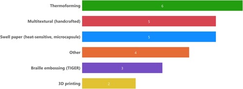
We can assume that those respondents who provided explicit values are those who design fixed types of tactile maps for a specified target group and use selected production methods, whereas those who produce a wider variety of tactile maps have to amend these parameters according to the intended purpose of a map. In turn, general agreement can be reported in terms of used map sheet formats. Every respondent answered the related question providing specific formats or their dimensions. It turns out that the vast majority of the respondents use formats similar to A4 or A3 standards. Based on the reported positive impact of height differentiation of tactile symbols on tactile maps legibility (e.g., Holloway et al., Citation2018; Wabiński et al., Citation2022), we were surprised by a considerably low number of respondents that apply this feature on their tactile maps (only 25% of the respondents). We also asked about the production methods used for tactile map production (). Thermoforming, swell paper and hand-crafting remain the most popular production methods, regardless of the recent developments. We analyse the detailed results of the questionnaire in the following chapters in relation to our research questions, together with the analysis of the scientific literature in this area.
Figure 1. Production methods used by questionnaire respondents. Source: authors.
Results
What are the recommendations for tactile symbols design?
The starting point in the design of tactile symbols is the same as in traditional cartography – it is important to maintain the real-world object’s characteristics (e.g., railroads symbolized as two parallel lines with transverse lines) and to keep them as simple as possible because simplicity is considered the second most important principle after legibility in tactile map design (Nolan and Morris, Citation1971). More complex symbols, such as stylized pictorial symbols, are hard to comprehend for individuals with adventitious blindness and partial sight (Wiedel and Groves, Citation1969), although more recent studies show that some aspects of perspection are understood by PVI (Kennedy, Citation2006).
In general, the symbols on tactile maps should be differentiated along as many tactual dimensions (variables) as possible. Because different variables are used for different types of symbols (points, lines, areas and inscriptions), the recommendations for the design of tactile symbols were analysed separately for each of these groups.
Point symbols
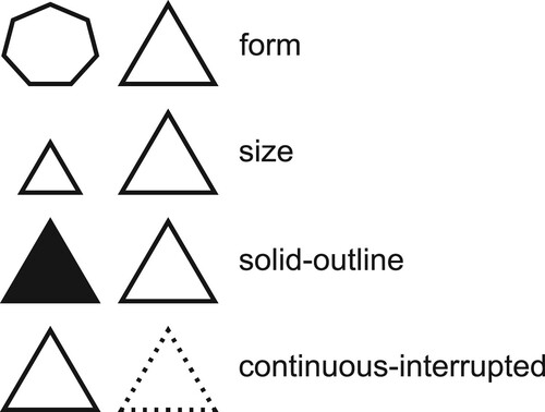
Following the previous rule that symbols should be as simple as possible, simple geometrical shapes, such as circles, triangles, rectangles or squares should be used as point symbols (Bris, Citation2001; Polak and Olczyk, Citation2010; ISO, Citation2019). Other resources suggest supplementing this set by one of the following: cross, plus symbol and asterisk (The NSW Tactual and Bold Print Mapping Committee, Citation2006). Although more complicated 3D point symbols were found to be legible by Holloway et al. (Citation2019), they require considerable gaps between symbols (minimum 1 cm). Apart from overall shape, Nolan and Morris (Citation1971), list four features that impact the discriminability of point symbols: form, size, solid-outline and continuous-interrupted ().
Figure 2. Different approaches for point symbol design. Source: authors.
According to Polak and Olczyk (Citation2010), the easiest point symbols to perceive are unfilled symbols that use only an outline. Moreover, small point symbols of the same shape (e.g., a circle) should not appear on a single map in two versions, e.g., as filled symbols and outline symbols (Eriksson et al., Citation2003). According to French guidelines (Bris, Citation2001), standalone point symbols should not be the same as those used to form area symbols (textured elements) on the same map, even if they differ in size.
Line symbols
Nolan and Morris (Citation1971) identify four features that impact the discriminability of a line symbol: whether a line is continuous-interrupted, smooth-ragged, single-double, or thick-thin. Generally, using single lines is usually recommended because they result in faster exploration times and better memory representations than double lines (Bentzen and Peck, Citation1979; Easton and Bentzen, Citation1980). Double lines require more space and slow down the rate of extracting information (Easton and Bentzen, Citation1980).
Regarding line continuity, Wiedel and Groves (Citation1969) noted that broken or dotted lines are more easily recognized and followed tactually than smooth lines. But if dots are used for the line pattern, they should be either larger than 2 mm or smaller than 0.7 mm in diameter to avoid confusion with braille cells (The NSW Tactual and Bold Print Mapping Committee, Citation2006).
To maximize legibility and avoid a potential injury or discomfort while reading tactile maps, cross-sections of line symbols should be in the shape of a semicircle or trapezoid. Squared shapes should be avoided (ISO, Citation2019). Nevertheless, tactile map designers should also pay attention in situations where line symbols topologically interact with other features. When a more important line intersects with a less important one, a small blank space at the intersection should be left (splitting the less important one) (James, Citation2009). This gap should be 2–3 mm (The NSW Tactual and Bold Print Mapping Committee, Citation2006). In general, single lines should not cross double lines (Amendola, Citation1976).
In the case of lines embedded in areal symbols, it is necessary to use at least two differing attributes between their characteristics. For example, if a continuous line is within a texture composed of continuous lines – they can be differentiated by line width and line texture (Barth, Citation1983) or by putting symbols at different heights (Wabiński et al., Citation2022).
Area symbols
According to The NSW Tactual and Bold Print Mapping Committee (Citation2006), area symbols are characterized by three dimensions: style (geometry of texture elements), pitch (distance between pattern elements), and thickness (width of pattern elements). Nolan and Morris (Citation1971) identified additional characteristics: whether patterns are regular or irregular (pattern), composed of continuous or broken elements (continuity), and their sharpness. The shape of the textural element composing the pattern was found to be of lower importance – two symbols with the same pattern, continuity and pitch that were simply rotated by 90° were often confused. Thus, rotation should be applied together with some other variables.
A common issue in the design of tactile maps is that the number of textures to be used on a single map is limited. In some cases, the edges of areas that we do not want to distinguish with a unique texture may be marked with an asymmetrical line; smooth on one side and made of rectangular or triangular elements on the other (Polak and Olczyk, Citation2010). Another way to differentiate area symbols is to use different heights in adjoining surfaces (ISO, Citation2016; Wabiński et al., Citation2022).
Inscriptions and Lettering
Placing labels on tactile maps is a complicated task because they take up much space. They should therefore be placed only where necessary and be as short as possible. Abbreviations are a good way of labelling features where there is not enough space to put full names. All abbreviations should be listed in the legend. Single Braille cell abbreviations cannot appear on a map as they are meaningless to a reader – a minimum of two cells (three preferably) should be used (The NSW Tactual and Bold Print Mapping Committee, Citation2006). It is also desirable to use codes for groups of objects that facilitate memorization of such descriptions by readers (Edman, Citation1992; Olczyk, Citation2014). For example, the Braille letters ‘oat’ stand for Atlantic Ocean, where ‘o’ is the code for oceans and ‘at’ stands for Atlantic. Polish guidelines suggest that when a Braille inscription does not fit within a small area, it might be placed in the adjacent area near the border and preceded with the ampersand symbol (Więckowska et al., Citation2012).
Braille labels should be placed horizontally with the only exception of street descriptions written along their course. Such labels cannot be expanded to mimic area symbols as in traditional cartography, where labels are used to present certain areas covered by the labelled features. However, text labels can be used for describing smaller area features instead of introducing area symbols (Edman, Citation1992; ISO, Citation2016).
Large raised characters could be used instead of Braille to depict common features, such as P for parking, but neither serif fonts nor script type fonts with decorations (e.g., italics) should be used (ISO, Citation2019). The label size should be at least 14–18 pt (Wiedel and Groves, Citation1969; Edman, Citation1992; Polak and Olczyk, Citation2010; ISO, Citation2013, Citation2016), although according to Brazilian guidelines (de Mello, Citation2018), the font used should be Arial of at least 26 pt size. The letter spacing should be set to ‘normal’ or ‘expanded’ (The NSW Tactual and Bold Print Mapping Committee, Citation2006).
It is even possible to design a legible tactile map without using Braille labels if every symbol is unique and discriminable from all others applied on the same map (Gardiner and Perkins, Citation2002). However, other guidelines suggest that inscriptions should be used for description of unique features: ‘symbols have to be learned (not a trivial task) whereas Braille can be read immediately' (The NSW Tactual and Bold Print Mapping Committee, Citation2006: 17). Another possibility is to use unified symbols that provide audio feedback (e.g., Barvir et al., Citation2021).
What are the recommended tactile symbols?
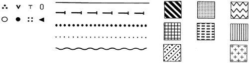
One of the earliest studies concerning the legibility of tactile symbols was carried out by Heath (Citation1958). Their study compared different area symbols prepared using Virkotype printing (dusting the wet ink-print image with a fine resinous powder) in terms of their legibility. This was further extended by Nolan and Morris (Citation1963) using a vacuum-formed technique. Similar studies were later carried out for point and line symbols and some authors also investigated the discriminability of point symbols used in Braille books (embossed paper) at the time. The results of these investigations are summed up in the final report by Nolan and Morris (Citation1971) and some of the examples are presented in .
Figure 3. Highly distinguishable tactile symbols to be used with vacuum-forming. Based on Nolan and Morris (Citation1971).
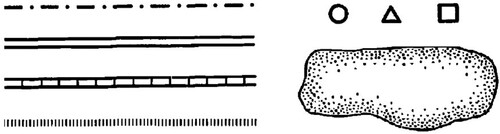
Wiedel and Groves (Citation1969) tested a number of different symbols for various map-based tasks as preliminary research. As a result, they managed to highlight the most distinguishable set of symbols that were later used during the project for various maps ().
Figure 4. Tactile symbols that were found to be the most discriminable during the preliminary study (Wiedel and Groves, Citation1969).
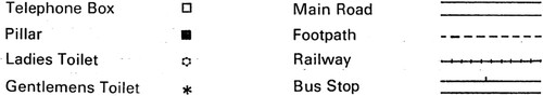
Having a set of symbols applicable within one study is an insufficient basis for standardizing tactile map production. Thus, a few years later, one of the first attempts to create a standardized set of tactile symbols was described by James (Citation1975). This symbol set () was supposed to be used for orientation and mobility maps, either hand-crafted or vacuum-formed.
Figure 5. Selected symbols from the first described attempt to standardize tactile symbols. Based on James, (Citation1975).
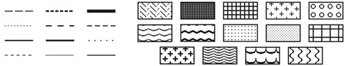
Similar investigations for the swell paper printing method were carried out by the Braille Authority of North America and the Canadian Braille Authority (Citation2010). In their guidelines, one can find recommendations for the textures of area symbols, as well as propositions of distinctive line textures ().
Figure 6. Highly distinguishable tactile symbols to be used with swell paper. Based on BANA and the CBA (Citation2010).
Some designs appear more frequently than others. For example, simple geometric forms such as squares and circles for point symbols, solid and dashed lines with various spacing and area symbols consisting of solid lines at different angles are the most common, regardless of the printing method considered. Thus, we can assume that such symbols are the most universal.
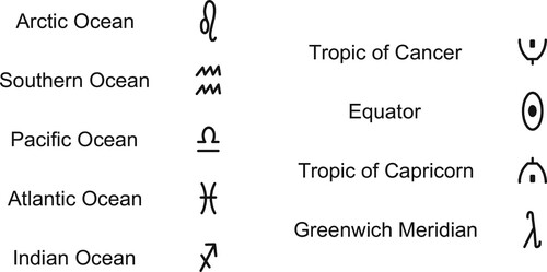
Whereas most of the studies focus on discriminability and aim at proposing legible symbols suitable for individual purposes, there are examples of research undertaken to propose standardized tactile symbol sets to depict unique real-world features, e.g., by Regis and Nogueira (Citation2013). They proposed a set of symbols for the depiction of unique geographic features that are commonly presented on world maps, such as oceans or tropics (), but, to the best of our knowledge, are not globally accepted. A table with all the extracted symbol designs along with more detailed descriptions may be found in the Appendix.
Figure 7. Proposition of standardized symbols for tactile world maps. Based on Regis and Nogueira (Citation2013).
General rules for the creation of tactile maps
Best practice in tactile cartography not only considers the symbols themselves, but also their arrangement and the map’s overall composition, which facilitates the preparation of a legible product for PVI. To consider a tactile map legible, a person with normal sight should be able to distinguish its main features (in bold print) from a distance of approximately 2–3 m (The NSW Tactual and Bold Print Mapping Committee, Citation2006). To achieve this, tactile maps cannot be cluttered. It is recommended to include no more than 10–15 distinct symbols (Rowell and Ungar, Citation2003), and no more than four (Więckowska et al., Citation2012; Červenka et al., Citation2013), or, according to Mexican guidelines, six, unique textures (area symbols) (Instituto Nacional de Estadisticas y Geografia, Citation2017) on a tactile map. Besides, according to the Polish guidelines, no additional graphic features, such as bar charts, or numerical values that describe map features, should be placed on tactile maps (Więckowska et al., Citation2012). The same applies to inset maps, whose meaning might be too complex for PVI (Polak and Olczyk, Citation2010).
Tactile maps should also be small enough to relate their elements together within a maximum arm span of an average person (Bentzen, Citation1980; Edman, Citation1992). This goes in line with the need for tactile maps to be portable and usable in situ. However, some PVI in the studies cited indicate the need to study a map at home before putting it to practical use.
Keeping maps portable and legible requires a suitable level of generalization. As a result, all the mapped features might not fit onto one map sheet. In that case, map content could be split across several map sheets. Some features have to be repeated for easier comparison. The most common choice is to include hydrography on each of the maps in a series as a reference (Polak and Olczyk, Citation2010). Another approach is to split the same map into parts that would form a complete whole when joined. In this case, the cutting line should not interfere with any of the key features of the map. The map parts must be labelled, e.g., parts A and B (The NSW Tactual and Bold Print Mapping Committee, Citation2006).
Mathematical foundations of cartography are less important for the design of tactile maps and therefore some exceptions and unique design approaches can be applied. For example, according to Bentzen and Marston (Citation2010), map scale does not necessarily have to be consistent in all parts of a map to be useful. Also, as suggested in the Polish guidelines, the tendency of using non-rounded scales (e.g., 1:985) on tactile maps is higher than in traditional cartography because cartographers of tactile maps have to exploit the free space on a sheet to the maximum extent (Więckowska et al., Citation2012). However, whenever possible, consistent round scale denominators should be used, and also in map series (or atlases). Map scales should follow a logical sequence for easier comparison of dimensions (e.g., 1:300,000, 1:600,000) (Polak and Olczyk, Citation2010). Linear scales are useful for distance comparisons, but can be omitted on tactile maps in smaller scales (Wiedel and Groves, Citation1969).
If a map grid has to be presented on a tactile map, an appropriate cartographic projection should be used, so that the grid would be as simple as possible (straight lines or soft curves). Instead of full lines representing a map grid, one could use labelled ticks on the map border to symbolize meridians and parallels (Polak and Olczyk, Citation2010).
Although cartometry is of lower importance on tactile maps, they still require appropriate map miscellanea (e.g., title, authorship). These elements should be grouped together on a tactile map (typically in the top left-hand corner). The currency of information is particularly important for maps used for orientation and navigation. Thus, the date of production and the author’s contact information should be mentioned on the map (Edman, Citation1992; ISO, Citation2016).
There is no agreement upon the placement of legends (keys). Some sources suggest placing them on the map sheet itself (The NSW Tactual and Bold Print Mapping Committee, Citation2006), whereas others suggest these should be placed on a separate sheet or on the last page of an atlas (Nogueira, Citation2009; Polak and Olczyk, Citation2010). When a legend is on a map sheet, it should be framed by thick lines that will distinguish it from the map's content (Wiedel and Groves, Citation1969). The map itself should also be framed using solid lines so that a reader would be aware of the neatline, or map limits (The NSW Tactual and Bold Print Mapping Committee, Citation2006). Also, all the symbols used on a tactile map sheet have to be included in a legend. Its elements should be placed in two vertical columns (symbols on the left and their explanations on the right) using exactly the same dimensions as those on the map sheet. First, tactile symbols should be listed, then Braille abbreviations with their explanations. If a ‘you are here' symbol is used, it should appear first in the legend (Edman, Citation1992; ISO, Citation2016). As not all PVI can read Braille, labels in a legend should also be prepared in an audio form and/or as a large print underlay. This underlay should match the Braille character size and line spacing exactly (Gardiner and Perkins, Citation2002).
In Braille or audio legends, whenever a feature present on a map is mentioned, its abbreviation (if any) should also be mentioned (The NSW Tactual and Bold Print Mapping Committee, Citation2006). The audio description of a map should ‘visit’ every symbol on a given map and explain it. PVI prefer to listen to this information while reading a map and compare the audio with tactile information (Gardiner and Perkins, Citation2002). Whenever possible, hybrid maps for both PVI and their assistants or teachers should be prepared, e.g., in the form of transparent tactile overlays with raised elements put on appropriately designed visual underlays (Gardiner and Perkins, Citation2002).
Tactile maps, just like traditional maps, should withstand long-term use and remain unaffected by moisture or liquid. But their cartographers should also consider those characteristics that are usually omitted in traditional cartography. For example, tactile maps must be regularly cleaned. The material used should not cause allergic reactions, or get too hot or too cold due to the environmental conditions. Moreover, shiny surfaces should be avoided to prevent glaring effects – matt finish is preferred (ISO, Citation2016). Matt finishes also enhance the movement of a finger over tactile maps and facilitate the reading process (Rowell and Ungar, Citation2003). Detailed design rules and parameters for general map editing are presented in .
Table 1. Miscellaneous.
Unfortunately, although numerous rules and parameters can be extracted from existing studies, many gaps remain, making it impossible to prepare a holistic standardized workflow. Where there is a lack of recommendations, we assume that it is possible to follow guidelines normally applied in traditional cartography. The following paragraphs contain examples of these guidelines.
To maintain the legibility of tactile maps, Piątkowski (Citation1969) recommends the following: symbols must clearly contrast with each other, be unambiguous and constructed with the simplest graphic elements possible, but, at the same time, their design should suggest their meaning. Piątkowski recommends defining the minimum allowable radius of curvature for different symbol groups (e.g., lakes, roads) and proposes that the distance between elements forming a texture should be at least three times the thickness of the element.
According to Grygorenko (Citation1970), when mapping land cover elements, the most characteristic breakpoints should be marked first. Then the full borders should be drawn. Appropriate curvature should be maintained to create easily traceable elements. In fact, angular compliance is the most important factor in line symbol generalization according to Boczar (Citation1977). All lines must intersect at the same angles on both original and generalized maps. The same author also indicates that when generalizing area symbols closed by boundaries, the area of the generalized region must be equivalent to the original region, whereas the boundary can be simplified. All of these guidelines could be applied to tactile maps.
During transcriptions of traditional maps into tactile maps, eye and finger resolutions have to be considered, but in such cases, a simple reduction of the amount of information is not the same as reducing the value of information. Reducing the quantity usually leads to an improvement in the quality of its reception (Ratajski, Citation1989). With this in mind, a numerical generalization parameter proposed by Szaflarski (Citation1955) can be also applied to tactile cartography: the map content reduction ratio should remain close to the square of the scale reduction value. Another example of a numerical parameter is that proposed by Topfer and Pillewizer (Citation1966):
where nf is the number of objects that could be shown in the target scale, na is the number of objects shown on original scale, and Ma and Mf are scale denominators of the original and target source respectively.
One of the important problems for the standardization in tactile mapping is that the most common real-world features are symbolized differently on tactile maps in different parts of the world, e.g., sea and ocean waters. A common approach for Polish tactile maps is to use parallel horizontal lines for the symbolization of large water bodies (Główny Urząd Geodezji i Kartografii and Polski Związek Niewidomych, Citation2006). In Australia, water bodies are presented using dashed horizontal lines (The NSW Tactual and Bold Print Mapping Committee, Citation2006), whereas on tactile maps originating from the United States, either dotted patterns or slanted parallel lines are used to symbolize the same features (National Braille Press, Citation2021). As a result, due to this local standardization, PVI accustomed to symbolizing particular features with fixed textures might omit the legend and be mistaken while reading foreign maps. In such cases, it would be useful to follow traditional cartographic rules. Well-established standards, such as those relating to topographic maps, exist in traditional cartography (e.g., Davis et al., Citation2019). Apart from the official guidelines, numerous unwritten cartographic conventions exist, e.g., water on maps is blue and the forests are green. Thanks to such consistent use of symbols along with their meaning, readers spend less time familiarizing themselves with symbols (Lobben, Citation2015). Such conventions should also be developed in tactile cartography.
Numerical parameters necessary for the creation of tactile maps
These can be divided into three main groups: dimensions, distances and heights. Many of the parameters cited in derive from national guidelines and result from practical experience of tactile cartographers in different parts of the world.
Table 2. Dimensions.
Table 3. Distances.
Table 4. Heights.
Dimensions () are mainly related to tactile symbols. They consider both general parameters and numerical parameters for different geometric symbols (points, lines and areas). In some cases, there is a great discrepancy between the suggested values, e.g., the minimum size of point symbol spans from 3 to 5 mm in the Polish guidelines (Więckowska et al., Citation2012) to 13 mm in the Brazilian guidelines (Regis and Nogueira, Citation2013). Such discrepancies may derive from the fact that different production methods were analysed.
Distances () refer to the spacing between different types of symbols or their elements. The recommended distances between different symbols range from 1 mm (Wabiński et al., Citation2022) to 5 mm, as recommended in the Polish guidelines (Więckowska et al., Citation2012). Interestingly, although both of the values cited above originate from Polish authors, they differ greatly. Similarly, the minimum recommended distances between symbols and their annotations are different depending on the country of origin of the guidelines, e.g., in Polish guidelines one can read that such distances should be at least 3–4 mm (Więckowska et al., Citation2012), whereas in the US and Canada, these are 3–6 mm (BANA and the CBA, Citation2010).
The final group of parameters mentioned are those relating to the height of symbols (). For this also, there is no agreement on the optimal values, e.g., the minimum symbol height should be 0.2 mm according to Jehoel et al. (Citation2006), but 0.75 mm according to Jesenský (Citation1988). The same is true for the minimum height difference between symbols: 0.04–0.08 mm according to Jehoel et al. (Citation2009), but 0.5 mm in the French guidelines (Bris, Citation2001).
Differences between production methods
Apart from cartographers' preferences in terms of the design of tactile maps, PVI also have preferences when it comes to production methods, which forms yet another obstacle on the way to tactile mapping standardization. In a study by Nagel and Coulson (Citation1990), participants indicated the superiority of swell paper over multi-textured and thermoform maps, whereas in (Pike et al., Citation1992) no significant differences in performance were found between the same two methods. In the two papers that investigated this issue (Jehoel et al., Citation2005; Wabiński et al., Citation2022), the majority of participants preferred the rougher substrates (textures) over the smoother ones used for area symbols.
Most of the sources cited here do not provide detailed information about the recommended symbols, but some indicate explicitly the production methods to be used along with the guidelines. For example, these include the Australian (The NSW Tactual and Bold Print Mapping Committee, Citation2006) and Swedish (Eriksson et al., Citation2003) guidelines that relate strictly to the swell paper method or the guidelines specifically created for thermoformed tactile maps (Gardiner and Perkins, Citation2002).
When choosing appropriate production methods, apart from the specific design guidelines, one has to consider production-related issues. For example, in the swell paper method, raised elements tend to widen when overheated, whereas in thermoforming, the dimensions of the final product differ from those of a mould due to the width of the PVC (polyvinyl chloride) foil used for production. We assume that the numerical values provided by other authors cited in this paper refer to the final products, regardless of the production methods used, because these authors do not provide such details. The future standardization guidelines should specify the range of production methods for which the guidelines apply.
Discussion and conclusions
As noted by Wiedel and Groves (Citation1969), symbolization must be standardized in order to facilitate the design and use of tactile maps. Considering the recommendations described in this paper, selected aspects of tactile mapping can be standardized, but to obtain a holistic solution, much work is still required.
Currently, official bodies issuing tactile maps usually produce high quality and widely accepted tactile maps, but due to the old-fashioned manual workflows they maintain, their production is slow and expensive. On the other hand, numerous solutions for automatic tactile map development have emerged. The problem with such solutions is that these products does not involve appropriate generalization and adaptation of the spatial data that they rely on, or their creators spend much time seeking appropriate design solutions instead of applying ready-to-use guidelines and parameters. Leonard and Newmann (Citation1970) highlighted the need, that is still relevant, to develop solutions using standardized procedures that could be applied locally at low cost and without specialist equipment. A combination of automated workflows for the creation of tactile maps and modern production techniques along with parameterized design rules might result in wider access to legible tactile maps and increase their usage among PVI. The more accurate and cartographically sound these products will be, the better.
Our review shows that much has already been done in the parametrization of key stages involved in tactile mapping processes. Unequivocal rules, along with measurable parameters related to symbolization and map editing, can be found in published research. In this paper, we have gathered detailed guidelines for the design of tactile symbols, recommended symbol sets, and the numerical parameters that should govern the preparation of tactile maps, to answer the research questions stated. It is worth noting that many of the most useful, explicit rules come from the less official guidelines, which are based on ther practical knowledge of their creators who have usually verified them experimentally with PVI. Therefore, a more comprehensive knowledge of tactile mapping requires the dissemination of unpublished guidelines and best practices.
This review also highlights a number of problems on the way to the standardization of tactile map production. First of all, the parameters provided in this manuscript tend to differ greatly across various literature resources. One of the reasons is that these resources consider different production methods. The problem is that it is rarely explicitly stated which production methods should be used along with particular guidelines. Even when following unequivocal standards during tactile map compilation, the final result might differ depending on the production method used. Besides, not all shapes can be reproduced using every production method. Thus, readers should consider the parameters quoted as approximate values that should be modified in iterative experiments with different production methods and test with target groups of readers, bearing in mind that PVI feedback is more useful than that of a sighted person. As stated by Stangl and Yeh (Citation2015), they know exactly, what are their needs. Such experiments might allow creating a ‘pool’ of tactile symbols useful in different contexts as suggested by Jansson (Citation1987). Moreover, such sets should be described in detail, including the production method used. It is not sufficient to describe only 2D properties of tactile symbols when attempting to standardize them. Different production methods might elevate those 2D symbols in different ways, resulting, for example, in varying cross-sections that should also be considered.
According to James (Citation2009), the lack of agreement upon symbology for navigational maps came from the lack of standardized materials for tactile map production, rather than from other considerations. Perhaps, instead of developing numerous new production methods, we should choose one globally recommended method and implement its standardization. Eriksson et al. (Citation2003) named the differences between production methods as the largest difficulty in the standardization of tactile symbols. At the same time, as noted by James (Citation2009): standardization should not necessitate stagnation of ideas for improving production methods.
Another problem identified in this paper is local standardization. Some symbols’ designs are well established within single countries or regions, but can have completely different meanings in other parts of the world. We therefore need global standards. Such standards exist in traditional cartography, e.g., water is blue on topographic maps. But not only geometric symbols require standardization. Due to the decrease in Braille literacy among PVI (Danish Association of the Blind, Citation2018), it would be helpful to develop linguistically independent, standardized inscriptions.
Lastly, guidelines for the design of tactile maps seldom form official publications that are translated into English, which reduces their accessibility. There are experienced practitioners who may retire without passing their knowledge and skills on to the next generation of cartographers of tactile maps. For this reason, we plan to create an experience exchange platform for practitioners and tactile mapmakers, where all the guidelines will be stored, and will be available for anyone interested in creating their own, legible tactile maps.
In this paper, we have focused primarily on the haptic content of tactile maps, but due to the rising popularity of multimodal maps involving multiple senses (Brulé et al., Citation2016; Giudice et al., Citation2020; Matsuo et al., Citation2020; Barvir et al., Citation2021) and universal design concepts in general, future research could address the challenge of formally describing design principles to consider senses other than touch.
To sum up, we would like to paraphrase one of our questionnaire respondents. We believe that in the near future all countries will follow the same rules for the design of tactile maps, which lies in contrast to the current situation where every study - as well as every country - follows different design principles for their creation.
Disclosure statement
No potential conflict of interest was reported by the author(s).
Notes on the contributors
 Jakub Wabiński is an engineering doctoral student as well as a research and teaching assistant at the Faculty of Civil Engineering and Geodesy, Military University of Technology in Warsaw. He graduated from his BSc studies at the Maritime University of Szczecin in 2015 and MSc studies at the Military University of Technology in Warsaw in 2017. He worked as a postgraduate researcher at the Dublin Institute of Technology in Ireland (2017) and a courtesy research assistant at the University of Oregon in the United States (2020). As a part of his doctorate, he is working on the issue of tactile map design and the automation of their production. He is also interested in novel cartographic presentation methods.
 Albina Mościcka is an Associate Professor at the Faculty of Civil Engineering and Geodesy, Military University of Technology in Warsaw. She graduated from the Faculty of Geodesy and Cartography at the Warsaw University of Technology (1997), received PhD at the Institute of Geodesy and Cartography (2005), also in Warsaw, and habilitation degree at the Warsaw University of Technology (2015). She gained her research experience during internships at Stanford University (USA) and the University of Stuttgart, as well as during European Union projects in Dushanbe (Tajikistan). Her research interest focuses on modern cartography and spatial data visualization, as well as on the use of GIS and cartography in historical research and in cultural heritage access, management and dissemination.
 Guillaume Touya is a senior researcher at IGN France (the French mapping agency) and Université Gustave Eiffel. He holds a PhD and habilitation in GI science from Paris-Est University. His research interests focus on automated cartography, map generalization and volunteered geographic information. He is particularly interested in research approaches to multi-scale cartography that mix automated cartography, spatial cognition and human-computer interaction issues. He is the principal investigator of the recent LostInZoom project, funded by the Europe Research Council (ERC) and is the Chair of the ICA Commission on Map Generalization and Multiple Representation.
Additional information
Funding
References
- Amendola, R. (1976) “Practical Consideration in Tactile Map Design” Long Cane Newsletter 9 pp.22–24.
- BANA and the CBA (2010) Guidelines and Standards for Tactile Graphics Available at: www.brailleauthority.org/tg (Accessed: 5th August 2022).
- Barth, J. (1983) “Factors Affecting Line Tracing in Tactile Graphs” The Journal of Special Education 17 (2) pp.215–226 DOI: 10.1177/002246698301700213.
- Barvir, R., Vondrakova, A. and Brus, J. (2021) “Efficient Interactive Tactile Maps : A Semi-Automated Workflow Using the TouchIt3D Technology and OpenStreetMap Data” ISPRS International Journal of Geo-Information 10 (8) p.505.
- Bentzen, B.L. (1980) “Orientation Aids” In Welsh, R.L. and Blasch, B.B. (Eds) Foundations of Orientation and Mobility New York: American Foundation for the Blind, pp.291–355.
- Bentzen, B.L. and Marston, J. (2010) “Teaching the Use of Orientation Aids for Orientation and Mobility” In Wiener, W.R., Welsh, R.L. and Blasch, B.B. (Eds) Foundations of Orientation and Mobility (3rd ed.) New York: American Foundation for the Blind, pp.315–351.
- Bentzen, B.L. and Peck, A. (1979) “Factors Affecting Traceability of Lines for Tactile Graphics” Journal of Visual Impairment & Blindness 73 p.7.
- Boczar, S. (1977) Kartografia: opracowanie map i reprodukcja kartograficzna Kraków, Poland: Akademia Górniczo-Hutnicza im. S. Staszica.
- Bris, M. (2001) “Guide de l’acheteur public de produits graphiques en relief a l’usage des personnes deficientes visuelles. Ministere de l’economie des finances et de l’industrie” Available at: https://www.economie.gouv.fr/daj/guide-lacheteur-public-produits-graphiques-relief-a-lusage-des-personnes-deficientes-visuelles-n (Accessed: 5th August 2022).
- Brittell, M.E., Lobben, A.K. and Lawrence, M.M. (2018) “Usability Evaluation of Tactile Map Symbols Across Three Production Technologies” Journal of Visual Impairment & Blindness Available at: https://files.eric.ed.gov/fulltext/EJ1200590.pdf.
- Brulé, E., Bailly, G., Brock, A., Valentin, F., Denis, G. and Jouffrais, C. (2016) “MapSense: Multi-Sensory Interactive Maps for Children Living with Visual Impairments” Conference on Human Factors in Computing Systems - Proceedings pp.445–457 DOI: 10.1145/2858036.2858375.
- Brulé, E., Tomlinson, B., Metatla, O., Jouffrais, C., Serrano, M., Serrano Review, M. and Tomlinson, B.J. (2020) “Review of Quantitative Empirical Evaluations of Technology for People with Visual Impairments.” Proceedings of the 2020 CHI Conference on Human Factors in Computing Systems Honolulu, 25th-30th April 2020, pp.1–14 DOI: 10.1145/3313831.3376749ï.
- Butler, M., Holloway, L.M., Reinders, S., Goncu, C. and Marriott, K. (2021) “Technology Developments in Touch-Based Accessible Graphics: A Systematic Review of Research 2010-2020” pp.1–15 DOI: 10.1145/3411764.3445207.
- Cole, H. (2021) “Tactile Cartography in the Digital Age: A Review and Research Agenda” Progress in Human Geography 45 (4) pp.834–854 DOI: 10.1177/0309132521995877.
- Červenka, P., Břinda, K., Hanousková, M., Hofman, P. and Seifert, R. (2016) “Blind Friendly Maps: Tactile Maps for the Blind as a Part of the Public Map Portal (Mapy.cz)” Lecture Notes in Computer Science (Including Subseries Lecture Notes in Artificial Intelligence and Lecture Notes in Bioinformatics) 9759 pp.131–138 DOI: 10.1007/978-3-319-41267-2_18.
- Červenka, P., Hanouskov, M., Másilko, L. and Nečas, O. (2013) Tactile Graphics Production and its Principles Brno: Masaryk University: Teiresiás – Support Centre for Students with Special Needs.
- Danish Association of the Blind (2018) Braille Teaching and Literacy: A Report for the European Blind Union Available at: https://www.pathstoliteracy.org/wp-content/uploads/2022/06/Braille_teaching_and_literacy_report_Europe_Jan_2018.pdf (Accessed: 5th August 2022).
- Davis, L.R., Fishburn, K.A., Lestinsky, H., Moore, L.R. and Walter, J.L. (2019) “US Topo Product Standard” U.S. Geological Survey Standards Book 11, Collection and Delineation of Spatial Data (2nd ed.) Reston, Virginia: DOI: 10.3133/tm11b2.
- de Mello, H.B.P. (2018) Produção e validação da Caixa Tátil-Sonora como ferramenta educacional de Tecnologia Assistiva para alunos deficientes visuais Niterói, Brazil: Universidade Federal Fluminense.
- Easton, R.D. and Bentzen, B.L. (1980) “Perception of Tactile Route Configurations by Blind and Sighted Observers” Journal of Visual Impairment and Blindness 74 (7) pp.254–261 DOI: 10.1177/0145482X8007400703.
- Edman, P.K. (1992) Tactile Graphics New York: American Foundation for the Blind.
- Eriksson, Y., Jansson, G. and Strucel, M. (2003) Tactile Maps – Guidelines for the Production of Maps for the Visually Impaired Enskede, Sweden: The Swedish Braille Authority.
- Fleming, L. (1990) “Tactual Mapping” In Perkins, C. and Parry, R. (Eds) Information Sources in Cartography London: Bowker Saur, pp.409–422.
- Gardiner, A. and Perkins, C. (2002) “Tactile Book Advancement Group” Available at: http://www.tactilebooks.org/tactileguidelines/page1.htm (Accessed: 9th July 2022).
- Giudice, N.A., Guenther, B.A., Jensen, N.A. and Haase, K.N. (2020) “Cognitive Mapping Without Vision: Comparing Wayfinding Performance After Learning from Digital Touchscreen-Based Multimodal Maps vs. Embossed Tactile Overlays” Frontiers in Human Neuroscience 14 p.87 DOI: 10.3389/fnhum.2020.00087.
- Główny Urząd Geodezji i Kartografii & Polski Związek Niewidomych (2006) Atlas geograficzny Europy Warsaw: Tyflograf. Available at: https://tyflomapy.pl/Atlas_Geograficzny_Europy.html.
- Götzelmann, T. and Pavkovic, A. (2014) “Towards Automatically Generated Tactile Detail Maps by 3D Printers for Blind Persons” In Miesenberger, K., Fels, D., Archambault, D., Peňáz, P. and Zagler, W. (Eds) Computers Helping People with Special Needs. ICCHP 2014. Lecture Notes in Computer Science Cham: Springer, pp.1–7 DOI: 10.1007/978-3-319-08599-9_1
- Griffin, A.L., Robinson, A.C. and Roth, R.E. (2017) “Envisioning the Future of Cartographic Research” International Journal of Cartography 3 (sup1) pp.1–8 DOI: 10.1080/23729333.2017.1316466.
- Grygorenko, W. (1970) Redakcja i Opracowanie map ogólnogeograficznych Warsaw: Państwowe Przedsiębiorstwo Wydawnictw Kartograficznych.
- Gual, J., Puyuelo, M. and Lloveras, J. (2015) “The Effect of Volumetric (3D) Tactile Symbols Within Inclusive Tactile Maps” Applied Ergonomics 48 pp.1–10 DOI: 10.1016/j.apergo.2014.10.018.
- Hänßgen, D. (2015) “HaptOSM-Creating Tactile Maps for the Blind and Visually Impaired” Mensch und Computer 2015 – Workshopband, pp.405–410.
- Heath, W.R. (1958) “Maps and Graphics for the Blind: Some Aspects of the Discriminability of Textural Surfaces for use in Areal Differentiation” (PhD thesis) University of Washington.
- Holloway, L., Marriott, K. and Butler, M. (2018) “Accessible Maps for the Blind: Comparing 3D Printed Models with Tactile Graphics” Proceedings of the 2018 CHI Conference on Human Factors in Computing Systems - CHI ‘18, pp.1–13 DOI: 10.1145/3173574.3173772.
- Holloway, L., Marriott, K., Reinders, S. and Butler, M. (2019) “3D Printed Maps and Icons for Inclusion: Testing in the Wild by People Who are Blind or Have Low Vision” ASSETS 2019 – 21st International ACM SIGACCESS Conference on Computers and Accessibility, pp.183–195 Pittsburgh: 28–30th October 2019, pp.183–195 DOI: 10.1145/3308561.3353790.
- ICEB (2002) “International Council on English Braille” Available at: http://www.iceb.org/icetac.html (Accessed: 21st November 2021).
- Instituto Nacional de Estadisticas y Geografia (2017) Metodología "para la elaboración de cartografía táctil mediante la tecnica de termoformado Aguascalientes, Mexico: INEG.
- ISO (2013) ISO 17049 – Accessible Design – Application of Braille on Signage, Equipment and Appliances.
- ISO (2016) ISO 19028 – Accessible Design – Information Contents, Figuration and Display Methods of Tactile Guide Maps.
- ISO (2019) ISO 24508 – Ergonomics – Accessible Design Guidelines for Designing Tactile Symbols and Characters.
- James, G.A. (1975) “A Kit for Making Raised Maps” The Cartographic Journal 12 (1) pp.50–52 DOI: 10.1179/caj.1975.12.1.50.
- James, G.A. (2009) “Mobility Maps” In Schiff, W. and Foulke, E. (Eds) Tactual Perception: A Sourcebook New York: Cambridge University Press, pp.334–363.
- James, G.A. and Gill, J.M. (1975) “A Pilot Study on the Discriminability of Tactile Areal and Line Symbols for the Blind” Research Billetin of the American Foundation for the Blind 29 pp.23–31.
- Jansson, G. (1987) “An International Pool of Useful Symbols for Tactual Pictures” Wenner-Gren Center Regional Seminar on New Technologies for Handicapped in Special Education Stockholm: 11th–15th May.
- Jehoel, S., McCallum, D., Rowell, J. and Ungar, S. (2006) “An Empirical Approach on the Design of Tactile Maps and Diagrams: The Cognitive Tactualization Approach” British Journal of Visual Impairment 24 (2) pp.67–75 DOI: 10.1177/0264619606063402.
- Jehoel, S., Sowden, P.T., Ungar, S. and Sterr, A. (2009) “Tactile Elevation Perception in Blind and Sighted Participants and its Implications for Tactile Map Creation” Human Factors 51 (2) pp.208–223 DOI: 10.1177/0018720809334918.
- Jehoel, S., Ungar, S., McCallum, D. and Rowell, J. (2005) “An Evaluation of Substrates for Tactile Maps and Diagrams: Scanning Speed and Users’ Preferences” Journal of Visual Impairment and Blindness 99 (2) pp.85–95 DOI: 10.1177/0145482X0509900203.
- Jesenský, J. (1988) Hmatové vnímání informací s pomocí tyflografi Prague: SPN.
- Kennedy, J.M. (2006) “How the Blind Draw” Scientific American 16 (3s) pp.44–51 DOI: 10.1038/scientificamerican0906-44sp.
- Kent, A.J. (2019) “Maps, Materiality and Tactile Aesthetics” The Cartographic Journal 56 (1) pp.1–3 DOI: 10.1080/00087041.2019.1601932.
- Klatzky, R.L. and Lederman, S.J. (2003) “Touch” In Healy, A.F. and Proctor, R.W. (Eds) Handbook of Psychology, Volume 4: Experimental Psychology Hoboken, New Jersey: John Wiley & Sons, p.151.
- Laufenberg, W. (1988) “Euro-Town-Kit: A Set of Standardized Symbols for Making Town Maps for Visually Handicapped Persons” Review of the European Blind 17 p.4.
- Leonard, J.A. and Newman, R.C. (1970) “Three Types of ‘Maps’ for Blind Travel” Ergonomics 13 (2) pp.165–179 DOI: 10.1080/00140137008931130.
- Lobben, A. (2015) “Tactile Maps and Mapping” Journal of Blindness Innovation and Research 5 (1) pp.1–7.
- Matsuo, M., Miura, T., Ichikari, R., Kato, K. and Kurata, T. (2020) “OTASCE Map: A Mobile Map Tool with Customizable Audio-Tactile Cues for the Visually Impaired” Journal on Technology and Persons with Disabilities 8 pp.82–103.
- Mukhiddinov, M. and Kim, S.-Y. (2021) “A Systematic Literature Review on the Automatic Creation of Tactile Graphics for the Blind and Visually Impaired” Processes 9 p.1726 DOI: 10.3390/pr9101726.
- The NSW Tactual and Bold Print Mapping Committee (2006) A Guide for the Production of Tactual and Bold Print Maps (3rd ed.) Available at: https://printdisability.org/wp-content/uploads/2018/02/TabMap-Tactual-Maps-Guide-3-2006.pdf(Accessed: 5th August 2022).
- Nagel, D.L.D. and Coulson, M.R.C. (1990) “Tactual Mobility Maps: A Comparative Study” Cartographica 27 (2) pp.47–63 DOI: 10.3138/D310-6U13-H13J-H414.
- National Braille Press (2021) “About the Princeton Braillist Collection” Available at: https://www.nbp.org/ic/nbp/publications/princetonbraillists.html (Accessed: 4th October 2021).
- Nogueira, R.E. (2009) “Mapas Táteis Padronizados e Acessíveis na Web” Benjamin Constant 15 (43) pp.16–27.
- Nolan, C. and Morris, J. (1963) Tactual Symbols for the Blind: Final Report Louisville, Kentucky: American Printing House for the Blind.
- Nolan, C., and Morris, J. (1971) Improvement of Tactual Symbols for Blind Children: Final Report Washington, DC: Department of Health, Education and Welfare DOI: 10.1017/CBO9781107415324.004.
- Olczyk, M. (2014) “Zasady opracowania map dotykowych dla osób niewidomych i słabowidzących” Polish Cartographical Review 46 (4) pp.413–442.
- Pandey, M., Subramonyam, H., Sasia, B., Oney, S. and O’Modhrain, S. (2020) “Explore, Create, Annotate: Designing Digital Drawing Tools with Visually Impaired People” Conference on Human Factors in Computing Systems – Proceedings DOI: 10.1145/3313831.3376349.
- Perkins, C. (2002) “Cartography: Progress in Tactile Mapping” Progress in Human Geography 26 (4) pp.521–530 DOI: 10.1191/0309132502ph383pr.
- Piątkowski, F. (1969) Redakcja map i reprodukcja kartograficzna Warsaw: PWN.
- Pike, E., Blades, M. and Spencer, C. (1992) “A Comparison of Two Types of Tactile Maps for Blind Children” Cartographica 29 (3–4) pp.83–88 DOI: 10.3138/RQ41-Q433-8411-7G40.
- Polak, M. and Olczyk, M. (2010) “Redakcja tyflokartograficzna” Przegląd Tyflologiczny 1–2 pp.40–41.
- Ratajski, L. (1989) Metodyka kartografii społeczno-gospodarczej (2nd ed.) Wrocław: PPWK.
- Regis, T. and Nogueira, R.E. (2013) “Contribuição para o ensino-aprendizagem degeografia: A padronizacao de mapas tateis.” 14° Encontro de Geógrafos da América Latina: “Reencuentro de Saberes Territoriales Latinoamericanos.” Lima, Peru. Available at: http://observatoriogeograficoamericalatina.org.mx/egal14/Ensenanzadelageografia/Metodologiaparalaensenanza/56.pdf (Accessed: 5th August 2022).
- Rowell, J. and Ungar, S. (2003) “The World of Touch: Results of an International Survey of Tactile Maps and Symbols” The Cartographic Journal 40 (3) pp.259–263 DOI: 10.1179/000870403225012961.
- Stangl, A., Cunningham, A., Blake, L.A. and Yeh, T. (2019) “Defining Problems of Practices to Advance Inclusive Tactile Media Consumption and Production” Proceedings of the 21st International ACM SIGACCESS Conference on Computers and Accessibility Pittsburgh: 28th–30th October, pp.329–341 DOI: 10.1145/3308561.3353778.
- Stangl, A. and Yeh, T. (2015) “Transcribing Across the Senses : Community Efforts to Create 3D Printable Accessible Tactile Pictures for Young Children with Visual Impairments” Proceedings of the 17th International ACM SIGACCESS Conference on Computers & Accessibility, pp.127–137 DOI: 10.1145/2700648.2809854.
- Szaflarski, J. (1955) Zarys kartografii Warsaw: Państwowe Przedsiębiorstwo Wydawnictw Kartograficznych.
- Štampach, R., and Muličková, E. (2016) “Automated Generation of Tactile Maps” Journal of Maps 12 (sup1) pp.532–540 DOI: 10.1080/17445647.2016.1196622.
- Takagi, N. and Chen, J. (2014) “Development of a Computer-Aided System for Automating Production of Tactile Maps and its Usability Evaluation” World Automation Congress Proceedings pp.213–218 DOI: 10.1109/WAC.2014.6935788.
- Taylor, B., Dey, A., Siewiorek, D. and Smailagic, A. (2016) “Customizable 3D Printed Tactile Maps as Interactive Overlays.” Proceedings of the 18th International ACM SIGACCESS Conference on Computers and Accessibility Reno, Nevada: ACM Press, pp.71–79 DOI: 10.1145/2982142.2982167.
- Thompson, N.R. (1983) “Tactual Perception of Quantitative Point Symbols in Thematic Maps for the Blind” In Wiedel, J.W. (Eds) Proceedings of the First International Symposium on Maps and Graphics for the Visually Handicapped Washington, DC: Association of American Geographers, pp.103–112.
- Touya, G., Zhang, X. and Lokhat, I. (2019) “Is Deep Learning the New Agent for Map Generalization?” International Journal of Cartography 5 (2–3) pp.142–157 DOI: 10.1080/23729333.2019.1613071.
- Töpfer, F. and Pillewizer, W. (1966) “The Principles of Selection” The Cartographic Journal 3 (1) pp.10–16 DOI: 10.1179/caj.1966.3.1.10.
- Wabiński, J. and Mościcka, A. (2019) “Automatic (Tactile) Map Generation – A Systematic Literature Review” ISPRS International Journal of Geo-Information 8 (7) pp.1–25 DOI: 10.3390/ijgi8070293.
- Wabiński, J., Mościcka, A. and Kuźma, M. (2020) “The Information Value of Tactile Maps: A Comparison of Maps Printed with the Use of Different Techniques” The Cartographic Journal pp.1–12 DOI: 10.1080/00087041.2020.1721765.
- Wabiński, J., Śmiechowska-Petrovskij, E. and Mościcka, A. (2022) “Applying Height Differentiation of Tactile Signs to Reduce the Minimum Horizontal Distances Between Them on Tactile Maps” PLOS ONE 17 (2) DOI: 10.1371/journal.pone.0264564.
- Watanabe, T., Yamaguchi, T., Koda, S. and Minatani, K. (2014) “Tactile Map Automated Creation System Using OpenStreetMap” ICCHP 2014: Computers Helping People with Special Needs Cham: Springer, pp.42–49 DOI: 10.1007/978-3-319-08599-9_7.
- Wiedel, J.W. and Groves, P.A. (1969) Tactual Mapping: Design, Reading, and Interpretation (Final Report No.RD-2557-S) Washington, DC: Department of Health, Education, and Welfare.
- Więckowska, E., Chojecka, A., Mikołowicz, B., Fuksiński, C., Mendruń, J., Olczyk, M. and Rudnicka, M. (2012) Standardy tworzenia oraz adaptowania map i atlasów dla niewidomych uczniów Available at: https://tyflomapy.pl/files/33160/Standardy_tworzenia_oraz_adaptowania_map_i_atlasow_dla_niewidomych_uczniow.pdf (Accessed: 5th August 2022).
- Yanoff, M. and Duker, J.S. (2009) Ophthalmology (3rd ed.) Philadelphia: Mosby Elsevier.
Appendix – recommended symbols
Table