
Abstract
Psychophysical research on text legibility has historically investigated factors such as size, colour and contrast, but there has been relatively little direct empirical evaluation of typographic design itself, particularly in the emerging context of glance reading. In the present study, participants performed a lexical decision task controlled by an adaptive staircase method. Two typefaces, a ‘humanist’ and ‘square grotesque’ style, were tested. Study I examined positive and negative polarities, while Study II examined two text sizes. Stimulus duration thresholds were sensitive to differences between typefaces, polarities and sizes. Typeface also interacted significantly with age, particularly for conditions with higher legibility thresholds. These results are consistent with previous research assessing the impact of the same typefaces on interface demand in a simulated driving environment. This simplified methodology of assessing legibility differences can be adapted to investigate a wide array of questions relevant to typographic and interface designs.
Practitioner Summary: A method is described for rapidly investigating relative legibility of different typographical features. Results indicate that during glance-like reading induced by the psychophysical technique and under the lighting conditions considered, humanist-style type is significantly more legible than a square grotesque style, and that black-on-white text is significantly more legible than white-on-black.
Background
Graphical interface design necessitates a unique balance between artistic sensibility and pragmatic concern to meet specific needs. One key aspect of interface design is the selection of a typestyle and the various associated display characteristics (colour, weight, size, etc.). There is tremendous variability in typography, and a typeface may visually express any number of subjective attributes – feminine, masculine, fun, austere, retro, futuristic, generic, rebellious and so on – but ultimately, the legibility of the strokes and terminations of a typeface is guided by the limitations of the human visual system (Poulton Citation1972; Legge et al. Citation1985; Reich and Bedell Citation2000), the inherent characteristics of a display technology (Aten, Gugerty, and Tyrrell Citation2002) and the environmental conditions in which reading occurs (Taptagaporn and Saito Citation1990; Shieh and Lin Citation2000). Recent technological advances in display technology (i.e. increased resolution) have allowed for the presentation of more text at smaller sizes. The mobility of displays in vehicles, portable electronics and wearables has also begun to change the ways in which that text is read. These technologies encourage users to spend a greater amount of time than ever before on consuming information in small, frequent glances.
As more glance-based reading is done while driving or walking, it is imperative to ensure that interfaces are optimised to communicate information quickly and efficiently, and thus keep the reader’s eyes off the screen and focused on situationally important information. Human–machine interfaces that are to be used in mobile environments should therefore employ displays that maximise legibility and minimise the amount of time spent reading the screen. However, given the large numbers of interacting factors that can affect legibility in situ (such as size, contrast, colour, style and crowding), determining a ‘best’ or most legible typeface is a difficult proposition. It would be useful to develop an empirical, efficient method for investigating the legibility of on-screen type, one that could help inform design decisions or validate the performance of existing interfaces.
Psychophysical methods commonly present stimuli of interest for brief, glance-like periods, and in this sense are well suited for investigations of glance legibility (Stevens Citation1958; Uchida, Kepecs, and Mainen Citation2006), though it should be noted that while many legibility studies are broadly ‘psychophysical’ in design, they commonly utilise long-form reading tasks and associated metrics such as proofreading tests and reading comprehension assessments. Some of the earliest psychophysical investigations concerned the legibility of the English alphabet (Sanford Citation1888). These methods have since been carried over into modern investigations of digital typography (Fox, Chaparro, and Merkle Citation2007; Beier and Larson Citation2010; Chaparro et al. Citation2010). Most of these legibility investigations concern broad visual or cognitive features, such as size (Huang, Patrick Rau, and Liu Citation2009; Legge and Bigelow Citation2011; Piepenbrock, Mayr, and Buchner Citation2013), digit span (Chen and Chien Citation2005), lexical frequency (Grainger and Segui Citation1990; Yan et al. Citation2006), spatial frequency (Paterson, McGowan, and Jordan Citation2013), visual crowding (Pelli et al. Citation2007; Pelli and Tillman Citation2008; Wang et al. Citation2008) and reading in peripheral vision (Legge, Mansfield, and Chung Citation2001; He, Legge, and Deyue Citation2013).
The question of how contrast polarity (black-on-white or white-on-black) affects legibility has gained greater prominence in recent years, as digital displays have made it trivially easy to display light text on a dark background. For instance, negative polarity displays (light on dark) are popular in night-time applications, including automotive HMIs and smartphones, because they emit less light into the cabin and are thus thought to be safer. However, recent research suggests that negative polarity displays are in fact less legible than their positive counterparts, likely because the dilation of the pupils under low illumination produces optical blurring (Taptagaporn and Saito Citation1990; Shieh and Lin Citation2000; Wang and Chen Citation2003; Piepenbrock, Mayr, and Buchner Citation2013). This line of research highlights the ‘balancing act’ of the different factors such as lighting, display characteristics and foreground and background text colours that come into play when optimising the elements of a display, particularly in safety critical contexts.
The size of displayed text is another factor worth considering, and has been an object of study for many years. A full review of the research on typographic size is beyond the scope of the present work, and the reader is directed to Legge and Bigelow’s (Citation2011) extensive review. Two studies of typographic size that are of particular relevance to the present work examined the interaction of size and contrast polarity (Piepenbrock, Mayr, and Buchner Citation2013), and the interaction of text size and display resolution (Huang, Patrick Rau, and Liu Citation2009). Piepenbrock et al.’s work showed that differences between contrast polarity conditions became more pronounced as text size decreased. Huang et al.’s research indicates that the minimum acceptable text size decreases as display resolution increases, though the study suffers from a small sample size and a lack of sensitivity in several measures. Notably, both of these studies utilise long-form reading tasks and their associated metrics as dependent measures, and do not attempt to examine reading in glance-like scenarios.
Intuitively, optical size should impact legibility, as smaller type is harder to read (Legge et al. Citation1985). Looking more deeply at this factor, however, it becomes apparent that typographic size is a nuanced topic governed by a number of complicating factors, particularly in regard to how a given typeface might be rendered on a screen. In traditional metal printing, the letterforms of smaller sizes of a typeface would be modified from the master design – strokes would be thickened slightly and corners softened – to accommodate the physical behaviour of the ink (Carter Citation1984; Legge and Bigelow Citation2011). However, few digital typefaces provide small-size variants, and even fewer rendering systems are equipped to utilise them. Most digital text-rendering systems are designed to scale a single set of text glyphs to the space available, smoothing the resulting strokes according to one of the several possible algorithms. As a result, in digital typography, the legibility of type at small sizes is mediated by the limits of the pixel grid. A small letter may have a total width of 6–8 pixels, and the letter’s strokes may be a single pixel or less in thickness. Therefore, factors such as the smoothing algorithm used and the resolution of the display become crucial factors impacting legibility (Chaparro et al. Citation2010). At the same time, it may be the case that some typefaces, owing to their intrinsic design characteristics, may scale better than others. For example, even at larger sizes, two typefaces being displayed at the same empirical size, such as ‘12 points’ and ‘22 pixels’, may have strikingly different optical sizes owing to differences in the ratio between the typefaces’ ‘capital height’ (the height of the capital letters) and ‘x-height’ (the height of a lowercase ‘x’, typically representative of the height of key elements in lowercase letters, such as the bowls of the ‘b’ and ‘p’ and the height of the base of the lowercase ‘i’). For a deeper discussion of these typographic concepts, see Reimer et al. Citation2014.
Relatively little research has treated the typeface itself as the unit of analysis. Such studies have examined how typefaces impact word recognition in visually impaired children (Bessemans Citation2012), and how a typeface’s intrinsic design factors mediate the perception of type (Wang and Chen Citation2003; Vinot and Athenes Citation2012). Studies focusing on the issues surrounding screen reading, as it differs from reading on paper, have typically considered typeface as a secondary factor (Gould, Alfaro, Barnes, et al. Citation1987; Gould, Alfaro, Finn, et al. Citation1987; Sheedy et al. Citation2005, Citation2008; Slattery and Rayner Citation2009), often in combination with examinations of font smoothing (anti-aliasing) algorithms (Gugerty et al. Citation2004; Sheedy et al. Citation2005, Citation2008). These studies often examine typefaces with obvious stylistic differences, such as between serif and sans-serif type or blackletter families (Rayner et al. Citation2006; Moret-Tatay and Perea Citation2011; Perea, Moret-Tatay, and Gómez Citation2011; Sanocki and Dyson Citation2011), but comparisons of typefaces within the same stylistic family are relatively rare (though Gould et al.’s early work does examine this, albeit as a secondary focus, as previously noted). Moreover, such studies have often utilised reading comprehension metrics to gauge legibility, and importantly, usually present participants with traditional long-form reading tasks. While Sheedy et al. (Citation2005) eschewed long-form reading and estimated legibility thresholds using individual letters and short words as the primary stimuli, these estimates were derived from the results of self-paced trials.
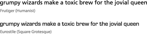
Recent research has compared the legibility of typefaces in a fully simulated driving environment (Reimer et al. Citation2014). In that study, participants performed a menu selection task while driving a fixed-based driving simulator. The in-vehicle device’s menus were set in Frutiger, a ‘humanist’ typeface, and Eurostile, a ‘square grotesque’ typeface. The humanist typeface is characterised by its varied, open letterforms and spacing, while the square grotesque utilises a more closed-off, strongly geometric design. For these reasons, typographers believe that humanist type should be more legible than square grotesque (see Figure for examples; for a detailed discussion of these design differences, see Reimer et al. Citation2014). Results from the simulator study supported this intuition, indicating that participants were able to perform the menu selection task more quickly and more accurately when menus were set in humanist type as compared to square grotesque, and that this effect was more pronounced for men as compared to women.
These initial results indicate that empirical methods can reveal important differences in legibility stemming from the design of typeface itself. However, given the number of possible characteristics (aesthetic or otherwise), scenarios and languages that could be tested, conducting subsequent tests in a full-driving simulator environment is impractical (a prohibitive investment of resources and time). Although a fully simulated environment provides excellent face validity, it forces the investigator to examine visual design characteristics in the complex context of the driving task, in which it is hypothesised that the constant demands of the driving task on visual attention, risk management, hand–eye coordination and situational awareness may interfere with basic measurements of legibility (Reimer et al. Citation2014). In essence, other subtle, but potentially significant, design effects might be ‘swallowed’ by the larger influences of ingrained driving behaviours and attentional allocation strategies involved with driving. Lastly, a methodology that is specifically bound to a driving simulator calls into question the generalisability of outcomes. Therefore, a methodology that more directly examines the influence of typeface design characteristics on visual behaviour in glance-like contexts was developed.
Here, we first describe a methodology that allows for the rapid comparison of legibility differences of typographical characteristics – the method is illustrated using the same two typefaces used in the previously described simulator work. We examine the effect of text polarity (the choice of foreground and background colours for the text display) by comparing the two typefaces under positive polarity (black on white) and negative polarity (white on black) conditions. A second follow-up study extends these findings to an examination of the effect of typeface size on legibility, and allows for a deeper examination of how a typeface’s intrinsic design characteristics (the rules that govern its shape) interact with extrinsic factors such as the pixel grid on which the typeface is rendered. The methodology works by presenting words on screen for a very brief duration, enforcing glance-like behaviour. This way, the methodology enforces glance-like reading behaviour and parallels the occlusion testing standard commonly used in the driving research field (Senders et al. Citation1966, Citation1967; International Standards Organization Citation2007), with a much simpler and easily reproducible set-up.
Study I
Methods
Participants
A total of 67 participants between the ages of 20 and 75 were recruited from the greater Boston area through print and online advertising and through the Massachusetts Institute of Technology AgeLab’s existing participant pool. All participants reviewed and signed an approved informed consent form. Participants were required to drive on average at least once per week and to be in self-reported reasonably good health for their age. Exclusion criteria included experience of a major medical illness or hospitalisation in the last six months, conditions that impair vision (other than typical nearsightedness or farsightedness) or a history of epilepsy, Parkinson’s disease, Alzheimer’s disease, dementia, mild cognitive impairment or other neurological problems. Participants were also required to be native English speakers. All participants had normal or corrected-to-normal vision (glasses or contact lenses) and were tested on site for near acuity using the Federal Aviation Administration’s test for near acuity (Form 8500-1), and for far acuity using a Snellen eye chart. Corrected near and far visual acuities did not differ significantly between genders (p > 0.05 for all statistical comparisons of visual acuity, Wilcoxon signed rank tests). Assessed binocular acuity decreased with age in both near (Pearson’s R = 0.47, p = .008) and far (R = 0.34, p = .018) acuity tests. No participants were excluded due to excessively low acuity. To ensure the participants’ comfort, they were allowed to decide whether to use corrective lenses once situated in the experiment room. Participants were also told to adhere to their decision throughout primary data collection.
Of the 67 participants, 19 were excluded from the analysis for the following reasons: 11 (16.4%) failed to reach a stable stimulus duration threshold, 6 (9.0%) due to technical problems with the equipment or software and 2 (3.0%) because the target sample gender distribution had already been reached. Failure to reach a stable threshold was defined as a calculated threshold value of greater than 300 ms, or if a participant’s staircase was still in the process of steadily descending when the condition ended (no staircase reversals during the condition’s final 20 trials, indicating that the staircase had not yet reached the participant’s true threshold point, as described below).
This left a total of 48 participants, equally split between males and females (mean age = 45.7 years). Age distribution did not differ significantly between genders (t(45) = 0.34, p = .737, t-test). Summary statistics for men and women are given in Table .
Table 1. Sample sizes, mean, standard deviation and range of ages for men and women in Study I.
Task, apparatus and stimuli
Task
Participants performed a one-interval forced choice lexical decision task (Meyer and Schvaneveldt Citation1971). The lexical decision paradigm can employ a variety of word pools and decision types, and thus probe many different aspects of orthographic and/or phonological processing. Common manipulations of the presented word stimuli include, for example, semantic pairings (Meyer and Schvaneveldt Citation1971; Cerella and Fozard Citation1984), variable word frequencies (Wagenmakers et al. Citation2008; Perea, Moret-Tatay, and Gómez Citation2011; Montani, Facoetti, and Zorzi Citation2014) and, as in the present study, lexicality (Perea, Moret-Tatay, and Gómez Citation2011; Perea and Gomez Citation2012). Since the present study was primarily concerned with low-level text legibility, we follow Slattery and Rayner’s definition of legibility, which is simply ‘how easy the letters in a word are to encode’ (Slattery and Rayner Citation2009; Chahine Citation2012). Therefore, a word/pseudoword identification task, which depends on the proper encoding of letter stimuli, provides a fairly direct probe for the issue at hand. While there are known individual differences in phonological processing that can affect performance on lexical decision tasks (Stanovich Citation1982; Burt and Fury Citation2000; Ann Atchley et al. Citation2003; Olson et al. Citation1985; Facoetti et al. Citation2010), the within-subject design of these experiments, the manipulation of lexicality (as opposed to semantic meaning) and the use of relatively low-frequency words are intended to minimise any such effects.
A schematic of the task is presented in Figure . Each trial begins with a 1000 ms display of a fixation rectangle (200 px by 100 px, or approximately 5.29° by 2.65°), centred on the screen, indicating the general area where stimuli will appear (all stimuli and masks are displayed at the screen’s centre). The fixation rectangle is followed by a 200 ms mask composed of randomised punctuation characters. Then, a single word (or pseudoword) stimulus is displayed for a variable presentation time, as determined by an adaptive staircase procedure (see ‘Adaptive Staircase Procedure’, below). This is immediately followed by another 200 ms mask. Finally, the participant is prompted to decide whether the stimulus was a word or pseudoword. Participants are given a maximum of 5000 ms to respond by pressing either the ‘1’ or ‘3’ key of the numeric keypad (the keys corresponded to ‘word’ and ‘pseudoword’, respectively, and were marked with either green and red tapes for clarity). Participants were not provided with feedback regarding the accuracy of their responses, other than during the practice section described below. Each mask was unique, constructed by randomly selecting eight characters from a small pool of punctuation characters. The sandwiching of the stimulus between the two masks minimises the stimulus’s visible persistence in iconic memory, ensuring that it will only be perceptually accessible for the intended presentation time (Coltheart Citation1980).
Figure 1. The structure of an individual trial of the experiment. See Methods for details.
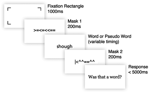
The experiment began with a series of 10 practice trials, with stimulus duration set to 1000 ms. After five consecutive correct answers, participants were permitted to move on to the main experiment. If the participant reached the end of the 10 trials without making 5 consecutive correct responses, he/she was allowed to repeat the practice block. A serif typeface that looked substantially different from the two typefaces of interest, ‘Georgia’, was used to display practice trial stimuli and all prompt text. Prompt text set in Georgia was also displayed at approximately double the size of the word and pseudoword stimuli.
Apparatus
The experiment was conducted in a quiet, dimly lit room. Illumination was provided by two low power floor lamps directed towards the room’s ceiling, which produced an illumination of approximately 23 lux near the participant’s eyes. Software was run on a 2.4 GHz Mac Mini running Mac OS X 10.6.8. Stimuli were created and displayed using Matlab (Natick, MA) running the Psychtoolbox 3 (Brainard Citation1997; Pelli Citation1997). Stimuli were displayed on a Dell 24″ (60.96 cm) LCD monitor with its luminance set to the lowest level allowed by the hardware (1 cd/m2 when displaying pure black and 113 cd/m2 when displaying pure white). The monitor had a resolution of 1920 × 1200 pixels and a refresh rate of 60 Hz.
Text was rendered using Matlab’s native font-rendering capabilities, which do not support subpixel anti-aliasing and instead use greyscale font smoothing. Greyscale smoothing works by shading the font’s edges in colours that are intermediate between the text colour and background colour, and operates on whole pixels. Subpixel anti-aliasing, on the other hand, leverages the fact that modern LCD pixels are composed of separate red, green and blue subpixels, and manipulates the brightness of the subpixels independently to achieve the illusion of greater horizontal resolution (and thus sharper smoothing). While greyscale and subpixel smoothing are thought to be more legible compared to unsmoothed (aliased) text, differences between the two smoothing methods are relatively subtle and tend to be non-significant in the research to date (Aten, Gugerty, and Tyrrell Citation2002; Gugerty et al. Citation2004; Sheedy et al. Citation2005, Citation2008).
Stimuli
The primary stimuli of this experiment were English words selected from an online orthographic database (Medler and Binder Citation2005). To generate a suitably large list of reasonably common words, word length was restricted to 6 letters; orthographic neighbourhood size, which is the number of words of the same length that differ by exactly one letter, was restricted to between 1 and 5 (inclusive); word frequency was set to 2–5 per million (inclusive); and bigram frequency, which is the frequency of a specific two-letter set of characters in a specific word position, was constrained to a minimum of 600 per million. All other search parameters were unconstrained. This ensured a list of relatively common English words that were also suitably varied in letter combination. Pseudowords, also 6 letters long, were generated from the same database using constrained trigrams. This resulted in pseudowords made of pronounceable combinations of letters, and closely resembled the list of real words in English. The resulting pools of words and pseudowords are provided in the Supplemental Materials.
Conditions tested
There were a total of four experimental conditions: 2 typefaces × 2 polarities (100 trials per condition). The typefaces were ‘Frutiger’ (a humanist typeface) and ‘Eurostile’ (a square grotesque). These typefaces are thought to represent two genres of design styles within the sans-serif style (the former is round and inspired by written forms, while the latter is very mechanical in feel), and have previously been associated with behavioural differences in a driving simulator (Reimer et al. Citation2014). Samples of each typeface are shown in Figure . Standard versions of Frutiger and Eurostile were modified to equalise their heights based on the height of each typeface’s capital ‘H’. The positive polarity condition displayed black text (RGB: 0, 0, 0) on a white background (RGB: 255, 255, 255), while the negative polarity condition displayed the opposite (same colour values). Each combination of polarity and typeface was presented in a separate block, and the order of blocks was counterbalanced across participants, with blocks of the same polarity conditions always presented consecutively. Each typeface/polarity condition contained 50 word trials and 50 pseudoword trials, randomly interleaved. Word order was randomised for each participant.
Figure 2. Pangram type samples displaying every letter of the English alphabet are shown for each of the typefaces used in this experiment (positive polarity shown). Image was rendered in Adobe Photoshop CS6 at nominally identical capital heights of 60 pixels in a 300DPI image.
Primary data collection (400 trials total) began after the practice block. Every 50 trials (approximately every 4–5 min), participants were allowed to take a short rest of up to 30 s (the participant could terminate the rest periods early if so desired). There was a mandatory 5-min break after the 200th trial, during which participants listened to a short biographical segment on Benjamin Franklin to fill time. Following this break, the transition between polarities always occurred.
To mimic the fixed visual distance of an automotive interface, participants were seated such that their eyes were approximately 27″ (68.58 cm) from the screen, and were instructed to try to maintain that distance throughout the session (word stimuli were therefore displayed at a vertical size of approximately 20.1 arcmin). Head restraints were not used, thus allowing for the kind of positional variability that is likely to be encountered in real-world reading scenarios. The 4-mm screen character height and the distant positioning of the participants’ eyes from the screen were consistent with ISO standard 15008 (International Standards Organization Citation2009) for automotive displays, which recommends an effective character size ≥20 vertical arcmin.
Adaptive staircase procedures
During the four main data collection blocks, task difficulty was controlled via an adaptive staircase procedure (Levitt Citation1971; Leek Citation2001). This technique changes the difficulty of the task based on a participant’s pattern of correct and incorrect responses. Using a ‘3-down, 1-up’ rule, the task is made more difficult (stimulus duration is decreased) after three consecutive correct responses, and made easier (stimulus duration is increased) after one incorrect response. Following this rule, stimulus duration will converge on a difficulty that produces 79.4% accuracy (Leek Citation2001).
We modified the staircase algorithm to accommodate the experiment’s workflow in the following ways. First, stimulus duration was initially decremented in a controlled manner to allow the participant to adapt to the expected task difficulty. At the start of each typeface/polarity block, stimulus duration was set at 800 ms. Three trials were performed at this setting, regardless of the participant’s responses. Stimulus duration was then decremented to 600 ms for the next 3 trials, 400 ms for 3 trials after that and finally, 200 ms for another 3 trials. Staircase control of stimulus duration was initiated on the 13th trial of the condition.
The staircase’s step size (the increment by which stimulus duration was adjusted, not to be confused with stimulus duration itself) was gradually decreased throughout each condition, allowing the staircase to make finer adjustments as the condition progressed. Step size was initially set to 12 frames (200 ms), and was reduced by a factor of 20% after every 3 staircase reversals (when the staircase switched from increasing to decreasing difficulty or vice versa). Over the course of 100 trials per condition, step size reached a minimum of 1 frame. Third, stimulus duration was constrained to be at least 33.4 ms and at most 1000 ms. While the 60 Hz monitor used in this study was capable of a minimum presentation time of 16.7 ms, it was felt that this value made the stimulus practically invisible and constituted a nearly impossible task difficulty, particularly for older participants. A floor of 33.4 ms was implemented to reduce participant frustration and increase the number of trial responses informed by veridical perception.
Staircase levels were reset at the start of each typeface/polarity block, allowing for the calculation of separate stimulus duration thresholds for each of the four conditions. Each condition is calibrated to the same hypothetical accuracy level. Therefore, a less legible typeface should require a longer presentation time (and thus a higher threshold) to reach the same accuracy level as a more legible typeface.
Data analysis
Thresholds were obtained for each of the 4 typeface/polarity conditions by calculating the median stimulus duration of each condition’s final 20 trials. Response accuracy and response times were recorded for each trial. Mean response times for correct responses, incorrect responses, word trials and pseudoword trials were calculated separately for each participant and condition based on the final 80 trials (i.e. excluding the first 20 trials of each condition to account for habituation to task pacing). Stimulus presentation time thresholds, performance accuracy and response time were analysed in a 2 × (2 × 2) repeated-measures design (gender × [typeface × polarity]). Gender is included in the analyses because previous research has indicated an effect of gender on legibility for the typefaces under study (Reimer et al. Citation2014). Although the sample included participants across a wide 20–75-year age range, an investigation of the differences in perception due to age was not an initial goal of the study. Therefore, in the aforementioned model, we include gender as a predictor and age as a covariate of the main effects of interest. Separate one-factor models, without demographic covariates, were used to compare response times for correct vs. incorrect responses and word vs. pseudoword stimuli. Measures of effect size are provided for all significant effects, either in the form of Cohen’s d for two group comparisons or as generalised eta squared (denoted ) for multivariate effects (Olejnik and Algina Citation2003; Bakeman Citation2005). All statistics were computed and visualised using R (R Core Team Citation2015).
Results
Response accuracy
Since task difficulty fluctuates in accordance with the staircase, mean response accuracy was calculated for the last 20 trials of each condition, when the staircase had stabilised. Summary statistics are shown in Table . In a model that considered the effects of typeface and contrast polarity on response accuracy, accuracy did not differ significantly between typeface (F(1, 46) = .06, p = .805) or polarity (F(1, 46) = .20, p = .655). These factors also did not interact significantly (F(1, 46) = .62, p = .436). This indicates that the adaptive staircase successfully calibrated participants to a consistent level of accuracy across conditions. Across conditions, response accuracy was 78.8% on average, which is not statistically different from the staircase calibration point of 79.4% (t(47) = −0.94, p = 0.350, t-test). This indicates that the staircase was able to converge on a stable threshold estimate in the allotted number of stimuli.
Table 2. Means (and standard deviations) of response accuracy for each of the four conditions in Study I.
Response times
It has been suggested that reaction/response times reflect the amount of time needed to process stimuli relevant to a decision. A longer response time indicates that a greater amount of cognitive ‘computation time’ is necessary before a decision point is reached (Uchida, Kepecs, and Mainen Citation2006; Ratcliff and McKoon Citation2008; Wagenmakers et al. Citation2008). It might therefore be anticipated that changes in legibility could be reflected in behavioural response times under the present paradigm. However, in a model that included typeface and contrast polarity as within-subjects factors and age as a between-subject factor, there was no significant effect of typeface (M humanist = 451 ms; M square grotesque = 457 ms; F(1, 46) = 0.28, p = 0.602), contrast polarity (M positive = 478 ms; M negative = 467 ms; F(1, 46) = 0.31, p = 0.580) or their interaction (F(1, 46) = 0.01, p = 0.933) on response time. Response times did, however, increase significantly with age (F(1,46) = 4.54, p = .038, = 0.07). At the same time, response times were sensitive to whether the stimulus was a word or pseudoword, and whether the participant’s decision was correct. Response times were significantly slower for incorrect responses compared to correct ones (556 ms vs. 432 ms, respectively, F(1, 47) = 65.0, p < .001, d = 0.77, test of mean correct vs. incorrect response time). Put another way, response times for incorrect responses were 28.7% slower compared to correct responses. Similarly, response times to pseudoword trials were significantly slower compared to word trials (478 ms vs. 429 ms, F(1, 47) = 24.8, p < .001, d = 0.35, test of mean word vs. pseudoword response time), suggesting that participants needed more time to process more novel or linguistically confusing stimuli.
Presentation time thresholds
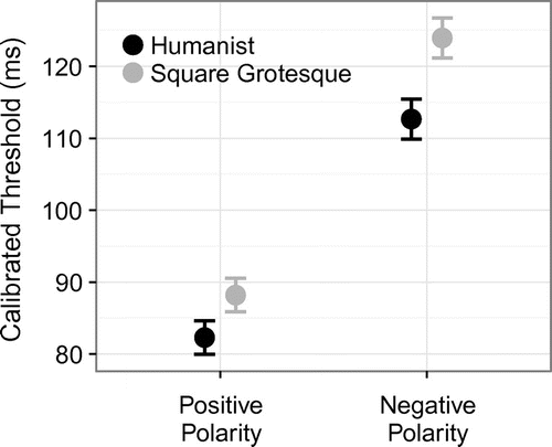
Presentation time thresholds are presented in Table and Figure . In a model that included typeface and contrast polarity as within-subjects factors and age as a between-subject factor, thresholds for the humanist typeface were significantly lower than thresholds for square grotesque (F(1, 46) = 7.32, p < .01, = 0.01), suggesting that humanist type took less time to read at the intended level of accuracy and is more legible. Thresholds were also significantly lower for positive polarity (black on white) text than for negative polarity (white on black) (F(1, 46) = 55.3, p < .001,
= 0.13). Typeface and polarity did not interact significantly (F(1, 46) = 0.44, p = .510), suggesting that the humanist typeface carries the same legibility benefit, regardless of polarity condition. There was no significant difference in thresholds between genders (F(1, 46) = 0.03, p = .863).
Table 3. Means (and standard deviations) of threshold presentation times (in ms) for each of the four conditions.
Figure 3. Calibrated presentation time thresholds for each condition of Study I.
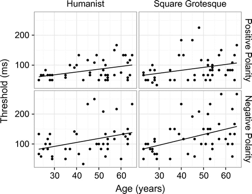
Although age effects were not a primary concern of the present study, the data do clearly demonstrate that stimulus duration thresholds across conditions increase significantly with age, as illustrated in Figure (F(1,46) = 10.49, p = .002, = 0.14). Estimates based on a linear regression of the data indicate that stimulus duration thresholds for a 20-year old would average 70 ms, versus 126 ms for a 65-year old, an increase of 81%. These findings are consistent with various well-known age-related declines in perceptual processing (Habak and Faubert Citation2000; Faubert Citation2002; Snowden and Kavanagh Citation2006; Govenlock et al. Citation2009). Interestingly, as shown in Figure , the age slope is nominally steepest for the square grotesque typeface when set in negative polarity, the condition that also had the highest thresholds (lowest legibility) across the age range.
Figure 4. Each participant’s average threshold in the four typeface/polarity conditions in Study I, visualised against the participant’s age.
Lastly, analyses indicate that threshold estimates differed significantly by block order (F(3, 141) = 3.88, p = .011, = 0.03, one-way repeated-measures ANOVA), and that this difference was due to thresholds being significantly elevated during the first condition of the session compared to the others (Condition 1 threshold vs. Conditions 2, 3 and 4, all p < .042; all other comparisons p > .270, post hoc paired t-tests). This order effect was anticipated, and condition order was appropriately counterbalanced between participants, ensuring that no typeface condition was significantly more likely to appear in the first block of the session compared to the others (X2(3) = 1.25, p = .741, Friedman test of block order by participant). Therefore, the order effect was adequately compensated for by the experiment design.
Study I showed that the typeface used to display text could meaningfully impact the time needed for accurate reading. This difference between typefaces was of similar magnitude in both contrast polarity conditions tested, suggesting that legibility of text may be an additive function of a selected typeface and contrast polarity. In this experiment, a more legibly designed typeface retains a fairly consistent advantage, regardless of contrast polarity.
Study II
Introduction
Contrast polarity is but one factor that may impact the legibility of a typographic configuration; another prominent factor is text size (Legge et al. Citation1985). While it is obvious that smaller text should be more difficult to read than larger text, the nature of this effect in interaction with typographic design is less clear. On the one hand, we might expect the legibility advantage observed for humanist type to remain relatively consistent between sizes (in an additive manner), as it did for different contrast polarities. However, digital font rendering is surprisingly complex (Chaparro et al. Citation2010), and it may be the case that fonts with certain design characteristics scale down to small sizes poorly, resulting in rendering artefacts or a loss of clarity that impacts their legibility more strongly than would be expected from a theoretical application of visual magnification (in a multiplicative manner).
To examine this issue, a second study was undertaken in which the same humanist and square grotesque typefaces used in Study I were displayed in negative polarity text at capital letter heights of 3 and 4 mm, once again resulting in four conditions to be tested.
Methods
Study II was designed to directly extend the results of Study I and uses similar (in most ways, identical) methodology, stimuli, equipment and statistical models. Differences in implementation between Studies I and II are noted here.
Participants
A total of 48 participants, none of whom had participated in Study I, were recruited for Study II. All provided written informed consent and were screened according to the same criteria as in Study I. Of the 48 participants, 16 were excluded from the final analysis set for the following reasons: 5 (10.4%) due to a failure to use necessary corrective lenses consistently during the session, 3 (6.3%) because they exhibited unusually slow mean response times (mean > 1.5 s), 1 (2.1%) because one of his/her threshold estimates was in excess of 400 ms, 6 (12.5%) due to probable threshold miscalibrations (failure to reach a stable threshold estimate in the allotted trials, as indicated by a mean response accuracy of less than 70% or greater than 90%, or an absence of staircase reversals during the final 20 trials of a condition) and 1 (2.1%) because the recruited sample had been reached. This left a total of 32 participants, equally split between men and women (see Table ). Visual acuity did not differ significantly between genders (p > .05 for all t-tests). Assessed binocular acuity decreased with age for near acuity (Pearson’s R = 0.44, p = .030) but not far acuity (R = 0.19, p = .384) tests. No participants were excluded due to excessively low acuity. Age did not differ significantly between genders (t(30.0) = 0.33, p = .749, t-test).
Table 4. Sample sizes, mean, standard deviation and range of ages for men and women in Study II.
Task, apparatus and stimuli
Task design, the pool of word/pseudoword stimuli and the typefaces used were identical to those of Study I. Study II tested four typographic conditions: humanist type set at 4-mm size, humanist at 3 mm, square grotesque at 4 mm and square grotesque at 3 mm. Since the negative polarity condition was found to more strongly differentiate typeface thresholds in Study I, all stimuli were displayed in negative polarity – white text (RGB: 255, 255, 255) on a black background (RGB: 0, 0, 0). Condition order was effectively counterbalanced between participants (X2(3) = 0.6, p = 0.897, Friedman test of block order).
Study II used the same software as in Study I, but the hardware was upgraded. Study II collected data using a 2.5Gz Intel Core i5 Mac Mini running Mac OS X 10.9.1. This change was made to accommodate the use of an Asus high refresh rate monitor (27″ [68.58 cm], 1920 × 1080 resolution, 109.9 Hz refresh rate). Theoretically, a higher refresh rate allows for task difficulty to be controlled in finer increments, and may therefore allow for greater sensitivity when distinguishing threshold measurements. As in Study I, participants were asked to maintain a distance of approximately 27″ (68.58 cm) from the display. As a result, stimuli in the 4-mm condition were rendered at a vertical height of approximately 20.1 arcmin, and stimuli in the 3-mm condition were rendered at approximately 15.0 arcmin.
Study II was analysed under the same statistical models as Study I, exchanging the factor of contrast polarity for type size in all two-factor tests.
Results
Response accuracy
As shown in Table , response accuracy did not differ significantly from the expected calibration point of 79.4% (t(31) = −0.77, p = 0.448, overall t-test; p > 0.08 in all individual conditions). Response accuracy was unaffected by typeface (F(1, 31) = 3.03, p = .092), size (F(1, 31) = 1.52, p = .227) or their interaction (F(1, 31) = 0.01, p = .904). These results confirm that threshold estimates reflect stable performance at the target accuracy level.
Table 5. Means (and standard deviations) of response accuracy for each of the four conditions in Study II.
Response times
Response time effects were generally consistent with Study I. Response times were not sensitive to differences in typeface (M humanist = 506 ms; M square grotesque = 516 ms; F(1,31) = 0.57, p = 0.456), size (M 3 mm = 517 ms; M 4 mm = 505 ms; F(1,31) = 0.39, p = .537) or their interaction (F(1,31) = 2.80, p = 0.104), and were also not significantly affected by age (F(1, 30) = 1.21, p = .279). As in Study I, response times reliably differentiated correct and incorrect responses (490 ms and 599 ms, respectively; F(1,31) = 42.1, p < 0.001, d = 0.67), with incorrect responses taking 22.3% longer compared to correct responses. Likewise, response times were sensitive to differences between word and pseudoword trials (482 ms and 540 ms, respectively; F(1,31) = 18.5, p < 0.001, d = 0.38). Response times did not differ significantly between studies (t(61.9) = −1.74, p = 0.09, t-test).
Presentation time thresholds
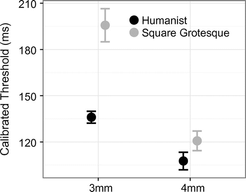
Stimulus duration thresholds are summarised in Table and Figure . Consistent with Study I, thresholds were significantly lower for the humanist typeface compared to the square grotesque (F(1,31) = 26.78, p < .001, = 0.07). In addition, thresholds were significantly lower for 4-mm type compared to 3 mm (F(1,31) = 24.84, p < .001,
= 0.13). These factors interacted significantly (F(1,31) = 11.77, p < .001,
= 0.03), suggesting that the reduction in size more adversely affected square grotesque thresholds than humanist thresholds. Post hoc testing shows that typeface had significant effects on presentation time thresholds at both 4 and 3-mm sizes (t(31) = 2.12, p = .042, d = 0.28 for 4 mm; and t(31) = 4.83, p < .001, d = 0.72 for 3 mm). Comparing the 4-mm negative polarity conditions in Studies I and II, there was no significant difference in the measurements between studies (F(1,78) = 0.14, p = .706), suggesting that threshold measurements were unaffected by the change in equipment.
Table 6. Means (and standard deviations) of threshold presentation times (in ms) for each of the four conditions in Study II.
Figure 5. Calibrated presentation time thresholds for each condition of Study II.
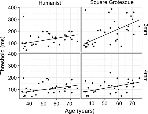
As shown in Figure , thresholds increase significantly with age (F(1,30) = 8.11, p = .008, = 0.15). A significant interaction between age and typeface is present (F(1,30) = 14.40, p < .001,
= 0.03), as well as a significant three-way interaction between age, size and typeface (F(1, 30) = 5.07, p = .032,
= 0.01), likely driven by the steeper age slope seen for the square grotesque 3-mm condition (Figure , upper right panel). Consistent with Study I, these results suggest that typeface legibility degrades more steeply across the lifespan if the type is less legible overall.
Figure 6. As in Figure 4, threshold estimates are plotted against age for each condition in Study II.
General discussion
The present study adapted classical psychophysical techniques to an investigation of the relative legibility of two different typefaces across two different polarities and sizes. Participants performed a simple yes/no lexical decision task, with task difficulty controlled by an adaptive staircase. We found that stimulus duration threshold levels were sensitive to all three factors examined. Humanist type showed a legibility advantage compared to a square grotesque. In Study I, stimulus duration thresholds were 8.8% faster for humanist typefaces compared to square grotesque. Positive polarity text (black on white) showed a strong legibility advantage, with average stimulus duration thresholds 38.6% lower than negative polarity text.
The polarity effects are consistent with other work showing that positive polarity displays are more legible than negative polarity displays, likely because the lower illumination of a dark background causes pupillary dilation, which introduces optical blurring (Piepenbrock, Mayr, and Buchner Citation2013). Owing to the simplified set-up of this psychophysical technique and the use of a small amount of text against a large background area, the effect of varying illumination from the background element is likely to be especially pronounced. Further insights may be gained by employing a display method that varies the polarity of text along with a smaller background area, but holds overall illumination constant between conditions.
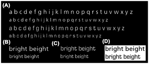
As shown in Study II’s threshold estimates, type size can have a dramatic impact on the amount of time required for accurate reading, and this effect can vary considerably depending on the typeface used. When reducing the capital height of the typeface from 4 to 3 mm, legibility thresholds increased 26.4% for the humanist typeface and 62.1% for the square grotesque typeface. Though the 3 and 4-mm sizes differ by only 3 pixels as measured by capital height, this drastically impacts the available space in which to render text glyphs. As shown in Figure , the letterforms of the humanist typeface remain relatively distinct at the smaller size, while the square grotesque’s becomes more confusable. This is particularly apparent in the ‘i’ and ‘j’ glyphs, which lose identifying characteristics at the smaller size. Likewise, the humanist’s ‘a’ and ‘g’ characters remain distinct at the 3-mm size, while the square grotesque’s appear to be significantly more muddled. The main effects of typeface observed in these experiments, along with the significant interaction observed between typeface and size, suggest not only that certain typefaces can have intrinsic design characteristics (‘stylistic’ qualities) that make them superior for glance-like reading, but that those intrinsic qualities may also interact with extrinsic factors such as the pixel grid in dramatic ways.
Figure 7. Samples of typefaces as displayed in actual screen pixels. Images are taken directly from the Psychtoolbox frame buffer, zoomed to show rendering artefacts.
These issues of size, rendering fidelity and letterform design are likely to influence, or perhaps be influenced by, visual crowding phenomena (Bouma Citation1970; Pelli et al. Citation2007). While the present studies were not specifically designed to investigate crowding effects, they are worth remarking on briefly. Visual crowding refers to the inability to recognise an object if it is closely flanked by other, similar objects (such as a letter surrounded by other letters). Crowding has been studied extensively in the context of reading, with a focus on determining how far from fixation letters and/or words can be accurately decoded under fixational and active reading paradigms (McConkie and Rayner Citation1975; Rayner Citation1998; Bosse, Tainturier, and Valdois Citation2007; Legge and Bigelow Citation2011). The task described in the present studies uses a foveally presented stimulus to emulate glance-like reading, which would place stimuli well within the various ‘uncrowded spans’ described in the literature. However, some crowding effects are evident even within the high-fidelity fovea. For example, it has been shown that decreased inter-character spacing (i.e. ‘tighter’ spacing) leads to increased recognition times for briefly presented words (Perea, Moret-Tatay, and Gómez Citation2011; Perea and Gomez Citation2012; Montani, Facoetti, and Zorzi Citation2014). Such effects are relevant to the present study, particularly given that the humanist and square grotesque typefaces are differentiated, in part, by marked differences in inter- and intra-character spacing. This begs the question as to whether legibility thresholds for square grotesque type might be made similar to those for humanist type simply by increasing the inter-character spacing of stimuli.
Although age effects were not the primary interest of the present study, the age effects observed in these experiments are worth further consideration. It is well known that human vision degrades considerably across the lifespan, resulting in losses of contrast sensitivity, visual acuity and other attendant degradations in the processing of visual stimuli (Devaney and Johnson Citation1980; Greene and Madden Citation1987; Owsley Citation2011; Paterson, McGowan, and Jordan Citation2013). In the context of long-form reading, these declines are associated with slower reading rates, particularly for especially small or large text (Akutsu et al. Citation1991). To compensate, older observers may adopt a ‘riskier’ reading strategy, in which more familiar words are skipped at the cost of a higher rate of saccadic regressions (Laubrock, Kliegl, and Engbert Citation2006; Rayner et al. Citation2006). Glance-like lexical decision paradigms have yielded a somewhat different pattern in regard to age. Ratcliff et al. have found that older observers exhibit slower response times to lexical stimuli, but have higher response accuracy, perhaps because they adopt a more conservative response strategy overall (Ratcliff et al. Citation2004). Ratcliff’s diffusion model suggests that the key difference in response times between age groups lies in ‘non-decision’ components, which are of limited applicability to the present work, as non-decision components encompass both stimulus encoding and behavioural response epochs (though the diffusion model does rule out more general ‘cognitive slowing’ effects). The results of Studies I and II are relevant to the encoding stage specifically, and suggest three general conclusions: (1) certain combinations of typeface, colour and style are measurably less legible than others across the lifespan; (2) legibility thresholds increase with age; and (3) older observers are more strongly affected by suboptimal designs. The third point is revealed in Figures and , which show noticeably steeper age slopes for the least legible condition in each experiment. While this effect is nominal for Study I, it is statistically significant in Study II, likely due to the stronger interaction of typeface and size observed in that study. It will be important to keep these types of age-related interactions in mind when designing user interfaces, especially as the world becomes demographically ‘grayer’.
Although response time measures were not sensitive to differences in typeface or polarity, they did reveal cognitive processing differences between correct and incorrect responses, as well as differences in processing words and pseudowords. These effects are consistent with the idea that more ambiguous or cognitively demanding stimuli take longer to process and reach an actionable ‘decision boundary’ (Ratcliff and McKoon Citation2008; Wagenmakers et al. Citation2008). In practice, longer response times may indicate misreadings or internal reassessments of the encoded stimulus. The increase in response times observed with age is consistent with the increase observed for stimulus duration thresholds; however, owing to the multifarious ageing effects that could affect response time (subtle motor impairment, increased ‘noise’ throughout the nervous system, a possible lack of familiarity with computer use among older participants, etc.), it is difficult to say whether this response time effect is strongly connected to legibility effects.
These results are consistent with previous research that examined the same typefaces in a fully simulated in-vehicle task (Reimer et al. Citation2014). Like the present study, those experiments found an advantage for a humanist typeface compared to square grotesque: the effect was most apparent in the simulated driving experiments in male participants. In contrast, in the present study, relatively equivalent typeface effects were observed for both genders.
The choice of task (lexical decision-making versus fully simulated driving environment) may explain the difference in gender effects found between the two studies. Women have been shown to more accurately evaluate the risks of certain driving situations, as well as their own driving abilities, as compared to men (Evans and Wasielewski Citation1983; DeJoy Citation1992; Byrnes, Miller, and Schafer Citation1999). Women may simply adopt a different strategy for balancing attention on the roadway with attention to the device, which may cause the putative benefits of a typeface to be lost in the final metrics. Conversely, the present study reduces the test of legibility to its most fundamental components: the ability to accurately read a briefly presented word. With most extraneous behavioural factors removed, the benefits of the humanist typeface are now evident for both genders and in both polarity conditions.
Applications
In summary, the methodology outlined in this paper can be used to investigate subtle aesthetic properties of typographic and graphic designs by employing a relatively pure measurement of legibility. The methodology eliminates a number of confounding variables that are present when studying legibility using more typical glance time measures or in a specific interaction format, such as menu selection. It is worth emphasising that the threshold presentation time used as the primary dependent measure in this methodology bears a direct relationship to glance time requirements. The method described here forces the observer to encode and process a small amount of text within a brief time window. This is an increasingly common behaviour that is broadly applicable to smartphone use, wearable computing, advertising and in-vehicle automotive technologies. This method and others like it allow an investigator, be s/he a designer, advertiser, engineer or scientist, to evaluate the information processing trade-offs of a targeted set of visual features. While the psychophysical technique cannot create a completely ‘natural’, self-directed glance state, we argue that the scenario is a proxy for glance-like perception of modern-day multi-tasking, and is conceptually comparable to occlusion testing methods commonly used in automotive research. An important advantage of the psychophysical methodology is that the reduced complexity, administration time and data reduction and analysis costs make it possible to study many more subtle variations in how typographic information is displayed than would be practical to test under fully simulated or actual driving conditions, or in other applied environments that necessitate the optimisation of display characteristics for glance-based legibility.
Future work will need to assess the degree to which other aspects of the graphical–user interface relate to the legibility of text rendered in different typefaces and across different polarities. Experimental paradigms such as the one outlined here could be used in combination with hierarchical modelling techniques to develop sophisticated but useful ‘roadmaps’ of design trade-offs (Merkle and Chaparro Citation2009). Overall, the optimisation of intrinsic and extrinsic features of type and the graphic designs in which the text is presented will help reduce the demand of glance-based interface activities. Investment in further use of these psychophysical methods for the assessment of other attributes of typeface may provide a robust way to evaluate the relative trade-offs between various intrinsic and extrinsic factors and help designers and engineers better balance the trade-offs between ‘art’ and ‘legibility’. Furthermore, the method can be easily generalised to studies of typography in other languages, environmental conditions and even more complex visual scenarios (Dobres et al. Citation2016). The goal of these methods is not to encourage reading while walking or driving, per se, but to ensure that, when a user chooses to undertake such behaviours, that the on-screen text has been designed to optimise reading and thus promote a rapid return of his or her attention back to the surrounding environment.
Limitations
A considerable proportion of participations in both studies were excluded from analysis due to a failure to reach stable staircase values (as previously noted, 16.4% in Study I and 12.5% in Study II). The staircase procedure used in this study was a relatively simple implementation, and could be further refined with more sophisticated movement rules or the incorporation of statistical priors based on the data collected here (Watson and Pelli Citation1983; Leek Citation2001). Additionally, the findings presented here represent legibility trade-offs in the dimly lit laboratory conditions studied as well as the hardware and software utilised. A deeper understanding of the sensitivity of these findings across lighting conditions and display technologies will require additional research.
Funding
This work was supported by US Department of Transportation’s Region I New England University Transportation Center; Monotype Imaging Inc.; Toyota Class Action Settlement Safety Research and Education Program.
Supplemental data
Supplemental data for this article can be accessed at http://dx.doi.org/10.1080/00140139.2015.1137637
Disclosure statement
No potential conflict of interest was reported by the authors.
terg-2015-0322-File001.doc
Download MS Word (443 KB)Acknowledgements
Partial funding for the development of this work was provided by the US Department of Transportation’s Region I New England University Transportation Center at MIT. This collaborative project was underwritten in part by Monotype Imaging Inc. through funding provided to MIT for Study I and in contribution of staff time. The authors would also like to acknowledge the Toyota Class Action Settlement Safety Research and Education Program for support of Study II and in the development of this manuscript. The views and conclusions being expressed are those of the authors, and have not been sponsored, approved or endorsed by Toyota or plaintiffs’ class counsel. Earlier presentations of this work appear as an AgeLab white paper and in a presentation to the 8th International Driving Symposium on Human Factors in Driver Assessment, Training and Vehicle Design (preliminary data).
Related Research Data
References
- Akutsu, H., G. E. Legge, J. A. Ross, and K. J. Schuebel. 1991. “Psychophysics of Reading – X. Effects of Age-Related Changes in Vision.” Journal of Gerontology 46 (6): P325–P331.10.1093/geronj/46.6.P325
- Ann Atchley, Ruth, Laura Halderman, Kristin Kwasny, and Lori Buchanan. 2003. “The Processing of Pseudohomophones by Adults with a History of Developmental Language Disabilities.” Brain and Cognition 53 (2): 139–144. doi:10.1016/S0278-2626(03)00096-4.
- Aten, T. R., L. Gugerty, and R. A. Tyrrell. 2002. “Legibility of Words Rendered Using CleartypeTM.” Proceedings of the Human Factors and Ergonomics Society Annual Meeting 46 (17): 1684–1687. doi:10.1177/154193120204601733.
- Bakeman, Roger. 2005. “Recommended Effect Size Statistics for Repeated Measures Designs.” Behavior Research Methods 37 (3): 379–384.10.3758/BF03192707
- Beier, Sofie, and Kevin Larson. 2010. “Design Improvements for Frequently Misrecognized Letters 1.” Information Design Journal 18 (2): 118–137. doi:10.1075/idj.18.2.03bei.
- Bessemans, Ann. 2012. Type Design for Children with Low Vision. Leiden University, Leiden, Netherlands.
- Bosse, Marie-Line, Marie Josèphe Tainturier, and Sylviane Valdois. 2007. “Developmental Dyslexia: The Visual Attention Span Deficit Hypothesis.” Cognition 104 (2): 198–230. doi:10.1016/j.cognition.2006.05.009.
- Bouma, H. 1970. “Interaction Effects in Parafoveal Letter Recognition.” Nature 226 (5241): 177–178.10.1038/226177a0
- Brainard, David H. 1997. “The Psychophysics Toolbox.” Spatial Vision 10 (4): 433–436. doi:10.1163/156856897X00357.
- Burt, Jennifer S., and Mary B. Fury. 2000. “Spelling in Adults: The Role of Reading Skills and Experience.” Reading and Writing 13 (1/2): 1–30. doi:10.1023/A:1008071802996.
- Byrnes, James P., David C. Miller, and William D. Schafer. 1999. “Gender Differences in Risk Taking: A Meta-Analysis.” Psychological Bulletin 125 (3): 367–383.10.1037/0033-2909.125.3.367
- Carter, H. 1984. “Optical Scale in Type Founding.” Printing Historical Society Bulletin 13: 144–148.
- Cerella, John, and James L. Fozard. 1984. “Lexical Access and Age.” Developmental Psychology 20 (2): 235–243.10.1037/0012-1649.20.2.235
- Chahine, Nadine. 2012. Reading Arabic: Legibility Studies for the Arabic Script. Faculty of the Humanities, Leiden University. http://hdl.handle.net/1887/20022.
- Chaparro, B. S., A. D. Shaikh, A. Chaparroa, and E. C. Merkle. 2010. “Comparing the Legibility of Six ClearType Typefaces to Verdana and Times New Roman.” Information Design Journal 18 (1): 36–49. doi:10.1075/idj.18.1.04cha.
- Chen, Chien-Hsiung, and Yu-Hung Chien. 2005. “Reading Chinese Text on a Small Screen with RSVP.” Displays 26 (3): 103–108.
- Coltheart, M. 1980. “Iconic Memory and Visible Persistence.” Perception & Psychophysics 27 (3): 183–228.
- DeJoy, D. M. 1992. “An Examination of Gender Differences in Traffic Accident Risk Perception.” Accident Analysis & Prevention 24 (3): 237–246.
- Devaney, K. O., and H. A. Johnson. 1980. “Neuron Loss in the Aging Visual Cortex of Man.” Journal of Gerontology 35 (6): 836–841.10.1093/geronj/35.6.836
- Dobres, J., N. Chahine, B. Reimer, D. Gould, and N. Zhao. 2016. “The Effects of Chinese Typeface Design, Stroke Weight, and Contrast Polarity on Glance Based Legibility.” Displays 41 (C): 42–49. doi:10.1016/j.displa.2015.12.001.
- Evans, Leonard, and Paul Wasielewski. 1983. “Risky Driving Related to Driver and Vehicle Characteristics.” Accident Analysis & Prevention 15 (2): 121–136.
- Facoetti, Andrea, Anna Noemi Trussardi, Milena Ruffino, Maria Luisa Lorusso, Carmen Cattaneo, Raffaella Galli, Massimo Molteni, and Marco Zorzi. 2010. “Multisensory Spatial Attention Deficits Are Predictive of Phonological Decoding Skills in Developmental Dyslexia.” Journal of Cognitive Neuroscience 22 (5): 1011–1025. doi:10.1162/jocn.2009.21232.
- Faubert, Jocelyn. 2002. “Visual Perception and Aging.” Canadian Journal of Experimental Psychology/Revue Canadienne De Psychologie Expérimentale 56 (3): 164–176.10.1037/h0087394
- Fox, D., B. S. Chaparro, and E. Merkle. 2007. “Examining Legibility of the Letter ‘E’ and Number ‘0’ Using Classification Tree Analysis.” Software Usability Research Laboratory, Wichita State University. Accessed June 14. http://usabilitynews.org/examining-legibility-of-the-letter-e-and-number-0-using-classification-tree-analysis/
- Gould, J. D., L. Alfaro, V. Barnes, R. Finn, N. Grischkowsky, and A. Minuto. 1987. “Reading is Slower from CRT Displays than from Paper: Attempts to Isolate a Single-Variable Explanation.” Human Factors: The Journal of the Human Factors and Ergonomics Society 29 (3): 269–299.
- Gould, John D., Lizette Alfaro, Rich Finn, Brian Haupt, and Angela Minuto. 1987. “Reading from CRT Displays Can Be as Fast as Reading from Paper.” Human Factors: The Journal of the Human Factors and Ergonomics Society 29 (5): 497–517.
- Govenlock, Stanley W., Christopher P. Taylor, Allison B. Sekuler, and Patrick J. Bennett. 2009. “The Effect of Aging on the Orientational Selectivity of the Human Visual System.” Vision Research 49 (1): 164–172. doi:10.1016/j.visres.2008.10.004.
- Grainger, J., and J. Segui. 1990. “Neighborhood Frequency Effects in Visual Word Recognition: A Comparison of Lexical Decision and Masked Identification Latencies.” Perception & Psychophysics 47 (2): 191–198.
- Greene, H. A., and D. J. Madden. 1987. “Adult Age Differences in Visual Acuity, Stereopsis, and Contrast Sensitivity.” Optometry and Vision Science 64 (10): 749–753.10.1097/00006324-198710000-00006
- Gugerty, Leo, Richard A. Tyrrell, Thomas R. Aten, and K. Andy Edmonds. 2004. “The Effects of Subpixel Addressing on Users’ Performance and Preferences during Reading-Related Tasks.” ACM Transactions on Applied Perception 1 (2): 81–101.10.1145/1024083
- Habak, C., and J. Faubert. 2000. “Larger Effect of Aging on the Perception of Higher-Order Stimuli.” Vision Research 40 (8): 943–950.10.1016/S0042-6989(99)00235-7
- He, Yingchen, Gordon E. Legge, and Yu Deyue. 2013. “Sensory and Cognitive Influences on the Training-Related Improvement of Reading Speed in Peripheral Vision.” Journal of Vision 13 (7): 1–14. doi:10.1167/13.7.14.
- Huang, Ding-Long, Pei-Luen Patrick Rau, and Ying Liu. 2009. “Effects of Font Size, Display Resolution and Task Type on Reading Chinese Fonts from Mobile Devices.” International Journal of Industrial Ergonomics 39 (1): 81–89.10.1016/j.ergon.2008.09.004
- International Standards Organization. 2007. Road Vehicles – Ergonomic Aspects of Transport Information and Control Systems – Occlusion Method to Assess Visual Demand due to the Use of in-Vehicle Systems. ISO 16673. Geneva: International Standards Organization.
- International Standards Organization. 2009. Ergonomic Aspects of Transport Information and Control Systems. ISO 15008. Geneva: International Standards Organization.
- Laubrock, Jochen, Reinhold Kliegl, and Ralf Engbert. 2006. “SWIFT Explorations of Age Differences in Eye Movements during Reading.” Neuroscience & Biobehavioral Reviews 30 (6): 872–884. doi:10.1016/j.neubiorev.2006.06.013.
- Leek, Marjorie R. 2001. “Adaptive Procedures in Psychophysical Research.” Perception & Psychophysics 63 (8): 1279–1292.
- Legge, G. E., and C. A. Bigelow. 2011. “Does Print Size Matter for Reading? A Review of Findings from Vision Science and Typography.” Journal of Vision 11 (5): 1–22. doi:10.1167/11.5.8.
- Legge, G. E., J. S. Mansfield, and S. T. Chung. 2001. “Psychophysics of Reading.” Vision Research 41 (6): 725–743.10.1016/S0042-6989(00)00295-9
- Legge, G. E., D. G. Pelli, G. S. Rubin, and M. M. Schleske. 1985. “Psychophysics of Reading – I. Normal Vision.” Vision Research 25 (2): 239–252.10.1016/0042-6989(85)90117-8
- Levitt, H. 1971. “Transformed Up-Down Methods in Psychoacoustics.” The Journal of the Acoustical Society of America 49 (2B): 467–477. doi:10.1121/1.1912375.
- McConkie, George W., and Keith Rayner. 1975. “The Span of the Effective Stimulus during a Fixation in Reading.” Perception & Psychophysics 17 (6): 578–586. doi:10.3758/BF03203972.
- Medler, D. A., and J. R. Binder, eds. 2005. MCWord. Accessed November 13. http://www.neuro.mcw.edu/mcword/
- Merkle, Edgar C., and Barbara S. Chaparro. 2009. “Using Sunflower Plots and Classification Trees to Study Typeface Legibility.” Case Studies in Business, Industry and Government Statistics 2 (2): 92–98.
- Meyer, D. E., and R. W. Schvaneveldt. 1971. “Facilitation in Recognizing Pairs of Words: Evidence of a Dependence between Retrieval Operations.” Journal of Experimental Psychology 90 (2): 227–234.10.1037/h0031564
- Montani, Veronica, Andrea Facoetti, and Marco Zorzi. 2014. “The Effect of Decreased Interletter Spacing on Orthographic Processing.” Psychonomic Bulletin & Review 22 (3): 824–832. doi:10.3758/s13423-014-0728-9.
- Moret-Tatay, Carmen, and Manuel Perea. 2011. “Do Serifs Provide an Advantage in the Recognition of Written Words?” Journal of Cognitive Psychology 23 (5): 619–624. doi:10.1080/20445911.2011.546781.
- Olejnik, Stephen, and James Algina. 2003. “Generalized Eta and Omega Squared Statistics: Measures of Effect Size for Some Common Research Designs.” Psychological Methods 8 (4): 434–447. doi:10.1037/1082-989X.8.4.434.
- Olson, R. K., R. Kliegl, B. J. Davidson, and G. Foltz. 1985. “Individual and Developmental Differences in Reading Disability.” In Reading Research, edited by G. E. MacKinnon, and T. G. Walter (Vol. 4, pp. 1–65). San Diego, CA: Academic Press.
- Owsley, Cynthia. 2011. “Aging and Vision.” Vision Research 51 (13): 1610–1622. doi:10.1016/j.visres.2010.10.020.
- Paterson, Kevin B., Victoria A. McGowan, and Timothy R. Jordan. 2013. “Filtered Text Reveals Adult Age Differences in Reading: Evidence from Eye Movements.” Psychology and Aging 28 (2): 352–364. doi:10.1037/a0030350.
- Pelli, D. G. 1997. “The Video Toolbox Software for Visual Psychophysics: Transforming Numbers into Movies.” Spatial Vision 10 (4): 437–442.10.1163/156856897X00366
- Pelli, Denis G., and Katharine A. Tillman. 2008. “The Uncrowded Window of Object Recognition.” Nature Neuroscience 11 (10): 1129–1135. doi:10.1038/nn.2187.
- Pelli, D. G., K. A. Tillman, J. Freeman, M. Su, T. D. Berger, and N. J. Majaj. 2007. “Crowding and Eccentricity Determine Reading Rate.” Journal of Vision 7 (2): 1–36. doi:10.1167/7.2.20.
- Perea, Manuel, and Pablo Gomez. 2012. “Increasing Interletter Spacing Facilitates Encoding of Words.” Psychonomic Bulletin & Review 19 (2): 332–338. doi:10.3758/s13423-011-0214-6.
- Perea, Manuel, Carmen Moret-Tatay, and Pablo Gómez. 2011. “The Effects of Interletter Spacing in Visual-Word Recognition.” Acta Psychologica 137 (3): 345–351. doi:10.1016/j.actpsy.2011.04.003.
- Piepenbrock, C., S. Mayr, and A. Buchner. 2013. “Positive Display Polarity is Particularly Advantageous for Small Character Sizes: Implications for Display Design.” Human Factors: The Journal of the Human Factors and Ergonomics Society 56 (5): 942–951. doi:10.1177/0018720813515509.
- Poulton, E. C. 1972. “Size, Style, and Vertical Spacing in the Legibility of Small Typefaces.” Journal of Applied Psychology 56 (2): 156–161.10.1037/h0032670
- R Core Team. 2015. R: A Language and Environment for Statistical Computing. Vienna. http://www.R-project.org/.
- Ratcliff, Roger, and Gail McKoon. 2008. “The Diffusion Decision Model: Theory and Data for Two-Choice Decision Tasks.” Neural Computation 20 (4): 873–922. doi:10.1162/neco.2008.12-06-420.
- Ratcliff, R., A. Thapar, P. Gomez, and G. McKoon. 2004. “A Diffusion Model Analysis of the Effects of Aging in the Lexical-Decision Task.” Psychology and Aging 19 (2): 278–289. doi:10.1037/0882-7974.19.2.278.
- Rayner, Keith. 1998. “Eye Movements in Reading and Information Processing: 20 Years of Research.” Psychological Bulletin 124 (3): 372–422. doi:10.1037/0033-2909.124.3.372.
- Rayner, Keith, Erik D. Reichle, Michael J. Stroud, Carrick C. Williams, and Alexander Pollatsek. 2006. “The Effect of Word Frequency, Word Predictability, and Font Difficulty on the Eye Movements of Young and Older Readers.” Psychology and Aging 21 (3): 448–465. doi:10.1037/0882-7974.21.3.448.
- Reich, L. N., and H. E. Bedell. 2000. “Relative Legibility and Confusions of Letter Acuity Targets in the Peripheral and Central Retina.” Optometry & Vision Science 77 (5): 270–275.
- Reimer, Bryan, Bruce Mehler, Jonathan Dobres, Joseph F. Coughlin, Steve Matteson, David Gould, Nadine Chahine, and Vladimir Levantovsky. 2014. “Assessing the Impact of Typeface Design in a Text-Rich Automotive User Interface.” Ergonomics 57 (11): 1643–1658. doi:10.1080/00140139.2014.940000.
- Sanford, E. C. 1888. “The Relative Legibility of the Small Letters.” The American Journal of Psychology 1 (3): 402–435.10.2307/1411012
- Sanocki, Thomas, and Mary C. Dyson. 2011. “Letter Processing and Font Information during Reading: Beyond Distinctiveness, Where Vision Meets Design.” Attention, Perception & Psychophysics 74 (1): 132–145. doi:10.3758/s13414-011-0220-9.
- Senders, J. W., A. B. Kristofferson, W. H. Levison, C. W. Dietrich, and J. L. Ward. 1966. An Investigation of Automobile Driver Information Processing. BBN Technical Report 1335. Cambridge, MA: Bolt Beranek and Newman.
- Senders, John W., A. B. Kristofferson, W. H. Levison, C. W. Dietrich, and J. L. Ward. 1967. “The Attentional Demand of Automobile Driving.” Highway Research Record 195: 15–33.
- Sheedy, James E., Manoj V. Subbaram, Aaron B. Zimmerman, and John R. Hayes. 2005. “Text Legibility and the Letter Superiority Effect.” Human Factors: The Journal of the Human Factors and Ergonomics Society 47 (4): 797–815.10.1518/001872005775570998
- Sheedy, Jim, Yu-Chi Tai, Manoj Subbaram, Sowjanya Gowrisankaran, and John Hayes. 2008. “ClearType Sub-Pixel Text Rendering: Preference, Legibility and Reading Performance.” Displays 29 (2): 138–151. doi:10.1016/j.displa.2007.09.016.
- Shieh, K. K., and C. C. Lin. 2000. “Effects of Screen Type, Ambient Illumination, and Color Combination on VDT Visual Performance and Subjective Preference.” International Journal of Industrial Ergonomics 26 (5): 527–536.10.1016/S0169-8141(00)00025-1
- Slattery, Timothy J., and Keith Rayner. 2009. “The Influence of Text Legibility on Eye Movements during Reading.” Applied Cognitive Psychology 24 (8): 1129–1148. doi:10.1002/acp.1623.
- Snowden, R. J., and E. Kavanagh. 2006. “Motion Perception in the Ageing Visual System: Minimum Motion, Motion Coherence, and Speed Discrimination Thresholds.” Perception 35 (1): 9–24.10.1068/p5399
- Stanovich, K. E. 1982. “Individual Differences in the Cognitive Processes of Reading: II. Text-Level Processes.” Journal of Learning Disabilities 15 (9): 549–554. doi:10.1177/002221948201500908.
- Stevens, S. S. 1958. “Problems and Methods of Psychophysics.” Psychological Bulletin 55 (4): 177–196.10.1037/h0044251
- Taptagaporn, S., and S. Saito. 1990. “How Display Polarity and Lighting Conditions Affect the Pupil Size of VDT Operators.” Ergonomics 33 (2): 201–208. doi:10.1080/00140139008927110.
- Uchida, Naoshige, Adam Kepecs, and Zachary F. Mainen. 2006. “Seeing at a Glance, Smelling in a Whiff: Rapid Forms of Perceptual Decision Making.” Nature Reviews. Neuroscience 7 (6): 485–491. doi:10.1038/nrn1933.
- Vinot, J. L., and S. Athenes. 2012. “Legible, Are You Sure?: An Experimentation-Based Typographical Design in Safety-Critical Context.” Presented at the Proceedings of the 2012 ACM Annual Conference on Human Factors in Computing Systems, New York: ACM, 2287–2296.
- Wagenmakers, Eric-Jan, Roger Ratcliff, Pablo Gomez, and Gail McKoon. 2008. “A Diffusion Model Account of Criterion Shifts in the Lexical Decision Task.” Journal of Memory and Language 58 (1): 140–159. doi:10.1016/j.jml.2007.04.006.
- Wang, An-Hsiang, and Cheng-Hsun Chen. 2003. “Effects of Screen Type, Chinese Typography, Text/Background Color Combination, Speed, and Jump Length for VDT Leading Display on Users’ Reading Performance.” International Journal of Industrial Ergonomics 31 (4): 249–261.10.1016/S0169-8141(02)00188-9
- Wang, Lin, Hitomi Sato, Pei-Luen Patrick Rau, Kaori Fujimura, Qin Gao, and Yoko Asano. 2008. “Chinese Text Spacing on Mobile Phones for Senior Citizens.” Educational Gerontology 35 (1): 77–90.10.1080/03601270802491122
- Watson, A. B., and D. G. Pelli. 1983. “QUEST: A Bayesian Adaptive Psychometric Method.” Perception & Psychophysics 33 (2): 113–120.
- Yan, Guoli, Hongjie Tian, Xuejun Bai, and Keith Rayner. 2006. “The Effect of Word and Character Frequency on the Eye Movements of Chinese Readers.” British Journal of Psychology 97 (2): 259–268. doi:10.1348/000712605X70066.