
Abstract
Typography plays an increasingly important role in today’s dynamic digital interfaces. Graphic designers and interface engineers have more typographic options than ever before. Sorting through this maze of design choices can be a daunting task. Here we present the results of an experiment comparing differences in glance-based legibility between eight popular sans-serif typefaces. The results show typography to be more than a matter of taste, especially in safety critical contexts such as in-vehicle interfaces. Our work provides both a method and rationale for using glanceable typefaces, as well as actionable information to guide design decisions for optimised usability in the fast-paced mobile world in which information is increasingly consumed in a few short glances.
Practitioner summary: There is presently no accepted scientific method for comparing font legibility under time-pressure, in ‘glanceable’ interfaces such as automotive displays and smartphone notifications. A ‘bake-off’ method is demonstrated with eight popular sans-serif typefaces. The results produce actionable information to guide design decisions when information must be consumed at-a-glance.
Abbreviations: DOT: department of transportation; FAA: Federal Aviation Administration; GHz: gigahertz; Hz: hertz; IEC: International Electrotechnical Commission; ISO: International Organization for Standardization; LCD: liquid crystal display; MIT: Massachusetts Institute of Technology; ms: milliseconds; OS: operating system
Introduction
It was 12 years ago that Steve Jobs introduced the modern smart phone to the world, and in that brief time mobile computing has become the centre of our attention. Low-resolution screens, once restricted to our desks, now offer high definition imagery and messages in our pockets, on our wrists, in our cars, and even perched on our faces (Sawyer et al. Citation2014; Beckers et al. Citation2017). Such ubiquitous screen real estate has changed both user expectations and interaction. Elegant, intuitive interfaces that communicate clearly and quickly have become the gold standard in attracting customer attention and building market share. At the same time, users live in a world of glances, where screens of information constantly vie for a moment of attention. Information-hungry users inevitably gravitate to this feed during critical but interruptible tasks. Driving, walking, socialising, all presently compete with glanceable interfaces. Failures in these tasks involve consequences ranging from the inconvenient to the fatal (see Reimer et al. Citation2014; Sawyer et al. Citation2014, Beckers et al. Citation2017). The human tendency to multitask makes it imperative that digital information be delivered efficiently; every moment spent focussed away from important situational information makes failure at a task more likely. Typographic choices can have a payout, or a cost, and so digital text plays a crucial role in the war for our limited attention.
Font, colour, contrast, size, layout; these fundamental choices define an extremely complex ‘design space’, even in a simple interface. Designers face functionally limitless options and combinations, with the nebulous goal of a ‘positive’ holistic user experience. Understanding trade-offs and balancing design factors are fundamental necessities in modern interface design. Beyond the received wisdom of design school, there is a need for methods that allow designers to empirically examine the effect that their design choices might have on users. Here, we describe a rapid, reliable method for evaluating one piece of the design puzzle: the relative legibility of different fonts. We present novel data illustrating the at-a-glance legibility differences between eight popular sans-serif typefaces.
Choosing a typeface for an interface or design is no small task, with many considerations. Aesthetically, different typefaces can allude to sophistication, playfulness, modernity, futurism, and so forth. Beyond stylistic considerations, a designer or engineer must navigate complex questions of function. The usability of a typeface within the context of an interface or product is a difficult decision—the typeface may have the right style, but will it be optimally legible under the most adverse use conditions? Moreover, is it legible for the entire intended audience, be they younger (with limited attention spans), or older (with limited visual acuity)? How can scientific methods help a designer determine what are the legibility trade-offs or truly best typeface for so many different applications and audiences?
Researchers have had an interest in legibility for over a century, but the bulk of this knowledge comes from inquiry into traditional long form, paper-based reading. It is unclear that principles uncovered regarding traditional typographic design apply as well to our increasingly glance-based, mobile interactions. Quantifying ‘legibility’ is a complex task. Previous research on legibility has examined factors such as letter size (Huang, Patrick Rau, and Liu Citation2009; Legge and Bigelow Citation2011), spatial frequency (Paterson, McGowan, and Jordan Citation2013), polarity (Dobres et al. Citation2016), and comparisons between overtly different type styles such as serif and sans serif (Arditi and Cho Citation2005; Bernard et al. Citation2003; Bernard, Liao, and Mills Citation2001; Boyarski et al. Citation1998; Josephson Citation2008). The majority of these studies have examined legibility in the context of long-form reading, although Kember and Varley (Citation1987) examined the impact of case on speed and accuracy. While the body of research on typography evolved to encompass legibility on digital screens (Chaparro et al. Citation2010; Gould, Alfaro, Barnes, et al. Citation1987a; Gould, Alfaro, Finn, et al. Citation1987b; Sheedy et al. Citation2008), more limited research could be said to investigate the truly ‘glance-based’ characteristics of many modern technologies. Likewise, very little legibility work addresses legibility threshold differences between typeface, considering seemingly subtle design differences between ostensibly similar typefaces.
Recent studies have begun to investigate legibility in a more modern context. Such work shows clearly that the typeface used to display information can affect legibility at-a-glance, whether in laboratory settings (Dobres et al. Citation2016; Dobres et al. Citation2017; Sawyer et al. Citation2017; Ko Citation2017), a simulated driving environment (Reimer et al. Citation2014), or on the highway (Carlson and Holick Citation2005). These studies reveal that, indeed, the choice of typeface matters, and that the magnitude of difference is enough to make real impact in a variety of real-world situations (Sawyer et al. Citation2017). These studies also provide straightforward methodological tools to detect such differences, although it is presently unclear how much typeface design must differ before a statistically, and practically, significant change occurs. The sensitivity of legibility-at-a-glance methods, or in other words, how fine a difference such methods can reveal, is an open question.
It is common practice to survey users in order to get a sense of their preferences for one design or another. Research has shown that design preferences for typefaces can be correlated with their legibility (Holleran and Bauersfeld Citation1993). However, in this instance what users think is easier is of less interest than what is actually easier to read. One robust approach is a pseudoword discrimination task paired with a staircasing approach to display time (as in Dobres et al. Citation2016; Sawyer et al. Citation2017). Participants are presented with a seemingly simple task based on word recognition (Meyer and Schvaneveldt Citation1971); viewing words (behave) or pseudowords (thigma) on a computer screen, and then making a simple yes/no decision as to whether what they just saw was a real word. The display time of each word/pseudoword is brief, and automatically adjusted based on the participants’ performance. For every three consecutive answers correct, display time is reduced and the task becomes more difficult. For every incorrect answer, display time is increased, making the task easier. Following this ‘staircasing’ rule, display time eventually settles on a point corresponding to about 80% reading accuracy—easy, but not too easy (Leek Citation2001; Levitt Citation1971). Said differently, this approach holds accuracy constant while varying stimulus display times per participant and font. Under staircasing, a more legible typeface would require less on-screen presentation time than a less legible one (see Dobres et al. Citation2016).
This method has several advantages. It requires no special equipment and data can be collected on a typical desktop computer using free software (Peirce Citation2007). Data collection is efficient, requiring about five minutes to collect 100 trials for each condition of interest (approximately the amount of data needed to reach a stable estimate of the reading time threshold). Most importantly, with the present method legibility is measured in an objective way. As long as the participants are performing the task to the best of their ability, true estimates of legibility will result, without the need to rely on subjective opinion and all of its many complexities.
Materials and methods
Participants
A total of 73 people (35 women) between the ages of 35 and 75 are included in this analysis. A manipulation check comparing age across gender was not significant (t(71) = 0.53, p = 0.592), and so we here report age statistics in aggregate across gender (age M = 55.0 years, SD = 12.8). Participants were paid for their participation. All participants had normal or corrected-to-normal vision, as assessed using the Federal Aviation Administration’s test for near acuity (FAA Form 8500-1, Near Vision Acuity Test Chart, dated April 1993), and a standard Snellen eye chart for far acuity. Participants were allowed to perform the experiment with or without optical correction, depending on what was typical for them at the experimental viewing distance.
Apparatus
A quiet, dimly lit room was used to conduct the study. Two low-power ceiling-directed floor lamps provided an ambient illumination level of approximately 23 lux near the participant’s eyes. A 2.5 GHz Mac Mini running Mac OS X 10.9.1 displayed stimuli using the PsychoPy library for Python (Peirce Citation2007). Stimuli were displayed on an Acer 27” (68 cm) LCD monitor with a resolution of 2560 × 1200 pixels and a refresh rate of 60 Hz. Text was rendered using the Pygame and Pyglet software libraries, which do not support subpixel anti-aliasing and instead use greyscale font smoothing to ensure accurate presentation of letterforms.
Stimuli
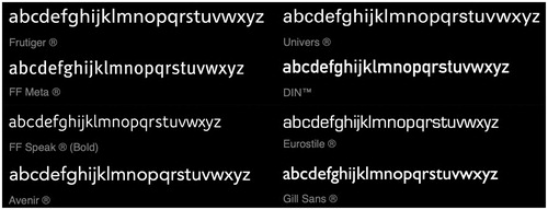
Previous research has shown that this desktop-based methodology can reveal differences between two sans-serif typefaces with relatively overt design differences (illustrated in ), as well as differences in highway signage fonts (Dobres et al. Citation2016; Dobres et al. Citation2017). In the present study, this method was used to compare eight popular sans-serif typefaces () in the context of a ‘bake-off’. Typefaces were chosen in consultation with a professional type designer (Nadine Chahine), and represent eight of the most commonly used sans-serif typefaces: Avenir® LT Pro 55 Roman, DIN Next™ LT Pro Regular, Eurostile® Regular, Frutiger® Neue LT Pro Regular, Gill Sans® MT Regular, Meta® Office Pro Book, Speak® Office Pro Book, and Univers® Next Pro Regular. The intention was to compare several of the most popular and commonly used sans serif typefaces that might be appropriate for interface design. All typefaces were displayed in the family’s Regular weight (or Roman/Book, depending on nomenclature), with the exception of FF Speak, which was displayed in its Bold weight, an attempt to increase uniformity by offsetting the FF Speak family’s unusually light overall weight.
Figure 1. Samples of two typefaces we evaluated. Eurostile (top row) and Frutiger (bottom row), illustrate their key design differences. Eurostile’s tight spacing, closed letter shapes, and highly uniform contours and proportions contrast with those of Frutiger. The at-a-glance legibility methods described here can test the performance characteristics of each. Figure adapted from Reimer et al. (Citation2014).
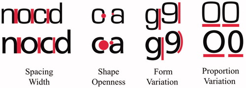
Figure 2. The eight commonly used sans serif typefaces assessed.
Procedure
After informed consent and assessment for visual acuity (see Participants), participants were seated in front of the screen. Each typeface was individually sized to a height of 4 mm using the letter ‘H’ as the reference, in accordance with current ISO guidelines for text size. Participants viewed the monitor at a distance of approximately 70 cm (IEC Citation2019). Participants’ distance to the screen was measured at the start of the session using a tape measure attached to an empty pair of glasses. No chin bar was used in the present experiment. Participants were coached to avoid leaning towards the screen and otherwise remain be mindful of their position. Each participant completed a full legibility threshold assessment for all eight typefaces. All stimulus text was set in negative polarity: white against a black background (see Dobres et al. Citation2016). All stimuli were presented at the screen’s centre. Each individual trial followed the same sequence of presentation: a large fixation rectangle signifying the start of new trial (400 ms), a masking stimulus composed of non-letter characters (200 ms), the stimulus of interest (variable timing, according to staircasing rules as described above), a second masking stimulus of non-letter characters (200 ms), and then a response prompt (up to 5000ms).
Experimental design
The present experiment investigates the influence of eight font choices, across age, upon calibrated legibility thresholds (Dobres et al. Citation2016; Sawyer et al. Citation2017). This dependent variable, reading time threshold, represents the amount of stimulus display time needed for each participant to read a given font with the targeted level of response accuracy. Thus all tested conditions are expected to produce roughly the same performance accuracy across and within participants, while display time thresholds should vary between tested conditions (as in Dobres et al. Citation2016; Sawyer et al. Citation2017, Sawyer et al. Citation2017).
Results
The expected calibration point of 79.6% accuracy was achieved across conditions (t(72) = 0.19, p = 0.852). It was expected, as in all threshold procedures, that accuracy would not differ across conditions. Therefore, as a manipulation check, accuracy was tested across conditions and did not differ significantly (F(7, 504) = 0.74, p = 0.641). As such, a mixed effects model was utilised to test the effects of age, gender, and typeface upon legibility thresholds (see ).
Legibility thresholds (see , ) differed significantly across typefaces (F(7, 483) = 3.96, p = 0.010). The two best performers (lowest thresholds) were Frutiger (105.5 ms) and FF Meta (108.6 ms). The two worst performers (highest thresholds) were Eurostile (122.9 ms) and Gill Sans (125.8 ms). Notably, given the fonts comparison in , Frutiger had a significantly lower threshold compared to Eurostile (t(72) = 3.16, p = 0.002).
Figure 3. Legibility thresholds for the 8 typefaces under study (lower numbers indicate better legibility, and see ), in order of best to worst in the present study. Error bars represent ±1 mean-adjusted standard error. Note that Frutiger outperforms Eurosile ().
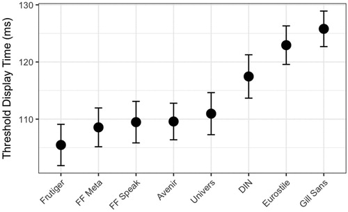
Table 1. Typeface by mean legibility threshold (in ms).
Legibility thresholds rose significantly with greater age (F(1, 69) = 4.20, p = 0.04). Legibility thresholds averaged 95 ms at age 35, compared to 132 ms at age 75, an increase of 38%. While some typefaces did experience lesser or greater increases in reading times across the lifespan, the interaction related to these differences was not significant in this study (see ).
Table 2. Mixed model results.
Discussion
In looking at the effects of eight fonts across age (our IVs) upon calibrated legibility threshold (a DV holding accuracy constant while measuring on-screen display time before response) the present study asked if fonts differed in terms of reading at-a-glance (Dobres et al. Citation2016; Sawyer et al. Citation2017). Frutiger had a significantly lower threshold compared to Eurostile, consistent with previous research showing these two typefaces to have significantly different legibility characteristics (Dobres et al. Citation2016; Reimer et al. Citation2014). Indeed, results show that typefaces with more open shapes and contours, such as Frutiger, FF Meta, and FF Speak, outperformed typefaces with more closed ones such as Gill Sans, Eurostile, and DIN. The result suggests that DIN, Eurostile, and Gill Sans form a ‘low legibility cluster’, while the other five typefaces have statistically similar legibility thresholds.
Limitations to the present study suggest a variety of future work. The method here described tests each typeface in practice and results reflect responses to the totality of its design. As such, it is not possible to make generalised statements as to why certain typefaces are performing better than others, but simply that they do perform better. Inspection of the fonts used does provide some clues as to why some may have performed as they did. For example, one would have expected Avenir to be on the higher end of the legibility spectrum based on its more ‘open’ design, but one can observe that its x-height to cap height proportion is smaller than average, so its optical size is reduced. This would likely have negatively impacted its performance. When it comes to Gill Sans, one of the possible factors in its poor performance is the very tight inter-character spacing and small x-height to cap-height proportion. One would expect typefaces with a large x- height to perform well and vice versa. However, that is not the only factor to consider, as evidenced by the relative performance of Avenir and Gill Sans, where Avenir does relatively well, while Gill Sans is on average the least legible typeface tested. Open shapes and contours may only be one typeface design aspect that leads to better performance. This study is not set-up to assess the impact of specific elements of typeface design on legibility, but is rather a comparative analysis of how various popular typefaces perform ‘out of the box’ when compared to one another and used at the same capital height.
This study included typefaces of approximately similar weights, but visual inspection of clearly shows that there was some variation in weight between fonts. As the purpose was to test the typefaces in their native design, we here chose to retain such variation rather than modify them to control for weight, x-height or optical size. In this study, there does not appear to be a simple relationship between weight and legibility. For example, two of the lightest fonts, FF Speak and Eurostile, are at opposite ends of the legibility spectrum here and the two heaviest, Gill Sans and Meta are also spread at the extremes. Previous research investigating at-a-glance effects of type weight does show that they influence legibility (Dobres et al. Citation2016). As such, while perfect control is unlikely to be possible in most evaluations, it is important to pick typefaces that support the question at hand. For example, in a study of how Frutiger performs compared to other typefaces, it would be appropriate to use the original Frutiger design, and not a modified version. In the present study, our decision to use the bold version of FF Speak supported uniformity and type weight among fonts in our bake-off.
Assessed thresholds were within 20.3 ms of each other on average (the extremes of Frutiger and Gill Sans were 105.5 ms and 125.8 ms, respectively). Two typefaces compared in earlier work, Frutiger and Eurostile, demonstrated a relationship in this study consistent with that earlier work. This provides a validation of the general methodology, which has produced consistent threshold estimates for these typefaces across separate samples, monitors, and rendering engines. However, the relatively tight range of threshold estimates suggests that this specific methodology has limits regarding how fine a difference it can discriminate, at least under response samples of this size (73 participants). Future work could investigate alternative measurements that may possess a higher degree of discriminatory power.
There are also limits imposed by the size of our sample. While adequate for answering the research question here, it cannot hope to encompass the wide range of variables that influence individual reading, but were not considered in our present work. Education, personal habits, health, environment, and many other variables exert unknown and unstudied influences on readers, and each is worthy of examination in future work. Happily, modern typefaces are often accessed by very large populations, as is the case with Google’s Roboto, seen in 3.5 billion search pages a day (Internetlivestats Citation2019). Therefore, it is certainly worthwhile to expand our method to very large samples. Indeed, such large-scale studies can be automated in ways that make collecting millions of datapoints equivalent to the effort of collecting these thousands (see Dobres et al. Citation2018; Dufau et al. Citation2011). Certainly the scale of such an effort may pale in comparison to the aggregate time and effort it would save the viewing public.
At the intersection of discriminatory power and large sample size lie modelling approaches. While the present method provides a solid methodological approach for evaluating how glanceable typefaces are relative to one another, large datasets of this type could allow for modelling the characteristics of ‘optimal’ glanceable typeface. Indeed, legibility has been modelled in other contexts (Watson and Fitzhugh Citation1989; Cai, Green, and Kim Citation2013; Wolfe et al. Citation2016). A model of optimal design characteristics leading to perfectly glanceable typography would be an ambitious undertaking, requiring a scope of data beyond the present effort. Potentially, however, such a dataset could be generated using the methods here, and might speak well to populations within such a large sample. Roughly speaking, the group differences observed in these data suggest a clear ‘lower legibility’ group and a somewhat wider range of relatively ‘higher legibility’ typefaces. Future work may leverage a distributed research platform to collect large-sample data and thus provide sufficient statistical power to expose these types of small differences between typefaces. Such work could help us understand what values bracket the full range of typographic performance in glanceable reading across a range of intrinsic and extrinsic factors. It might enable grading of fonts in terms of legibility, and perhaps even official certification of a set of fonts with more optimal legibility characteristics for select applications. In such a context, devices that are likely used in performance-critical situations, designers would choose to use fonts which have been shown to maximise human capacity to absorb information at-a-glance. In pursuit of a more strategic balance between style and function, one can imagine a future where a designer might pick a font, and have access to automatic recommendations of similar fonts with better performance characteristics based upon the application under consideration.
As we continue to interact with our ever-changing screens more frequently, and in shorter bursts—the smartphone is already giving way to the even smaller, more immediate smartwatch and other wearable technologies (Samost et al. Citation2015; Sawyer et al. Citation2014; Beckers et al. Citation2017),—glance-reading takes centre stage. While this new type of reading might be second nature to Millennials, who tend to be acutely aware of how new technologies work, what does this mean for older people who have years of experience with traditional long-form reading? Consistent with Dobres et al. (Citation2016), our data showed strong age-related increases in legibility thresholds indicative of the difficulties older readers face (see Wolfe et al. Citation2016). Therefore, it is important that designers strive to optimise legibility while considering the different sets of eyes that might use their interfaces. It is important for designers to understand the trade-offs their aesthetic choices entail. It is important for designers to be a part of a conversation on objective performance in the context of legibility and the role typography can play in this equation. Optimal interaction between text size, polarity, screen resolution, and many other factors is complicated, but has an identifiable goal: draw a reader’s awareness to the information efficiently but not excessively. By utilising efficient quantitative research methods such as the one we outlined above, human factors, ergonomics, and usability researchers, as well as industrial engineers, applied practitioners, and typographers, all can more efficiently balance design decisions with data on legibility trade-offs.
Indeed, the methods we outlined here can be performed by non-specialists, leveraging open source tools like PsychoPy (Peirce Citation2007). While commercial entities vetting typefaces for large populations will continue to seek out professional help in maximising the sensitivity of their analyses, we hope the present technique opens the doors for researchers and practitioners who might otherwise hesitate to apply scientific rigour to typographic and design decisions. Whether your yen for typography is as a scientist with an interest in design, a designer with an interest in functionality, or an engineer with an interest in usability, we hope a typographic bake-off is in your future.
Disclosure statement
Nadine Chahine was employed by Monotype at the time this work was performed.
Additional information
Funding
References
- Arditi, A., and J. Cho. 2005. “Serifs and Font Legibility.” Vision Research 45 (23): 2926–2933. doi:10.1016/j.visres.2005.06.013.
- Beckers, N., S. Schreiner, P. Bertrand, B. Mehler, and B. Reimer. 2017. “Comparing the Demands of Destination Entry Using Google Glass and the Samsung Galaxy S4 during Simulated Driving.” Applied Ergonomics 58: 25–34. doi:10.1016/j.apergo.2016.05.005.
- Bernard, M. L., B. S. Chaparro, M. M. Mills, and C. G. Halcomb. 2003. “Comparing the Effects of Text Size and Format on the Readibility of Computer-Displayed Times New Roman and Arial Text.” International Journal of Human-Computer Studies 59 (6): 823–835. doi:10.1016/S1071-5819(03)00121-6.
- Bernard, M., C. H. Liao, and M. Mills. 2001. “The Effects of Font Type and Size on the Legibility and Reading Time of Online Text by Older Adults.” Paper presented at CHI ‘01 Extended Abstracts, 175–176. New York, NY, USA: ACM.
- Boyarski, D., C. Neuwirth, J. Forlizzi, and S. H. Regli. 1998. “A Study of Fonts Designed for Screen Display.” Presented at the CHI ‘98: Proceedings of The SIGCHI Conference on Human Factors in Computing Systems, 87–94. New York, NY, USA: ACM Press/Addison-Wesley Publishing Co.
- Cai, H., P. A. Green, and J. J. Kim. 2013. “Estimating the Legibility of a Single Letter E Viewed at Different Display Angles.” Applied Ergonomics 44 (4): 575–587. doi:10.1016/j.apergo.2012.11.010.
- Carlson, P., and A. Holick. 2005. “Maximizing Legibility of Unlit Freeway Guide Signs with Clearview Font and Combinations of Retroreflective Sheeting Materials.” Transportation Research Record: Journal of the Transportation Research Board 1918 (1): 26–34. doi:10.1177/0361198105191800104.
- Chaparro, B. S., A. D. Shaikh, A. Chaparroa, and E. C. Merkle. 2010. “Comparing the Legibility of Six ClearType Typefaces to Verdana and Times New Roman.” Information Design Journal 18 (1): 36–49. doi:10.1075/idj.18.1.04cha.
- Dobres, J., N. Chahine, B. Reimer, D. Gould, B. Mehler, and J. F. Coughlin. 2016. “Utilising Psychophysical Techniques to Investigate the Effects of Age, Typeface Design, Size and Display Polarity on Glance Legibility.” Ergonomics 59 (10): 1377–1391. doi:10.1080/00140139.2015.1137637.
- Dobres, J., S. T. Chrysler, B. Wolfe, N. Chahine, and B. Reimer. 2017. “Empirical Assessment of the Legibility of the Highway Gothic and Clearview Signage Fonts.” Transportation Research Record: Journal of the Transportation Research Board 2624 (1): 1–8. doi:10.3141/2624-01.
- Dobres, J., K. Klarl, J. Kindelsberger, and B. Reimer. 2018. TypeTester: A Case Study of Behavioral Data Collection Using a Smartphone Platform. MIT AgeLab Technical Report 2018-1 (December 6, 2018). Cambridge, MA: Massachusetts Institute of Technology.
- Dufau, Stephane, Jon Andoni Duñabeitia, Carmen Moret-Tatay, Aileen McGonigal, David Peeters, F.-Xavier Alario, David A. Balota, Marc Brysbaert, Manuel Carreiras, Ludovic Ferrand, Maria Ktori, Manuel Perea, Kathy Rastle, Olivier Sasburg, Melvin J. Yap, Johannes C. Ziegler, and Jonathan Grainger. 2011. “Smart Phone, Smart Science: How the Use of Smartphones Can Revolutionize Research in Cognitive Science.” PLoS One 6 (9): e24974. doi:10.1371/journal.pone.0024974.
- Gould, J. D., L. Alfaro, V. Barnes, R. Finn, N. Grischkowsky, and A. Minuto. 1987. “Reading is Slower from CRT Displays than from Paper: attempts to Isolate a Single-Variable Explanation.” Human Factors: The Journal of the Human Factors and Ergonomics Society 29 (3): 269–299. doi:10.1177/001872088702900303.
- Gould, J. D., L. Alfaro, R. Finn, B. Haupt, and A. Minuto. 1987. “Reading from CRT Displays Can Be as Fast as Reading from Paper.” Human Factors: The Journal of the Human Factors and Ergonomics Society 29 (5): 497–517. doi:10.1177/001872088702900501.
- Holleran, P. A., and K. G. Bauersfeld. 1993. Vertical Spacing of Computer-Presented Text.” Paper presented at CHI '93: INTERACT '93 and CHI '93 Conference Companion on Human Factors in Computing Systems, 179–180.
- Huang, D.-L., P.-L. Patrick Rau, and Y. Liu. 2009. “Effects of Font Size, Display Resolution and Task Type on Reading Chinese Fonts from Mobile Devices.” International Journal of Industrial Ergonomics 39 (1): 81–89. doi:10.1016/j.ergon.2008.09.004.
- IEC. 2019. Road vehicles – Ergonomic aspects of transport information and control systems – Specifications and test procedures for in-vehicle visual presentation (No. 150082009).
- Internetlivestats. 2019. https://www.internetlivestats.com/google-search-statistics/.
- Josephson, S. 2008. “Keeping Your Readers’ Eyes on the Screen: An Eye-Tracking Study Comparing Sans Serif and Serif Typefaces.” Visual Communication Quarterly 15 (1–2): 67–79. doi:10.1080/15551390801914595.
- Kember, P., and D. Varley. 1987. “The Legibility and Readability of a Visual Display Unit at Threshold.” Ergonomics 30 (6): 925–931. doi:10.1080/00140138708969788.
- Ko, Y. H. 2017. “The Effects of Luminance Contrast, Colour Combinations, Font, and Search Time on Brand Icon Legibility.” Applied Ergonomics 65: 33–40. doi:10.1016/j.apergo.2017.05.015.
- Leek, M. R. 2001. “Adaptive Procedures in Psychophysical Research.” Perception & Psychophysics 63 (8): 1279–1292. doi:10.3758/BF03194543.
- Legge, G. E., and C. A. Bigelow. 2011. “Does Print Size Matter for Reading? A Review of Findings from Vision Science and Typography.” Journal of Vision 11 (5): 8–8. doi:10.1167/11.5.8.
- Levitt, H. 1971. “Transformed up‐down Methods in Psychoacoustics.” The Journal of the Acoustical Society of America 49 (2B): 467–477. doi:10.1121/1.1912375.
- Meyer, D. E., and R. W. Schvaneveldt. 1971. “Facilitation in Recognizing Pairs of Words: evidence of a Dependence between Retrieval Operations.” Journal of Experimental Psychology 90 (2): 227–234. doi:10.1037/h0031564.
- Paterson, K. B., V. A. McGowan, and T. R. Jordan. 2013. “Filtered Text Reveals Adult Age Differences in Reading: evidence from Eye Movements.” Psychology and Aging 28 (2): 352–364. doi:10.1037/a0030350.
- Peirce, JW. 2007. “PsychoPy - Psychophysics Software in Python.” Journal of Neuroscience Methods 162 (1–2): 8–13. doi:10.1016/j.jneumeth.2006.11.017.
- Reimer, Bryan, Bruce Mehler, Jonathan Dobres, Joseph F. Coughlin, Steve Matteson, David Gould, Nadine Chahine, and Vladimir Levantovsky. 2014. “Assessing the Impact of Typeface Design in a Text-Rich Automotive User Interface.” Ergonomics 57 (11): 1643–1658. doi:10.1080/00140139.2014.940000.
- Samost, Aubrey, David Perlman, August G. Domel, Bryan Reimer, Bruce Mehler, Alea Mehler, Jonathan Dobres, and Thomas McWilliams. 2015. “Comparing the Relative Impact of Smartwatch and Smartphone Use While Driving on Workload, Attention, and Driving Performance.” Proceedings of the Human Factors and Ergonomics Society Annual Meeting 59 (1): 1602–1606. doi:10.1177/1541931215591347.
- Sawyer, B. D., J. Dobres, N. Chahine, and B. Reimer. 2017. “The Cost of Cool: Typographic Style Legibility in Reading at-a-Glance.” Proceedings of the Human Factors and Ergonomics Society Annual Meeting 61 (1): 833–837. doi:10.1177/1541931213601698.
- Sawyer, B. D., V. S. Finomore, A. A. Calvo, and P. A. Hancock. 2014. “Google Glass: A Driver Distraction Cause or Cure?” Human Factors 56 (7): 1307–1321. doi:10.1177/0018720814555723.
- Sheedy, J., Y.-C. Tai, M. Subbaram, S. Gowrisankaran, and J. Hayes. 2008. “ClearType Sub-Pixel Text Rendering: Preference, Legibility and Reading Performance.” Displays 29 (2): 138–151. doi:10.1016/j.displa.2007.09.016.
- Watson, A. B., and A. E. Fitzhugh. 1989. “Modelling Character Legibility.” Society for Information Display Digest of Technical Papers 20: 360–363.
- Wolfe, B., J. Dobres, A. Kosovicheva, R. Rosenholtz, and B. Reimer. 2016. “Reduction in Legibility with Degradation in Older and Younger Observers.” Journal of Vision 16 (12): 1420–1420. doi:10.1167/16.12.1420.