
 ?Mathematical formulae have been encoded as MathML and are displayed in this HTML version using MathJax in order to improve their display. Uncheck the box to turn MathJax off. This feature requires Javascript. Click on a formula to zoom.
Abstract
Most text on modern electronic displays is set in fonts of regular letter width. Little is known about whether this is the optimal font width for letter recognition. We tested three variants of the font family Helvetica Neue (Condensed, Standard, and Extended). We ran two separate experiments at different distances and different retinal locations. In Experiment 1, the stimuli were presented in the parafovea at 2° eccentricity; in Experiment 2, the stimuli were presented in the periphery at 9° eccentricity. In both experiments, we employed a short-exposure single-report trigram paradigm in which a string of three letters was presented left or right off-centre. Participants were instructed to report the middle letter while maintaining fixation on the fixation cross. Wider fonts resulted in better recognition and fewer misreadings for neighbouring letters than narrower fonts, which demonstrated that wider letter shapes improve recognition at glance reading in the peripheral visual view.
Practitioner summary: Most of the text is set in fonts of regular letter width. In two single-target trigram letter recognition experiments, we showed that wider letter shapes facilitate better recognition than narrower letter shapes. This indicates that when letter identification is a priority, it is beneficial to choose fonts of wider letter shapes.
1. Introduction
Most of the typefaces in use today are based on traditions that were established at a time when all reading material was printed on paper. However, glance reading on digital devices puts a different kind of demand on the visual presentation of text. We have yet fully to understand how typography should be designed when glance reading competes with other cognitive tasks, such as driving while using an in-vehicle display (Reimer et al. Citation2014) or walking while reading on a mobile device (Chen and Lin Citation2016). Few studies have looked into the effects that font style might have on letter recognition and on lexical processing in glance reading. In letter recognition research, the focus is on the effects of letter structure (Beier, Bernard, and Castet Citation2018; Beier and Dyson Citation2014; Beier and Larson Citation2010; Bernard, Aguilar, and Castet Citation2016) and letter weight (Beier and Oderkerk Citation2019). In research on the lexical processing of words, a similar focus is seen on effects of letter structure (Dobres et al. Citation2017, Citation2015) and letter weight (Dobres, Reimer, and Chahine Citation2016), and also letter width (Dyson and Beier Citation2016; Sawyer et al. Citation2017). The latter showed a negative effect of Condensed font compared to a Regular width font (Sawyer et al. Citation2017), and a negative effect of an extremely Extended font compared to a Regular width font (Dyson and Beier Citation2016). With the variable font format (Hudson Citation2016), font width is of even greater relevance, as it allows developers, and also the user, to adjust and customise the width of the font to fit specific applications or needs (Treitman, Sawyer, and Rodrigo Citation2020).
In order to supplement previous findings on font width and lexical processing, we here intend to provide a better understanding of the effects of font width on letter recognition in the reader’s peripheral visual field.
Letter recognition in the visual periphery is essential both in reading paragraphs of text, where readers draw on information from the parafovea to decide where to place an upcoming fixation (Rayner Citation1998; Rayner et al. Citation1982; Shepherd, Findlay, and Hockey Citation1986; White, Warren, and Reichle Citation2011) and in glance reading in a spatial environment, where text can be located anywhere within the visual field. It has been shown that letter presentations in the parafovea and in the periphery are identifiable but prone to the error caused by poor visual acuity (Pelli et al. Citation2007; Yu et al. Citation2014), crowding (when neighbouring letters seem to merge perceptually and are thus misidentified; Coates, Chin, and Chung Citation2013; Pelli et al. Citation2007), as well as mislocation of neighbouring characters (when a neighbouring letter is misread as the target letter; Chung and Legge Citation2009), which is caused by crowding (Strasburger Citation2005). This negative impact becomes more pronounced the further the presentation moves into the peripheral eccentricity.
Magnification has been demonstrated to decrease the number of errors made. This is known as the cortical magnification factor, which means that stimuli can be equally visible in the fovea, the parafovea, and the periphery if they are scaled in size according to their cortical representation (Rovamo, Virsu, and Näsänen Citation1978; Virsu and Rovamo Citation1979). However, larger letter sizes would also cause the letters to move further into the eccentricity and thus into areas of lower acuity and more significant crowding. The critical print size – the smallest print size above which ordinary reading speed is unaffected by print size – is further known to increase in the visual periphery (Chung, Mansfield, and Legge Citation1998; Latham and Whitaker Citation1996).
Studies investigating the effects of letter size in the parafoveal and peripheral visual fields usually employ proportional magnification. However, findings from the early literature on measures of visual acuity in the central visual field indicate that expansion of the letter width might be sufficient (Berger Citation2009, Citation1950; Roethlein Citation1912; Waller Citation2007). Besides, expansion along the horizontal scale alone allows for more lines on a page, which could potentially improve reading with low-vision magnification aids.
Following the findings on peripheral magnification, we hypothesise that letter recognition in the visual eccentricity will benefit from added letter width.
2. Experiment 1
The visual information used to identify words in ordinary reading is typically obtained from the foveal region and the beginning of the parafoveal region (Rayner et al. Citation1982). To supplement the earlier positive results for the foveal presentation of wider letters (Berger Citation2009, Citation1950; Roethlein Citation1912; Waller Citation2007), we were interested in moving our presentation slightly outwards in the visual field of vision and measure the effect of width in the region between foveal and parafoveal vision.
2.1. Methodology
2.1.1. Participants
Ten participants (Mage = 24.60 years, SD = 4.63 years, eight women) took part in Experiment 1. Participants received reimbursement of DKK 300 for their time. Participants were recruited through the recruitment website Forsoegsperson.dk. All self-reported normal or corrected-to-normal vision. We obtained written consent after explaining the experiment to each participant. The research followed the tenets of the Declaration of Helsinki and The Danish Code of Conduct for Research Integrity.
2.1.2. Apparatus
Stimuli were displayed on a backlit 17-inch IBM/Sony CRT monitor (refresh rate = 85 Hz, resolution = 1024 × 768), and were created using the software OpenSeame 3.2 (Mathôt, Schreij, and Theeuwes Citation2012). The stimuli were presented as dark text (#000000) on a light background (#dadada). To ensure adequate pixel resolution, the distance between the participant and the screen was maintained at 200 cm using a headrest.
2.1.3. Stimuli and task
Every trial began with the presentation of a central fixation cross sized 0.63° by 0.63°, which was displayed for an average variable duration of 1,300 ms, with a uniformly distributed jitter of ±300 ms. This was followed by the stimulus, a trigram presented for 200 ms, composed of a string of three letters. Participants had been instructed to maintain fixation in the centre of the screen without moving their gaze towards the stimulus. The trigram appeared left or right of the fixation cross, such that the middle letter in the trigram was presented at 2° eccentricity while participants were seated 200 cm from the screen; this retinal location was chosen to maintain a fairly high visual acuity without presenting stimuli at fixation. The three unique letters that made up the trigram were selected from 16 lowercase English letters (a, d, e, h, g, s, p, n, m, o, k, u, y, t, r and f) without replacement, such that every letter occurred equally often in each of the three positions in the trigram. The stimulus letters occurred in one of the three test fonts, Helvetica Neue Condensed, Helvetica Neue Roman, and Helvetica Neue Extended (). The x-height of the stimulus letters was determined individually for each participant using an adapted accelerated staircase procedure (see ‘Adaptive Staircase Procedure’). The stimulus was followed by a backward mask, which was shown for 500 ms. This backward mask consisted of a rectangular noise patch that covered all three letters of the trigram, the height of which was equal to the font size of the stimulus. At this point, the participant had been instructed to report the identity of the middle letter in the trigram by typing it on the keyboard and confirming with the space key to start the next trial. They could press the space key to immediately start the next trial without reporting a letter, although participants had been informed that they were very welcome to guess, even if they were uncertain. Participants were instructed to fixate on the fixation cross in the centre of the screen and to indicate any gaze shifts towards the stimulus by reporting any of the numbers on the keyboard instead of the stimulus letter; these trials were then later discarded. Once a participant had pressed the space key to continue to the next trial, they would be presented with immediate feedback for 500 ms. This feedback informed them whether they were correct (Correct) or wrong (Wrong), or presented them with a dash if they either reported an eye movement or failed to report a letter. In every block, each of the three font conditions was presented 16 times in random order, for a total of 48 trials per block. Participants engaged in 8–14 blocks per experimental session.
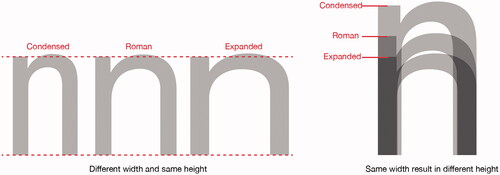
Figure 1. From the top: Helvetica Neue Condensed with a height/width ratio of 1 h/0.3w and 21 units of spacing between two vertical strokes as in ‘nn’, Helvetica Neue Roman height/width ratio of 1 h/0.5w and 24 units of spacing between two vertical strokes, Helvetica Neue Extended height/width ratio of 1 h/0.6w and 23 units of spacing between two vertical strokes. Except for the variable of letter width, they all have near identical letter features.
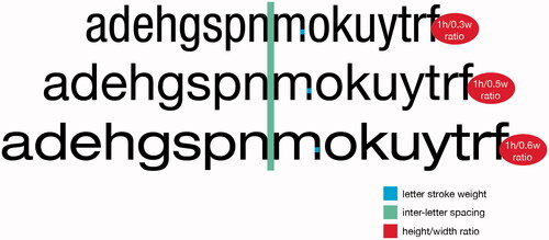
The three test fonts varied on the typographical variable of letter width. The fonts Helvetica Neue Condensed, Helvetica Neue Roman, and Helvetica Neue Extended were chosen for this experiment because the Helvetica font family is one of the most widely used font families in the Western world (Hustwit Citation2007). As all test fonts originate in the same family, typographical variables such as vertical proportion, letter structure, letter boldness and inter-letter spacing were all approximately identical.
2.1.4. Adaptive staircase procedure
The experimental session began with an accelerated staircase procedure based on the accelerated stochastic approximation, which determined the x-height of the stimulus letters and resulted in a mean response accuracy of 50% (Kesten Citation1958; Treutwein Citation1995). During the staircase procedure, participants performed the same task as they did in the subsequent practice and test blocks, with two exceptions: the stimulus size increased after each incorrect response and decreased after a correct response, and stimuli were always presented in the font of Helvetica Neue Roman. The size of the change in x-height between trials, referred to as the step size, decreased after a shift in the response category (i.e. from correct to incorrect or vice versa). As a result, if a participant was unable to correctly report any target stimuli, the x-height would continue to increase at a constant step size until a correct report was finally made. This procedure made it possible to make more fine-grained adjustments to the x-height whenever a shift in the response category occurred. This would continue until the staircase was terminated, after 19 shifts in the response category.
During the first eight trials of the staircase procedure, stimulus letters were presented at a constant x-height of 0.28°, which allowed participants to become accustomed to the experiment. After the first eight trials, the x-height was determined using EquationEquation (1)(1)
(1) as follows:
(1)
(1)
where
denotes the current trial number – excluding the first eight trials –
denotes the x-height of the current trial,
denotes the x-height of the following trial,
denotes the number of shifts in response category – excluding any that occurred during the first eight trials (from correct to incorrect or vice versa) – c denotes the initial step size of 0.19°, and
is 1 if the response for the current trial is correct and 0 if the response in the current trial is incorrect.
2.1.5. Data analysis
Trials in which participants reported a gaze shift were excluded (2.05% of test trials). Response accuracy was calculated as the mean number of correct responses during the testing blocks. Mislocations were calculated as the mean number of responses in which either one of the two flankers was reported instead of the target middle letter. We employed a one-way repeated measures ANOVAs to analyse the effects of the font (Condensed, Roman, and Extended) on mean letter recognition, as well as a 2 (flanker location: inner flanker vs outer flanker) × 3 (font: Condensed, Roman, Extended), repeated-measures ANOVA on the mean rate of mislocation. Pairwise comparisons were corrected for multiple comparisons using the Holm-Bonferroni correction.
2.2. Results
The average print size was 0.242° (std. = 0.05).
2.2.1. Letter recognition
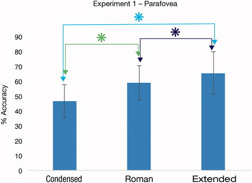
The repeated-measures ANOVA revealed a significant main effect of font F(2, 18) = 41.87, p < .001, ω2 = 0.275. Planned post hoc comparisons, corrected for multiple comparisons using the Holm-Bonferroni method, revealed that recognition decreased with Width. Specifically, mean recognition for Extended was significantly higher than both Roman, t(9) = 2.98, pholm = .015, d = 0.94, and Condensed, t(9) = 7.66, pholm < .001, d = 2.42; likewise, Roman was significantly higher than Condensed, t(9) = 8.54, pholm < .001, d = 2.70 ().
Figure 2. Mean recognition for the tested fonts. Error bars represent standard deviation. Comparisons marked with ‘*’ were significantly different (p < .05).
2.2.2. Mislocation
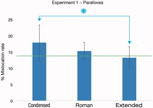
We tested the effects of flanker location and font on mean mislocation error rates using a 2 (flanker location: inner flanker vs outer flanker) × 3 (font: Condensed, Roman, Extended) repeated measures ANOVA. This analysis revealed a large significant main effect of font, F(2, 18) = 6.00, p = .010, ω2 = 0.166, but no effects of flanker location, F(1, 9) = 1.25, p = .293, ω2 = 0.005, nor of flanker location*font interaction, F(2, 18) = 1.02, p = .382, ω2 = 0.001. Holm–Bonferroni corrected planned comparisons showed that the effect of font resulted from significantly higher mislocation rates for the Condensed font relative to the Extended font, t(9) = 2.96, pholm = .048, d = 0.94, while there was no significant difference between Condensed and Roman, t(9) = 1.79, pholm = .107, d = 0.57, nor between Roman and Extended, t(9) = 2.22, pholm = .107, d = 0.70. Mean mislocation rates can be found in . Chance performance equal to 1/15 + 1/14 = 13.8% is represented in by the green dashed line (Strasburger Citation2005).
Figure 3. Mean mislocation rates for the tested fonts. Mislocation by chance is represented by the dotted line. Error bars represent standard deviation. Comparisons marked with ‘*’ were significantly different (p < .05).
2.3. Discussion
The experimental results were in line with our hypothesis in showing that the Condensed font impaired letter recognition compared to the Regular font condition and that the Extended font was better recognised than the Regular font condition. Bearing in mind that most text representation is in fonts of regular width; the enhanced performance of the Extended font condition is an extraordinary finding.
Our stimuli were presented only slightly outside the foveal area of vision. As a greater distance from fixation is popular within vision science (Chung and Coates Citation2019; Coates, Bernard, and Chung Citation2019; Sayim and Taylor Citation2019), we decided to follow up with an additional experiment in which we moved stimuli further into the visual eccentricity. We were interested in whether the advantage of the Extended fonts would be repeated under this condition.
3. Experiment 2
3.1. Methodology
3.1.1. Participants
Fifteen participants (Mage = 25.86 years, SD = 4.33 years, four women) took part in Experiment 2, for which they received reimbursement of DKK 300. Participants were once again recruited through the recruitment website Forsoegsperson.dk and reported normal or corrected-to-normal vision. We obtained written consent after explaining the experiment to each participant. The research followed the tenets of the Declaration of Helsinki and The Danish Code of Conduct for Research Integrity.
3.1.2. Stimuli and task
Experiment 2 was identical to Experiment 1, with the exception that stimuli in Experiment 2 were presented at 9° eccentricity, left and right of the fixation cross, while participants were seated 45 cm from the screen. The closer distance compared to Experiment 1 was chosen to allow for stimuli to be presented at greater eccentricity on the monitor. As a result, the visual angle of the fixation cross was 2.50° by 2.50°, the initial stimulus x-height during the staircase procedure was 1.25°, and the initial step size was 0.83°.
3.2. Results
The average print size was 1.086° (std. = 0.58).
3.2.1. Letter recognition
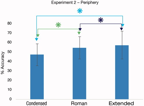
A one-way repeated measures ANOVA, through which we tested the effect of font (Condensed, Roman, and Extended) on mean letter recognition, showed a large significant main effect of font, F(2, 28) = 33.37, p < .001, ω2 = 0.161. Planned comparisons showed that mean accuracy for both the fonts conditions Roman, t(14) = 9.19, pholm < .001, d = 2.37, and Extended, t(14) = 5.31, pholm < .001, d = 1.37, were significantly higher than Condensed (), just as mean accuracy for Font Extended was significantly higher than Roman, t(14) = 2.16, pholm = .049, d = 0.56.
Figure 4. Mean recognition for the tested fonts. Error bars represent standard deviation. Comparisons marked with ‘*’ were significantly different (p < .05).
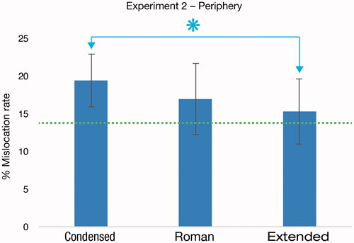
3.2.2. Mislocation
A 2 (flanker location: inner flanker vs outer flanker) × 3 (font: Condensed, Roman, Extended) repeated measures ANOVA revealed a large main effect of flanker location, F(1, 14) = 12.4, p = .003, ω2 = 0.263, with a significantly higher mean mislocation rate for inner flankers (mean = 10.01% STD = 3.27) than for outer flankers (mean = 7.21% STD = 2.70) as well as a main effect of font, F(2, 28) = 6.54, p = .005, ω2 = 0.117. There was no significant interaction between flanker location and font, F(2, 28) = 1.93, p = .163, ω2 = 0.023.
Planned comparisons, corrected for multiple comparisons using the Holm-Bonferroni method, showed that the effect of font resulted from significantly higher mislocation rates for Condensed flankers than for Extended ones, t(14) = 4.18, pholm = .003, d = 1.08 (). However, the mean mislocation rate for Roman was not significantly different from either Condensed, t(14) = 2.07, pholm = .114, d = 0.54, or Extended, t(14) = 1.32, p = .207, d = 0.34.
Figure 5. Mean mislocation rates for the tested fonts. Mislocation by chance is represented by the dotted line. Error bars represent standard deviation. Comparisons marked with ‘*’ were significantly different (p < .05).
4. General discussion
In two experiments, one at parafoveal and one at peripheral eccentricities, the Extended and Roman font conditions resulted in significantly better letter recognition than the Condensed font. In addition, the Extended font also significantly outperformed the Roman font in both the parafoveal and peripheral experiments. A closer look at the data showed that at both retinal locations, there was a higher rate of mislocations between flankers and the target using the Condensed font compared to the Extended font. Our experiments replicated previous results with proportional magnification (Chung, Mansfield, and Legge Citation1998; Latham and Whitaker Citation1996), showing better recognition in the visual eccentricity with stimuli occupying greater surface areas. While the physical size of enlarged letters increases on both the vertical and horizontal scales, the fonts Helvetica Neue Roman and Helvetica Neue Extended increase solely on the horizontal scale. Our results add to existing knowledge by revealing a positive effect of horizontal size increase alone.
Our findings on letter recognition are also in line with previous studies using different methodologies, where stimuli were presented in the centre of vision, showing that fonts of wider letters can be read at smaller font sizes (Berger Citation2009, Citation1950; Roethlein Citation1912; Waller Citation2007), and with measures of lexical decision showing that a wider font outperformed a narrow font (Sawyer et al. Citation2017). Measures of eye-tracking have shown fonts of narrow letter width to yield longer fixation time than fonts of wider letter width (Hautala, Hyönä, and Aro Citation2011; Kolers, Duchnicky, and Ferguson Citation1981; McDonald Citation2006; Minakata and Beier Citation2021). As longer fixation duration is known to be an indicator of longer processing time (Slattery Citation2016), our data corresponds with these findings as well.
We also found significant effects of fonts on the likelihood of misidentification of flankers for the target. At both retinal locations, the Condensed font had a higher occurrence of letter transposition than the Extended font. Previous research has shown that the greater the distance from fixation, the greater the risk of misidentification between a target and its flankers (Chung and Legge Citation2009; Strasburger Citation2005; Zhang et al. Citation2012), and suggests that it leads participants to misread features of the flankers as belonging to the target (Nandy and Tjan Citation2007).
It is a long-known finding that greater inter-letter spacing between letters in the periphery minimises the effect of crowding (Bouma Citation1970). Studies into object crowding have demonstrated that crowding not only exists between an object and its flankers but is also driven by the critical spacing of parts (Rosen, Chakravarthi, and Pelli Citation2014). This suggests that in addition to inter-letter crowding, crowding also occurs between the different parts of a letter. It is generally agreed that visual processing has two stages: the first stage involves independent feature detection, while the second stage involves the integration of the features into an object (Levi Citation2008; Pelli, Palomares, and Majaj Citation2004). Research supports the theory that the first stage of feature detection is unaffected by crowding (Nandy and Tjan Citation2007), while during the second stage of feature integration, crowding could be inappropriately large, leading to the integration of the target and its flankers (Pelli, Palomares, and Majaj Citation2004).
As we know that narrowly spaced objects induce crowding, we suggest the possibility that crowding also affects the misidentification of features within a narrow letter of multiple vertical strokes. Thus, as the height/width ratio of the counters of the lowercase ‘n’ is about 1/0.3 for Helvetica Neue Condensed, and the height/width ratio is about 1/0.6 for Helvetica Neue Extended, we speculate that the proximity in the narrow font of the vertical strokes of letters of multiple vertical strokes (such as the letter ‘m’) makes the letter counter more challenging to identify at the feature integration stage, which will lead to impaired recognition. This suggests that crowding may hamper the reading of narrow fonts.
Our results have implications on how much text can be displayed on a given surface area. Compared to proportional enlargement, where the distance between lines increases and reduces the number of available lines on a display, fonts that only scale on the horizontal axis do not change the physical distance between lines of text. However, wider fonts result in fewer letters on each line of text, if the text contains fewer than 13 characters, it negatively affects reading speed for normally sighted readers (Atilgan, Xiong, and Legge Citation2020).
Recent work shows that reading speed for the same text is identical between a narrow font and a wider font, despite the former taking up 16 lines of text and the latter 32 lines of text (Minakata and Beier Citation2021). The challenge is to identify the right trade-off between the amount of text, display size, and letter width. Our findings contribute to that by demonstrating that for situations where quick letter identification is essential, wider letters are easier to recognise than narrow letters.
5. Conclusions
This study shows that wider fonts provide better letter recognition than narrower fonts. The Extended font showed evidence of enhancing letter recognition when compared to the Regular width font. This is interesting since Regular width fonts are the most commonly used fonts for text setting.
As the complexity of digital interfaces increases, it is essential to begin to question typographic traditions established at a time when most readings involved printed matters. Our data indicate that wider fonts might be better suited for glance reading and when letter recognition is a central part of the reading task, such as road signage, wayfinding systems, and map navigation. The presented data shows that relatively small font changes can make significant differences to recognition.
Although solely tested on normal-vision participants, we believe that the results can also provide a framework for better low-vision reading support. For one, as readers with a central field of vision loss need to make use of the periphery for reading, the findings are of relevance for this reader group. The results will further be relevant for readers relying on text magnification: as fonts of wider letter shapes are enlarged on the horizontal scale and not on the vertical scale (), the reader will be able to keep more lines of text on the page and magnify the text to a lesser degree than with narrower font styles.
Figure 6. When the narrower fonts Helvetica Neue Condensed and Helvetica Neue Roman are proportionally magnified to have the same width as Helvetica Neue Extended, they take up more vertical space on the page.
By showing that letters from wider fonts are more easily recognised than narrower fonts, this study offers a stepping stone for future research to better understand how typeface proportions can affect various reading scenarios.
| Abbreviations | ||
| ANOVA | = | analysis of variance |
| DKK | = | Danish krone |
| cm | = | centimeter |
| ms | = | milisecond |
Disclosure statement
No potential conflict of interest was reported by the author(s).
Additional information
Funding
References
- Atilgan, N., Y.-Z. Xiong, and G. E. Legge. 2020. “Reconciling Print-Size and Display-Size Constraints on Reading.” Proceedings of the National Academy of Sciences of the United States of America 117 (48): 30276–30284. doi:https://doi.org/10.1073/pnas.2007514117.
- Beier, S., J.-B. Bernard, and E. Castet. 2018. “Numeral Legibility and Visual Complexity.” Paper presented at the Design as a catalyst for change - DRS International Conference 2018, Limerick, Ireland, June 25–28.
- Beier, S., and M. C. Dyson. 2014. “The Influence of Serifs on ‘h’ and ‘i’: Useful Knowledge from Design-Led Scientific Research.” Visible Language 47 (3): 74–95.
- Beier, S., and K. Larson. 2010. “Design Improvements for Frequently Misrecognized Letters.” Information Design Journal 18 (2): 118–137. doi:https://doi.org/10.1075/idj.18.2.03bei.
- Beier, S., and C. A. T. Oderkerk. 2019. “Smaller Visual Angles Show Greater Benefit of Letter Boldness than Larger Visual Angles.” Acta Psychologica 199: 102904. doi:https://doi.org/10.1016/j.actpsy.2019.102904.
- Berger, C. 1950. “Experiments on the Legibility of Symbols of Different Width and Height.” Acta Ophthalmol 28 (4): 423–434. doi:https://doi.org/10.1111/j.1755-3768.1950.tb05375.x.
- Berger, C. 2009. “Some Experiments on the Width of Symbols as Determinant of Legibility.” Acta Ophthalmologica 26 (4): 517–550. doi:https://doi.org/10.1111/j.1755-3768.1948.tb03189.x.
- Bernard, J.-B., C. Aguilar, and E. Castet. 2016. “A New Font, Specifically Designed for Peripheral Vision, Improves Peripheral Letter and Word Recognition, but Not Eye-Mediated Reading Performance.” PLoS One 11 (4): e0152506. doi:https://doi.org/10.1371/journal.pone.0152506.
- Bouma, H. 1970. “Interaction Effects in Parafoveal Letter Recognition.” Nature 226 (5241): 177–178. doi:https://doi.org/10.1038/226177a0.
- Chen, C.-M., and Y.-J. Lin. 2016. “Effects of Different Text Display Types on Reading Comprehension, Sustained Attention and Cognitive Load in Mobile Reading Contexts.” Interactive Learning Environments 24 (3): 553–571. doi:https://doi.org/10.1080/10494820.2014.891526.
- Chung, S. T., and D. R. Coates. 2019. “Spatio-Temporal Dependencies of Letter Feature Processing.” Journal of Vision 19 (10): 65b. doi:https://doi.org/10.1167/19.10.65b.
- Chung, S. T., and G. E. Legge. 2009. “Precision of Position Signals for letters.” Vision Res 49 (15): 1948–1960. doi:https://doi.org/10.1016/j.visres.2009.05.004.
- Chung, S. T., J. S. Mansfield, and G. E. Legge. 1998. “Psychophysics of Reading. XVIII. The Effect of Print Size on Reading Speed in Normal Peripheral Vision.” Vision Research 38 (19): 2949–2962. doi:https://doi.org/10.1016/S0042-6989(98)00072-8.
- Coates, D. R., J.-B. Bernard, and S. T. L. Chung. 2019. “Feature Contingencies When Reading Letter Strings.” Vision Research 156: 84–95. doi:https://doi.org/10.1016/j.visres.2019.01.005.
- Coates, D. R., J. M. Chin, and S. T. Chung. 2013. “Factors Affecting Crowded Acuity: Eccentricity and Contrast.” Optometry and Vision Science 90 (7): 628–638. doi:https://doi.org/10.1097/OPX.0b013e31829908a4.
- Dobres, J., S. T. Chrysler, B. Wolfe, N. Chahine, and B. Reimer. 2017. “Empirical Assessment of the Legibility of the Highway Gothic and Clearview Signage Fonts.” Transportation Research Record 2624 (1): 1–8. doi:https://doi.org/10.3141/2624-01.
- Dobres, J., B. Reimer, and N. Chahine. 2016. “The Effect of Font Weight and Rendering System on Glance-Based Text Legibility.” Paper presented at the 8th International Conference on Automotive User Interfaces and Interactive Vehicular Applications, Ann Arbor, MI, New York, NY.
- Dobres, J., B. Reimer, L. Parikhal, E. Wean, and N. Chahine. 2015. “The Incredible Shrinking Letter: How Font Size Affects the Legibility of Text Viewed in Brief Glances.” Paper presented at the 8th International Driving Symposium on Human Factors in Driver Assessment, Training, and Vehicle Design, Lake City, UT, June 22–25.
- Dyson, M. C., and S. Beier. 2016. “Investigating Typographic Differentiation: Italics Are More Subtle than Bold for Emphasis.” Information Design Journal 22 (1): 3–18. doi:https://doi.org/10.1075/idj.22.1.02dys.
- Hautala, J., J. Hyönä, and M. Aro. 2011. “Dissociating Spatial and Letter-Based Word Length Effects Observed in Readers’ Eye Movement Patterns.” Vision Research 51 (15): 1719–1727. doi:https://doi.org/10.1016/j.visres.2011.05.015.
- Hudson, J. 2016. “Introducing OpenType Variable Fonts.” Medium. https://medium.com/variable-fonts/https-medium-com-tiro-introducing-opentype-variable-fonts-12ba6cd2369
- Hustwit, G. 2007. Helvetica. London, UK: Swiss Dots, Ltd.; Brooklyn, NY: Plexifilm.
- Kesten, H. 1958. “Accelerated Stochastic Approximation.” The Annals of Mathematical Statistics 29 (1): 41–59. doi:https://doi.org/10.1214/aoms/1177706705.
- Kolers, P. A., R. L. Duchnicky, and D. C. Ferguson. 1981. “Eye Movement Measurement of Readability of CRT Displays.” Human Factors 23 (5): 517–527. doi:https://doi.org/10.1177/001872088102300502.
- Latham, K., and D. Whitaker. 1996. “A Comparison of Word Recognition and Reading Performance in Foveal and Peripheral Vision.” Vision Research 36 (17): 2665–2674. doi:https://doi.org/10.1016/0042-6989(96)00022-3.
- Levi, D. M. 2008. “Crowding-An Essential Bottleneck for Object Recognition: A Mini-Review.” Vision Research 48 (5): 635–654. doi:https://doi.org/10.1016/j.visres.2007.12.009.
- Mathôt, S., D. Schreij, and J. Theeuwes. 2012. “OpenSesame: An Open-Source, Graphical Experiment Builder for the Social Sciences.” Behavior Research Methods 44 (2): 314–324. doi:https://doi.org/10.3758/s13428-011-0168-7.
- McDonald, S. A. 2006. “Effects of Number-of-Letters on Eye Movements during Reading Are Independent from Effects of Spatial Word Length.” Visual Cognition 13 (1): 89–98. doi:https://doi.org/10.1080/13506280500143367.
- Minakata, K., and S. Beier. 2021. “The Effect of Font Width on Eye Movements during Reading.” Applied Ergonomics 97: 103523. doi:https://doi.org/10.1016/j.apergo.2021.103523.
- Nandy, A. S., and B. S. Tjan. 2007. “The Nature of Letter Crowding as Revealed by First-and Second-Order Classification Images.” Journal of Vision 7 (2): 5. doi:https://doi.org/10.1167/7.2.5.
- Pelli, D. G., M. Palomares, and N. J. Majaj. 2004. “Crowding is Unlike Ordinary Masking: Distinguishing Feature Integration from Detection.” Journal of Vision 4 (12): 1136–1169. doi:https://doi.org/10.1167/4.12.12.
- Pelli, D. G., K. A. Tillman, J. Freeman, M. Su, T. D. Berger, and N. J. Majaj. 2007. “Crowding and Eccentricity Determine Reading Rate.” Journal of Vision 7 (2): 20. doi:https://doi.org/10.1167/7.2.20.
- Rayner, K. 1998. “Eye Movements in Reading and Information Processing: 20 Years of Research.” Psychological Bulletin 124 (3): 372–422. doi:https://doi.org/10.1037/0033-2909.124.3.372.
- Rayner, K., A. D. Well, A. Pollatsek, and J. H. Bertera. 1982. “The Availability of Useful Information to the Right of Fixation in Reading.” Perception & Psychophysics 31 (6): 537–550. doi:https://doi.org/10.3758/bf03204186.
- Reimer, B., B. Mehler, J. Dobres, J. F. Coughlin, S. Matteson, D. Gould, N. Chahine, and V. Levantovsky. 2014. “Assessing the Impact of Typeface Design in a Text-Rich Automotive User Interface.” Ergonomics 57 (11): 1643–1658. doi:https://doi.org/10.1080/00140139.2014.940000.
- Roethlein, B. E. 1912. “The Relative Legibility of Different Faces of Printing Types.” The American Journal of Psychology 23 (1): 1–36. doi:https://doi.org/10.2307/1413112.
- Rosen, S., R. Chakravarthi, and D. G. Pelli. 2014. “The Bouma Law of Crowding, Revised: Critical Spacing is Equal across Parts, Not Objects.” Journal of Vision 14 (6): 10–15. doi:https://doi.org/10.1167/14.6.10.
- Rovamo, J., V. Virsu, and R. Näsänen. 1978. “Cortical Magnification Factor Predicts the Photopic Contrast Sensitivity of Peripheral Vision.” Nature 271 (5640): 54–56. doi:https://doi.org/10.1038/271054a0.
- Sawyer, B. D., J. Dobres, N. Chahine, and B. Reimer. 2017. “The Cost of Cool: Typographic Style Legibility in Reading at a Glance.” Proceedings of the Human Factors and Ergonomics Society Annual Meeting 61 (1): 833–837. doi:https://doi.org/10.1177/1541931213601698.
- Sayim, B., and H. Taylor. 2019. “Letters Lost: Capturing Appearance in Crowded Peripheral Vision Reveals a New Kind of Masking.” Psychological Science 30 (7): 1082–1086. doi:https://doi.org/10.1177/0956797619847166.
- Shepherd, M., J. M. Findlay, and R. J. Hockey. 1986. “The Relationship between Eye Movements and Spatial Attention.” The Quarterly Journal of Experimental Psychology Section A 38 (3): 475–491. doi:https://doi.org/10.1080/14640748608401609.
- Slattery, T. J. 2016. “Eye Movements: From Psycholinguistics to Font Design.” In Digital Fonts and Reading, 54–78. Singapore, Singapore: World Scientific.
- Strasburger, H. 2005. “Unfocussed Spatial Attention Underlies the Crowding Effect in Indirect Form Vision.” Journal of Vision 5 (11): 1024–1037. doi:https://doi.org/10.1167/5.11.8.
- Treitman, R., B. D. Sawyer, and S. Rodrigo. 2020. “This Changes Everything: New Approaches to Reading.” Adobe MAX. https://www.adobe.com/max/2020/sessions/this-changes-everything-new-approaches-to-reading-s6826.html
- Treutwein, B. 1995. “Adaptive Psychophysical Procedures.” Vision Research 35 (17): 2503–2522. doi:https://doi.org/10.1016/0042-6989(95)00016-X.
- Virsu, V., and J. Rovamo. 1979. “Visual Resolution, Contrast Sensitivity, and the Cortical Magnification Factor.” Experimental Brain Research 37 (3): 475–494. doi:https://doi.org/10.1007/BF00236818.
- Waller, R. 2007. “Comparing Typefaces for Airport Signs.” Information Design Journal 15 (1): 1–15. doi:https://doi.org/10.1075/idj.15.1.01wal.
- White, S. J., T. Warren, and E. D. Reichle. 2011. “Parafoveal Preview during Reading: Effects of Sentence Position.” Journal of Experimental Psychology. Human Perception and Performance 37 (4): 1221–1238. doi:https://doi.org/10.1037/a0022190.
- Yu, D., G. E. Legge, G. Wagoner, and S. T. Chung. 2014. “Sensory Factors Limiting Horizontal and Vertical Visual Span for Letter Recognition.” Journal of Vision 14 (6): 3. doi:https://doi.org/10.1167/14.6.3.
- Zhang, J.-Y., G.-L. Zhang, L. Liu, and C. Yu. 2012. “Whole Report Uncovers Correctly Identified but Incorrectly Placed Target Information under Visual Crowding.” Journal of Vision 12 (7): 5–11. doi:https://doi.org/10.1167/12.7.5.
