
ABSTRACT
Colour is one of the most powerful tools in the cartographer’s toolbox and can enhance the quality, clarity, and beauty of maps. Both in Protestant culture specifically and Western culture more widely, a visual artistic culture developed from the Middle Ages until the modern age in which colours designated specific, sometimes contradictory, ideals and concepts. Using late nineteenth and early twentieth century Protestant missionary world maps as a case study, this article shows how mapmakers used colour schemes to visualise Protestant world views about the global spread of the gospel as well as Western colonial perceptions of non-European cultures. Discussion of map colours in contemporary missionary reports, fiction and magazines corroborates and contextualises ‘map users'’ shared understanding of the cultural connotations of map colours.
La couleur est l'un des outils les plus puissants de la 'boîte à outils' du cartographe et peut améliorer la qualité, la clarté et la beauté des cartes. Dans les sociétés protestantes, et plus généralement dans la culture occidentale, une culture visuelle artistique s'est développée entre le Moyen Âge et l'époque moderne, dans laquelle les couleurs renvoient à des idéaux et des concepts spécifiques, parfois contradictoires. Prenant comme étude de cas des cartes du monde des missionnaires protestants de la fin du XIXe et du début du XXe siècles, cet article montre comment les cartographes ont utilisé par convention certaines couleurs pour rendre visibles les conceptions des protestants sur le monde au sujet de la diffusion mondiale de l'Évangile, ainsi que les perceptions coloniales occidentales des cultures non européennes. L'analyse des couleurs des cartes dans les rapports des missionnaires contemporains, dans les œuvres de fiction et dans les revues, confirme et contextualise à quel point les connotations culturelles des couleurs dans les cartes faisaient l'objet d'une compréhension commune de la part des usagers de ces cartes.
El color es uno de los instrumentos más poderosos en la caja de herramientas del cartógrafo y puede mejorar la calidad, claridad y belleza de los mapas. Tanto de manera puntual en la cultura protestante, como en la cultura occidental de forma generalizada, se desarrolló una cultura artística visual desde la Edad Media hasta la Edad Moderna, en la que los colores designaban ideales y conceptos específicos, a veces contradictorios. Recurriendo a mapamundis de misioneros protestantes de finales del siglo XIX y principios del XX como caso de estudio, este artículo muestra cómo los cartógrafos emplearon esquemas de color para visualizar las visiones protestantes del mundo sobre la difusión global del evangelio, así como las visiones coloniales occidentales de culturas no europeas. El análisis sobre los colores de los mapas en informes contemporáneos de misioneros, obras de ficción y revistas corrobora y contextualiza que los 'usuarios de mapas' tenían una comprensión compartida sobre las connotaciones culturales de los colores en los mapas.
Farbe ist eines der mächtigsten Gestaltungsmittel im Werkzeugkasten des Kartographen, sie kann die Qualität, Klarheit und Schönheit von Karten steigern. Sowohl in der protestantischen Kultur im Besonderen, als auch in der westlichen im Allgemeinen entwickelte sich vom Mittelalter bis zur Neuzeit eine Kultur künstlerischer Visualisierung, in der Farben verwendet wurden, um spezifische, manchmal widersprüchliche Ideale und Konzepte herauszuarbeiten. Anhand von Weltkarten des späten 19. und frühen 20. Jahrhunderts aus protestantischem Missionskontext zeigt dieser Beitrag beispielhaft, wie Kartographen Farbschemata verwendeten, um protestantische Weltanschauungen über die weltweite Verbreitung des Evangeliums, sowie westliche koloniale Wahrnehmungen nichteuropäischer Kulturen zu visualisieren. Die Diskussion der Farbschemata der Karten in zeitgenössischen Missionsberichten, Belletristik und Zeitschriften untermauert und kontextualisiert das gemeinsame Verständnis der „Kartennutzer“ über die kulturellen Konnotationen von Farben in Karten.
Colouring is one of the most useful instruments in the cartographer’s toolbox, ‘attracting the viewer’s gaze and promoting particular connoted narratives about the world,’ in the words of Piers Fotiadis.Footnote1 The subject of map colours has received ample attention, but research has until recently tended to focus on the development of techniques, systems and conventions.Footnote2 For example, according to Judy Olson, the twentieth century saw major technical strides in colour in cartography, but even so ‘color was already used as a powerful representational tool in the nineteenth century.’Footnote3 Diana Lange recently proposed an instrumental vocabulary that can serve to develop a methodology of studying colours on maps. She introduced the terms colour system, colour scheme and colour code, referring respectively to how maps are coloured, what colour patterns are used, and how specific information is communicated in colours.Footnote4 However, less attention has been paid to the deep cultural meanings of colours on maps. This article uses insights from scholars who have studied the cultural meanings and uses of colours. For instance, French medievalist Michel Pastoureau has shown how the colours blue, red, black, yellow and green acquired meanings in different cultures and periods.Footnote5 Indeed, cultural theorist Stuart Hall argued that colours do not have a ‘fixed meaning,’ but that cultures have their own ‘conceptual colour system.’Footnote6 Pastoureau and Hall's insights are a standing invitation to investigate the cultural significance of colours on maps.
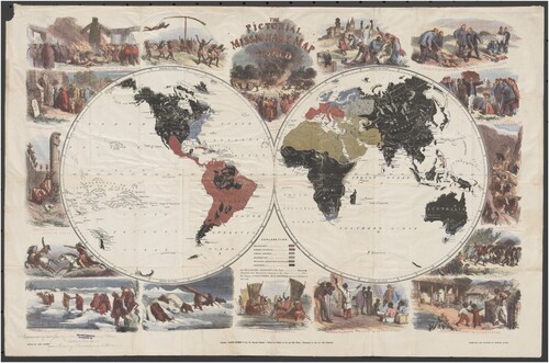
Take, for example, John Gilbert’s The Pictorial Missionary Map of the World, published in London in 1861 (). The splendid coloured edition depicted the world’s religions in striking tones: black for ‘heathen territory,’ red for Catholicism, green for Islam and blue for Protestantism.Footnote7 Indeed, next to the cartouches of ‘heathen practices,’ the colours are the most arresting attributes of the map.Footnote8 The colour scheme was not arbitrary; nineteenth century Protestant missionary tracts discussed, for instance, the negative connotations of black and red on missionary maps, as unenlightened and menacing. Protestant missionary world maps as artefacts both reflect Western Christian cultural attitudes towards the non-Western ‘heathen’ world and depict a global policy to convert and civilise. Studying them thus allows us to investigate how colours on maps reflect cultural attitudes and bolster narratives of global conversion. The colour schemes reflect nineteenth-century attitudes of the missionary movement across the Protestant world, but also show variation and development.
Fig. 1. John Gilbert, The Pictorial Missionary Map of the World (London: James Nisbet & Co., Citation1861), engraved and printed by Edmund Evans, 73.8 x 48 cm. Courtesy of the National Library of Australia, MAP RM 3764, https://nla.gov.au/nla.obj-232361632/view.
This article applies Fotiadis’s claim to nineteenth and early twentieth century Protestant missionary world maps, a genre which received little notice until Ruth Kark drew attention to the importance of missionary cartography in an article published in this journal in 1993.Footnote9 Interest in these missionary maps is now gaining traction but the genre remains relatively understudied.Footnote10 This genre is particularly useful to examine the cultural significance of colour schemes because the corpus is limited geographically to a handful of countries and chronologically to the long nineteenth century. Additionally, across space and time, Protestant missionary societies formulated several consistent narratives about the world that converged on the themes of conversion and civilization. The analysis considers how missionary narratives are conveyed on world maps and how colours bolstered and deepened but also diversified these narratives. Moreover, it shows how colour schemes developed through time, reflecting changing attitudes.
This article draws on the known and available corpus of coloured missionary world maps in missionary atlases and wall and sheet maps produced between 1839 and 1928 in Protestant countries (Germany, The Netherlands, England, Switzerland, New Zealand, Finland, Sweden and the United States) (). The chronology of this article is dictated by the rise of coloured maps around 1840 as a starting point, and World War II when the relationship between Europe and its colonies was being reconceptualized, as an end point.Footnote11 The article also draws on articles that reflect on the use of these maps published in missionary magazines in this period.
Table 1: Colours on Protestant World Maps
A Brief History of Protestant Missionary Cartography
The modern Protestant missionary movement emerged in the 1790s with the foundation of missionary societies in Britain, Germany, and The Netherlands.Footnote12 It was deeply interwoven with Western imperialism and colonialism, by focusing on converting peoples in European colonies worldwide. Whereas the early nineteenth century relationship between missionary societies and empire was often tense, by the late nineteenth and early twentieth centuries they often appeared symbiotic.Footnote13
Maps were a part of missionary education and propaganda campaigns from the very start. Most missionary maps were produced by cabinet cartographers or missionaries. They were disseminated by missionary societies to their support base to satisfy the need for information and to raise funds. Evidence suggests that their significance was fully realised in the second quarter of the nineteenth century.Footnote14 By the mid-century, the missionary movement had produced a substantial number of maps for dissemination in missionary journals, town hall lectures, Sunday schools and churches. Initially maps were published in black and white. From around the 1840s, colour maps became popular, facilitated by the invention of chromo-lithography in 1837. By the late nineteenth century, missionary cartography had matured through the work of the indefatigable Reinhold Grundemann (1836–1924), a German pastor and missionary who produced several high-quality missionary atlases.Footnote15 Although the heyday of missionary proselytization and cartography are now over, maps remain an effective tool of missionary societies.Footnote16
Missionary cartography existed in various forms. Missionary journals often contained maps to illustrate particular journeys of missionaries or the operations of specific missionary societies. There were generally two categories of missionary world maps: maps locating missionary stations and maps showing an overview of world religions in colour patterns. Some maps combined those two elements. In the 1820s wall and sheet maps, usually world maps or colonial maps, came into fashion for use in Sunday schools and lecture halls, such as Joseph Tracy’s Citation1843 missionary world map, which was ‘especially adapted for the use oe [sic] schools, geographical & historical lectures and missionary meetings.’Footnote17 The first missionary atlases appeared in the 1830 and focused either on specific colonies or missionary societies, or aimed to cover all Protestant missionary activity worldwide.
Cultural Significance of Colour
As this article will show, colour schemes were relevant for missionary cartography, and particularly world maps. This argument is grounded in research into the cultural significance of colour in Western society as a whole, as well as into the application of this insight to cartography. According to geographer Jean-Paul Bord, in Western civilisation, blue has overwhelmingly positive connotations because it is ‘calme, pacifique, lointain, presque neutre’ (‘calm, peaceful, distant, almost neutral’). Red, on the contrary, is seen as dangerous and is associated with fire and blood. Yellow is the colour of movement, light, and energy.Footnote18 Today we see those values in operation: blue is positively constructed in the UN blue helmets and red dangerously associated with the Communist scare.Footnote19 However, context matters. Red can be festive and fiery as well as dangerous, as shown for instance in the use of the ‘blood flag’ in maritime contexts to signal combat. Periodisation also matters. Whereas blue was scorned by ancient Greece, it is a popular colour in modern Western societies.Footnote20
Of relevance to the study of colour schemes in missionary maps, Christianity, and Protestantism in particular, have attributed meaning to colours in text and image. According to theologian Benno Zuiddam, in the Bible, black was invoked ‘as the absence of God and a reminder of His judgement; white represented the colour of God’s presence and holiness, blue stood for heaven as the seat of God’s authority, red was the cloth of divine authority and reminder of earthly sufferings.’Footnote21 In Christian tradition, green has been a colour of hope since the Middle Ages.Footnote22 Blue refers to heaven, with Renaissance painters often dressing Mary in blue garment, but Jesus as well to ‘emphasize the heavenly origin and mission.'Footnote23
Protestantism subsequently developed its own colour system. Michel Pastoureau studied the use of colour in Reformation art and concluded that Protestantism waged ‘war on colours’ for their association with the exuberance of High-Renaissance Catholicism.Footnote24 He believes that there was a ‘Protestant palette’ of ‘tender’ colours of nature which excluded bright colours.Footnote25 ‘Protestant chromoclasm’ hailed black, brown and white because they emphasised modesty.Footnote26 Red was the colour with the most consistently negative connotations. In mediaeval Christianity the colour stood for sin, and the Reformation associated it also with cardinals and Catholic luxury.Footnote27 For Calvin, blue was the most beautiful colour, symbolising the sky.Footnote28
Islam was usually represented by green and yellow, colours with both positive and negative significance to European culture. Green is a preferred colour in the Islamic world, both for Sunnites and Shi’ites, and refers to paradise. It is visible in a number of national flags, most notably that of Saudi Arabia and Pakistan and, in the nineteenth century, the Mughal Empire. Yellow is significant in Western perceptions of Islam. According to Jean-Paul Bord, yellow is the colour of movement and refers to the restless and expansive nature of Islam.Footnote29
Colours on Missionary World Maps: An Inventory
As this brief analysis shows, Western culture generated clear patterns of colour associations, but these could vary in different eras or religious confessions. In order to apply these insights to missionary cartography, we have compiled a database of Protestant world maps that forms the basis of this analysis (). There is no cartobibliography of this map genre, although Peter Meurer and the author of this article have recently published short inventories and a bibliography that serve as a starting point for this article.Footnote30 The corpus consulted for this article, fifteen commonly used missionary atlases (Appendix 1) and a similar number of popular wall and sheet maps (Appendix 2), is based on these bibliographies.Footnote31 The maps were produced in the late nineteenth and early twentieth century throughout the Protestant world: Germany, The Netherlands, England, Switzerland, New Zealand, Finland, Sweden and the United States.Footnote32 The maps are numbered and set in chronological order. They are clustered under one number when the maps are variations of one design, such as the series of Church Missionary Society maps, or when they are translations of the same maps, such as the Dutch Algemeene Kaart that was translated into Finnish and Swedish. Black and white maps have been included because greyscales can be relevant for comparison.
There are obvious colour patterns in the missionary world maps that suggest a limited and conscious repertoire of colour schemes. Almost without exception, Catholicism is marked in red or pink, regardless of country or time period. This is congruent with Catholic preference for red, but also with Protestant culture more broadly, in which the colour red is seen as dangerous and corrupt. This applies to the vast majority of the maps, whether they be German, Dutch, Scandinavian, English or American. With the exception of the Josenhans (Citation1857) and Grundemann (Citation1862/Citation1867) maps, Catholicism is referred to by either red or pink, which makes it very plausible that the colour is consciously selected. The red zones on the world map show Catholicism as a competitor, as they usually contrast sharply with the colour used for Protestantism.
The colour used for Orthodoxy (Greek and Russian) is usually pink. In most cases, orthodoxy and Catholicism have similar colours related to red, such as orange, pink, or taupe, indicating that from a Protestant point of view Catholicism and Orthodoxy are related.
Islam is almost exclusively referred to as green, the traditional colour of Islam, or yellow, a colour of restless movement associated with the expansive nature of Islam. There is no discernible reason for the choice for either green or yellow, other than that it seems dependent on the colour chosen for Protestantism. If green or blue are used to depict Protestantism on a map, yellow seems the default for Islam; in contrast, if yellow is used for Protestantism, green is left over for Islam. German mapmakers appear to use green more often, and British mapmakers prefer yellow.
In contrast, the colour used to depict Protestantism presents the least consistency. In this selection, it is represented in red (10), yellow (6), blue (5), and green (2). Grouping maps made by the same cartographer, which were essentially versions of the same map, reveals a slightly different but still wide distribution: red (5), blue (3), yellow (3), and green (2). Apart from red, these colours have positive connotations in Protestant culture that can be connected to the narrative of these missionary maps and are explicitly confirmed in missionary texts: green is the colour of hope as a result of the spreading of the gospel; blue is the colour of heaven and its message to mankind; yellow refers to light and movement. All Dutch and Scandinavian maps used blue, yellow, or green to refer to Protestantism, and most British and American maps as well. These maps narrate a story of global Protestantism about heavenly hope and positive movement. German maps show more variations, whereas Swiss maps consistently chose red for Protestantism. In the latter case, this may also be a conscious choice by the publisher, the Basel Mission. However, Reinhold Grundemann, for instance, was not consistent in his use of different colours for Protestantism in his various atlases.
Whereas the choice for blue, green, or yellow for Protestantism seems motivated by the cultural meaning of these colours, the choice for red for Protestantism is not easy to explain. What is striking, however, is that red for Protestantism is almost never used against blue, green, or yellow for Catholicism. There are five clusters of maps that use red for Protestantism. With one exception, these maps used similar colours for Catholicism and Orthodoxy, mainly pink. Perhaps this choice indicated unity of the Christian confessions vis-à-vis the other world religions. Such an interpretation seems substantiated by the map legends. James Wyld’s Citation1839 map, for instance, does not differentiate between the three confessions, but divides the world map into the categories Christianity (red), ‘Mahommedanism’ (green), and ‘paganism’ (grey/light blue). The Basel missionary world map of 1891 used red for Protestantism and pink for Catholicism, although the latter is white with red dots. The effect is to show Western Christianity on the world map in red, with ‘Evangelisch’ (Lutheran) as a more forceful variant than Catholicism.
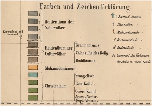
Whereas mapmakers show Abrahamic religions in colour, ‘heathendom’ is exclusively referred to in shades of black and white. It is colourless and usually black or dark grey, which had clear racist connotations. On black and white maps as well, mapmakers regularly used lighter colours or shades to indicate ‘higher’ forms of civilization or ‘true’ religion.Footnote33 Most maps use a single colour for non-Christians: black. This colour scheme is particularly visible in Gilbert’s map, which shows ‘heathen’ territories in pitch black, and whose cartouches illustrate the manifold vices of non-Christian cultures ().Footnote34 As noted above, black has racist connotations; in theology, it is mainly associated with the absence of the ‘light’ of the gospel. These two meanings easily overlapped in nineteenth-century missionary thinking. However, some missionary maps also displayed the non-Christian world in shades of white and light-grey, to denote the possibilities for spreading the gospel, such as in Koetsveld’s 1854 map (). Still others, employ variations to differentiate among different kinds of 'heathendom.' Grundemann's Citation1862 map (), for instance, uses shades of grey for ‘Naturvölker’ and three shades of brown-grey for ‘Culturvölker’ (Hinduism, Buddhism and Confucianism) (). The map of ‘Prevailing Religions’ by John G. Bartholomew for the Harlan Beach atlas issued in the wake of the 1910 Edinburgh world missionary conference was the first to use distinct colours for Hinduism (orange) and Buddhism (yellow), and marks a trend from missionary maps that are focused solely on conversion to more scientific approaches to depict the world’s religions.Footnote35
Fig. 2. C.E. van Koetsveld, Godsdienst- en zendingskaart voor den nieuwsten tijd (Groningen: J. Oomkens, Jz., Citation1855) 44 x 54 cm. Courtesy of Utrecht University Library, *VII*.A.116 (Dk1-1) https://objects.library.uu.nl/reader/index.php?obj=1874-385408&lan=nl#page//11/47/97/114797941729447303618971090928993661104.jpg/mode/1up
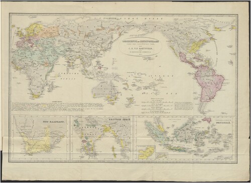
Fig. 3. Reinhold Grundemann, Missions-Weltkarte zur ubersicht sammtlicher evangelischen Missions Gebiete (Leipzig: H. Kunsch, Citation1862) 196 x 102 cm. Courtesy of Barry Lawrence Ruderman Antique Maps Inc., https://www.raremaps.com/gallery/detail/56712/with-annotations-in-papua-new-guinea-missions-weltkarte-z-grundemann.
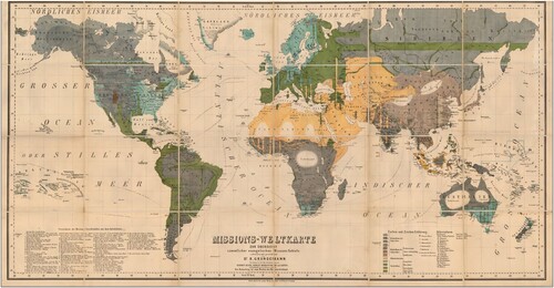
Fig. 4. Detail from Grundemann, Missions-Weltkarte, Citation1862. A key explaining colours and lettering.
Following Diane Lange’s methodological repertoire, some general conclusions can be drawn based on the information in . We observe that the colour system of most missionary world maps was to use full colour for world religions, but not to pay much attention to geographical details, such as cities, rivers, mountain ranges or seas. The same principle was applied to black and white maps, where grayscales indicated the various world religions and confessions. One result of using colour for so-called world religions is to impose a cartographic silence on religious minorities. In applying solid colour fields to vast territories, the emphasis is exclusively on the dominant religions. Some cartographers tried to overcome this limitation. For instance, in the Koetsveld 1854 map, darker borders are used to indicate where religions are dominant and the legend explicitly states that in other territories the colour refers to the majority religion. Koetsveld also used symbols that interfere with the dominant narrative of the colour schemes and indicate a more complex story. Greek letters α (American), β (Dutch), γ (French), δ (German) and ϵ (English) indicate the nationality of organisations running Protestant missionary stations. Mission among Jews is marked with the Hebrew character shin (ש) and Catholic stations with a cross (†). (). Gilbert’s Pictorial Missionary Map also plays with patterns within colours, showing dots in grey fields that denote patches of ‘decayed Christian churches’ (Nestorians, Ethiopian and Coptic churches) within Islamic territories that are difficult to notice on the brightly coloured map. Cartographers thus used subtle techniques to make their missionary maps more complex than the simple colour schemes suggest.
Contemporary Readings of Missionary Map Colours
Contemporary missionary textual sources confirm that both mapmakers and map readers understood the cultural significance of colours in missionary maps. An 1859 report of the Dutch Protestant Missionary Society (Nederlandsch Zendeling Genootschap) lays out a colour scheme, noting without elaboration that ‘[i]f we spread out the missionary map in front of us, we are astonished to see that the earth has so much black, yellow and red against so little green.’Footnote36 Almost fifty years later, in a 1916 Dutch missionary children’s novel, Des Heeren weg (‘The way of the Lord’), a bookseller identified the significance of a similar colour scheme on a missionary map in his shop: red for Catholic, yellow for ‘Mahometan,’ black for ‘heathendom,’ and blue for Protestantism, using the word hemelsblauw (heavenly blue).Footnote37
A boolean text search in Delpher, a Dutch database containing about 12 million pages of historical magazines and books, yields a number of hits for ‘colours’ and ‘missionary maps’ that provide further corroboration. For instance, a study of the use of black on missionary maps shows multiple resonances in missionary magazines. An 1860 Dutch missionary society report on Africa noted that it ‘is encouraging to see the green spots on the missionary map in the midst of the dismal black,’ suggesting that formerly ‘heathen’ areas had converted to Protestantism.Footnote38 Similarly, a 1903 report published in The Netherlands recalled that ‘[o]n the black missionary map of the beginning of the nineteenth century, only a few green spots were visible, the colour of hope’ implying that the proportions had changed over the century.Footnote39 Although the conflation and black and heathendom had obvious racist connotations, in missionary literature of the nineteenth century it is usually associated with the absence of the light of the gospel, consistent with biblical notions. In 1854, Reverend Gerbrand Fabius complained that ‘Alas! It is black that is still more common in the lands on the map of the world.’Footnote40 The Monthly message from the Dutch Missionary Society in 1860 assigned black as the colour for the African continent, ‘covered in the darkness of heathendom.’ Here black also referred to the ‘abominable slave trade.’Footnote41 In 1903, reformed theologian Philip Hoedemaker wrote: ‘We colour our missionary maps black there where the church of Christ has not yet been established and the gospel had not penetrated. Thus, we indicate that the realm of darkness exerts unlimited power here.’Footnote42
However, colour schemes were not static, as instances of full colour reversals show. Several missionary maps used white or grey, rather than black, for ‘heathendom,’ indicating not so much the darkness of ignorance but rather either emptiness or opportunity. Thus a 1939 missionary article spoke of the ‘white spots on the world map,’ territories as yet unknown that still need to be reached for the gospel.Footnote43 In 1937, the Journal of Missiology lamented the fact that the missionary map of South Sumatra in the Dutch East Indies ‘shows such a large part of Sumatra white, because there is no organized missionary work.’ Footnote44 White was a colour with explicit theological meaning, referring to the possibilities for mission and the ‘mission field,’ based on the New Testament. In John 4:35 Jesus admonished His disciples: ‘Lift up your eyes, and look on the fields; for they are white already to harvest.’Footnote45 Colours on missionary maps thus tied in with a variety of missionary narratives about conversion and imperialism.
Colours of Protestant missionary maps in the nineteenth and early twentieth centuries had deep cultural meanings and convey missionary narratives about the global spreading of the gospel. Red is consistently associated with Catholicism, and green or yellow apply to Islam. ‘Heathen’ territory is usually marked in black or grey. These shades align with common nineteenth-century tropes on race and civilisation, but also with Protestant theological notions and cultural traditions on the contrast between the darkness of ignorance and the light of the gospel. The colours used for Protestantism on maps - blue, green, and yellow – refer to heaven, hope, and movement and are easily associated with the global spread of the gospel. At the same time, cartographers were flexible in their usage of colour, enabling them to emphasise shifting views about mission. Occasionally red was used for Protestantism and pink for Catholicism, emphasising Christian unity rather than confessional rivalry. ‘Heathendom’ was sometimes depicted in white, pointing to opportunities for mission, rather than black, referring to darkness and lack of civilization.
Colours on Protestant missionary maps thus tell stories about the need and desirability of spreading the gospel globally. Evidence from missionary literature shows how ordinary Christians knew how to ‘read’ these colours and their meanings on missionary maps. The conclusion of this article substantiates the claim of Fotiadis that colour patterns on maps convey narratives of the world and calls for continuous research into the cultural significance of colours on maps that is attentive not only to where and when the maps are produced, and for whom, but also to the multiple meanings each colour might convey.
Acknowledgements
I am thankful to Michiel van Groesen, Marco van Egmond and the editors and referees of Imago Mundi for their critical feedback and helpful suggestions for this article, and to Kate Delaney for editing the final draft. I want to thank Linda McGregor of the National Library of New Zealand, Paul Peucker of the Moravian Church Archives, and Michael Robertson of the John Bulow Campbell Library of Columbia Theological Seminary for providing me with scans of atlases.
Disclosure statement
No potential conflict of interest was reported by the author(s).
Additional information
Notes on contributors
David Onnekink
▸ Dr. David Onnekink is Associate Professor in the Department of History and Art History at the University of Utrecht in The Netherlands. Email: [email protected]
Notes
1 Piers Fotiadis, ‘The Strange Power of Maps: How Maps Work Politically and Influence Our Understanding of the World’ (School of Sociology, Politics, and International Studies. University of Bristol, Working Paper No. 06-09), 33. See also Denis Wood, Rethinking the Power of Maps (New York: Guildford Press, 2010), 34, 51.
2 See for instance the relevant entries in the History of Cartography series: Nicolas Verdier and Jean-Marce Besse, ‘Color and Cartography,’ in Matthew H. Edney and Mary Sponberg Pedley, eds., The History of Cartography. Cartography in the European Enlightenment, part 1 (Chicago: University of Chicago Press, 2019), 294–302; Judy Olson, ‘Color and Cartography’, in Mark Monmonier (ed.), The History of Cartography vol VI. Cartography in the Twentieth Century part 1 (Chicago: University of Chicago Press, 2015), 255–66. See Karen S. Pearson, ‘The Nineteenth Century Colour Revolution: Maps in Geographical Journals,' Imago Mundi 32, no. 1 (1980), 9–20. Christian Jacob, The Sovereign Map: Theoretical Approaches in Cartography Throughout History (Chicago: University of Chicago Press, 2005), has multiple observations on colours of specific maps but no overall argument on their cultural significance.
3 Olson, ‘Color and Cartography,' 265.
4 Diana Lange, ‘Colours on Maps: Systems, Schemes, Codes,' Imago Mundi, 74, no.1 (2022): 117–24.
5 Michel Pastoureau, Red: The History of a Color (Princeton: Princeton University Press, 2016); Green: The History of a Color (Princeton: Princeton University Press, 2014); Black: The History of a Color (Princeton: Princeton University Press, 2008); Blue: The History of a Color (Princeton: Princeton University Press, 2001); Yellow: The History of a Color (Princeton: Princeton University Press, 2019).
6 Stuart Hall, ‘The Work of Representation,’ in Stuart Hall ed., Representation: cultural Representations and signifying Practices (London: Open University, 1997), 26.
7 John Gilbert; Edmund Evans, engraver and printer, Pictorial Missionary Map of the World (London: James Nisbet & Co., 1861), 73.8×48 cm.
8 Petrus Koppius wrote a lengthy review article on missionary maps and started each section with an analysis of the colours. Petrus Adrianus Koppius, ‘Over Zendings-geographie,’ in Wetenschappelijke Bijdragen ter bevordering van den Opbouw der evangelische Kerk in Nederland (Schoonhoven: S.E. van Noten, 1856) II: 167.
9 Ruth Kark, ‘The Contribution of Nineteenth Century Protestant Missionary Societies to Historical Cartography,’ Imago Mundi 45, no. 1 (1993): 112–19.
10 See for instance, on missionary maps, Guy Thomas, ’Horizonte der "Missionskartographie" am Beispiel der Basler Mission,’ Cartographica Helvetica 58 (July 2019), 2–12 and David Onnekink, ‘Kingdom Come: the Eschatology of Missionary Maps,’ International Bulletin of Missionary Research 45, no. 3 (July 2021)248–56, https://doi.org/10.1177/2396939320930249; Johanna Skurnik, ‘Encountering Colonial Worlds Through Missionary Maps in the Late-Nineteenth-Century Grand Duchy of Finland,’ in Raita Merivirta, Leila Koivunen, and Timo Särkkäkä, eds., Finnish Colonial Encounters (London: Palgrave MacMillan, 2020), 199–221; Mirela Altić, 'Mapping the Missionary World: Nineteenth-Century Missionary Atlases with Special Regard to Justus Perthes’s Production,’ Imago Mundi 75, no. 1(2023): 24-44 DOI: 10.1080/03085694.2023.2223064. More generally on Protestant missionary geography, see Jan A.B. Jongeneel, Philosophy, Science and Theology of Mission in the 19th and 20th Centuries: A Missiological Encyclopedia. Part I: The Philosophy and Science of Mission (Frankfurt: Peter Lang, 1995), 258–72. See also an online exhibition on missionary maps, Marco van Egmond, Hannah de Korte and David Onnekink, 'Maps with a message: missionary cartography ca. 1850-1950,' Utrecht University Library, accessed on 13 October 2023, https://www.uu.nl/en/utrecht-university-library-special-collections/collections/digital-exhibitions-of-special-material/maps-with-a-message-missionary-cartography-ca-1850-1950.
11 The earliest missionary atlas I found was published in 1839, the last in 1942.
12 There is a vast literature on Protestant mission. A good starting point is Dana L. Robert, Christian Mission How Christianity Became a World Religion (Newark: John Wiley & Sons, Incorporated, 2009).
13 See for instance: Norman Etherington, ed., Missions and Empire (Oxford: Oxford University Press, 2008); Andrew Porter, Religion versus Empire? British Protestant Missionaries and overseas Expansion, 1700–1914 (Manchester: Manchester University Press 2003); Dana L. Robert, Converting Colonialism: Visions and realities in Mission History, 1706-1914 (Grand Rapids: William B. Eerdmans Publishing Company, 2008).
14 The American Board of Commissioners for Foreign Mission (ABCFM), ‘On the Use of Missionary Maps at the Monthly Concert’ (Boston: Crocker and Brewster, 1842), 4, reported that the success of missionary maps was recognized first by the ABCFM in the mid-1820s.
15 Reinhold Grundemann, Allgemeiner Missions-Atlas (Gotha: Justus Perthes, 1867), Neuer Missions-Atlas (Calw: Verlag der Vereinsbuchhandlung, 1896) and Kleiner Missions-Atlas zur Darstellung des evangelischen Missionswerkes nach seinem gegenwärtigen Bestande (Stuttgart: Verlag der Vereinsbuchhandlung, 1905).
16 Hannah de Korte and David Onnekink, ‘Maps Matter: The 10/40 Window and Missionary Geography, ’ Exchange. Journal of Contemporary Christianities 49, no. 2 (2020): 110–44. DOI 10/1163.1572543X-12341558.
17 Joseph Tracy, The World, on the Globular Projection with a Graduation for the Measurement of Distances Especially Adapted for the Use oe [sic] Schools, Geographical & Historical Lectures, and Missionary Meetings (Boston: Crocker and Brewster, 1843).
18 Jean-Paul Bord, ‘Cartographie, Géographie et Propagande: De quelques Cas dans l'Europe de l'après-guerre,’ Vingtième Siècle. Revue d'histoire 80 (2003): 15–24.
19 See also Fotiades, ‘The strange Power of Maps,’ 34.
20 Pastoureau, Blue, passim.
21 Benno Zuiddam, ‘The Spiritual Value of Contrast, Black, White, Blue and Red in Renaissance Paintings: Biblical Colour Symbolism and Interpretation of Christian Art,’ South African Journal of Art History, 33, no. 1(2018): 67–90, 69.
22 Fulvio Pellegrino Morato, Del Significato de Colori (Venice: Giovan'Antonio de Nicolini da Sabio 1535) referred to green as the colour of hope. See: Zuiddam, ‘Spiritual Value,’ 85.
23 Zuiddam, ‘Spiritual Value,’ 77.
24 Pastoureau, Red, 108.
25 Pastoureau, Blue, 107.
26 Pastoureau, Black, 124–125.
27 Pastoureau, Red, 98, 111–13; Pastoureau, Black, 124.
28 Pastoureau, Blue, 106.
29 Bord, ‘Cartographie, Géographie et Propagande,’ 15–24.
30 An exception is Peter H. Meurer, ‘Kurzbibliographie der älteren Missionsatlanten’, Cartographica Helvetica 58 (July 2019): 68–71. Bibliographies of missionary Maps and Atlases as Part of my ‘Missionary Map Project’ are available at David Onnekink, ‘Bluebelts,’ URL: https://www.bluebelts.nl/religion-and-globalization/.
31 Within this selection, the focus on world maps allows for a delineated corpus that serves our purpose. It excludes a number of atlases that focus on the activities of specific societies or regions. Unlike most regional missionary maps, missionary world maps usually worked with colour schemes that represented world religions
32 For known corpus: see appendices. As for availability, a number of maps and atlases are referred to in either missionary magazines or university libraries throughout the world. I have tracked most of these, but some were unavailable to me or no known copies are left.
33 For an example where the light to dark scale explicitly correlated from ‘civilization’ to ‘barbarism,’ see Moral and Political Chart of the inhabited World: Exhibiting the Prevailing Religion, Form of Government, Degree of Civilization and Population of Each Country, published by William Woodbridge in 1821. I thank the editors of this journal for this reference.
34 Gilbert, Pictorial Missionary Map.
35 John G. Bartholomew, ‘Prevailing Religions,’ inset map on Plate 1: World Protestant Missions, in James S. Dennis, Harlan P. Beach and Charles H. Fahs, World Atlas of Christian Missions: Containing a Directory of Missionary Societies, a Classified Summary of Statistics, an Index of Mission Stations, and Maps Showing the Location of Mission Stations throughout the World (New York: Student Volunteer Movement for Foreign Missions, 1911).
36 Toelichting van de Algemene Bepalingen der Nederlandsche Zendingsvereeniging te Rotterdam … 1859, (Rotterdam: D. de Koning, 1871), 19.
37 A.J. Hoogenbirk, Des Heeren weg (Callenbach: Nijkerk, 1916), 3-4.
38 '5. Zuid-Afrika,' Zending van het Fransche Genootschap,'Maandberigt van het Nederlandsch Zendingsgenootschap, vol. 24 (Rotterdam: M. Wijt & Zonen, 1860), 65, 66.
39 Lemma in Het Oosten (23 Jan. 1901); Maandberigt also referred to green as the ‘colour of hope’, 66. Similarly, S. Ulfers, Hans Egede in L. Heldring, E. Nijland, S. Ulfers en P. van Wijk (Comité voor Nederlandse Zendingsconferentiën), Lichtstralen op den Akker der Wereld (Rotterdam: J.M. Bredée, 1895), 1–28, page 28, refers to the ‘merry colour of green of Protestantism’ on the missionary map where ‘heathendom’ is disappearing.
40 G.H. Fabius, Woord van Opwekking tot Deelneming aan den Arbeid tot Uitbreiding van het Evangelie onder Heidenen … (Monnikendam: J. Koker Bz., 1854), 3.
41 '5. Zuid-Afrika,' Maandberigt, 65, 66. L. C. Schuller tot Peursum, ‘speaks of ‘dark’ colour when referring to the black areas on the missionary map in Weggevlotene Jaren,’ Stemmen voor Waarheid en Vrede,’ 54 (1917): 23.
42 Philip Hoedemaker, De duistere Achtergrond der Dingen. Leerrede over Eph. 6:12 (Amsterdam: J.H. van Dam, 1903), 16.
43 For an example of white as the focus of missionary enterprise, see W. Cremer-De Vries, ‘Rondvlucht. De witte Plekken op de Wereldkaart’, in Bouwen en Bewaren: Orgaan van den Bond van Meisjesvereenigingen op gereformeerden grondslag in Nederland 20, 27 October 1939: 454.
44 Joh. Rauws, ‘Overzicht van het zendingswerk’, Mededeelingen. Tijdschrift voor Zendingswetenschap (Oegstgeest 1937), 454.
45 This was, for instance, the motto of the Church Missionary Society, as shown on the frontispiece of The Church Missionary Atlas: Maps of the Various Missions of the Church Missionary Society, with Illustrative Letter-press (London: Church Missionary Society, 1862).
Appendix 1. Protestant Missionary Atlases (numbers to refer to maps in Table 1)
- Bäschlin, H., lith. Welt-Karte der Mission (Schaffhausen: Evangelischen Missions-Anstalt Basel, 1844) (6a).
- Beach, Harlan, et al., World Atlas of Christian Missions: Containing a Directory of Missionary Societies, a Classified Summary of Statistics, an Index of Mission Stations, and Maps Showing the Location of Mission Stations throughout the World (New York: Student Volunteer Movement for Foreign Missions, 1911) (19b).
- Beach, Harlan and Charles H. Fahs, World Missionary Atlas, Containing a Directory of Missionary Societies, Classified Summary of Statistics, Maps Showing the Location of Mission Stations Throughout the World, a Descriptive Account of the Principal Mission Lands, and Comprehensive Indices (New York: Institute of social and religious research, 1925) (19c).
- Grundemann, Reinhold, Allgemeiner Missions-Atlas nach Originalquellen: mit erläuterndem Texte (4 vols, Gotha: Justus Perthes, 1867-1871) (16b)
- Grundemann, Reinhold, Kleiner Missions-Atlas zur Darstellung des evangelischen Missionswerkes (Stuttgart: Verlag der Vereinsbuchhandlung, 1886) (16a).
- Grundemann, Reinhold, Neuer Missions-Atlas aller evangelischen Missionsgebiete mit besonderer Berücksichtigung der Deutschen Missionen (Calw: Verlag der Vereinsbuchhandlung, 1896) (16c).
- Grundemann, Reinhold, Neuer Missions-Atlas aller evangelischen Missionsgebiete mit besonderer Berücksichtigung der Deutschen Missionen (Calw: 1903, Verlag der Vereinsbuchhandlung, 2nd ed.) (16d).
- Josenhans, Joseph, Atlas der evangelischen Missions-Gesellschaft zu Basel: Nach den Angaben der Missionare Locher (Basel: Basler Mission, 1857) (11).
- Missionsdirektion der Evangelischen Brüder, Missions-Atlas der Brüdergemeine, Achtzehn Karten mit erläuterndem text (Herrnhut: Missionsbuchhandlung, 1907) (18a).
- Moravian Church and Mission Agency, The Moravian Missionary Atlas: Containing an Account of the Various Countries in which the Missions of the Moravian Church Are Carried On, and of its Missionary Operations (London: Moravian Church and Mission agency, 1908) (18b).
- Morse, Sidney E., The Cerographic Missionary Atlas (New York: Sidney E. Morse & Co. 1848) (8).
- Missions-karte der Erde (Basler Mission, Basel 1903) (6c).
- Missionsweltkarte (Basel: Verlag der Missionsbuchhandlung, 1891) (6b).
- The Church Missionary Atlas: Containing Maps of the Various Spheres of the Church Missionary Society, with Illustrative Letter-press (London: Church Missionary Society, 1862). The first edition was published in 1859; additional editions were issued in 1865, 1873, 1879, 1887, and 1896) (15).
- World Missionary Conference Committee 1, Statistical Atlas of Christian Missions: Containing a Directory of Missionary Societies, a Classified Summary of Statistics, an Index of Mission Stations, and a Series of Specially Prepared Maps of Mission Fields (Edinburgh: The conference, 1910) (19a)
- Wyld, James, An Atlas of Maps of Different Parts of the World; Designed to Show the Stations of the Protestant Missionaries (London: J. Wyld, 1839) (1).
Appendix 2. Protestant Missionary Wall and Sheet Maps (numbers to refer to maps in Table 1)
- Colton, George Radcliffe, Missionary Map of the World Showing the Prevailing Religions of its Various Nations and the Central Stations of All Protestant Missionary Societies (New York: G.W. and C.B. Colton, 1906) (17).
- Gilbert, John, Pictorial Missionary Map of the World (London: James Nisbet & Co., 1861) (13a).
- Groen, J.A., A.J. Zn., del.; A.J. Wendel, engrav., ‘Wereldkaart der christelijke zendingsposten’ (s.l.: Meerburg impressum, 1851) in Handboek voor de vrienden der zendingszaak ten gebruike bij het houden en bijwonen der maandelijksche bedestonden voor de uitbreiding des christendoms (Leyden: C.C. van der Hoek, 1851) (9a).
- Groen, J.A., Christelijke zendingskaart (Leiden: J.H. Zetman 1854) (9b).
- Grundemann, Reinhold, Missions-Weltkarte zur übersicht sämmtlicher evangelischen Missions Gebiete (Leipzig: Kunsch, 1862) (14a).
- Grundemann, Reinhold, Zending-wereldkaart tot een overzigt van geheel het evangelische zendingsgebied (Kemink: Utrecht 1867) (14b).
- Koetsveld, Cornelis Elisa van, Godsdienst- en zendingskaart voor den nieuwsten tijd (Groningen: Oomkens Jz, 1855) (10).
- ‘Algemeene kaart der Nederlandse zendingsposten’ in Handleiding bij de algemeene kaart … (Rotterdam: M. Wijt, 1846 (1st ed.), 1849 (2nd ed.) and 1857 (3rd ed.)) (12a)
- Gover, Edward, The Protestant Missionary map of the world (London: Seeley, Burnside & Seeley, 1846) (7)
- Koenig, Theophil, Weltkarte mit Angabe der protestantischen Missions-Anstalten und der WichtigstenSchiffuhatscourse (Berlin: Verlag der Nicolai'schen Buchhandlung, between 1840 and 1861) (2).
- Finnish Missionary Society, Maailman kartta lähetys-toimesta (Helsinki: Suomen lähetysseura,1860) (12b).
- Werldskarta öfver hedna-missionen (s.l, s.d) (12c).
- Illustrerad missions charta öfver werlden (Uppsala: Evang. Fosterlands Stiftelsens Förlags Expedition, n.d.) (13c).
- Nisbet, James, ‘Children’s Missionary Map … Extracted from Children's Missionary Magazine‘ (London: January 1843) (5a)
- R., W., Missions-weltkarte für jung und alt (Elberfeld: P.W. Kreeft, 1845) (5b).
- Society for the Propagation of the Gospel in Foreign Parts, A Colonial and Missionary Church Map of the World (London: Society for the Propagation of the Gospel, 1842) (3).
- Tracy, Joseph, The World, on the globular projection with a graduation for the measurement of distances especially adapted for the use oe [sic] schools, geographical & historical lectures, and missionary meetings (Boston: Crocker and Brewster, 1843) (4).
- Trap, Pieter Willem Marinus, Zendingsprentenkaart (Rotterdam: M. Wijt, 1863?) (13b).
