Abstract
This study investigates whether health spending and access to services in South Africa have become more or less pro-poor over time. We find that over the post-apartheid period health spending has become significantly more pro-poor. In addition to the rising share of the health budget allocated to public clinics, there has been an increase in the share of public clinic and hospital spending going to the poor and a rising share of the health budget allocated to public clinics. In addition, between 1993 and 2008 there were improvements in both financial access to public health services – as measured by the incidence of catastrophic costs – and physical access to public health facilities – as measured by reduced travel time. Given that substantial progress has been made with fiscal equity and access to health, problems that users complain about – rude staff, long queues and lack of medicine – have moved higher on the policy agenda.
1. Introduction
South Africa's apartheid health system was grossly ineffective in providing the population with access to quality health care. In 1992/93, combined private and public health spending was among the highest in the world at 8.4% of GDP, yet due to inequalities in provision and poor efficiency of spending the country did not even rank among the top 60 in terms of health status indicators (Goudge, Citation1999). Consequently, post-transition health policy placed a strong emphasis on achieving greater equity.
Against the backdrop of the extremely dualistic South African health system, we investigated whether public health spending and access in South Africa have in fact become more equitable since the end of apartheid. This paper deals with two aspects of such equity: the targeting of fiscal spending and the consequent access to public health care.
About 16% of the population is covered by medical schemes, and membership is heavily concentrated among the more affluent (DoH, Citation2011). Individuals with medical scheme coverage tend to obtain health care from the private health sector. The rest of the population is largely dependent on public facilities, which are often free, but where queues are long and there are frequent complaints about prescribed drugs not being available (Burger & Van der Berg, Citation2008). Unhappy with the lack of privacy and the long waiting times, many of those not covered by medical schemes also use private facilities, particularly general practitioner services, usually paying for these services out of their own pockets. Surveys such as the General Household Survey (GHS) show that private providers constitute roughly one fifth of health care utilisation by those in the poorest quintile.
Government expenditure on health constituted 44% of total health expenditure in 2010, up from 39% in 2005 (WHO, Citation2012). For the period of this study, public hospitals and clinics – the focus of this study – together represent 82% of the total health budget (National Treasury, Citation2004).
Since the political transition in 1994, much effort has been invested in improving health outcomes by making public health care more accessible to the poor. Real per capita public expenditure on health has increased over this period.Footnote1 To improve equity, budget allocations have been shifted towards historically poorly endowed provinces and, within provinces, particularly to primary health care. In 2000 the government was spending just over R2 on primary care for every R10 it spent on hospitals but by 2007 the rate was R3 for every R10. This shift was achieved by both increasing the share of the health budget allocated to primary care and reducing the share allocated to hospitals. In an attempt to remove obstacles to accessing health services, the government introduced free care for pregnant mothers and young children in 1994 and free primary health care for all in 1996. Since 1994 the primary health care facility network has been expanded, with more than 1300 clinics being built or upgraded (Manuel, Citation2006).
This paper attempts to gauge the effect of these changes on the targeting of public spending on health, and on access to care, in terms of both the physical proximity of facilities and the affordability of government health services.
While a number of studies have addressed equity in South African health spending, they have each focused on only a part of the question, at a particular point in time, or using a specific dataset, and none has offered a comprehensive and detailed comparison of a number of data points over the post-apartheid period. For example, Castro-Leal et al.'s (2000) pioneering multi-country study on health spending in Africa provides estimates of South Africa's spending equity in 1994, but this is now outdated. Havemann & Van der Berg's (Citation2003) study dealt with the demand for health shortly after the transition, and was thus able to estimate some of the effects of price on utilisation of health services, before free services became widespread. Similarly, Van der Berg's (Citation2001) overview of social spending trends covers only the apartheid era (up to 1993), and although his later studies cover two successive parts of the post-transition period, they consider health expenditure only as part of social spending (Van der Berg, Citation2005, Citation2009). McIntyre & Ataguba's (2009) work uses data from the 2006 South African Consortium for Benefit Incidence Analysis (SACBIA) survey, which was designed for this purpose and consequently contained very detailed utilisation data and information on the need for care that allowed the authors to experiment with a novel approach to benefit incidence analysis.
This paper expands this literature by considering patterns in post-apartheid public health spending and access to public health services, using a number of large representative household datasets. To the best of the authors' knowledge, there have been no previous attempts to construct a dedicated analysis of how spending on South African public hospitals and clinics has changed since the end of apartheid.
While the focus of this work is retrospective, it has relevance for current policy debates about health reform. Because there are still large disparities in health outcomes, the accessibility, equity and effectiveness of health care are high on the agenda of policy makers. The analysis presented here can help inform the debate around these issues by assessing the government's efforts to prioritise primary health delivery since the formal end of apartheid.
Section 2 below explains how we used the data to track trends in the incidence of government health spending; Section 3 describes the available data sources and their limitations; Section 4 presents the main results of our analysis, including trends in health care utilisation and the incidence of public health spending over this period; Section 5 investigates the drivers of utilisation, exploring whether the changes can be attributed to the expansion of the clinic network and the elimination of user fees, and considers whether there is evidence that affordability concerns and physical distance continue to constrain access to public facilities; and Section 6 concludes.
2. Methodology
We use fiscal incidence analysis to assess how pro-poor government spending is. In essence, a fiscal incidence study estimates the proportion of overall spending targeted at specific subgroups of the population. Demery Citation(2003) explains that the proportion of spending allocated to a specific subgroup can be calculated using the following formula:
As is evident from the formula, the share of government spending accruing to a particular subgroup (such as the poorest quintile) for a specific health service is driven by two factors: utilisation share per region and per subgroup, and the share of spending for the region. It is usually relatively straightforward to calculate the share of utilisation from household surveys. It is not easy, however, to retrieve an estimate for the share of spending allocated to a region for a specific service. To simplify matters, we assume for most of the analysis that the unit subsidies are constant across regions, i.e. that while the subsidy varies across hospitals and clinics, the average subsidy for each visit to a specific type of facility is the same and is not influenced by differences in the length of stay, quality of care and intensity of service provision. We then use administrative data and survey data to explore the validity of this assumption (see Appendix A). We conclude that there is no evidence that costs vary systematically by region, thus it is valid to use the assumption made in most such studies internationally – that unit subsidies at any one point in time are constant. Where individuals pay user fees the computation becomes more involved. To calculate the government subsidy, revenue collected from user fees needs to be subtracted from government spending. However, data on user fees are difficult to come by and only available for 2003 and 2008 (see Section 3.1). Fortunately, user fees are (especially currently) quite small relative to the magnitude of subsidies, thus their influence on fiscal incidence estimates is small.
Demery Citation(2003) notes that the share of spending received by a subgroup cannot be interpreted as indicative of the benefit that this group receives unless we can assume that the cost of providing the service is indicative of the value that the beneficiaries obtain from the service. If a household had been given the additional funds, it is not clear that they would have wanted to spend the money to purchase that health service. This does not, however, pose a challenge to the merits of fiscal incidence analysis. Even though there may be problems with interpreting spending shares as benefit shares, it is still useful to know what share of government spending serves the poor.
3. Data sources
In order to conduct fiscal incidence analysis, information is needed on government health spending at the public clinic and hospital levels, health care utilisation and a measure of socioeconomic status (such as consumption, expenditure or assets) to enable us to rank households. Information on user fees is desirable in order to estimate unit subsidies, otherwise simplifying assumptions are required (Wagstaff, Citation2012).Footnote2
3.1 Data on health care utilisation and socioeconomic status
Health care utilisation data are obtained from a series of nationally representative South African household surveys from 1993 onwards that also contain reliable information on total household expenditure. The 1993 Project for Statistics on Living Standards and Development survey (PSLSD), the 1995 matched Income and Expenditure Survey (IES), the 1995 October Household Survey (OHS), and the 2008 National Income Dynamics Study (NIDS) are obvious choices. But this leaves a long period between 1995 and 2008 during which there were no household surveys that collected information on both utilisation of public health services and household expenditure. The 2000 and 2005 IESs contain detailed information on household income and expenditure, but not on health care utilisation. Health expenditure cannot be used to infer who uses health services, because some services are free. The Labour Force Surveys (LFSs) do not include information on health care utilisation. Some of the earlier OHSs asked questions about utilisation of health services, but these surveys only have salary, rather than expenditure or consumption, data. Similarly, the 1998 and 2003 Demographic and Health Surveys (DHSs) have detailed information on health status and interventions, but contain information neither on the utilisation of general curative care nor on expenditure or income. Using a wealth or asset index to rank households would not render these data sufficiently comparable with the other years where rankings were based on expenditure; the correlation between the household rankings produced by wealth indices and per capita expenditure data is known to be relatively low – between 0.2 and 0.4 (World Bank, Citation2003).
The GHSs appear to offer the best possibility of filling the data gap between 2003 and 2008, as they contain in-depth questions on health service utilisation. However, the only measure of income that they capture is that from salaries and wages, which is a poor approximation of household expenditure. There is also a question on expenditure, but responses are collected over only eight broad household expenditure categories.
For this reason, household expenditure in the 2003 GHS was imputed using coefficients from a household expenditure model estimated using the 2000 IES/LFS, containing variables common to both surveys. This ‘out-of-sample imputation’ (Alderman et al., Citation2003:173) method has been used in many previous studies (see for example Elbers et al., Citation2000:2–3) where two datasets contain a sufficiently large set of overlapping variables. We estimated a model for each of the expenditure categories in the GHS 2003, constraining predicted household expenditure to fall within the originally reported intervals (see Appendix B for details). The per capita household expenditure that was calculated from these estimates of the value of household expenditure was then used to rank households into per capita expenditure quintiles. The model performs well and allocates IES 2000 households to the correct expenditure quintile in 79% to 95% of cases (see , Appendix B).
For each of the years covered by the surveys there were slight differences in the categories offered to respondents to describe where their health consultations took place. However, the major categories (private doctors, public clinics, public hospitals and private hospitals) were always included – apart from in 1993, when no distinction was made between private and public facilities. In the early 1990s, private hospitals and clinics were still rare, so we assumed that responses related to public facilities (both clinics and hospitals) only. In 2008, utilisation was captured with a more general question, asking ‘When did you last consult someone about your health?’ To make these answers more comparable with those from the other two surveys, we eliminated health visits that took place more than 30 days prior to the date of the interview.
Ex ante there is no reason to expect any systematic bias in our survey estimates, but it is important to note that the household surveys suffer from a number of shortcomings for estimating fiscal incidence. Significantly, McIntyre & Ataguba Citation(2009) highlight that household surveys tend to track only the most recent visit to a health worker, whereas there would often be multiple visits and consultations during an episode of illness or injury. In addition, because of the sequencing of questions (i.e. first asking whether the respondent was ill or injured in the last period and only conditional on a positive answer to the first question asking whether he or she had consulted a health worker), the surveys only track health consultations resulting from acute conditions and overlook preventative care, and potentially also some forms of chronic care.
3.2 Data on government health spending
To test the assumption of constant unit subsidies across expenditure quintiles, administrative data were obtained from the Department of Health and analysed to investigate patterns in unit cost by province. In order to obtain the unit cost of service provision, detailed facility-level expenditure data were matched to facility-level utilisation data in 2002, the only year for which such information could be obtained. This analysis is detailed in Appendix A. Specifically, we wanted to examine whether provinces where more affluent individuals lived tended to have higher unit costs. The fact that no systematic differences in unit costs were observed leads us to conclude that there is no reason to deviate from the usual assumption of constant unit cost across regions (or, in this case, provinces).
4. How equitable is health care utilisation and government spending on hospitals and clinics?
4.1 Utilisation patterns for clinics and hospitals
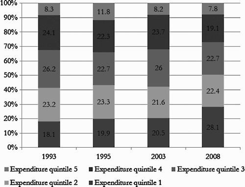
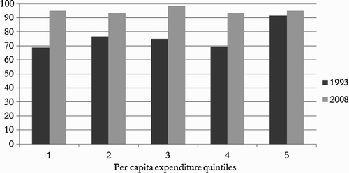
and depict changes in the quintile share of service utilisation in public hospitals and clinics between 1993 and 2008.Footnote3 Looking at the shares of the poorest and richest quintiles respectively helps to identify underlying patterns. It appears there was an increase in the bottom quintile's share of utilisation of both hospitals and clinics. Also, throughout this period the top quintile's utilisation of public hospital and clinics was considerably smaller than that of other quintiles, although, as expected, the share is larger in the case of public hospitals than clinics. It is encouraging to note that these pro-poor patterns of public health facility utilisation are broadly in line with what is reported by McIntyre & Ataguba Citation(2009).
Figure 1: Distribution of utilisation of public hospitals, by per capita household expenditure quintile, 1993–2008
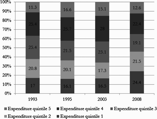
Figure 2: Distribution of utilisation of public clinics, by per capita household expenditure quintile, 1993–2008
shows a remarkably steep rise in clinic visits as a share of all public health facility visits across all five expenditure quintiles following the introduction of free primary health care in 1996 and the expansion of the clinic network. This suggests a shift towards using primary health care service to lighten the burden of hospitals.
Figure 3: Share of clinics in total utilisation of public health facilities, by per capita household expenditure quintile, 1993–2008
The surveys indicate a rise in primary health care utilisation as a proportion of public and total health care visits (not shown here). The District Health Information System data (DHIS) is available from 2000 and also shows an increase in primary health care visits per capita from 1.7 to 2.4 between 2000 and 2010 (Health Systems Trust, Citation2012).
displays the public–private mix in health care utilisation by quintile. The increase in the public share of health utilisation between 1993 and 1995 was before the elimination of fees for primary care in 1996. We would have expected such a shift to be more prominent after the introduction of universal free primary care in 1996, and not already by 1995 following the introduction in 1994 of free health care for pregnant women and young children.
Figure 4: Share of public health care facilities in total health care utilisation, by per capita household expenditure quintile, 1993–2008
The utilisation of public facilities varies according to socioeconomic status, with most poorer families opting to use public providers. The sharp drop in the utilisation share of public providers for the top two quintiles between 1995 and 2008 could perhaps be due to those who can afford to do so turning away from the public system; there have been reports that staff morale and conditions may have worsened due to the increased utilisation of public facilities following the introduction of free care (Walker & Gilson, Citation2004).
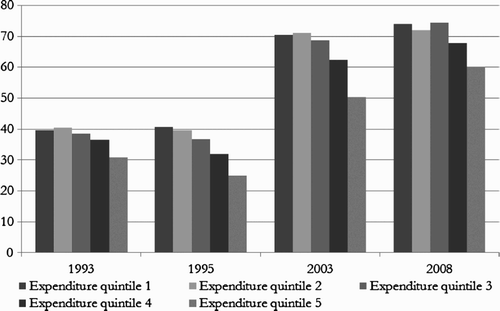
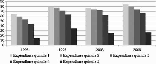
However, overall, as may be expected, the more affluent individuals are more likely to consult a health worker when they are ill or injured, as shows.Footnote4 This pattern is even starker if we exclude individuals who report being ill or injured but do not consider their condition serious enough to warrant consulting a health worker. This is done in order to correct for the possibility of ‘perception bias’, i.e. the phenomenon whereby the perceived threshold of discomfort and pain associated with terms such as ‘ill’ or ‘injured’ differ between the poor and the affluent (Demery, Citation2003; Lindelow, Citation2005). Encouragingly, there was a rise in the proportion of the bottom two quintiles that sought care when ill or injured between 1993 and 2003 (results not shown here).
Table 1: Prevalence of reported illness and injury and proportion of those ill and injured who reported consulting a health worker over the last month by per capita household expenditure quintile, 1993–2003
4.2 Fiscal incidence of health spending
As mentioned earlier, we examined the validity of the assumption of constant unit subsidies. The appendices show our analyses of administrative data (Appendix A) and user fees (Appendix C). Appendix A describes the matching of facility level administrative spending and utilisation data and concludes that there is no statistically significant difference between the unit costs for different expenditure quintiles for either public hospitals or clinics across provinces. Appendix C shows that public facility user fees are trivially small compared to the costs associated with delivering health services; consequently they have little impact on the incidence of health spending.
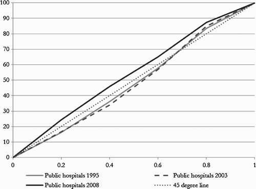
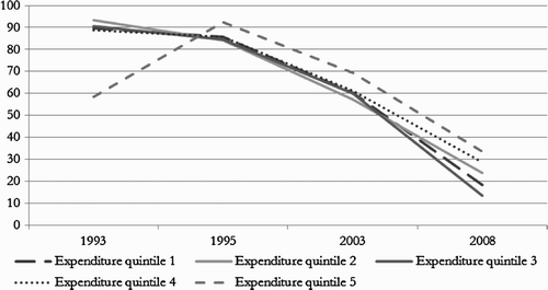
The concentration curves shown in to suggest that government expenditure on both clinics and hospitals became more pro-poor between 1995 and 2008. Data from 1993 are omitted due to lack of comparable data on government expenditure for that year. The x-axis represents the proportion of the population ranked from poorest to richest and the y-axis the proportion of total government expenditure received. The diagonal line is the line of perfect equality, e.g. at incision mark 0.2, the poorest 20% of the population (the poorest quintile) receives 20% of government health spending. A curve that lies above the line indicates a pro-poor spending pattern.
Figure 5: Concentration curves for public clinics, 1995–2008
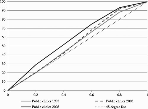
In the case of public clinics, in 1995 and 2003 the bottom part of the curve was virtually on the diagonal (45° line), suggesting that the poorer quintiles were benefiting from government spending approximately in proportion to their population shares (see ). Quintiles 3 and 4 were receiving slightly more than their proportional share of government spending and the top quintile a considerably smaller share. By 2008, however, government health care spending on clinics was markedly pro-poor; the concentration curves have moved away from the diagonal and further into the upper triangle. Around 30% of government health spending is on the poorest 20% of the population, and around half on the poorest 40% of the population.
Government spending on public hospitals was initially more pro-rich and shifted to being pro-poor. In 1995 and 2003, the poorest three quintiles as well as the top quintile received less than their proportional share of government spending, while the fourth quintile received more than its population share (see ). The pattern is influenced by many in the upper quintile opting out of the public health system, but this effect is less pronounced for hospitals than for clinics. By 2008, government spending on hospitals had become noticeably pro-poor, with the poorest 20% benefiting from around 25% of government funding and the poorest 40% benefiting from 45% of government funding. Nevertheless, government spending on hospitals is less pro-poor than government spending on clinics – but the gap is surprisingly small.
Figure 6: Concentration curves for public hospitals, 1995–2008
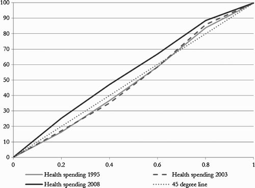
shows the overall incidence of health spending. It resembles for hospitals quite closely because hospitals remain the major spending item in the health budget – despite significant shifts towards primary care and away from hospitals over this period.
Figure 7: Concentration curves for public health spending (public clinics and public hospitals combined), 1995–2008
Trends in inequality of spending can also be shown by concentration indices which are derived from the concentration curves. They can range from –1 to +1, with a higher number indicating a greater degree of inequality. In the case of public spending, a negative value of the concentration index indicates that government spending is concentrated among the poor and a positive value indicates that spending is concentrated among the more affluent. The corresponding concentration curves lie above the line of equality and before the line of equality respectively.
The concentration indices for hospital and clinic spending between 1993 and 2008 in confirm the pro-poor trends shown by the concentration curves and also that clinics are more pro-poor than hospitals.
Table 2: Concentration indices for hospital and clinic spending, 1993–2008
The analysis suggests that South Africa's public health spending compares favourably to that of other developing countries cited in Yaqub Citation(1999), Castro-Leal et al. Citation(2000) and Sahn & Younger Citation(2000). It also compares favourably with the findings of a multi-country study of low and middle income Asian countries which found, using data from the late 1990s and early 2000s, that while the incidence of public health expenditure at the non-hospital (clinic or primary health centre) level was in most cases pro-poor, public health expenditure on hospitals (both inpatient and outpatient) was generally pro-rich (O'Donnell et al., Citation2007). In Tanzania, public health care subsidies have been found to be pro-rich at regional hospitals for both inpatient and outpatient care, indeterminate at the level of the district hospital, and pro-poor at the level of clinics (Mtei et al., Citation2012).
5. What drives the utilisation of public health services?
It seems credible that events such as the elimination of user fees and the expansion of the clinic network may lie behind the observed shifts in the utilisation of health services. The analysis below explores whether household survey data on trends in affordability and travel time support such an interpretation. The section also explores whether utilisation is constrained by affordability concerns and travelling distance. It finds little evidence of cost and the distance to the facility constraining access in a significant way, but the analysis suggests that long waiting times, drug shortages and impolite staff members may be deterrents.
5.1 The elimination of primary care user fees
If there is a relationship between the elimination of primary care user fees and the increased utilisation of these services, we would expect to observe a drop in the proportion of individuals reporting that they pay for these services and we would also expect to see public health services become more affordable. Of course, this only provides evidence in support of the hypothesis and does not demonstrate a causal relationship.
The analysis shows that reported payments for public clinics and hospital visits declined sharply between 1993 and 2008 (see Figures and ). The trend is most noticeable for clinics, where user fees were eliminated in 1996.Footnote5 In line with this observation, we also see a sharp drop in the average amounts paid for public hospital and clinic visits between 1993 and 1995.
Figure 8: Percentage of users who paid for their visit to public clinics by per capita household expenditure quintile, 1993–2008
Figure 9: Percentage of users who paid for their visit to public hospitals by per capita household expenditure quintile, 1993–2008
Affordability ratios and the prevalence of catastrophic expenditureFootnote6 across expenditure quintiles provide some evidence of how these shifts have affected households. This analysis is important because we can only judge whether health services are affordable by assessing such expenditure within the context of the household's budget.
Affordability ratios express health expenditure for households as a share of their non-food expenditure. shows average affordability ratios for five survey years across five expenditure quintiles. On average, health costs appear to be relatively low, but there was a slight increase in 2005 and 2008 for the poorest quintile. Given the variations in the questions and categories used to capture health expenditure across these surveys, small fluctuations between the two surveys should not necessarily be interpreted as meaningful trends.
Table 3: Average affordability ratios for the uninsured by per capita household expenditure quintile, 1993–2008 (%)
Affordability ratios present the average experience, but may mask the experience of subgroups that are particularly vulnerable to high health costs. Consequently, it is also important to consider the incidence of ‘catastrophic expenditure’, i.e. the percentage of households whose out-of-pocket medical expenditure exceeds a particular threshold. O'Donnell et al. Citation(2008) recommend a threshold of 10%, when defined relative to total household expenditure of 10%, and 40% when defined relative to expenditure minus nondiscretionary expenses (which is usually taken to mean non-food expenditure). By these measures, the incidence of catastrophic expenditure in South Africa is virtually zero. Even at a stricter benchmark of 10% of non-food expenditure, the prevalence of catastrophic expenditure is extremely low ().
Table 4: Prevalence of catastrophic expenditure for the uninsured by per capita expenditure quintiles, 1993–2008 (%)
These estimates are close to the ratios reported by McIntyre & Ataguba Citation(2009).Footnote7 They are also in line with the findings of Xu et al. Citation(2003) who, using a 40% share of non-food expenditure as the benchmark and a different methodology for deriving basic food expenditure, found a very low prevalence of catastrophic health expenditure in South Africa, only about 0.03% of the population. By this measure, South Africa ranks in the same league as the UK (0.04%), France (0.01%) and Germany (0.03%), though the quality of care that this money buys in South Africa is generally very far below that offered in those countries. Nevertheless, viewed in this broader context, it appears that financial protection is an area in which the South African health system is performing well. Moreover, given that and the DHIS data show reasonably high levels of utilisation, the low out-of-pocket expenditure cannot be the result of a lack of access to care.
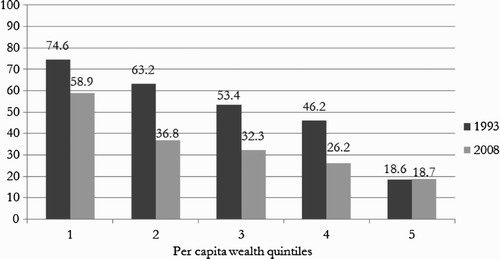
However, the upward trend in the prevalence of catastrophic expenditure among the poorest households is a matter for concern and mirrors the rise in affordability ratios among this group that seems to indicate. Given the low prevalence of payment for public sector facilities and the increased utilisation share of public facilities, it is possible that this increase can be attributed to higher private provider costs. shows that in 1993 there was considerable variation across quintiles in the share that private providers represented of the out-of-pocket expenditure of households, but by 2008 this measure seemed to have converged across quintiles at around 95%, presumably due to the elimination of user fees in primary public care facilities.
Figure 10: Private provider share of out-of-pocket expenditure by per capita household expenditure quintile, 1993 and 2008
provides further confirmation that costs do not appear to be a constraint to accessing public health care. In 1993 the poorest quintile reported that in 8.9% of cases individuals did not consult a worker when they were ill because it was too expensive; by 2008 this proportion had declined to 3.7%. Instead of cost, the most widely cited reason for not consulting a health care worker when ill was that the individual was not ill enough and did not require a consultation (16.4%). This was also the most widely cited reason for not consulting a health worker when ill (14.9%) among those in the poorest quintile.
Table 5: Prohibitive cost cited as reason for not consulting a health worker, 1993–2009 (%)
5.2 Physical proximity and the expansion of the clinic network
Responses to questions about distance to facilities and reported travel time in the surveys give an indication whether use of public health facilities by the poor has increased because physical proximity to such facilities has improved.
Distance to health facilities was not captured in the 1993 PSLSD survey, but it is likely that there was progress on this front between 1993 and 2002 as a result of the expansion of the clinic network. Only a small proportion of households cited distance as an issue; in 2008 this group represented 1.7% of the overall sample. Distance was very rarely cited as a constraint to seeking health care (3.1% in 2002 and 3.8% in 2008).
The GHS 2008 provides information on travel time that is comparable to the 1993 PSLSD. In order to create comparable quintile groupings for these two surveys, and in the absence of expenditure data in GHS 2008, an asset index was estimated in both surveys using a set of 10 overlapping household assets and characteristics. From this, was derived. It shows a decline in travel times to public facilities for most groups between 1993 and 2008, but relatively little progress for the poorest users, many of whom live in remote rural communities. Even for this group, distance is rarely a constraint to seeking health care when ill: in 2008 only 3.8% of the bottom quintile said they did not consult a health worker because the facility was too far. The Kaiser Family Foundation Survey of Health Care also indicated that there was a large improvement in travelling times to health centres in the 1990s: according to Smith et al. Citation(1999) the proportion of black respondents who travelled less than 15 minutes to their closest public health facility rose from 36% to 54% between 1995 and 1998.
Figure 11: Percentage of respondents reporting more than 30 minutes travel time to the closest public health facility, 1993 and 2008
5.3 Other factors contributing to access to care
Financial and geographic factors are not the only barriers to accessing care. According to , the main complaints about public facilities are waiting times, a lack of available drugs and rude staff.Footnote8 Costs appear to be only a minor concern and patients do not consider the quality of diagnosis to be a problem. These three main complaints also have sizeable and significant coefficients when added to a multivariate regression of self-reported satisfaction (rated on a Likert scale), providing evidence that these factors matter for the users and influence their experience and perception of public health facilities. It is plain that the affluent complain more, perhaps because they have a lower tolerance for waiting and for rude staff behaviour, and that the poor complain less, perhaps because they are less assertive. The factors that prompt complaints from users who visit public health care centres for acute care may cause people to avoid or delay seeking preventative or chronic care, resulting in a deterioration of health status and, possibly, more costly future care.
Table 6: Percentage of respondents reporting the following complaints about public facilities, 2002–2008
6. Conclusion
This analysis has shown that South Africa's public health spending became more pro-poor between 1993 and 2008, with spending in both clinics and hospitals becoming better targeted at the poor and a greater share of spending being allocated to public clinics. Poor households are more frequent users of public hospitals and clinics than those who are more affluent, who often belong to a medical scheme and can afford private facilities and may therefore more readily opt out of using public facilities.
User fees were so small relative to public expenditure on health that they had a negligible impact on subsidy shares. Even when including private provider fees, costs rarely appear to be prohibitive. The comparatively low incidence of catastrophic health expenditure compared to other countries makes improving financial protection a relatively low public health priority. Similarly, distance is not a major impediment to public health care utilisation. This suggests, furthermore, that the low out-of-pocket expenditure (and high degree of financial protection) is not the result of lack of physical access to care. A high proportion of those experiencing illness or injury sought care; not needing medical assistance was the most widely cited reason for not consulting a health worker when ill or injured. It is possible that cost and distance may be greater constraints for preventative and chronic conditions – which could not be measured with the available data – than for acute conditions.
Despite the success of the shift in targeting health spending to the poor, users are frustrated by long waiting times, staff rudeness and problems with drug availability at health facilities. This may indicate that priorities for health reform should include strengthening human resources for health and improving the pharmaceutical supply chain as critical components. These findings resonate with Harrison's perspective (Citation2010) that the public health sector has made significant strides forward in terms of access, rationalisation of health management and a fairer distribution of health spending post-1994, but that these gains are now threatened by factors such as weak health system management and low staff morale.
Indeed, this analysis has suggested that, in the post-transition period, the South African health care system has been fairly successful in expanding access to care, especially for the poor, and, moreover, avoids imposing a significant financial burden on households. What we were not able to assess, and what is a critical area for future research, is the quality of care that is being received. Given that there is little evidence of health outcomes responding to the increased utilisation of public health care services, this should be a priority item on the policy agenda.
Acknowledgements
The findings, interpretations and conclusions expressed in the paper are entirely those of the authors, and do not represent the views of the World Bank, its Executive Directors, or the countries they represent.
Notes
1Between 2000 and 2008 real public health spending per capita increased by 5% per year. Prior to 2000 it is more difficult to obtain comparable spending estimates, but the work of McIntyre et al. Citation(1998) indicates that there was a slight decrease in real public health spending per capita between 1995 and 1999. However, the relative magnitudes are such that the growth in per capita real spending in the second period dominates the slight decrease in the first period.
2For example, the constant unit cost assumption (where each patient visit is assumed to cost the same) or the constant unit subsidy assumption (where each visit is assumed to be subsidised by the same amount, regardless of patient or whether it is the first, second or last visit).
3It is encouraging that fairly similar patterns are obtained when using alternative welfare indicators to examine spending incidence in 2003. The results are thus not an artefact of the modelling process used.
4In 1993 the recall period (i.e. the length of time that the survey asked respondents to recall) was two weeks, whereas it was a month in 1995 and 2003, so the 1993 survey estimate was adjusted to be more comparable with that of 1995 and 2003. Estimates for 2008 are not shown, as questions were not comparable to those asked in 1993, 1995 and 2003. The 1995 and 2003 questions were reasonably comparable, but in 1993 a sentence was added (‘This includes people who have some form of permanent injury, disability or ailment’) to make it clear that the question also referred to chronic conditions.
5Note that comparability between the top quintile in 1993 and 1995 may be compromised because the analysis assumes that medical scheme members always paid for their services and the 1993 survey does not capture medical schemes membership. This assumption regarding payment by medical scheme members was introduced because of inconsistencies in how the question on payment for services was perceived and answered by medical schemes members across survey years. The assumption does not affect our analysis much because utilisation of public facilities is rare amongst medical scheme members and the focus of the research is on the uninsured and those at the bottom of the distribution.
6Medical scheme members are excluded from both these estimates because of the variation in how comprehensively the expenditures of medical scheme members were captured, and because the focus of this analysis is on the poor.
7On the basis of their 2006 SACBIA survey, McIntyre & Ataguba Citation(2009) report that average out-of-pocket health expenditure represented less than 2% of total expenditure.
8This table is based on a pooled version of the GHS surveys. The wealth quintiles are based on a wealth index that was compiled using multiple correspondence analysis (MCA) to weight a series of characteristics and household assets. MCA is similar to principal component analysis, but considered more appropriate when the variable list includes discrete variables with no cardinal interpretation. Respondents were asked whether they had complaints about any of seven potential problems – with ‘other’ as an additional category. We report the prevalence of ‘yes’ responses to the five most frequently cited complaints. The other two complaints not reported here were ‘opening times not convenient’ and ‘facilities not clean’, both rarely cited as complaints by respondents.
Related Research Data
References
- Alderman , H , Babita , M , Demombynes , G , Makhatha , N and Özler , B . 2003 . How low can you go? Combining census and survey data for mapping poverty in South Africa . Journal of African Economies , 11 ( 2 ) : 169 – 200 . (doi:10.1093/jae/11.2.169)
- Burger , R and Van der Berg , S . 2008 . “ How well is the South African public health care system serving its people? ” . In Transformation Audit , Edited by: Hofmeyr , J . Cape Town : IJR (Institute for Justice and Reconciliation .
- Castro-Leal , F , Dayton , J , Demery , L and Mehra , K . 2000 . Public spending on health care in Africa: Do the poor benefit? . Bulletin of the World Health Organization , 78 ( 1 ) : 66 – 74 .
- Demery , L . 2003 . “ Analyzing the incidence of public spending ” . In The Impact of Economic Policies on Poverty and Income Distribution. Evaluation Techniques and Tools , Edited by: Bourguignon , F and Pereira da Silva , L . New York : Oxford University Press .
- DoH (Department of Health), 2011. National Health Insurance in South Africa: Policy Paper. Government Gazette No. 34523. www.doh.gov.za/docs/notices/2011/not34523.pdf and www.doh.gov.za/docs/notices/2011/not34523-2.pdf Accessed 12 August 2011.
- Elbers , C , Lanjouw , J O and Lanjouw , P . 2000 . Welfare in villages and towns. Discussion Paper TI 2000-029/2 , Amsterdam : Tinbergen Institute .
- Goudge , J . 1999 . “ The public–private mix ” . In South African Health Review 1999 , Edited by: Crisp , N and Ntuli , A . Durban : Health Systems Trust .
- Harrison , D . An overview of health and health care in South Africa 1994–2010: Priorities, progress and prospects for new gains . Discussion Document Commissioned by the Henry J Kaiser Family Foundation to help inform the National Health Leaders' Retreat . 24–26 January , Muldersdrift .
- Havemann , R and Van der Berg , S . 2003 . The demand for health care in South Africa . Journal for Studies in Economics & Econometrics , 27 ( 3 ) : 1 – 27 .
- Health Systems Trust, 2012. Health indicators. http://indicators.hst.org.za/healthstats/116/related Accessed 16 August 2012.
- Lindelow , M . 2005 . The utilisation of curative healthcare in Mozambique: Does income matter? . Journal of African Economies , 14 ( 3 ) : 435 – 82 . (doi:10.1093/jae/eji015)
- Manuel , T A . 2006 . Budget Speech, 15 February. National Treasury, Pretoria. www.treasury.gov.za/documents/national%20budget/2006/speech/speech.pdf Accessed 16 August 2012
- McIntyre , D and Ataguba , J . 2009 . Financing and benefit incidence in the South African health system: Preliminary results Working Paper 09-1, Health Economics Unit, School of Public Health and Family Medicine, University of Cape Town
- McIntyre , D , Baba , L and Makan , B . 1998 . “ Equity in public sector health care financing and expenditure in South Africa: An analysis of trends between 1995/96 to 2000/01 ” . In South African Health Review 1998 , Edited by: Ntuli , A . Durban : Health Systems Trust .
- Mtei , G , Makawia , S , Ally , M , Kuwawenaruwa , A , Meheus , F and Borghi , J . 2012 . Who pays and who benefits from health care? An assessment of equity in health care financing and benefit distribution in Tanzania . Health Policy and Planning , 27 ( 1 ) : i23 – i34 . (doi:10.1093/heapol/czs018)
- National Treasury, 2004. Trends in intergovernmental finances: 2000/01–2006/07, August. National Treasury, Pretoria . http://www.finance.gov.za Accessed September 2004.
- O'Donnell , O , Van Doorslaer , E , Rannan-Eliya , R , Somanathan , A and Adhikari , S R, et al. 2007 . The incidence of public spending on health care: Comparative evidence from Asia . World Bank Economic Review , 21 ( 1 ) : 93 – 123 . (doi:10.1093/wber/lhl009)
- O'Donnell , O , Van Doorslaer , E , Wagstaff , A and Lindelow , M . 2008 . Analysing Health Equity Using Household Survey Data: A Guide to Techniques and their Implementation , Washington , DC : World Bank .
- Sahn , D E and Younger , SD . 2000 . Expenditure incidence in Africa: Microeconomic evidence . Fiscal Studies , 21 ( 3 ) : 329 – 47 . (doi:10.1111/j.1475-5890.2000.tb00027.x)
- Smith , M , Solanki , G and Kimmie , K . 1999 . The Second Kaiser Family Foundation Survey of Health Care in South Africa: 1999. http://kff.org/southafrica/1513-index.cfm Accessed 16 August 2012
- Van der Berg , S . 2001 . Trends in racial fiscal incidence in South Africa . South African Journal of Economics , 69 ( 2 ) : 243 – 68 . (doi:10.1111/j.1813-6982.2001.tb00012.x)
- Van der Berg , S . 2005 . Fiscal expenditure incidence in South Africa, 1995 and 2000 . Report for the National Treasury , www.treasury.gov.za Accessed March 2005
- Van der Berg , S . 2009 . “ Fiscal incidence of social spending in South Africa, 2006 ” . In Working Papers 10/2009, Department of Economics , Stellenbosch University .
- Wagstaff , A . 2012 . Benefit-incidence analysis: Are government health expenditures more pro-rich than we think? . Health Economics , 21 ( 4 ) : 351 – 66 . (doi:10.1002/hec.1727)
- Walker , L and Gilson , L . 2004 . We are bitter but we are satisfied: Nurses as street-level bureaucrats in South Africa . Social Science & Medicine , 59 ( 6 ) : 1251 – 61 . (doi:10.1016/j.socscimed.2003.12.020)
- WHO (World Health Organisation), 2012. National health accounts. www.who.int/nha Accessed 16 August 2012.
- World Bank . 2003 . “ Measuring Living Standards: Household Consumption and Wealth Indices ” . In Quantitative Techniques for Health Equity Analysis, Technical Note 4 , Washington, DC : World Bank .
- Xu , K , Evans , D B , Kawabata , K , Zeramdini , R , Klavus , J and Murray , CJ L . 2003 . Household catastrophic health expenditure: A multi-country analysis . Lancet , 362 : 111 – 6 . (doi:10.1016/S0140-6736(03)13861-5)
- Yaqub , S . 1999 . “ How equitable is public spending on health and education? Background paper to WDR 2000/1 ” . Washington, DC : World Bank .
Appendix A: The distribution of unit costs
To assess the incidence of health spending, it is necessary to know whether, and by how much, the average cost of providing hospital and clinic services differs by region. Provincial level estimates of expenditure could not be used as these included items that could distort the unit cost calculations, such as one-off projects requiring large capital expenditure or expenditure on specialised hospitals also serving other regions. Instead, regional average costs were calculated by matching facility-level data on recurrent expenditure for 2002/03 (the only year for which these could be obtained) with utilisation statistics for the same year.
For hospital services, a hospital's recurrent expenditure reported by the provinces was matched to the inpatient day numbers for the facility from the National Hospital database to compute a unit cost for each hospital (excluding specialised hospitals). Although there were 51 cases where no utilisation information could be found for hospitals with expenditure information, these items represented only 5% of total hospital expenditure. Outpatient days were not included in the calculation because information on these was incomplete. The average unit cost calculated for each province used the total number of inpatients visiting each facility as a weighting factor.
When provincial averages were inserted into GHS 2003, average unit cost estimates for the top quintile were 11.03% higher than those for the lowest per capita household expenditure quintile, but the differences were not statistically significant. As average unit costs by quintile differed so little across regions, there was no evidence to warrant assuming anything other than constant unit costs for public hospitals, as is commonly done in international studies.
In the case of clinics, the expenditure database was more incomplete, allowing successful facility-level matching for only four of the nine provinces. Again there was little evidence of a systematic regional bias in the average unit cost, and applying these estimates to the survey data reveals little evidence of an anti-poor bias in unit costs. There is a mere 2.3% difference (not statistically significant) between the estimated average cost per visit for the lowest and the highest quintile of households. Motivated by these findings, we assume constant unit cost for public clinics.
Appendix B: Constructing quintiles for GHS 2003 using a model based on IES 2000
GHS 2003 does not contain adequate expenditure data to link to the rich set of variables on service delivery in fiscal expenditure analysis. To exploit this data it was thus necessary to allocate households to quintiles in a manner similar to the other surveys. The only expenditure variable in GHS 2003 was aggregate household expenditure, recorded in one of eight expenditure categories. Out-of-sample imputation was used to estimate household per capita expenditure quintiles in GHS 2003, based on models of expenditure generated within IES 2000, which did contain more detailed expenditure, and adjusting for inflation. Variables generated through identical questions and response categories in IES 2000 and GHS 2003 were candidate variables for out-of-sample imputation.
The set of variables available for model estimation fell into six categories. The first related to income sources and included estimated salary income, whether household members received social grants, and information about any other form of financial support. The second captured the structure of the household, e.g. household size, dependants, etc. The third contained geographical variables, such as rural and provincial dummies. The fourth described characteristics of the household head (e.g. age, literacy, educational attainment, race and gender). The fifth and sixth categories were private assets and community resources; for each of these categories, variables were combined to calculate an asset index using principal component analysis. These asset indices were added to the list of available variables.
A set of models predicting household expenditure was then generated in IES 2000, matching each of the household expenditure categories in GHS 2003. The models were chosen on the basis of how well they predicted in which expenditure decile households fell in IES 2000. In the model selection process both income and expenditure models were considered. We also constructed models for non-salary household or individual income and for total household or individual income or total household or individual expenditure, and we used the eight household expenditure categories available in the GHS 2003 to full advantage by devising a separate model for each of these expenditure categories. We used predictive accuracy to choose the best models.
The overall correlation between the estimated and actual per capita household expenditure in the IES 2000 data was 0.66. Note that the model predicts household expenditure, which was only thereafter converted into per capita terms. The model coefficients estimated in IES 2000 were then used in GHS 2003 to estimate household expenditure, with the proviso that estimates were constrained or ‘boxed’ to remain within the original expenditure categories that respondents had indicated.
shows predicted and actual quintile allocation in IES 2000. Although the low explanatory power for some of the household expenditure models caused clustering among predictions, especially at the bottom of the distribution, estimates appeared to be reasonably robust, in the sense that user fee and utilisation estimates stayed more or less the same when using alternative methods to estimate expenditure quintiles.
Table B1: Predictive accuracy of expenditure model tested in IES/LFS 2000
Appendix C: Deriving comparable user fee estimates
To derive comparable user fee estimates, it was necessary to make a number of assumptions. Firstly, we assumed that all medical scheme members paid for visits to health facilities. This assumption was necessary because of discrepancies in how the question on payments was perceived and answered by medical scheme members across survey years. In 2003 most members of medical schemes reported that they paid for their health care visit, while very few medical schemes members indicated that they had paid for their visits in 1995. It is likely that this shift in perceptions occurred because health care providers increasingly required patients to pay directly for services and seek reimbursement from their medical schemes. Where medical scheme members reported no payment, we used the average payment for users in that quintile visiting such a facility as an estimate.
shows high average public facility fees paid by those in the top quintile in 1993, but these averages may overestimate actual public sector user fees, due to the inclusion of a few expensive private facilities, because the PSLSD 1993 did not distinguish between private and public hospitals and clinics.
Table C1: Average payment in South African rand (2000 prices) for visit to public hospitals and to public clinics by per capita household expenditure quintile, 1993–2008
The IESs in 1995 and 2000 asked respondents to estimate their household's annual expenditure on a number of items, including ‘Flat rate in respect of services and medicine obtained at hospital/clinic’, ‘Doctors, dentists, psychiatrists, specialists, opticians, nurses, homeopaths, paediatricians, etc.’ and ‘Hospitals, nursing-homes, clinics, etc. including ambulance services’. For 1995, this expenditure could be linked to information on the facilities visited and paid for (e.g. public hospitals or clinics) in the linked OHS survey. This made it possible to allocate payments for the three items listed above to public hospitals or clinics. For each quintile, annual spending on these three items was determined for all those (excluding medical scheme households) who reported using a particular facility type and paying for services received in such a facility in the past month. In cases where a household had indicated using more than one health facility (2.15% of cases), half of the expenditure was considered to be spending on hospitals and half on clinics. For each quintile, total health expenditure so calculated was then expressed per paid hospital visits for the year, and the average user fee (including for those who did not pay) was calculated, assuming that all medical scheme members paid. The derived user fees for public hospitals and clinics are shown below in , in constant 2000 rand values, and assuming no other change in real costs between 2000 and 2003. This method is not ideal, but gives an indication of broad trends in user fees over time.
As the 2000 IES/LFS contained no information on health service utilisation, it was additionally assumed that the ratio of expenditure on public hospitals to expenditure on all health services remained the same in each of these categories as in 1995.
It is important to note that our robustness checks show that user fees have a negligible effect on the fiscal incidence calculations, thus the accuracy of these assumptions is of less concern for this purpose.